Rather than relying on guesswork, smart marketers A/B test their ideas – all the time – before making marketing decisions.
That is to say, they try out different variations of their marketing campaign to know which will bring the most desired outcome.
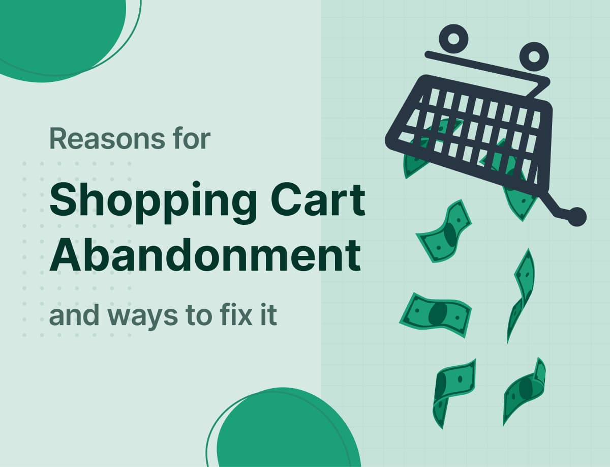
Have you been A/B testing your ideas lately? Or do you believe in luck? You do what you think is best, and hope for results.
A/B testing – or split testing, if you prefer to call it – puts you in control of your business outcomes. It puts you ahead of your competitors who, for the most part, are waiting on mother luck to help them succeed.
But what elements of your marketing campaign should you split-test?
Well, quite a lot!
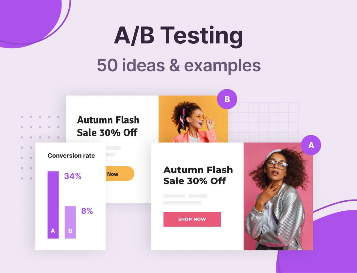
In fact, in this post, we have compiled a list of 50 A/B testing ideas and examples you can try out right now.
And that’s not all. We will also be examining a few case studies – that is, practical live examples of A/B testing in action.
But first things first: we need to get clear about what A/B testing is all about. Is it really worth the stress? You are about to find out for yourself, so stay tuned.
Table of Content
- What is A/B testing and why should you care?
- 50 A/B testing examples that will win you more conversions
- Real life A/B testing examples and case studies
- AB testing: best practices and mistakes to avoid
- Conclusion
What Is A/B Testing and Why Should You Care?
Are you looking to launch a marketing campaign to promote, say, your Black Friday sales?
If so, here are some questions you might have to answer:
- Red or blue color for your CTA (call to action) button?
- A pop-up box or a slide-in to display your sales offers?
- Discount or free shipping to win more sales?
Which of these options will bring you the most leads, conversion, and sales? The truth is, you can never really tell until you experiment – or, in this context, A/B test.
So, A/B testing, simply, is testing out two variations of an element to see which works best.
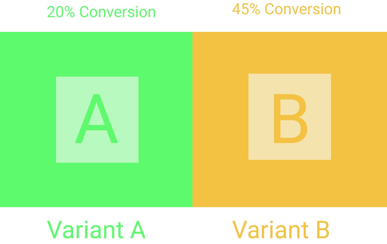
Of course, it doesn’t have to be just two variants – you can have as many as you please.
A/B testing saves you the headache of relying on faulty assumptions when looking to get the best out of your digital marketing efforts. Getting more leads means more sales and information, which can be used for your business goals. One reliable way to get leads is to use research ads agency UK. Agencies will help you with their experience and help you succeed.
It gives you insight into actionable, accurate data you can depend on when making marketing decisions.
And for this reason, we’ve built a robust A/B testing feature into Adoric. It’s super simple to use.
Okay, why should you bother about testing out your ideas before deciding which to implement? Especially when less than 44% of companies actually split-test their campaigns. Here are a few.
- A/B testing, when done right, can help improve your conversion rate remarkably
- As your conversion rate increases, so will your sales
- It can save you from fatal marketing mistakes that can potentially sink your business
With that said, let’s get to the business of the day: 50 A/B testing examples to get you fired up.
50 A/B Testing Examples That Win You More Conversions
To make it easy for you to follow through, we’ve broken the examples we will be looking at into 6 categories, and they are as follows:
Copy/messaging
You need to give people a good reason to want to make a purchase, subscribe to your newsletter, sign up for an account, etc. And, it’s through the copy you write that you will get to do this.
Therefore, you have to get your copy and messaging right by A/B testing the following:
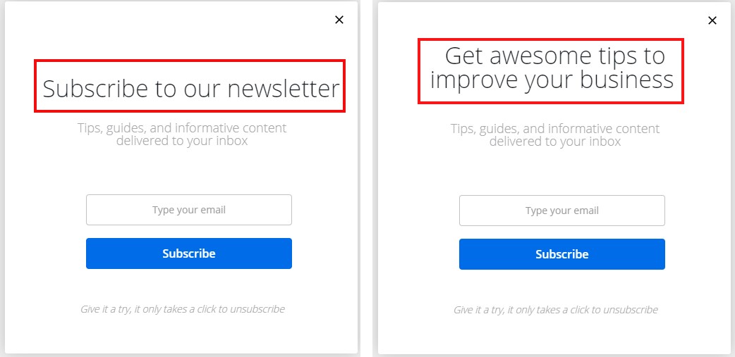
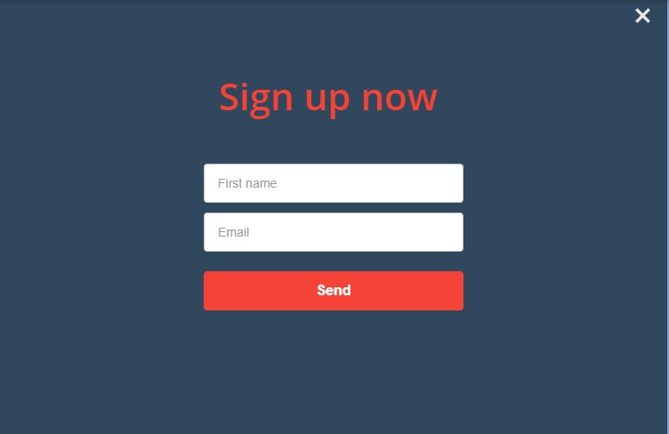
1. Headline Text
Your headline text is your visitors’ first port of call. More often than not, it’s what they will first read before deciding whether to read the main body text.
Thus, your headline text is a good starting point for A/B testing.
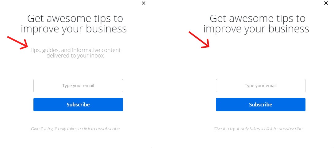
2. Body Text
A stellar body text is equally important as a strong headline text. So, you need to get it right as well.
But you might not be able to get it right until you have tried different approaches.
Spice up your copy with humor to see if it will resonate well with your audience. Try long and short text to see which your visitors will respond the most to.
Or better still, remove the body text altogether and stick with just a headline.
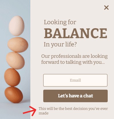
3. Footer Text
Adding footer text to your campaign can help improve your conversion rate. Of course, you can’t really tell until you have tried it out.
4. Ask a Question
Asking potential subscribers or customers a question puts them on the spot. It forces them to pause for a moment to think about your offer.
For example, instead of saying “Double your revenue in two days”, you could ask the following question:
“Do you want to double your revenue right now?”
But be careful; asking a question can turn your audience off. Only by experimenting can you figure out if asking a question will win more conversions for you, or do the opposite.
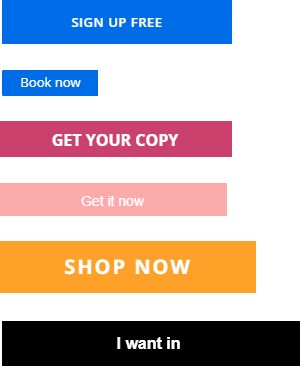
5. CTA Text
What exactly is your campaign goal? Get visitors to subscribe to your mailing list? Drive traffic to your product page, or get people to make a purchase?
Whatever your campaign goal is, you have to communicate it clearly via your CTA (call-to-action) button.
Looking for inspiration for your CTA? We’ve got plenty:
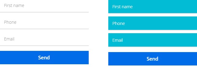
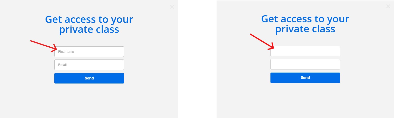
6. Placeholder Text
Placeholders are the faded, descriptive texts that appear in form fields. You use them to tell users what information to fill into a form.
It’s also a good element to split-test.
For example, instead of using just “Email” as a placeholder, why not try something different? Maybe something in the line of “Give us your email”.

7. CTA in Your Blog Post
Call-to-action buttons are there to help you drive more conversions. But if they are not noticeable enough, their purpose might be defeated.
This begs the question: where do you place your CTA buttons?
Your website header, sidebars, pop-up and slide-in forms, etc. are excellent places. But have you thought of placing one right within your blog post?
Try it out to see if your conversion rate would increase.
Design/visuals
In addition to writing a compelling copy, you need to make your campaign visually appealing. Your color combination needs to be spot on, font-style right on point, and graphic elements in the right mix.
That being said, here are some A/B testing ideas and examples in that regard.
8. Font Style
Sometimes, it’s not what you say that matters but how you say it.
Translation: the font-style you write your copy in can actually influence your conversion.
Arial or Times New Romans? Lato or Calibri? A/B test to find out the best of the mix.
9. Font Size
Using large text can be tempting. After all, it’s attention-grabbing. But it can also come off as annoying.
Since you don’t know exactly how things will pan out by using large text, split test by trying out small.
10. Font Color
Did you know that colors, naturally, influence our emotions? And emotions, in turn, influence our decisions?
This means that with the right colors, you can get visitors to take whatever action you want on your website.
In fact, studies show that with the right color combination, you can increase your conversion rate quite remarkably.
So, by all means, split-test your font color.
11. Campaign Background Color
While split testing your font color, see to it that you do the same for your campaign background color.
It can turn out to be the only split testing you will ever need to see more conversions.
12. Campaign Background Image
Adding background images to your campaign can help to get you more conversions. The reason is simple: the human brain engages more with pictures than it does with text.
Needless to say, you can never be so sure until you test.
13. Campaign Placement
What’s the point of placing campaigns on your website if no one will see them?
But where exactly should you place them for maximum exposure and visibility?
Placing it all over your pages might come to mind first, but would such an approach be really effective? What about placing it on a specific page, say, your homepage or, perhaps, blog page?
Well, only by A/B testing will you figure out which works best.
14. Background Opacity
What if you tweaked the background opacity of your campaign a little? Will doing so make it more visually appealing, or blatantly annoying?
Your answer is on the other side of A/B testing.
15. Button Color
What comes to your mind when you see the red color? Danger, hot, urgent, isn’t it?
Well, this makes red, possibly, a good option for promoting time-sensitive offers. However, if your goal is to build trust instead, blue might be a better fit.
So, try different colors for your CTA buttons until you find the one that drives the most conversion.
16. Form Color
Who said your opt-in form needs to be black text against a white background all the time? This might be what’s been hurting your conversion all the while.
Why not test out different combinations for your form’s text and background colors?
17. Emoticons
Emoticons are graphic elements you use to communicate your, well, emotions. You’ve probably used them in chats several times.
😏😎
Incorporating emoticons into your campaign might help improve user engagement, and hence more conversions. Or it might not – so test.
18. Icons
Like emoticons, icons can also help spice up the visual appeal of your campaigns. Adoric’s design editor has got plenty of icons you can use for your campaign design.
Create two variants of your campaign, one with an icon and the other without. Publish both and see which works best.
19. GIFs
GIFs are relatable, they are fun to watch, and they are an excellent attention grabber. Why not try one out on your campaign and see the outcome.
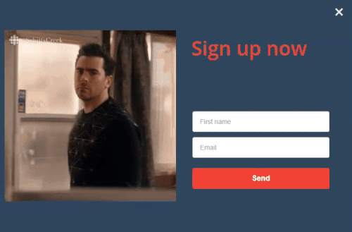
20. Video
Compared with text, videos are a lot easier to consume, and hence have the potential to yield you a higher return on your investment.
So, it wouldn’t hurt to experiment with using videos in your campaigns.
Thankfully, with Adoric, you can seamlessly embed videos into your opt-in forms.
21. Carousels
Have you ever considered using carousels in your campaign? They can potentially increase your sign-ups, much more than using single images would.
What’s even more interesting is that Facebook found carousel ads can reduce cost-per-conversion by 30 – 50%.
So, what’s holding you back from trying out carousels for your campaign?
22. Placeholders
The standard convention has always been to have placeholders in form fields. But who said it always has to be that way?
Try removing placeholders from your form fields to see how things will turn out.
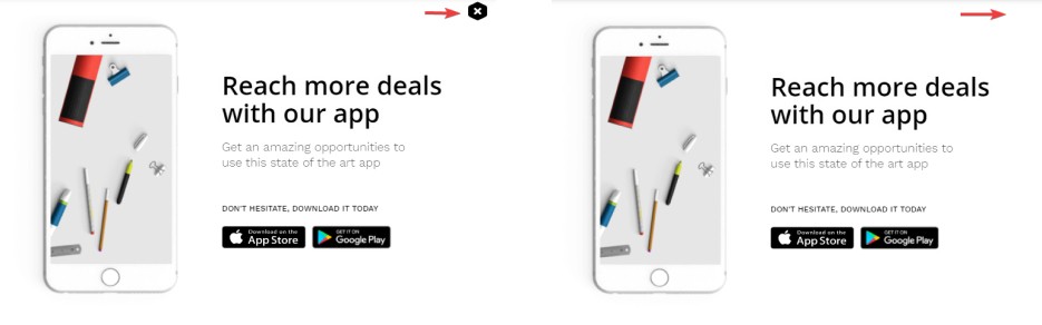
23. Close Button
You need to give visitors a way to close your popup should they want to. Usually, this is done by placing an X button somewhere at the top-edge of a popup box.
But the goal is to have visitors engage longer with your popup and not close it the instant it appears, right?
Then try different button designs. Thankfully, Adoric has got plenty you can pick from.
Experiment with the button positioning – it mustn’t always be at the top.
In fact, remove the button altogether. Make the popup close only when a user clicks off it.
Campaign Layout
As for campaign layout, here are some elements you can A/B test to see which will improve your conversions.
24. Popup Box
No web element is better suited for driving conversion than a popup box. With popup boxes, you can promote just about anything: lead magnets, summer/Black Friday/flash sales, sign up forms, etc.
However, it might not always resonate with your users all the time. Split testing allows you to know when best to use them
25. Slide-ins
Slide-ins, like popup boxes, are also ideal for promoting whatever you want. But unlike popup boxes, they are less intrusive.
The problem with using slide-ins, however, is that they can be easily missed. A little bit of split testing will help you determine when best to use them.
26 Sticky Bar
Sticky bar, as its name implies, are campaigns that stick fast to the top or bottom of a webpage as a user scrolls along with your website.
Give it a shot and see how many conversions it will fetch you.
27. Campaign Positioning
Believe it or not, the positioning of your campaigns has a lot to do with your conversion rate.
For example, if your popup appears at the top right corner of your users’ screen, they might close it right away without reading a thing.
On the other hand, if it appears at the bottom left corner, it will be less intrusive, and so has a better chance of being read.
So, choose wisely.
28. In-page Positioning
Instead of making your campaign float, while not embed it natively into your pages.
Users might engage more with it than they would if it floated.
29. Multi-step Popup Campaign
If your regular popup campaign hasn’t been yielding any significant conversion, it’s about time you tried a multi-step popup campaign.
Also known as Yes/No campaign, it starts by asking users a question to pique their curiosity.
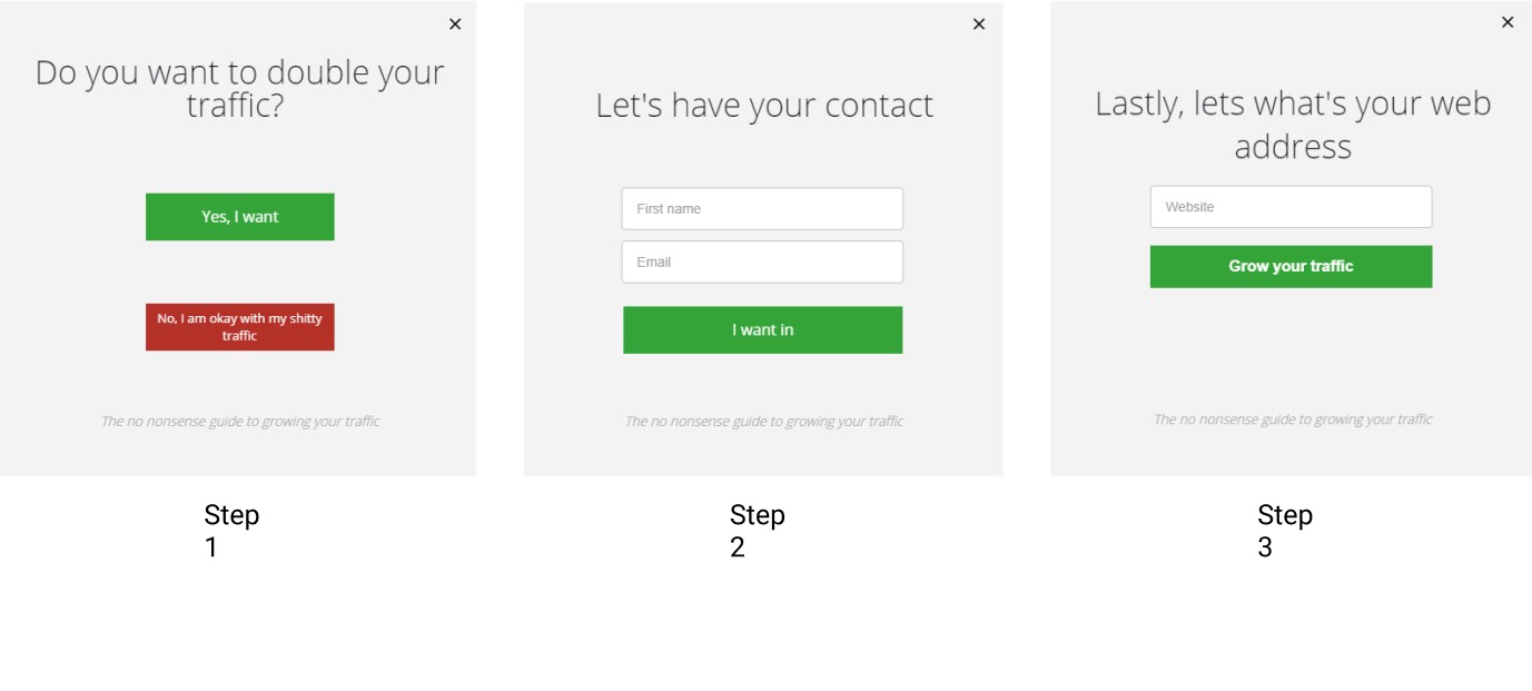
With their interest aroused, some will go for the “yes” option, while the rest will opt out by clicking “no”, thus closing your popup.
Users that click “yes” will be shown another popup, and, as Zerganik found out, will most likely follow through to the end.
This means more conversions for you.
30. Multi-step Popup Without a “No” Option
Okay, previously we discussed using a multi-step campaign in the form of a yes/no popup. Users that click “yes” will continue the signup process, whereas those that click “no” will be exited.
What if instead of “no”, you offered users an alternative, like so:
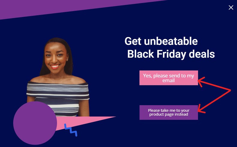
If, on the one hand, they clicked yes, all good. On the other hand, if they go for “alternative”, more gains for you.
Either way, you enjoy better conversions.
It goes without saying that users can always close the popup if none of your offers fits the bill for them.
31. Single Long-form vs Multi-Step Form
Depending on your marketing goals, you might want to collect a lot of personal information from your visitors.
This will, most certainly, warrant the need for an extensive, long-form. Should you then use a single long form, or break it up into multiple steps?
Each has its pros and cons. But the goal is maximum conversion, right? Try both in two different campaigns to see which brings you closer to your goal.
32. Exit-intent Popups
Ever heard of exit-intent popups? They appear when a visitor gestures to exit a website, hence the name.
They are there to help you win back abandoning visitors, and, hence, drive more conversions. Why not try one out and see if your conversion rate will improve.
33. Number of Fields
How many fields, ideally, should your opt-in forms have?
Just an email field?
Email, name, and phone number fields?
Well, there are pros and cons to adding multiple fields to your form.
For the con, it can lead to form fatigue – that is, visitors getting tired and frustrated halfway signing up to your opt-in form.
But it can also bring you more leads. However, you have to A/B test to know for sure.
34. Submit Button
When a user clicks the submit button in your sign up form, the form should close, right? Well, what if you switched things up a little.
Maybe, instead of closing the form the submit button, upon click, could redirect a user to your offer page.
Or, if not your offer page, your Whatsapp business page?
Interestingly, Adoric allows you to redirect users to wherever you want when they click your submit button.
Offer/promotions
Are your offers irresistible enough to want to make users want to give away their emails, make a purchase, subscribe to your paid plans, etc?
If they are not, you sure have been losing money. But by A/B testing, you can figure out what your audience will like the best.
35. Discount
Do you want to drive more conversions and in turn make more sales? Offering prospective customers discounts is an efficient strategy you should try.
But how much of a discount is just too little or too much? 10%, 25%, or 50%?
Well, surprisingly offering more discounts to customers is not a guarantee for winning more sales.
So, rather than using up your limited resources on discounts that won’t bring you meaningful sales, why not A/B test to see how much is just about enough.
36. Free Shipping
There are times when discounts won’t just cut it, no matter how much you give. At such times, offering free shipping might be your best line of action.
This will particularly be useful if you’ve been experiencing cart abandonment problems.
37. Coupon Code
If neither discounts nor free shipping is getting you sales, why not try out coupon codes?
You never really can tell what outcomes it can get you.
38. Countdown Timer
Naturally, your potential customers will hesitate when deciding whether to do business with you or not.
To overcome this hesitation, you will want to create a sense of urgency with them.
Countdown timers allow you to do just that.
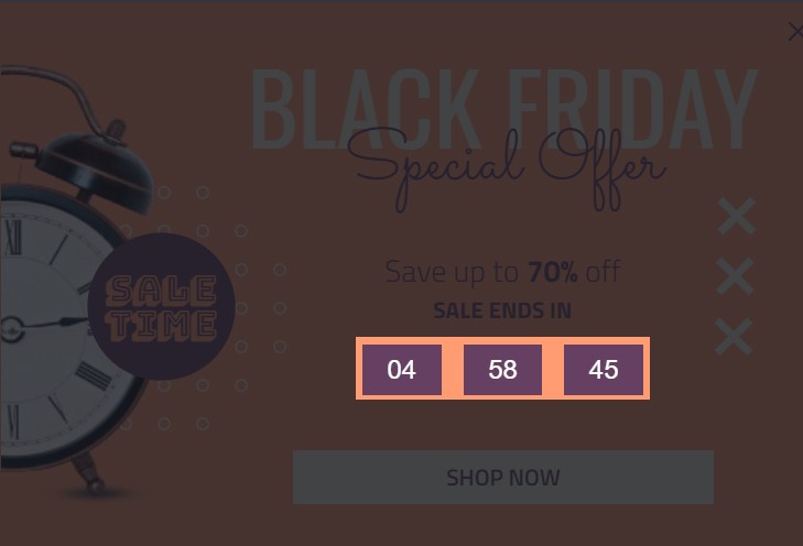
But it could turn out a nuisance rather than being helpful. So, experiment a little before deciding whether to implement one on your website or not.
39. Personalized Recommendations
Did you know that Amazon makes 36% of its net sales by recommending personalized products to their customers?
This goes to prove that personalized product recommendations can boost your sales, incredibly.
The downside to it, however, is that it costs money – and time, as well, to implement.
But hey, if what you get at the end of the day outweighs whatever you spend, wouldn’t it be worth it?
So, if you haven’t already, try your hands on personalized product recommendations on your online store to see if your sales will turn for the better.
And, if you are afraid of costs, you can try out our own recommendations’ solution – it won’t leave holes in your pockets.
40. Lead Magnet
So, you want as many visitors as possible to subscribe to your mailing list, don’t you? The question is, what’s in for them? What would they get in return for giving out their emails?
And, don’t even think of rewarding them with free ebooks – that’s old-fashioned and no longer works. Or does it?
The truth is, you never can really tell which lead magnet works best for your audience – free ebook, video tutorial, freebies, etc – until you A/B test.
41. Duration of Free Trial
If you offer free trials to your customers, how long should the free trial period run for? 2weeks, 1 month, 1 year, or forever?
It might surprise you to know that longer isn’t always better. As such, offering users an extensive free trial period isn’t a guarantee for optimum conversion – and retention. Neither will short trial duration.
A/B testing will help you to make a better judgment.
42. Credit Card for Sign up or Not
Naturally, you will want users to take your Saas product for a spin, and without having to make any financial commitments upfront.
Should you ask for the credit card detail when they are signing up for a trial or not?
Well, why not try both approaches to see for yourself?
Campaign Trigger
For maximum results and optimum conversions, it’s important you show your campaigns just when the time is right.
Here are a few trigger options you can try your hands on to see which will bring you closer to your goals.
43. Timed Display
Will showing your popups immediately after a visitor arrives at your site lead to more conversion? Or maybe displaying a campaign after a certain delay – say, after 4 seconds – yield better results?
Rather than guessing, why not use Adoric’s trigger tool to know for sure. With it, you can delay your campaign for 5 seconds, 10 seconds — or whatever suits you best.
44. Page Scroll
If timed triggering isn’t hitting the spot for you, scroll-triggering might. How does it work?
Simple. As soon as a visitor starts to scroll down your page and reaches a certain distance, your popup automatically shows.
So, go ahead and give it a try
45. Mouse Action
What if you wanted your campaigns to show only when a user clicks or hovers on an element of your website, like your CTA button? That might help to increase your conversion rate.
Thankfully, Adoric lets you do just that.
46. Display Frequency
There are no laid down rules to follow regarding the number of times your campaigns show. Once might look ideal, but there are no guarantees your conversion rate will be good.
Showing your campaigns once more after a use closes it, surprisingly, can actually boost your conversion rate.
47. Exit-intent
Will waiting till a visitor is about to leave your website before showing your campaign cut it? Who knows, this might work beyond your wildest imagination.
Of course, you will still need to test to be sure.
Audience Targeting
Now, it’s a bad idea to treat your audience as the same, because no two persons are alike. So, while some will find your campaigns relevant, others won’t.
As such, it makes sense to target different demographics of audience to see which are most receptive.
48. Geo Location
If your website caters to a global audience, apparently, your audience will be composed of visitors from different countries and locations.
Instead of throwing your offer at everyone that comes to your website, why not first segment your audience. Then, promote personalized offers to each segment of audience based on their geo-location.
The results might astound you.
49. Traffic Source
In addition to segmenting your audience based on their geo-location, you could as well segment them based on their traffic source.
By traffic source, we mean the channel through which they found your website: Google search, Social media, PPC campaign, etc.
After segmenting your audience based on traffic source, throw different campaigns at them to see which they will respond the most to.
50. Visitor Type
At every given instance, there will be two broad types of visitors to your website: first-time and returning visitors.
Now, these two categories of audience won’t respond to your offers in the same way. On the one hand, your first-time visitors might respond well to your lead magnets and email sign-up forms.
Returning visitors, on the other hand, might be more receptive to your product offers (hard selling).
Real Life A/B Testing Examples and Case Studies
Does A/B testing really work? And if it does, are there live examples you can get inspiration from?
Yes, A/B testing works. And yes, there are practical examples you can take a cue from. And we will be going over them.
Example 1: Adoric
So, we start out by looking inwards, specifically at our homepage.
At the start of this year (2020), our home page looked like this:
Now, though we are in the business of helping our clients build a customized journey for their customers, we reasoned that not everyone will get the message we were trying to put out.
And our conversion rate attested to this. That is to say, we weren’t seeing the conversions we aimed for.
So, we decided to do some tweaking to our copy, without altering our design. After a couple of brainstorming sessions, we eventually came up with this:
This copy, as you can see, is a lot clearer and concise.
And though we are still gathering data to determine if this tweak has helped to improve our conversion, we’ve so far seen meaningful improvements.
We hope to share our results with you in no distant time.
Example 2: Performable
Earlier in this post, we told you that changing the color of your CTA button can help improve your conversions.
Well, if you didn’t believe that, here’s a case study that will level your doubts.
Performable, a marketing automation company, wanted to significantly increase their conversion rate.
Of all the possibilities they would have tried to achieve this goal, they simply decided to change the color of their button.
It went from green to red, and the results were amazing.
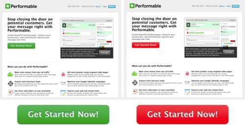
At the end of it all, Performable saw their conversion rate grow by 21%.
So, never underestimate what changing your button color can do for you.
Example 3: Groove
There is no foolproof formula to getting A/B testing right. Sometimes, changing one element of your design can do all the magic.
Other times, you might have to split test virtually all elements of your website to see meaningful improvements.
Groove, a customer support Saas company, learned this lesson in this case study. Rather than making tweaks to, say, the CTA button and sitting back, they went all out.
Their web copies, they rewrote. They went from using a few CTAs to using several. In fact, they went as far as adding a video testimonial to their home page.
Here’s how their homepage looked like before the split testing, and how it looked afterward
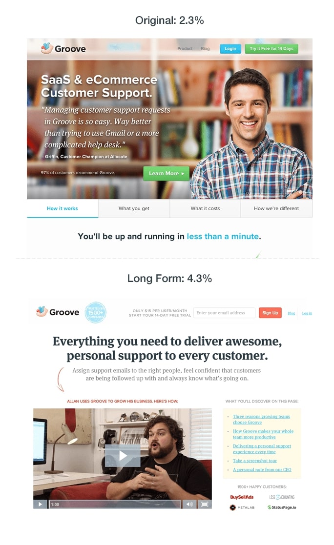
As you can see, the company’s conversion rate went from 2.3% to 4.3%. It may not look like much, but it was definitely worth it.
A/B Testing: Best Practices and Mistakes to Avoid
We hate to break it to you, but your A/B testing effort won’t yield results – especially the ones you are expecting – all the time.
There are times you won’t see any meaningful change no matter the tweaking and twisting you do. As a matter of fact, there’s a good chance you might experience exactly the opposite of what you hoped for – poorer conversions.
It’s not us being pessimistic; it’s just the way things are. With this in mind, here are a few things you can do to make the most of your split testing endeavors.
1. Iterate as Frequently as Possible
Like we earlier mentioned, there will be times when no matter how hard you seem to A/B test nothing will seem to work.
At such times, rather than quitting altogether, iterate.
If your goal is to improve your conversion rate and changing your CTA button color didn’t bring you closer to that goal, try something else.
Maybe, try adding an attention-grabbing image or video to your opt-in form and watch it for a while. If nothing positive still happens, try a different approach.
The takeaway here is, for A/B testing to work for you, define a goal, try out different approaches – one at a time – until you find which hits the spot for you.
2. Avoid Short-term Thinking
You sure want to see immediate results from your A/B testing efforts, don’t you? That’s quite understandable.
But in your quest for results, remember that A/B testing is a process and never an event. It’s not what you do once and back off whether you see results or not. You just have to keep at it.
Long story short: so long as you are in business, keep A/B testing.
3. Be Patient
How long should you wait before determining if a test is actually working? 2 days, 3 weeks, or 2 months?
The thing is, there are no fixed rules to it. However, it really makes sense to give yourself some time before determining if a split test worked.
How long you wait is entirely up to you to decide, but be patient.
4. Test One at a Time
Let’s say you’ve set a goal to improve your conversion rate, and are looking to split-test a couple of elements of your marketing campaign.
Which element should you test first? Or, would it be okay if you tested them all at once?
Well, it’s fine if you can’t figure out which element to split-test first. But, it’s definitely not okay to test all of them at the same time.
The reason is simple: how can you tell which element, exactly, helped to bring you the desired result if you tested them all at the same time?
Thus, test one element at a time.
Conclusion
And there you have it: 50 A/B testing ideas that are simple to implement.
If you are looking for a robust A/B testing solution to help move your business forward, Adoric is the right tool for you.
Sign up for a free account to see why other Shopify sellers trust Adoric for sales and conversions.