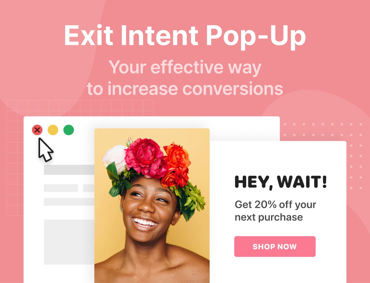
This might come as a surprise to some but exit popups work very well.
They’ve been proven to increase conversions and can be effective in winning lost customers.
In this article, we’ll provide some great tips on how to use exit popups with some real-life examples.
Let’s start:
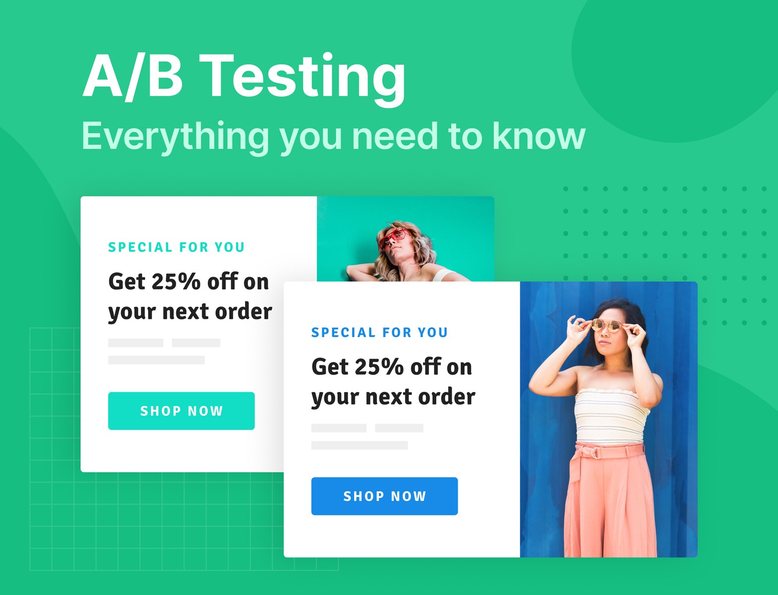
What is Exit-Intent Popup?
An exit intent popup is a website’s last effort to stop a user from leaving. Let’s first understand what ‘exit intent’ is.
Websites use a feature to gauge when a user is ready to leave a site. On desktops and laptops, the system is triggered when a user moves the cursor to the exit (X) button to close the tab. of the tab or the internet.
On mobile devices, the system typically gets triggered when a user scrolls down and fast up. Another trigger can be the ‘back’ button.
Once the system gets triggered, it shows a special message in the form of a popup to get the visitor’s attention and force him or her to take your desired action. For example, provide email, have a look at your products, etc.
Despite popups being annoying and a large number of people using popup blockers, exit popups have proven to be quite effective, especially since they’re shown to users who have already decided to leave your site.
Exit intent popups can increase your conversion by up to 267 percent; however, that’s a long shot. Most companies see a jump of 10 percent by using this technique.
A small firm, Fastrack was able to recover about 53 percent of abandoning visitors by using exit popups. The key lies in knowing when and how to use exit intent popups.
Here are some tips to follow:
How to Use Exit-intent Popups: 13 Tips to Increase Conversion
1. Personalize Your Message
Personalization offers several benefits. About 44 percent of consumers say they prefer to become repeat buyers if a company offers a personalized experience. Companies see an increase in sales by using personalization and about 59 percent of customers agree that personalization influences their decision. A message can be personalized in a lot of ways. For example, you can use a customer’s name to make an offer as seen below:
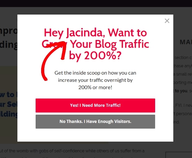
This will make the user feel as if the popup is specifically designed for him or her. Ask for your visitor’s name before you make your first pitch. However, we understand it can be hard to get a visitor’s name, especially if it’s their first time on your site.
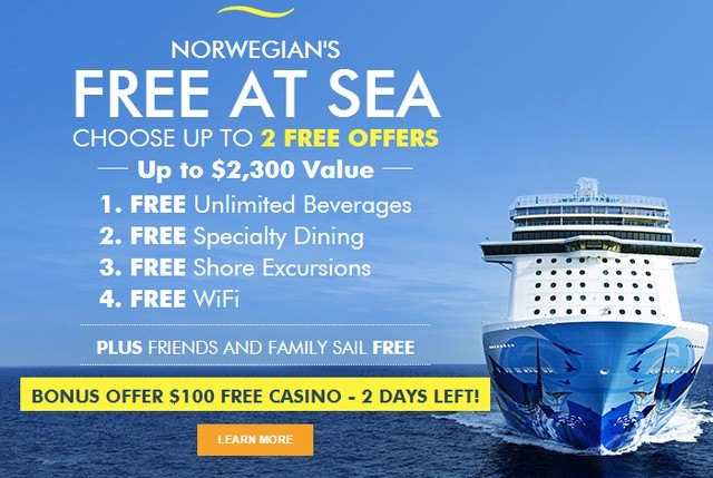
In such a scenario, you can use the referral source to make a personalized pitch. For example, if a reader lands on your page after reading a specific product review, you should display an exit popup related to that specific product since you know that the visitor is interested in the product.
Referrer detection technology can be very useful here. See here, this company makes special popups for visitors based on the referral source:
There’s a lot of information you can gather about a visitor through cookies and other such sources. Use a reliable exit popup generator that can use this information to serve personalized ads.
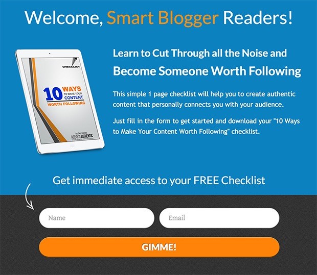
2. Offer More Content
This might come as a surprise to some users but content upgrades have been proven to be effective in increasing conversions.
Consider these offers for users who spend a decent amount of time on your website reading about a specific topic. For example, if someone lands on your site and reads a blog on ‘How to Find a Date’, it means the person is interested in this topic.
Once the user decides to leave, you can use a popup to advertise more content on this topic such as a detailed guide on finding dates.
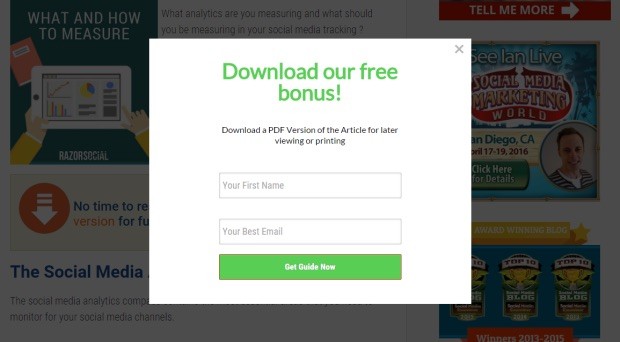
RazorSocial used this trick to increase conversion by over 500 percent. However, you have to be careful about the timing. Users who leave the page right away or within seconds might not be interested in such an offer. But, users who spend a few minutes on the page or interact with your content are more likely to convert because they’ve proven that they’re interested in what you have to offer.
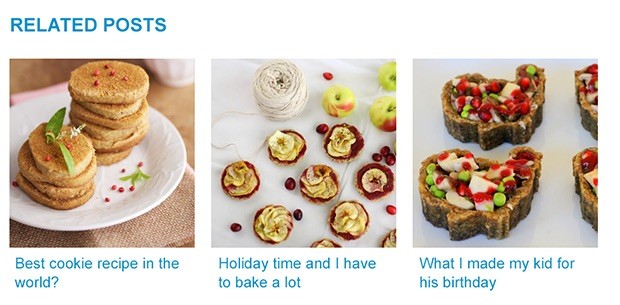
In addition to this, you can also offer related posts, especially if you are interested in reducing the bounce rate.
In the case of ecommerce stores, you can show related products to push a customer to spend more time on your page and make some purchases.
Think about why a customer would exit your site. There can be many reasons including distractions such as an email or a phone call. You have to remind them why they landed on your site in the first place and how you can help them.
3. Give Visitors Few Choices
Since a large number of exit-popups are served to users who are new to your site, you might not always know what they’re interested in. This is why it might be a good idea to give visitors several choices to choose from as seen in this exit intent popup:
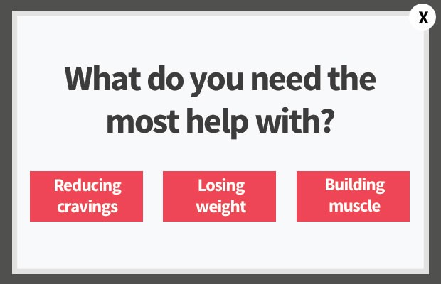
This happens because not everyone who lands on your page might be interested in the same thing. Someone looking for a ‘smart TV’ might land on your page offering a 45” LED but the person might be interested in a 75” or 50” LED.
An exit popup with the option to buy different sizes of LEDs can be very effective for such users.
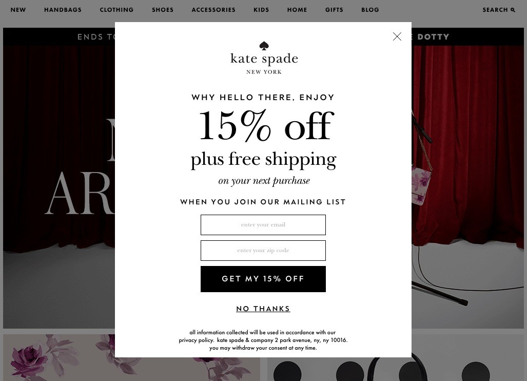
4. Offer Special Discounts
A discount can convince even people who never intended to make a purchase. You can offer a discount code in exchange for your visitor’s email address.
This will not only encourage the buyer to make a purchase but they might even revisit your site.
Here’s a very good example of an exit intent popup that offers a discount code in exchange for email address:
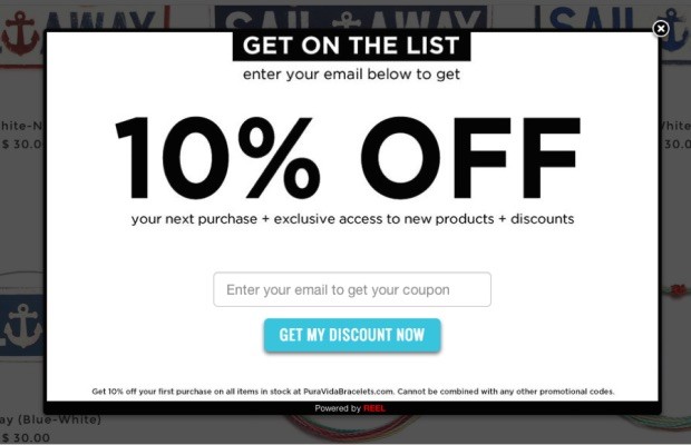
There’s a lot you can learn from this example.
Look at how they have highlighted the advantages of sharing email addresses. Users will not only get access to a discount code, they’ll also know about new products and offers.
Also, they haven’t used a typical ‘subscribe’ button. Instead, they’ve opted for a “Get My Discount Now”. As highlighted in our What is a Good Conversion Rate and How to Improve It article, using creative buttons can increase conversion.
5. Give a Demo or Free Trial
Nothing sells like a free trial.
The concept is pretty popular among streaming services like Hulu, WWE Network, and Netflix. They all advertise free trials through popups.
In addition to this, most software also come with special demos and free trials.
The purpose is to allow your potential users to understand what you offer and how things work.
Both free trial and demo strategies are great. Users are more likely to sign up for a company that offers a free trial. If your product or service is good enough, they might decide to become a paid customer.
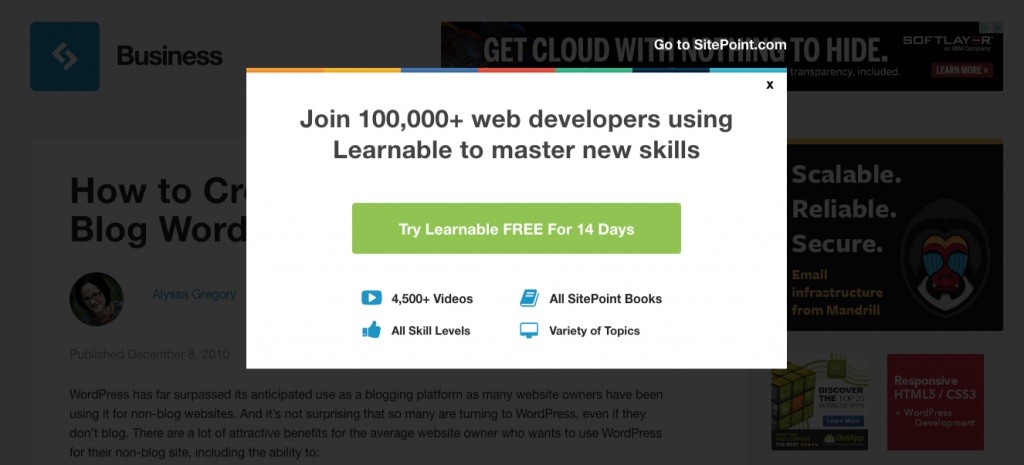
The above example is great, it clearly highlights what a user will get if he or she decides to sign up. However, you can offer more through a free trial exit intent popup as seen here:
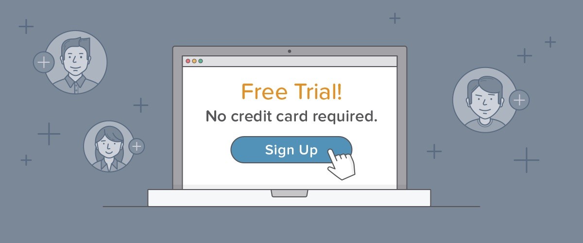
The above example is great – it shows how a user can sign up without having to enter private details such as a credit card number. This is very important because users do not typically like to share financial details on a website that they do not trust.
By giving users a chance to sign up for an account without sharing private details, you can convince them to use your site, and build a relationship with you. This way, they’ll be more likely to provide credit card information when the time comes.
6. Make Sure to Include Images
Use images whenever and wherever you can. They have the potential to make a huge difference to any campaign.
Images are attractive. Plus, they are very descriptive. Look at this example:
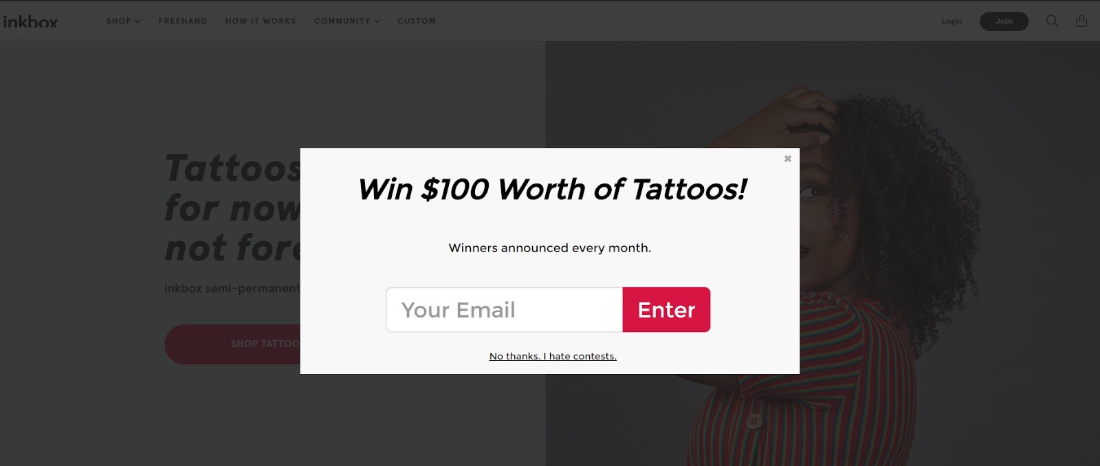
The popup gives a very interesting offer. Anyone would be interested in getting $100 worth of tattoos but there’s something missing in the ad – it has no images.
The offer is great but a large number of users may miss it because the popup looks plain and dull. Now, consider this:

Here, the user can see what kind of designs are available. Plus, there are several options to choose from. Someone interested in getting tattoos will be more likely to click such an ad, especially if it contains a good offer such as a special discount.
Images are important for every business including eCommerce. According to reports, about 67 percent of buyers pay more attention to the quality of the product image than the description.
You can use images in a variety of ways in your popup ad. Look at this example:
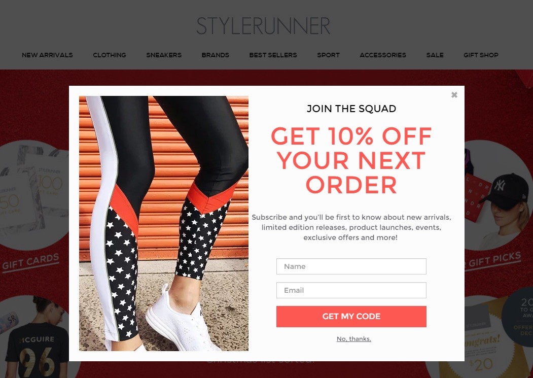
In the above example, the product is clearly highlighted. This will tell your visitors what kind of products you offer even if they have no idea about your business. They’ll share the details if they like what they see.
7. Clear Their Doubts
It is common for visitors to leave a website because of some doubts or objections.
Some might not like the high price, some might have questions, and some might not be willing to provide personal details. You can use exit popups to help your visitors overcome objections so they can take your desired action.
Think about eCommerce; a common objection users have is ‘wrong purchase’. They can’t always be sure they’ll receive what’s being shown in pictures. You can convince such users by highlighting a ‘return policy’ and prevent them from leaving.
Here’s a very good example of a popup that makes such an offer:
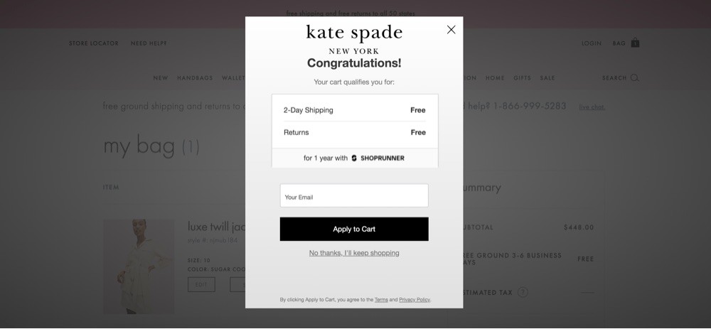
The popup ad above makes two offers – free shipping and returns – that are both very much in demand.
Other users are also using similar exit intent popups. Here’s another example:
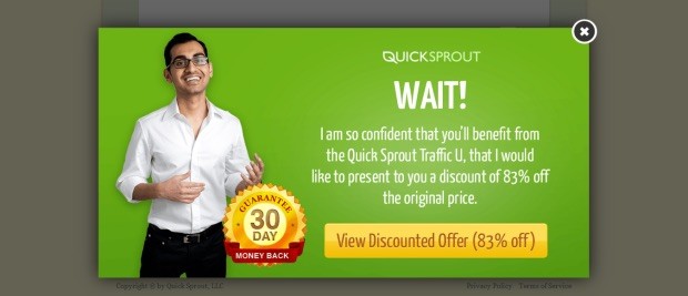
Neil Patel offers a 30-day money-back guarantee for Quick Sprout. But, you don’t have to stop here. You have to cater to all kinds of objections a user may have.
Here are some of the most common reasons that cause shoppers to exit a page:
- Not sure about a product – can show reviews, testimonials, or a good refund policy
- The prices are high – can offer a discount
- The product might not suit the use – offer a demo or trial
- Unsure about sharing private details – highlight security features
- The process is taking too much time – offer the user to come back later
8. Use a Progress Bar
It can be a little difficult to explain this factor because psychology comes into play here.
According to Bluma Zeigarnik, a Russian psychologist, people do not like the idea of leaving things incomplete. The phenomenon – known as the Zeigarnik Effect – has been proven to be true.
Zeigarnik studied a number of waiters and noted how they could remember complex orders until food was delivered and would forget things once they were done with their part of the job.
She researched and concluded that “pending orders create a state of incompleteness that makes them remember things so they can complete the job.”
According to her, we tend to remember unfinished tasks better than finished jobs. Marketers can use this belief to coax visitors into performing a specific task. Highlight how they have a pending task and what they need to do to get it done with.
Some very popular platforms including LinkedIn and UpWork use this trick. They both show “profile completeness” level to urge users to reach the 100% mark as seen below:
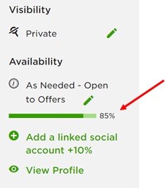
This is not an example of exit popups but you can use this technique to create exit popups as well. Here’s an example:
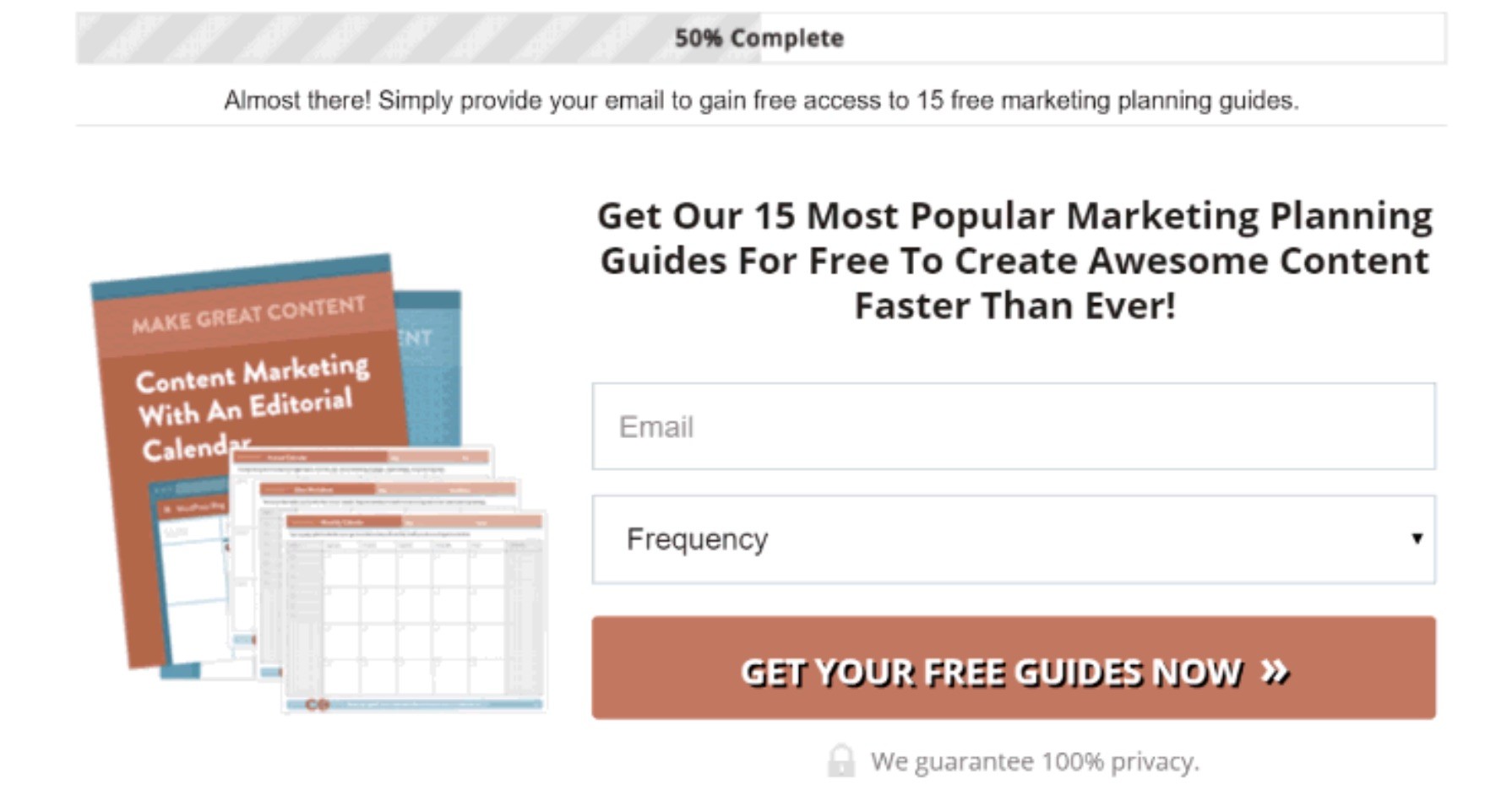
Use a bar as it looks good and makes it easy to recognize different stages of a process.
9. Remind Your Users What to Do
As odd as it may sound, it is common for users to forget why they landed on a site. Some users can even leave a site after adding products to a cart simply because they got distracted and forgot about what they were to buy.
You can use an exit intent popup for this purpose. Take a moment to remind them they have items left in the cart and the process isn’t finished. However, it’s not always due to distractions that users decide to leave a page and at times the distraction might be ‘urgent’.
Consider giving the option to save their basket and send reminders through emails. This will give you access to their email address, which you can use later to send marketing emails as seen here:
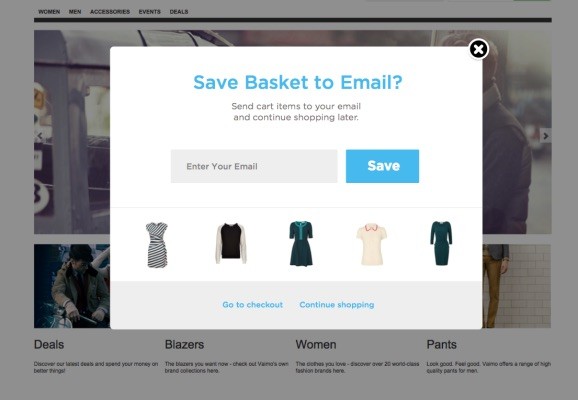
Set up your carts so that users see items in cart when they land on your page later on.
10. Give Them Free Shipping
There are few things as powerful as ‘free shipping’.
It’s the number one reason why users abandon shopping carts. You can recover up to 44 percent of buyers by offering free shipping.
There are two ways to approach this, you can offer a coupon right inside the popup as seen in this example:
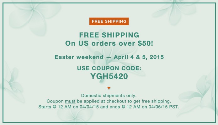
Make sure to add all details regarding the coupon such as its expiry date and eligibility requirements, i.e. minimum order size.
Also, include a link to the product page that the user was viewing, especially if the popup is being delivered on a different page.
If this sounds too complicated, you can make things easier for your user and give them the option to add coupon instantly as seen here:
This method can be effective as it does not require additional effort on the buyer’s part. This works well when you’re sure high shipping cost is the only reason a buyer is exiting your page.
While this technique can be effective, it has a small disadvantage. You might not get a chance to collect your visitor’s email account if he or she decided to exit and not make a purchase.
In addition to this, you can use this trick as well:
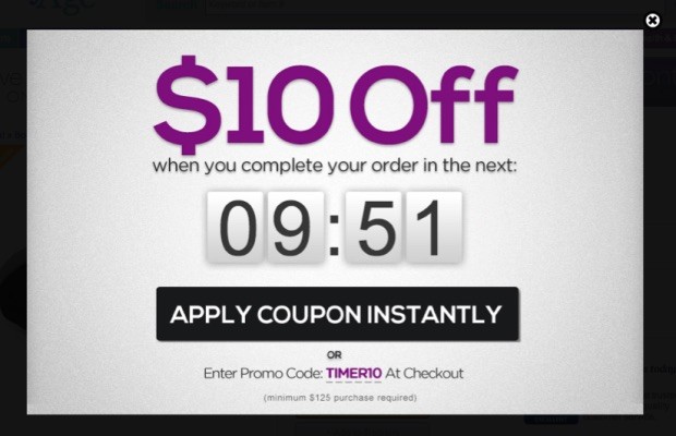
11. Create Urgency and Scarcity
We talked about this topic in detail in our How to Use Countdown Timers to boost Conversions with Examples article.
The rule applies here as well. It doesn’t matter what kind of a customer you’re dealing with, scarcity and urgency always work.
The key lies in making your visitor feel they’d lose on something very important or rare if they do not take your desired action now.
You can use this concept in a number of ways. For example, you can use Adoric to create a countdown timer that offers a special discount to visitors telling them they’d lose the price if they don’t purchase NOW.
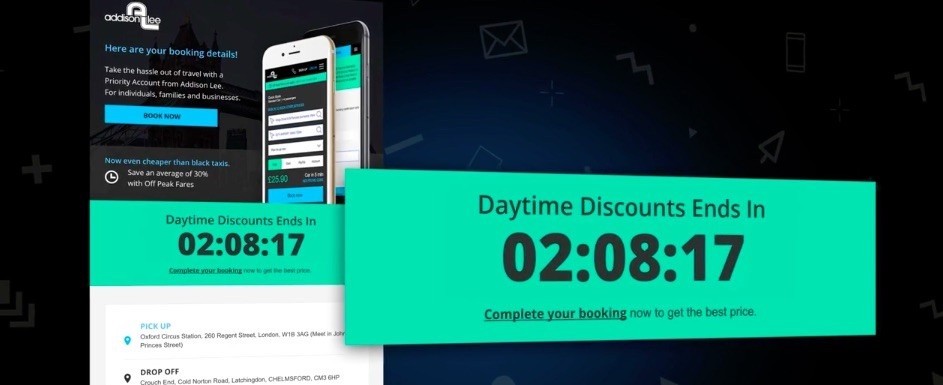
Another great way to use it is to show how you’re low on stock and the product might not be available tomorrow.
Property booking sites use a similar concept to show how popular a specific product is. You will see something like this if you book a hotel through booking.com:
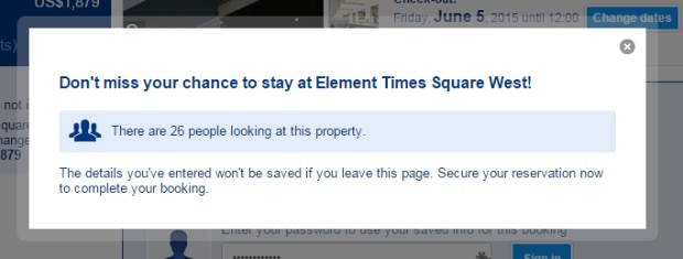
This exit popup does a very good job. It shows users how a specific property is popular, which can help convince users to get more interested in it, while also making them feel they might lose it if they don’t book it right away.
You can use different elements such as arrows and symbols to highlight a special offer.
There can be different ideas, think about what your audience might be interested in and make an offer.
12. Offer a Little More
An exit popup might not sound like the best place to ‘upsell’ but it can be effective if you make the right offer.
It is common for visitors to leave a website because they didn’t find the product interesting or attractive enough. You can win such customers by offering more for the same price or at a discount.
In simple words, offer an upgraded version of the product or the option to add more products at a discount.
Your job is to tell users how the product is beneficial or how they can get more out of it.
Here’s a great example; the company is offering free services:
If there’s something you can give for free then advertise it through the exit popup.
13. Present a Quiz or Survey
Surveys and quizzes can be beneficial in a lot of ways.
They can help you know more about your customers and what they want including what’s causing visitors to exit your site.
While they’re effective, it can be a little tricky to use them. You must know when to offer a survey to a visitor. You can’t display a bunch of questions to someone who has only spent a few seconds on your page.
A survey should be presented to someone who has shown true interest in what you have to offer. Also, it should come with a gift in the form of a discount coupon, free shipping code, or a sample.
Here’s a good example:
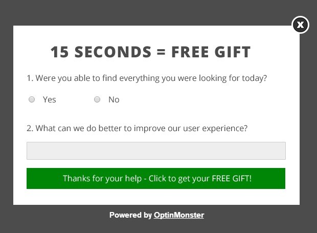
A gift is important because the user must have a reason to share his or her opinion with you. Someone who’s already leaving your site and has no loyalty for you might not be interested in answering questions unless you offer something good in return.
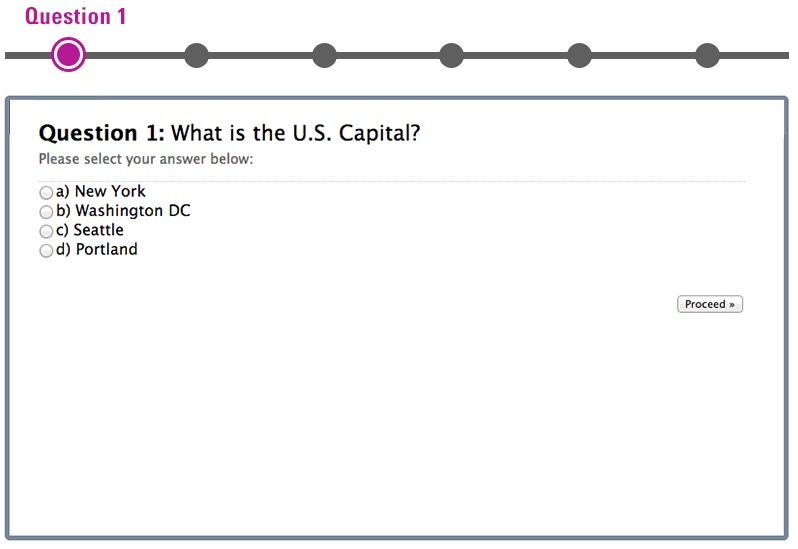
In addition to this, the quiz or survey should be short and simple. Customers like to stay away from personal quizzes unless you have a website that requires so.
For example, if you offer relationship advice then you can ask your visitor’s relationship status and other such questions, but if you sell clothes then you don’t need such information.
Moreover, since long quizzes are usually tiring, consider telling visitors how long it takes to complete your quiz so that they’re motivated to start it as seen here:
You can also use a progress bar to show how far a user has progressed, i.e.: question number 5 of 10 as seen here:
Exit Intent Popups: Conclusion
These were some of the best ways to use exit intent popups. Come up with a popup that best suits your audience and make sure to time it correctly. This refers to how often a popup shows and after how much time a user has spent on your site.
Adoric can help you create great exit intent popups that look attractive and offer good returns. Explore our product to know more.