When it comes to publishers & blogs, popups are great at convincing users to read & stay more.
Why popups are great at convincing users to read & stay more?
Because you can easily adjust the popup to fire according to triggers & conditions which fits your audience and the call to action. you can create journies that make users consume more and more of your content. Regardless of being convincing, popups are used to capture users emails without being annoying (when done right).
Here are 8 professionally designed popup examples which built upon principles proved to increase conversions, everything is explained under each popup.
By the way, All the examples presented can be used as templates in Adoric’s editor.
Article promotion popup to awaken readers dreams
The science behind
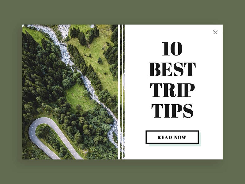
Besides creating an amazing atmosphere, Bird’s-eye view photos make things look approachable. Just watch the Christ the Redeemer Statue from a bird’s-eye view. After igniting the viewer’s mind we just have to announce strongly that we have 10 best tips for them. The subconscious mind may associate these tips with an amazing, approachable trip and we granted another consumer of the related content.
Who should see it
- Users who consume related content
- Users who fit into the personas the article is written for
Boutique promotion popup for real fans
The science behind
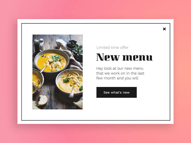
Pumpkin ramen, good environment, menu fonts, and classic design.
The target audience well resonates so well with this popup because it has all the elements of a good restaurant. By the way, the outer rectangle and the limited time are there to increase the sensations of uniqueness.
Who should see it
- Your real fans and heavy users
- Users who fit into your best personas
Targeted promotion popup that uses high-quality elements
The science behind
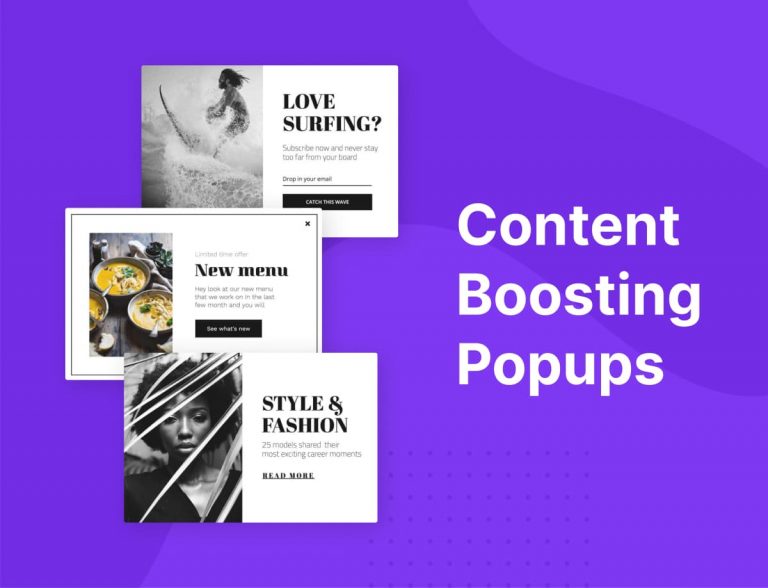
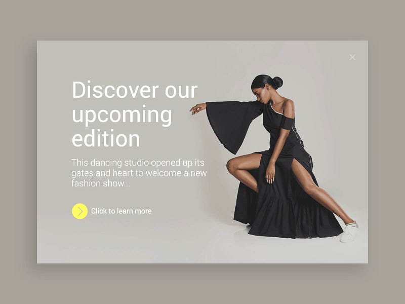
No sophistication here, only quality. A photo that simply transfers dancing & fashion, what our new edition is about. A museum-like sensation is created by all the popup elements so art lovers will relate and fill like learning more is a good idea.
Who should see it
- Users who fit into well-described personas
Promotion pop-up that makes users mind trust you
The science behind
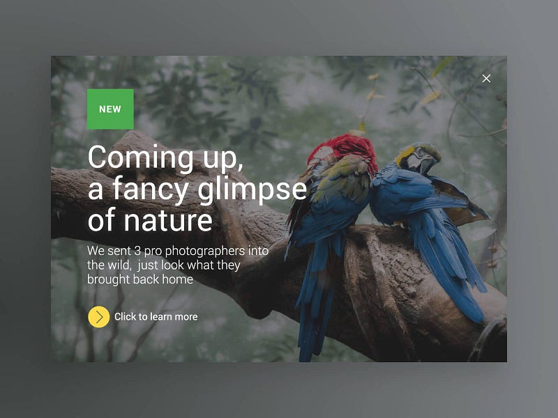
A good way to gain trust is by proving your word, The title is a brief summary of the photo Quality speaks. The call to see more photos like this is reliable because of the first impression, which is impressive The green new badge is proven to arouse curiosity.
Who should see it
- Users who read or buy your related content or products
- Test with personas you slightly know (because everything in this popup is so positive), i.e test on groups of users you know can provide a good conversion rate, but they aren’t yet
Dramatic promo for an exciting piece of content
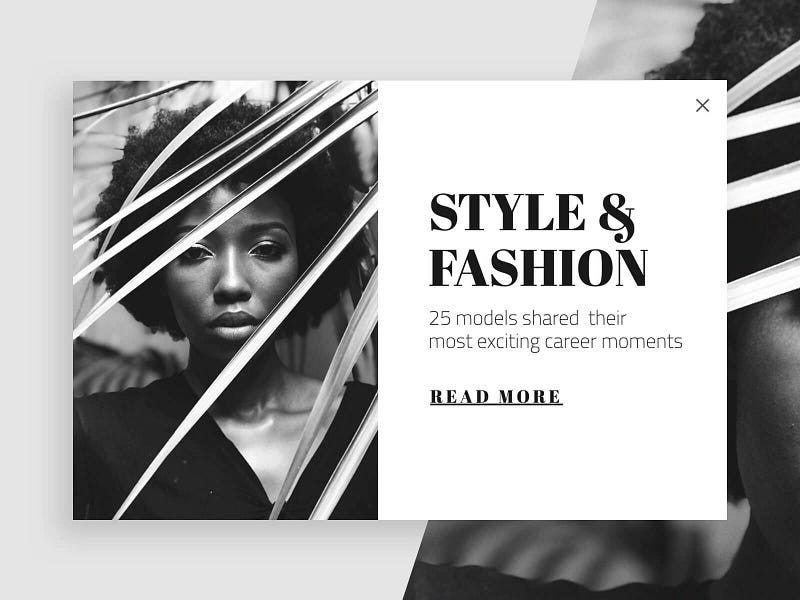
The science behind
All the elements of this popup are creating a sense of drama, a message that the content we promoting is exciting indeed. We, humans, are strongly affected by photos of other humans, the emotion of the photo is transferred with clarity. Black and white colors are dramatic. Have a glance at photos colorized and see how they turn much less dramatic. Strong wording like ‘models shared’, ‘exciting career moments’ are pouring curiosity into readers mind. Assertive fonts are related to luxurious fashion companies which are also trusted.
Who should see it
- Users which the popup will speak to them
A sign-up popup to create long-term relationships
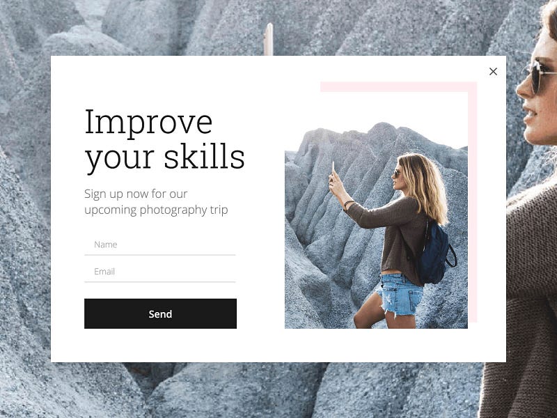
The science behind
creating relationships is easy when you contributing your skills and knowledge by putting it in your content. the photo of a girl taking a picture unprofessionally is to connect with the target audience — amateur photographers. An interesting title making the user mind go ‘this is exactly what I need’. Calling to action here is very friendly, only your name and email are required to join a trip which will improve your photography skills. The image created in the user’s mind is of getting a high-value gift
Who should see it
- Users who match the targeted persona
Email capturing popup that makes your newsletter look super exclusive
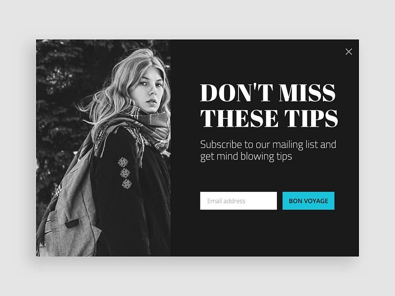
The science behind
Black & white make things look simple and dramatic. The call to action button is highlighted in color and with a language which is fun and not dramatic.
Talking about missing tips arise FOMO, surely when they are mind-blowing and the whole popup environment is so dramatic.
Who should see it
- Users who love your content
- Users who are similar to your best personas
A highly targeted subscription popup which acts as a magnet on the target audience
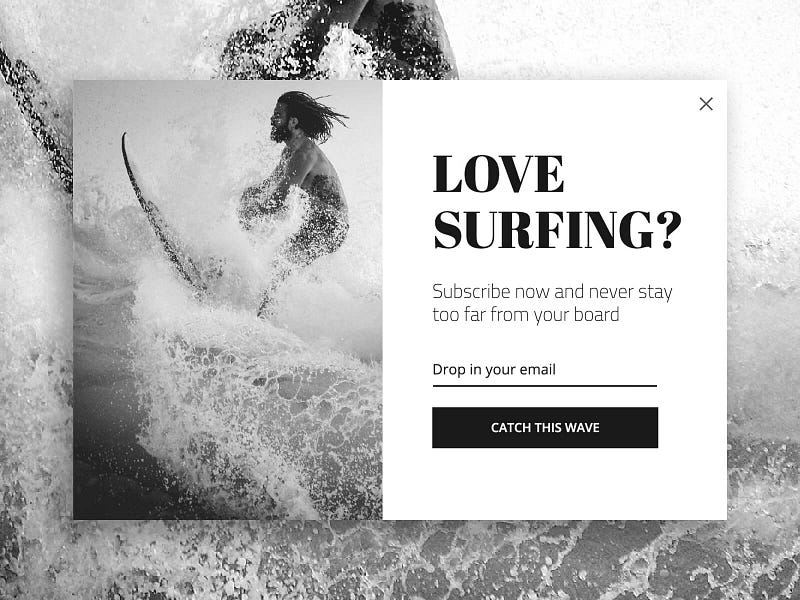
The science behind
The surfer image is highly resonating with its target audience, it is strong & emotional. Black & White photos affect users in many ways, in this case, it’s creating a sense of timeless drama. Surfers don’t like to miss waves, so the call to action is FOMO’ish and talks in the surfer’s jargon and so is the rest of the popup.
Who should see it
- Users who read enough from your article or blog
- Potential customers or users who show a medium interest to purchase
- Users who match into your content followers personas

