Email marketing is still huge, after all, it offers an ROI of up to 4,300%. But to see anything out of it, you need to know how to build an email list.
What does it take to build a great email list? One that subscribers love and read:
- Good content
- Smart email collection
This guide is focused on the second option.
In this article, we will be covering 38 email collection methods to help you prepare a solid email list.
They are all gathered from the best email marketers across the net, and of course, from Adoric’s team that have years of experience collecting emails.
Before we start, I will like to let you know that all the methods featured in this article are smart.
What makes them smart?
Each of them allows you to control at least 1 of these 3 parameters:
- Who – You’ll choose from whom to collect emails and from whom not. For example, only visitors who visited specific product pages.
- How – Pick key elements of your email collection campaigns like shape, color, pictures, titles, buttons, and more. Customize them to your brand style by clicking the ‘Magic’ button.
- When – Choose when exactly to collect emails. In the middle of the article? Before leaving your website? Trigger your campaigns by specific locations & behaviors.
Contents
- List Building – The basics
- Let Visitors Win – Lead Magnets
- Glorify the Purpose – Squeeze Pages
- Must-Have Subscription Boxes
- Exit-intent – Utilize the Most Critical Moment
- Button Popup – The Zero-Interruption Popup
- Scrolling Box – At the Right Place & Time
- Side Box – Be Super Relevant
- Top Bar – Unignorable, Nor Demanding
- Creative List Building Widgets
- Creative Locations to Collect Emails
- Email Collection Optimization
- Other People Networks
- Real-life Email Collection Methods
- Conclusion
Email List Building – The Basics
1. Win Leads with Lead Magnets
Want visitors to hand you their email address voluntarily?
You need to arouse the sensation that there is much more to win than lose. And that’s exactly what a good lead magnet does. So what will make your lead magnet worthy? Your visitors’ true needs.
A solution to their problem/s in one of the content forms below will make you look like a subscribe-worthy website.
- Guides
- Webinars
- Templates
- Ebooks
- Checklists
- Courses
- Reports
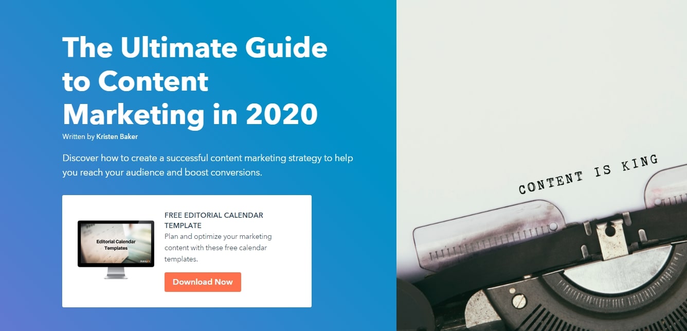
Your content must be actionable and actually problem-solving.
Hubspot is famous for ‘bribing’ visitors to opt-in with their email with powerful lead magnets, and their content strategy is working like an oiled machine.
You need to be clear about what you’re offering to your readers. This can help the opt-in rate can increase by about 85%.
So make sure your content is actionable and organized into steps. This way, you’re gaining your readers’ trust. This will not only push them to sign up but will also ensure they read your emails.
Pro tip: The words you use when offering your lead magnets have a tremendous impact on how it will convert. Check out Power words [link to section] to see how to do it properly.
2. Glorify the Purpose – Squeeze Pages
Have you ever encountered this confusing situation in a restaurant before?
You read the menu and have no idea what to order!
Damn, only if these restaurants had a simpler menu.
A squeeze page would be the digital parallel of this simplified menu. It’s easy to understand, fun to read, but here there is only one option. A good squeeze page makes three important things:
- It creates a connection with your market by presenting the right pain points.
- It makes the visitor’s decision easy by leading to one action only.
- Offer that one action in a desirable way.
Compare a 30-dish menu to a one-dish menu, the format is confusing and the latter fully focused.
Your squeeze page is your one-dish menu that is customized and has something for everyone.
A squeeze page draws the attention of people who need your solution, convinces them to get in, and then makes sure they perform your desired action.
Check how Mark Shreeve on his squeeze page talks about his audience pain points, presents a solution, and offers one action only:
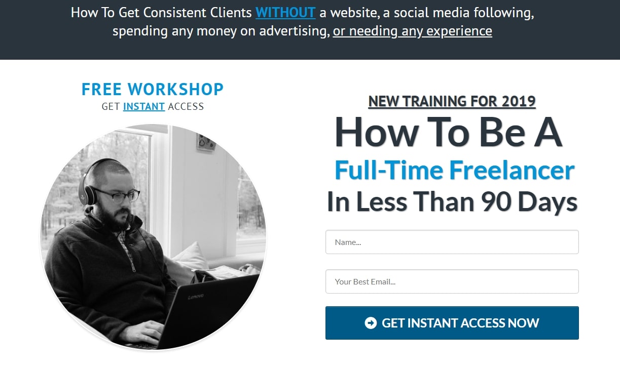
The key lies in showing users how beneficial your content is for them. Consider using tools like Leadpages, Unbounce, Instapage. They’re effective and helpful.
* Pro-tip: combining at least 2 email collection methods from sections 4-8 will make your squeeze page much more effective.
3. Must-Haves: Subscription Boxes & Popups
Despite what everyone says, pop-ups are still in demand and the top 10 percent offer a conversion rate of 9.28%.
However, you must know how to use them effectively. Not everyone likes pop-ups. In fact, it’s believed that 69% of users have pop-up blockers.
Businesses use a variety of techniques to force people to avoid using pop-ups but they may not always be effective. The key lies in creating attractive pop-ups and placing them in the right place.
Targeted & personalized pop-ups work like a charm.
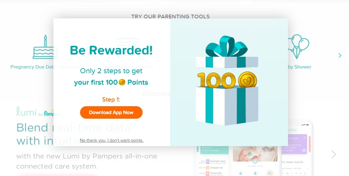
As you can see in the picture above, popups are smart these days; a new visitor is detected and by a missing cookie file on his device, And he gets a nice incentive to download & use the app.
Pay attention to what people do not like. Avoid having pop-ups on the front, make sure to place a close button, and be very clear about what it offers.
4. Exit-intent – Get Them Before They Are Gone for Good
When a visitor decides to leave, there are usually 2 options;
She/he leaves with empty hands OR with something.
This is your chance to win back a customer. Businesses can use a variety of techniques to grab the attention of a customer that’s about to leave.
Give your visitor something (digital) in exchange for his/her email address. It can be a discount, a feedback form, or a simple reminder to look at something relevant.
This is an effective way to build email lists as it does not affect scrolling.
An effective way to get people to stop is to highlight scarcity, i.e: we only have two items left in stock. Moreover, you can offer to let people know once prices drop or new shipments arrive.
That leads to this email-collection squeeze page:
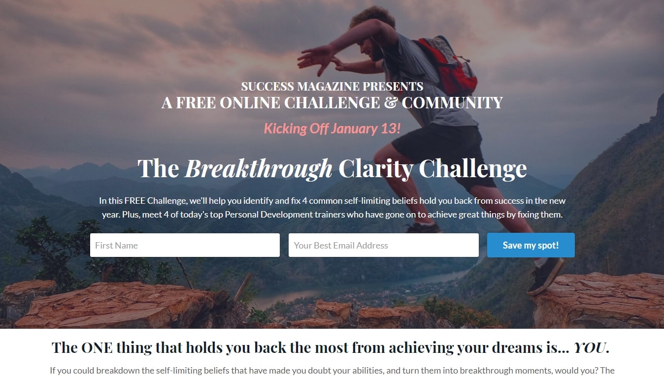
By framing the action of leaving your website as a loss, you make visitors feel afraid. Therefore, they’ll hand you their email address instead of departing. Isn’t it a good deal?
5. Button Popup: The Zero-Interruption Popup
A button popup sits humbly on the edge of your website, waiting to be seen by curious visitors.
When clicked, an email subscription box (AKA opt-in) will pop out.
Called the ‘let’s chat’ button, this is an effective tool since there aren’t a lot of ways to ignore it.
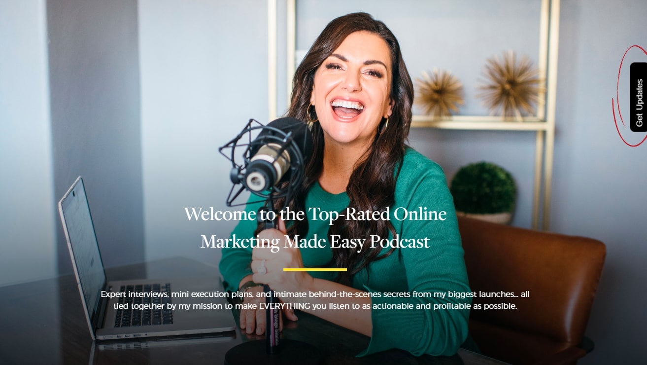
When using a button popup, make sure that the popup is prominent enough.
Come up with a unique color and text combination so that it doesn’t get ignored. Take a look over method 34 about ‘Killing Normality’ in your call to action.
Tip: Make sure to disable campaigns in the same location wherever using button popup to prevent an override.
6. Side Box – Be Super Relevant
So you’re looking for ways to market your product.
You just got hooked into an article. Then, you read the title, opening, & think “oh, that’s exactly what I need!”
After that, you continue reading the subtitles and getting excited.
Seeing the first image, picturing in your head…
And on the right side of all this, there is a cool box.
It says: ‘Download Our Free eBook for More Tips on How to Market Your Product with Real Life Examples”
You get it. People who are hooked, and also people who are not hooked yet, will love it.
The goal of a good sidebar is to strengthen the reader’s emotions by offering something that he or she is already interested in, but bigger.
That offer is most likely a digital file like an eBook, Checklist, Guide, etc.
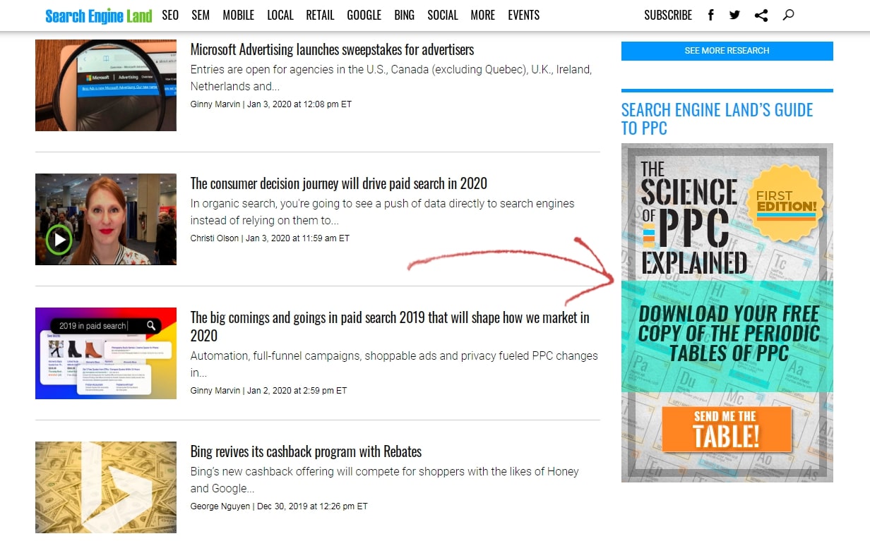
If you give users what they’re interested in, they’d willingly share their details. It could also be as simple as this example:
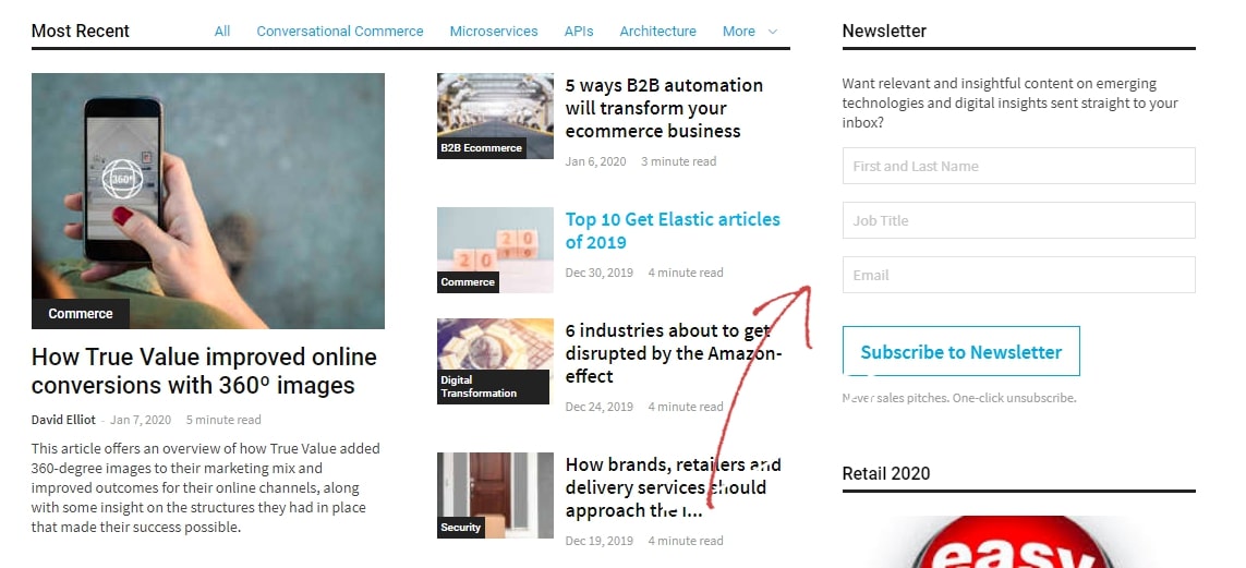
Combining this method with the next one (bar) is a sure way to boost your email collection.
7. Top Bar – Unignorable, But Not Demanding
The top bar is like the ceiling.
It doesn’t call for attention but it’s impossible to miss.
Unlike a popup, a bar will slowly build focus on your message, making viewers feel comfortable.
Subscription is a great thing to ‘sell’ on your top bar;
It’s free, and subscribers don’t have to work to get the goods (great content).
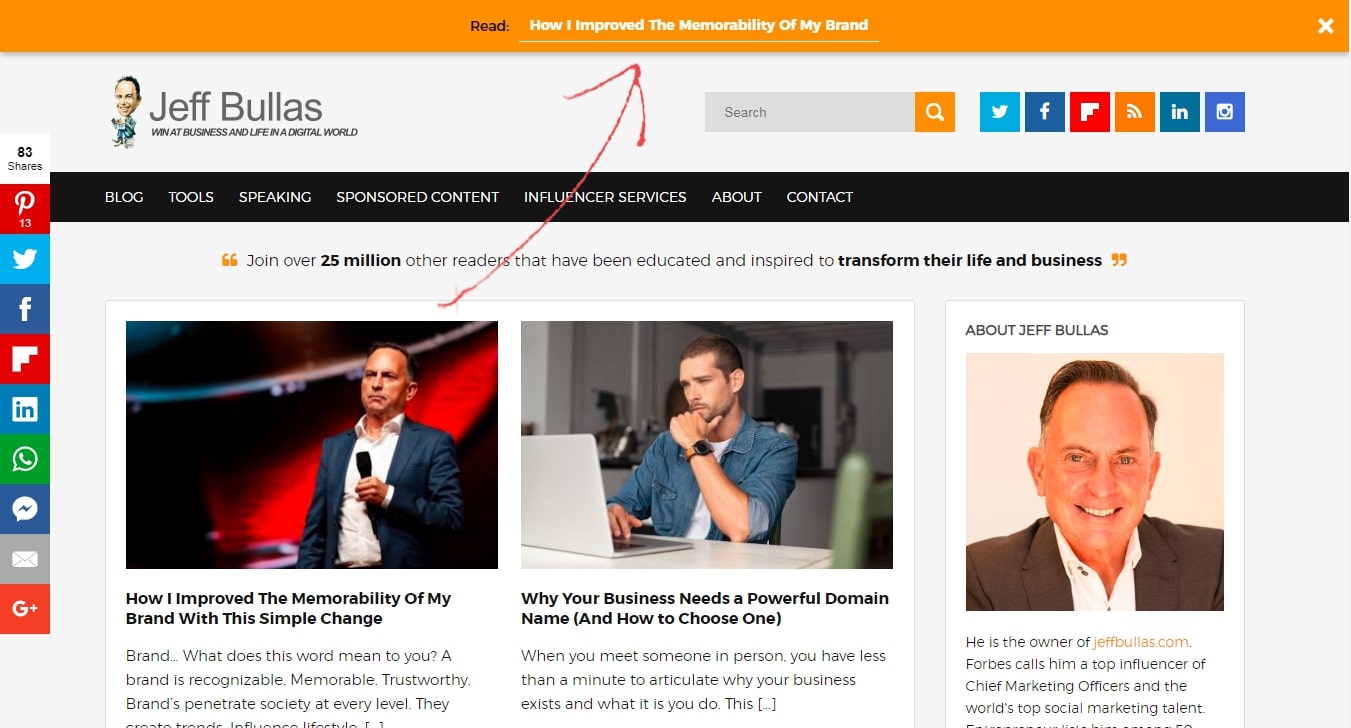
Because bars are not right on viewers’ sight, you’ll have to work a little bit extra to make it stand out.
So, make sure to come up with interesting text and ideas.
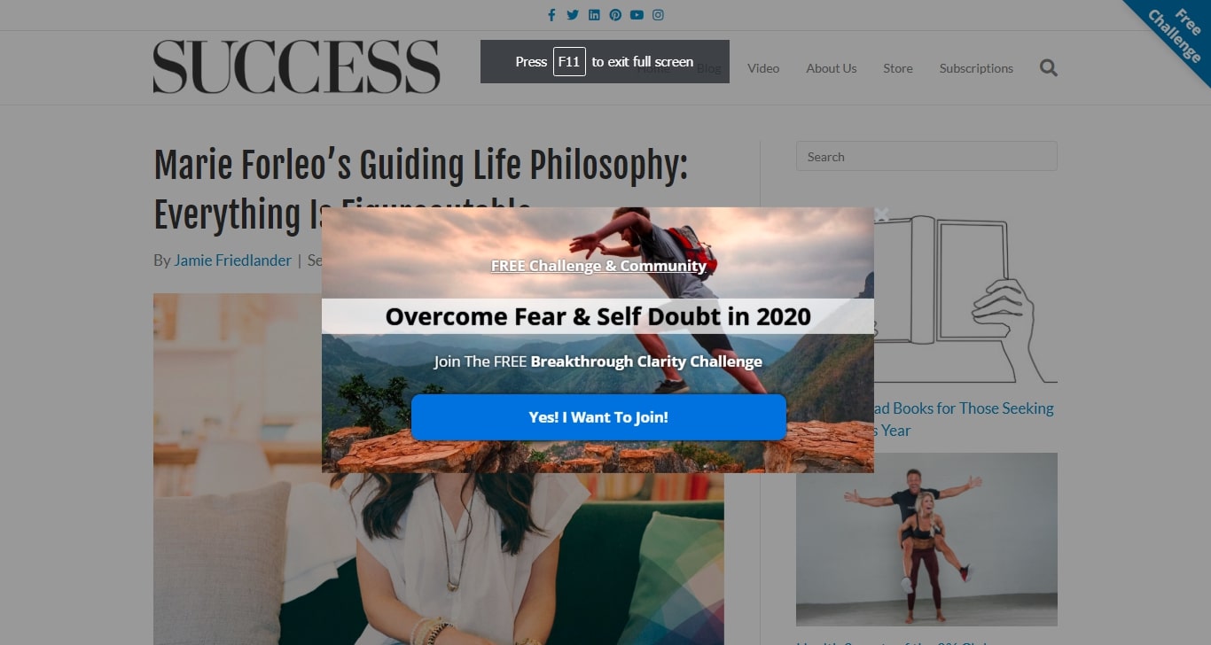
Just like Marie Forleo did here:
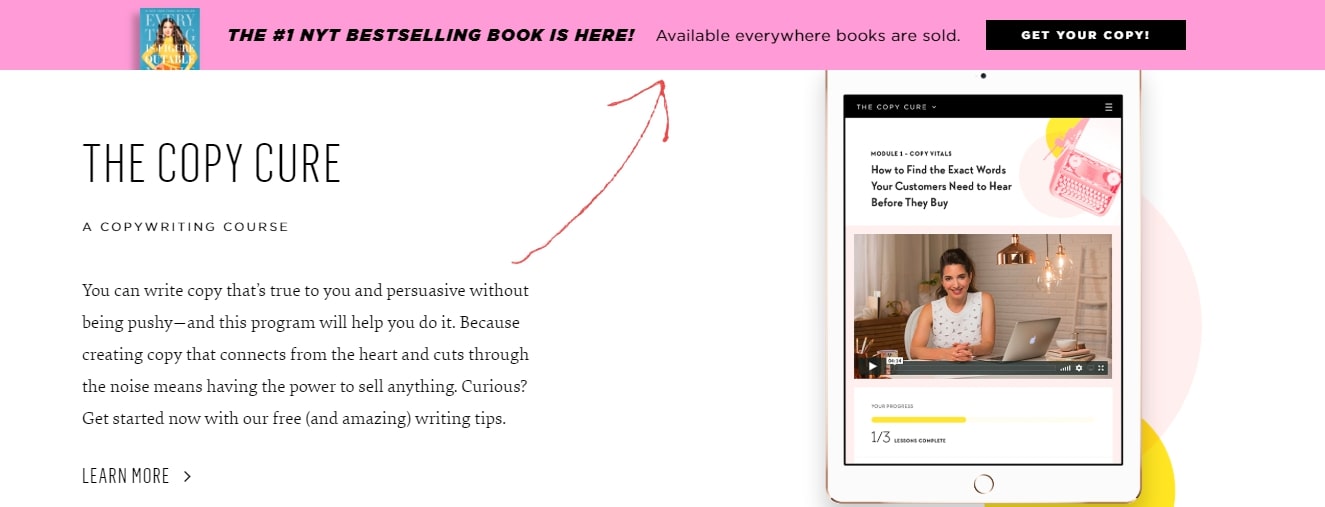
Bars can be a great addition to your subscription arsenal.
The methods presented in this part of the article are the basics of email collection.
Combine them with some creative list-building widgets (that you probably never thought about) to have an email collection system that helps you build an impressive email list.
Let’s jump in.
Creative List Building Widgets
8. Quizzes
Quizzes are fun. They attract people, keep them glued, and often have them coming back.
Websites like BuzzFeed built their huge reputation over quizzes!
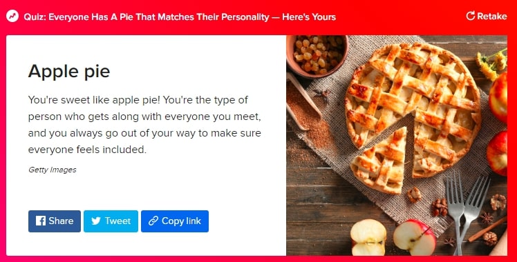
It’s all about entertaining your audience. Create an interesting quiz if you really want people to share their email. Here are some tricks you can use:
- Subscribe to know when a new quiz becomes available
- Share your feedback about our quiz
- Give suggestions on new quiz topics
- Receive quiz results via email
The purpose of introducing a quiz is to continue the conversation in the future. Platforms like WWF and UNiDAYS reported conversion rates of 39% and 68.5% respectively. However, not everyone gets the desired results. The average conversion rate is as high as 33.6%.
Chanti Zak, a popular blogger, got over 10,000 subscribers by creating and embedding quizzes in blogs.
So how do you create an enjoyable quiz that visitors will be happy to complete?
Here are 6 tips for creating a quiz people will enjoy:
- Have a clear objective: teach, evaluate, entertain, relate…
- Know your audience. What do they like and enjoy?
- Be precise with your questions, transfer the right emotions
- Use interesting images
- Make sure to avoid lengthy or complicated questions
- Learn from the pros: complete some BuzzFeed quizzes and take notes
We’ve noticed that silly quizzes tend to do well as well. The most important bit is to make sure all your quizzes are relevant. For example, if you have a site related to finance then avoid posting quizzes about Hollywood.
Give visitors the option to share your quiz on social media by adding widgets.
Consider using tools like Typeform, GoConqr, &SurveyMonkey. They’re effective and easy to use.
You can also embed the quiz over your website with these.
Tip: When asking people to subscribe at the end of the quiz, keep the exact same tone you used in the quiz.
9. Surveys
Let’s be honest, most visitors don’t care about surveys, and so respond to them.
A response rate of 50% is considered excellent but in most cases, only about 20% of users who start a survey will complete it.
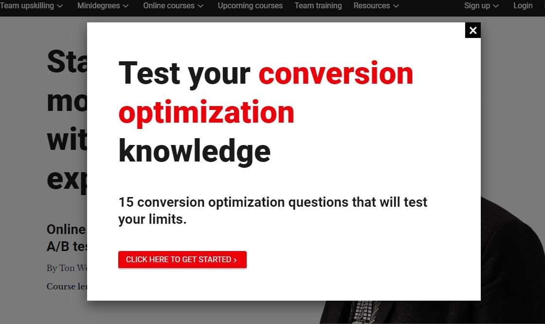
But let’s get to the root of why this happens;
Most surveys are business-centered, and not visitors/customer-centered.
So, how to build a wise email collection survey?
Well, the survey needs to make the visitors feel that it’s about them, as seen in this example:
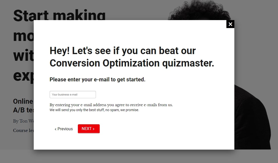
One trick is to ask for the email right at the start.
The University of Alberta saw a growth of about 500% by using this technique. However, we must mention that this technique may not be suitable for everyone.
10. Contests
Nothing attracts people more than freebies. A single campaign can help brands get over 17,500 email addresses. However, contests work best when on social media platforms.
They’re fun, easy to manage, and reliable. Plus, they offer other benefits as well including more engagement and followers.
Here are a few things to remember when creating contests:
- Easy to Participate: Contests should be easy so that more individuals are interested in participating. Remember your aim is to get as many emails as possible so keep it simple, i.e: award gifts for tagging people uploading photos, etc.
- Tempting Prize: The prize should be worth it. It can be a digital gift such as a gift card or a physical present. It doesn’t have to be very expensive but it should be of value.
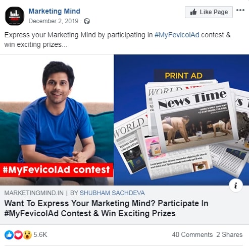
You can collect emails through contests by using the following techniques:
- Sign up to take part in a contest
- Provide an email so you can receive your gift
- Provide email to share the contest with others and increase your chances of winning
We suggest that you ask for the email in the beginning so that you can have it even if someone decided to not take part in a contest.
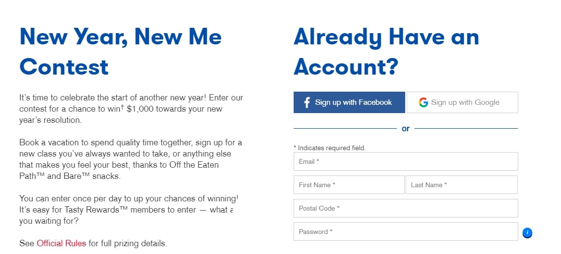
The rules should be clear and simple. Also, try to promote the contest as much as possible and encourage shares.
Pro Tip: combine at least 3 email collection forms to make your contest squeeze page much more effective.
11. Giveaways – Easy Mode Contests
There isn’t much of a difference between a giveaway and a contest but we thought this option deserves its own heading due to how effective it is.
Josh used this technique by turning to KingSumo, a WordPress plugin that helps manage giveaways. He shared the information on social media and collected 187,991 email addresses in just 11 days.
Not just this, website visits increased dramatically and he more than doubled Twitter followers by motivating users to share his tweets.
Giveaways typically do not include contests and winners are selected randomly. They, however, have to meet certain requirements, i.e: follow the page, share a post, etc.
While giveaways are effective, the emails that you receive may not always be relevant.
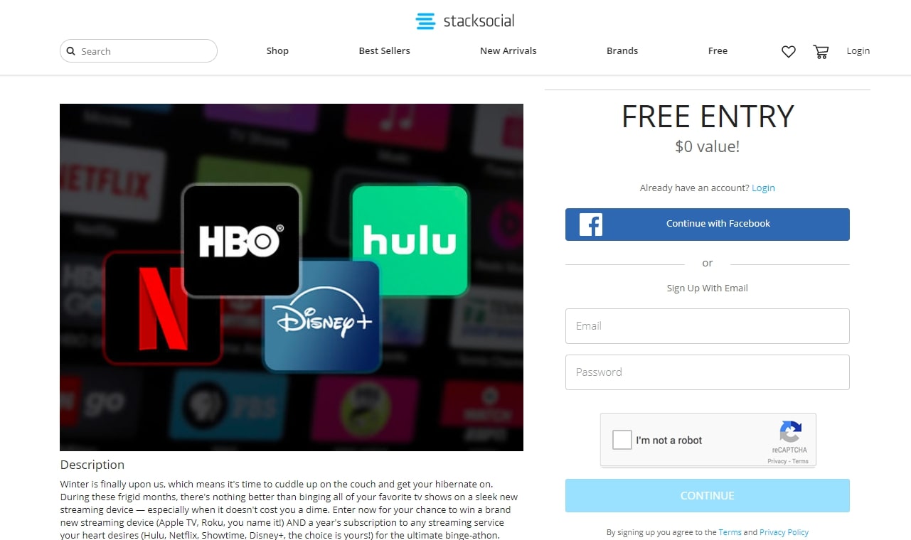
Here are some tips to make your giveaway as reliable as possible:
- Don’t ask for anything more than first name and email address
- Put a subscription confirmation checkbox on the form
- Offer a prize related to your business
- Send confirmation emails
- Don’t be cheesy
Giveaways should be hosted on a squeeze page and contain at least 3 email collection methods to be effective.
12. Keep the Flow – Inpage Subscription Box
The job of a subscription box is to remind users that you have more to offer.
This concept was introduced in 2004 but didn’t find much success until 2010 when Birchbox used it to gain 45,000 members in less than a year.
These boxes work because they do not distract the user as they appear very natural.
Look at this subscription box on Backlino’s article, located right after the intro:
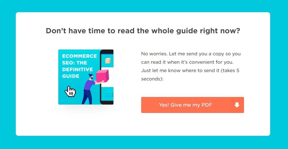
And Pointillist did the same:
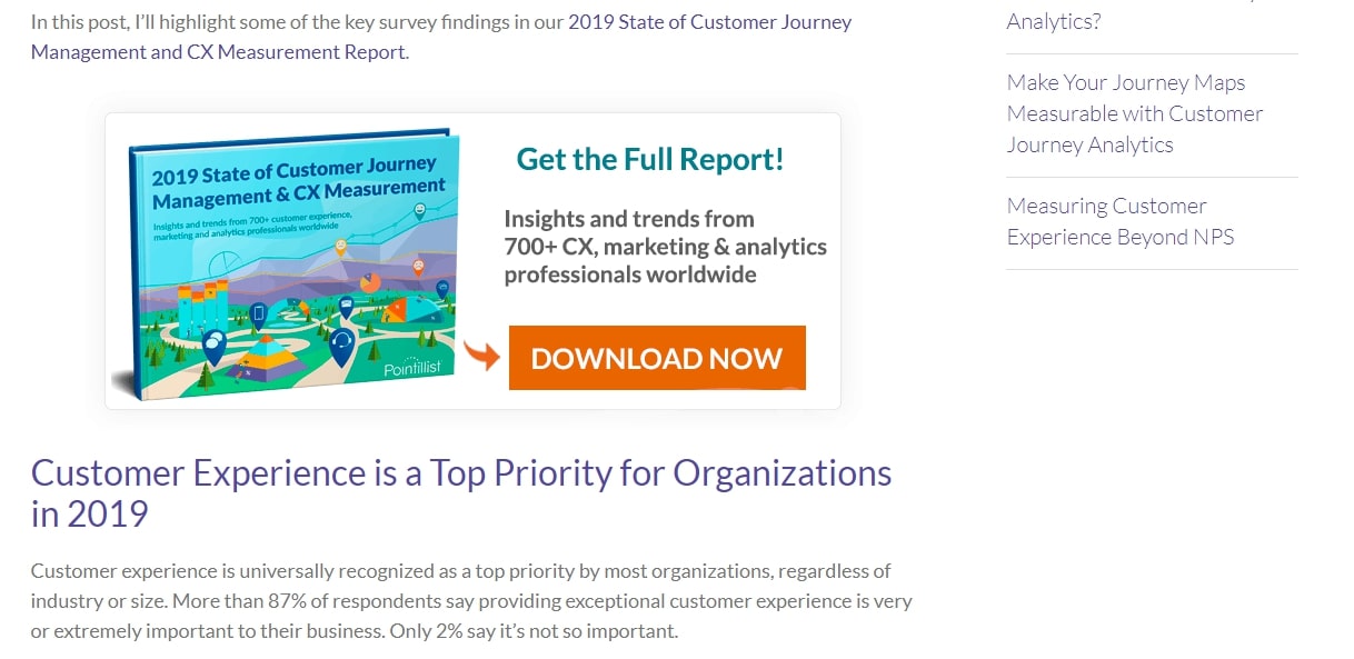
But it can also be simple & convincing like in DesignRush’s case:
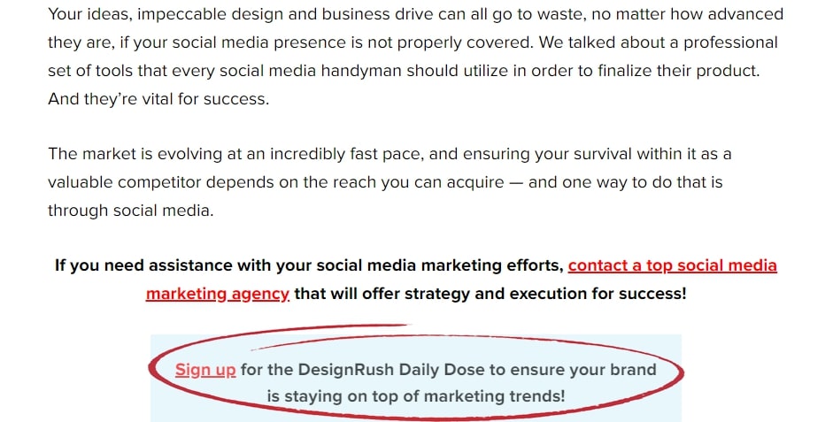
Pro-tip: To increase your average content consumption & collected emails, set the same email collection system in related content, and link to it in the article, just like the following example:
13. ‘By the Way’ Method – The Checkbox
This method requires users to check a box.
And where do we put this checkbox?
On locations that highly- engaging users love:
- Purchases (checkouts)
- Sign up pages
- Forms
- Comments
- Contact us
- Tickets
There is more good news: engaging users are much more likely to subscribe to your email lists & become your most loyal subscribers.
You can also try this technique:
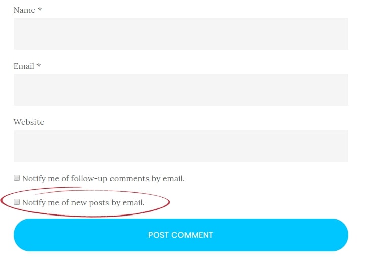
Notifications about follow-up comments are great to make users come back to your website, and also to get them used to receive emails from you.
Newsletter by The Newsletter Team integrates this method on contact form & comments. You can also try WPDiscuz, a plugin designed to collect emails from users who comment.
14. Tease Related Content
You can tease users by offering them more in exchange for their email addresses without making it look like you’re interested in their email.
Instead, make it look like you’re interested in offering them more.
I strongly recommend that you use one of these formulas in your teaser to maximize the effect it lands on readers.
- [Take this action] + For [Specific Time Period] + To [End Result]
- [End result they want] + In [Time period] + Without [Address the objections]
- The secret to [A need/goal of your readers] + Revealed in this [Type of content]
Content teasers can go anywhere on your page.
Animalz.co executed this beautifully here:

Rebrandly does it well:
15. Welcome Persuasively with a Welcome Mat
A welcome mat is a friendly popup that appears when you first visit a site.
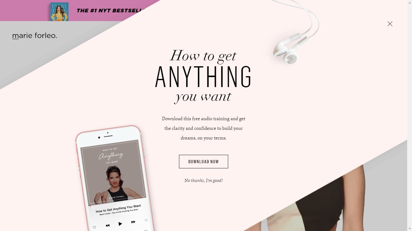
This popup requires some caution since it’s, well, all over your users’ screen. Its purpose is to tell users what more they can have just by sharing their email. It is meant for users who have never visited your site before. A very good option is to give them a chance to avail of a discount via email.
Jump into Creative Locations to Collect Emails.
Creative Locations to Collect Emails
It’s easy to convince the convinced.
Users who already showed interest over your social media are more likely to subscribe to your email list.
This is why social media is considered the best tool to build an email list.
16. Facebook
With more than 2.6 billion active users, Facebook can be a great place to acquire new clients and create an email list.
Businesses use a variety of methods to get emails through Facebook. These include posting contests, giveaways, quizzes, surveys, and adding a subscription button as a call to action.
Alternatively, you can give it a place on the menu (or use both techniques together).
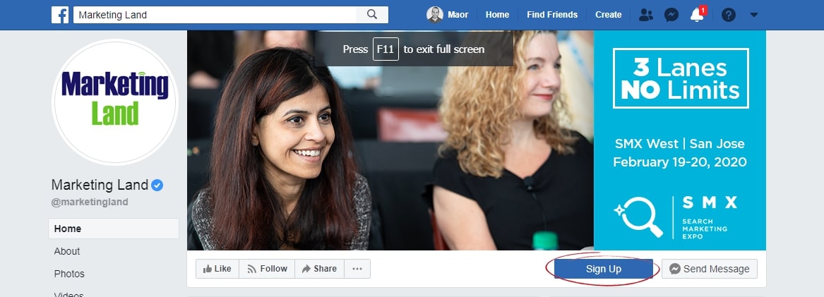
Posts with gated content are always a great tool to reinforce this method.
In addition to this, you can also post ads on Facebook asking users to ‘Learn More’ and share their contact information. However, this technique may only be suitable for brands that want to use PPC.
17. LinkedIn
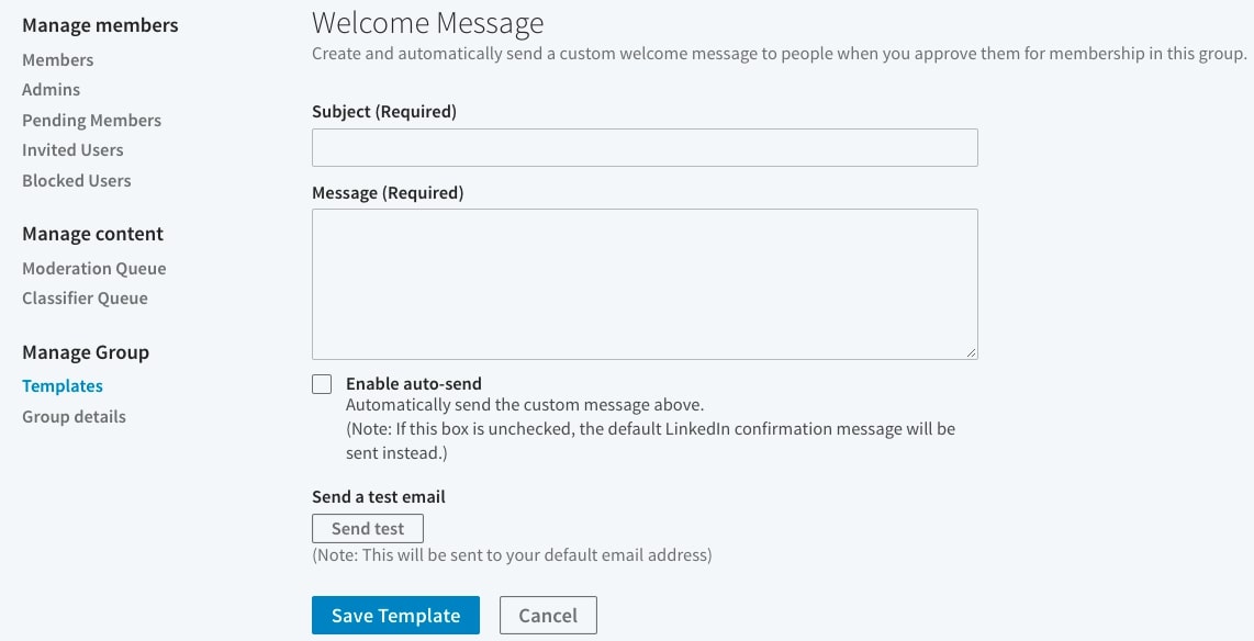
Linkedin allows you to send a welcome email to your new group members.
Now that’s an opportunity to strike the iron while it’s hot.
Your membership confirmation email should contain these parts:
- A warm welcome to your new members
- A brief about your group purpose
- A confirmation link leading to your landing page
This is how it works.
Go to your LinkedIn group through the homepage, click Manage –> Temples –> Create Template:
There are also several other ways to collect emails via LinkedIn.
- Log into your account and go to the ‘My Network’ section.
- Click ‘See All’
- On the right side, you will find the ‘Manage synced and imported contacts’ option. Click it.
- Choose to ‘Export contacts’ and download the file.
- Open the file, this will contain emails of all your connections.
The more connections you have, the heavier will be your list.
18. Twitter
Unlike social media platforms, Twitter followers are more likely to want to hear from you often.
This is because Twitter is the go-to platform for users wanting to know more about a business. They use hashtags to find information and follow companies they’re interested in.
Don’t be ashamed to tweet your followers to join your email list. However, make sure to give them a reason to.
You can choose a personal approach as Emika did;
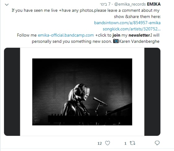
You can also pick the ‘by the way’ approach:
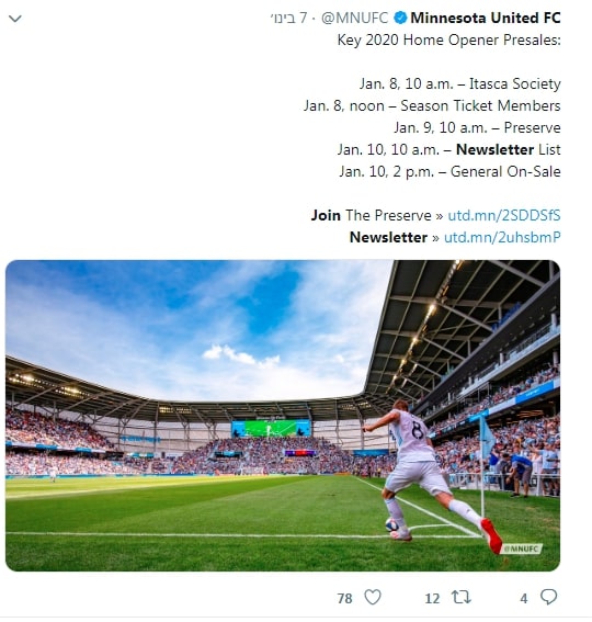
Adding images to posts can be a great way to gain people’s attention since 34% of users are more likely to retweet posts than contain images.
You can also use Twitter cards and the ‘pin’ feature to reach more users.
19. Instagram
Bio links on Instagram can work like a charm.
People actually click on it since Instagram allows links only in bio, and not over posts (only promoted).
You can ask users to find the link in your posts as seen here:
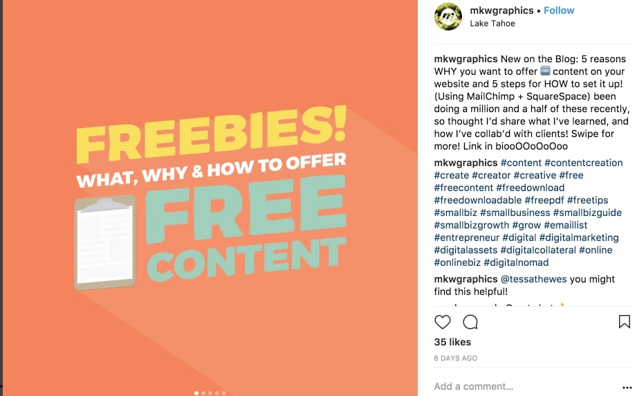
Other options include posting giveaways and holding competitions.
20. YouTube
You can use any lead magnet as a free gift to draw viewers into your squeeze page.
Just pitch up your gift & why joining your email list can be beneficial for them.
The channel Improvement Pill does it in many videos to build killer email lists:
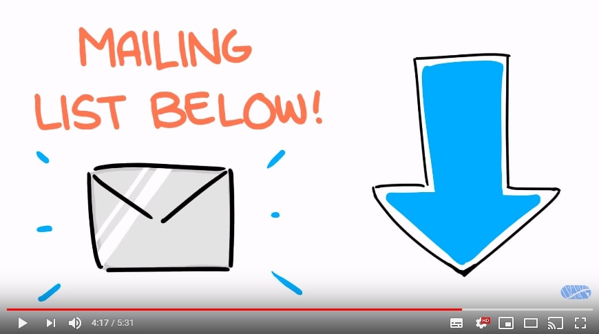
Moreover, you can also post a video talking about what kind of content subscribers will find when they sign up and include links in the bio.
21. High Priority – Right at Main Menu
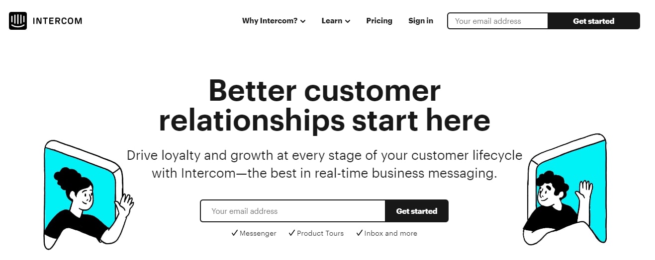
Almost everyone who visits your site is going to interact with the menu, so make good use of it to create an email list.
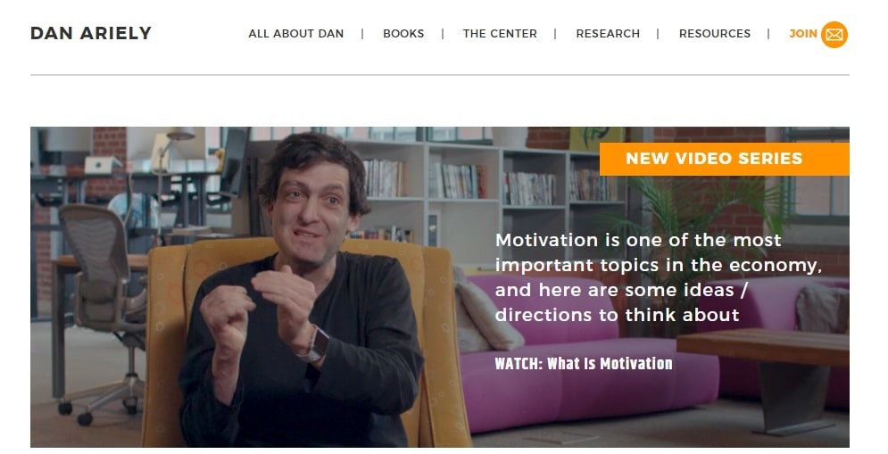
You can use a squeeze page or a simple subscription popup.
Just take a look over Intercom’s menu:
22. The Faster, the Better
This technique allows users to come back to a page when they have the time to go through it.
This is very important because users may not always have the time to read a blog or watch a video even if they’re interested.
By giving users the option to send a reminder or blog link to their email, you will not only get access to their email account but you will also increase loyalty and viewership.
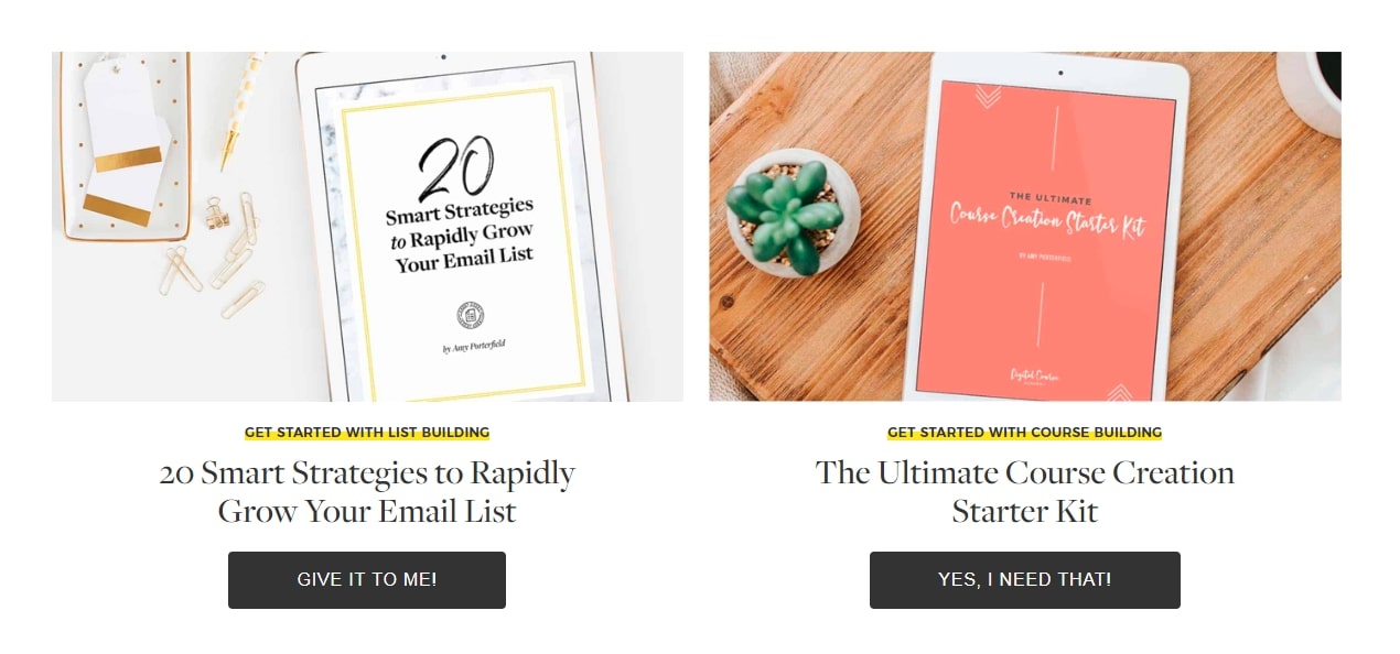
In addition to the article, you can also offer to send similar articles or a summary to users who are in a hurry.
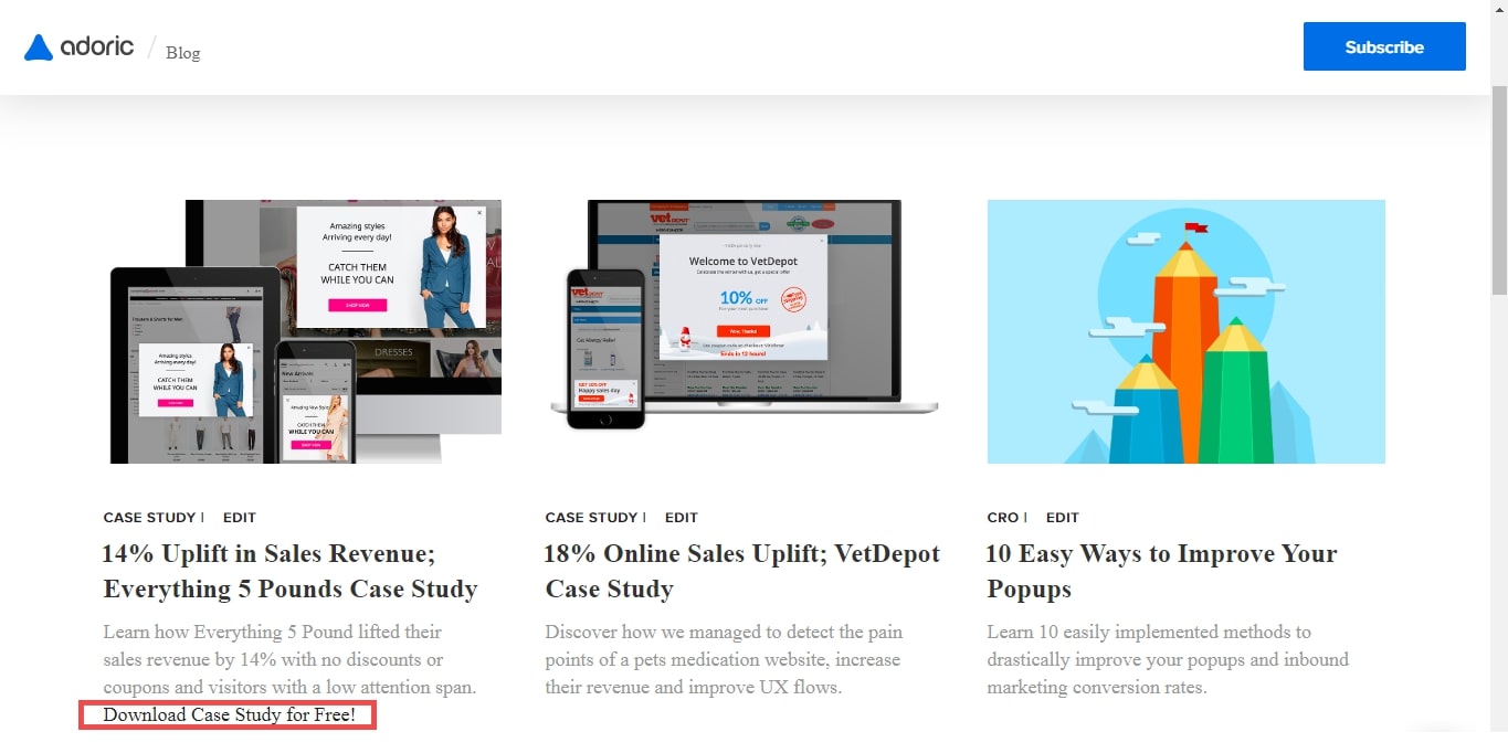
This is not the most effective trick out there since users typically skim through content or bookmark pages they want to come back to but some still prefer a link in their inbox.
23. Make Your About Page to Shine
You might see the About page as a boring part of your website when it’s actually one of the most important pages.
- The about page is one of the most visited pages on your website (check it on GA)
- If visitors get to the About page it means that they are very interested in you & what you do
This is important before visitors who want to know more about you or your business would gladly share their details.
Hence, make sure to use the about us page to get more sign-ups.
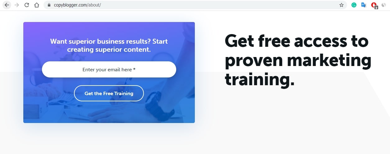
One humble way is to keep it at the bottom of the page as CopyBlogger did.
Read this quote of an SEO and marketing genius, Brain Dean: “About Page=Squeeze Page”
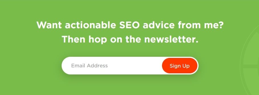
In fact, he believes in it so much that he has 2 email opt-in forms on his about page.
One in the middle of the page
And just to make sure people will subscribe, another one on the higher-bottom of the page
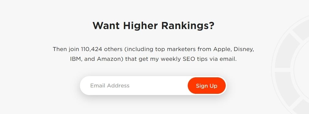
Brian’s page gives him a conversion rate of 9.31%.
Consider creating an on-site form with Adoric and embedding it in your about page.
24. Make it Stand Out: Hero / Slider
Hero image stands for its name. It is the first image on your homepage, and it must transfer the message big time and instantly, just like a hero does.
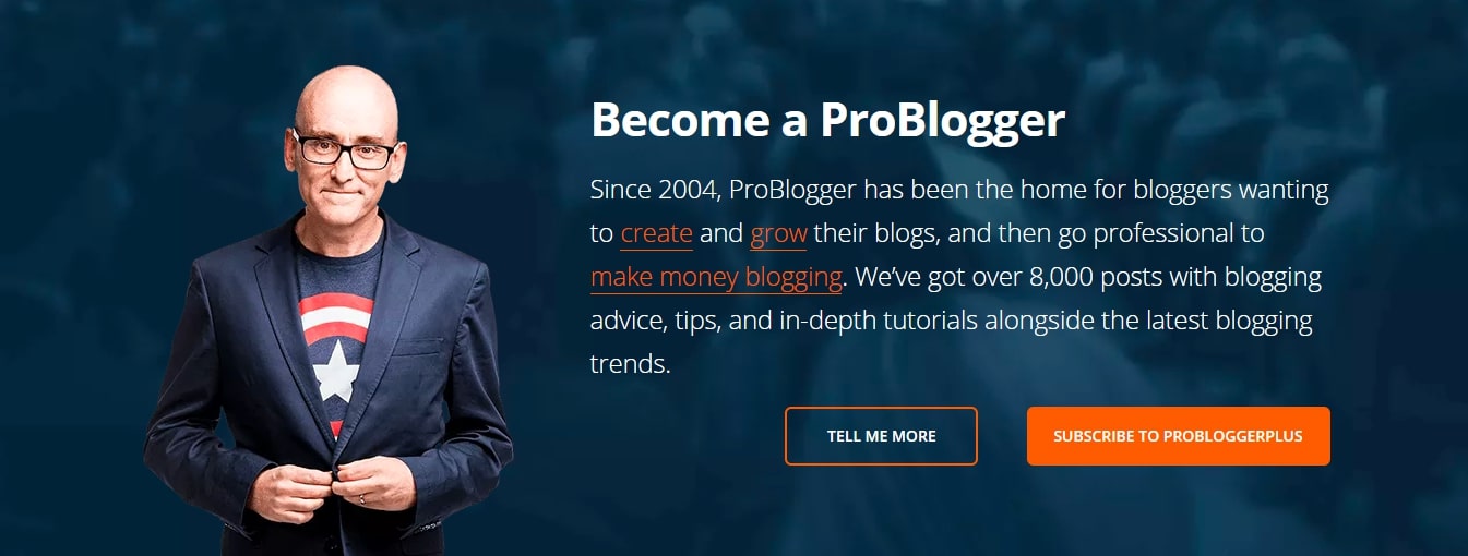
A slider, on the other hand, is very different. It is more like the digital equivalent of billboards that change automatically and contain different ads. Only here Instead of ads, there will be direct messages combined with a call to action. You can use the slider to ask people to sign up for your newsletter. Since sliders continue to move, remember to redirect your visitors to another page or open a subscription popup.
25. High Enough so Everyone can See
Located high enough to get lots of attention, and thin enough to allow focus on other elements as well, this option can be quick and simple.
The key here is to put this box on pages that receive a lot of visitors like your blog section:
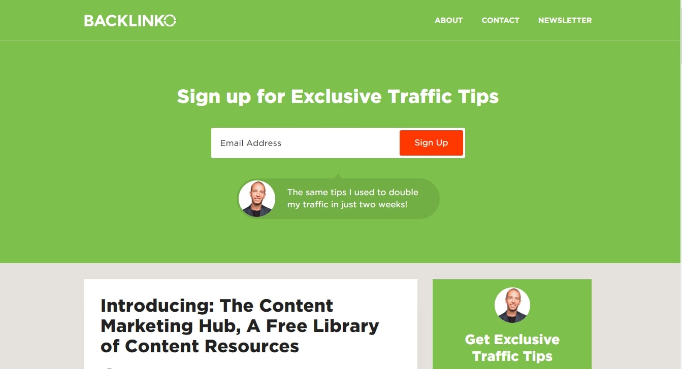
But you don’t have to go fancy, simplicity can be just as good;

Since this is basically a higher feature box, you should use these practices.
- Highlight the benefit
- Make an interesting offer
26. Commenting? Stay Updated!
Commenters are the ultimate candidates to join your email list.
Just see how amazing commenters are:
- Probably like your content (hopefully)
- Highly engaging
- Not afraid to say what they think
- Happy to learn
- Already put their email address on the form
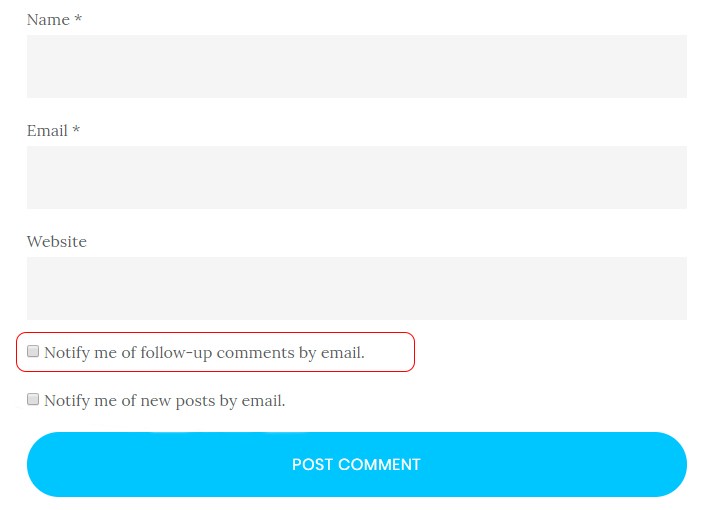
All that is required is to check a box.
Remember to make your checkbox stand out by using power words (Power Words chapter).
How to add a subscription checkbox to your comments section?
MC4WP (Mailchimp for WordPress) allows integrating plugins that will allow you to collect emails on any form, while WPDiscuz is a complete comments plugin that helps to gain subscribers from comments.
27. Contact Us Page
For whichever reason it is, people are already contacting you.
All you need is a checkbox asking ‘by the way, would you like to subscribe?’
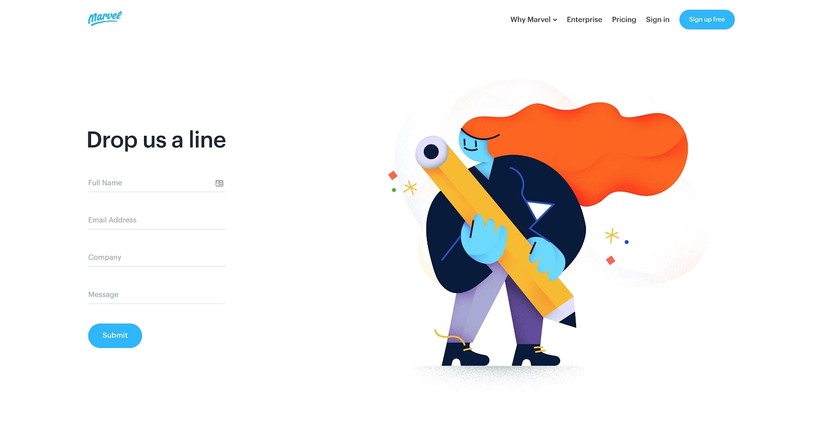
Here are 2 plugins that will help you with that:
- MC4WP (Mailchimp for WordPress) By Ibericode allows integrating many plugins
- Newsletter by The Newsletter Team integrates with more email services, but with fewer plugins.
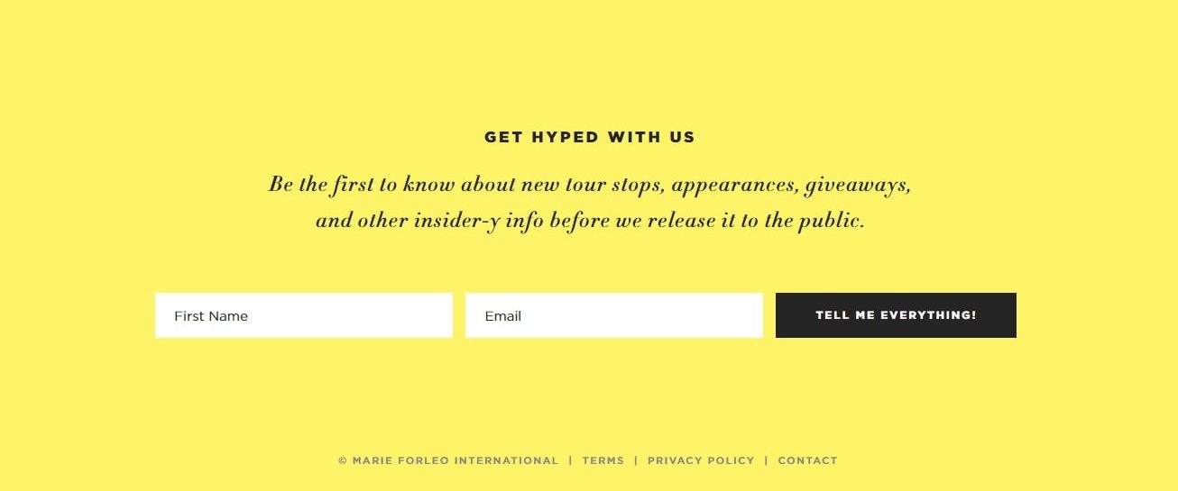
28. Dessert of the Page – Footer Subscription Box
Unfortunately, less than 20% of total visitors get to the footer.

This graph by Clicktale displays a simple fact: The lower the point on the page, the fewer visitors will see it. But let’s not ignore another important fact: Those who reach the lowest part of your page, are extremely interested.
Email Collection Optimization
29. Power Words
Want to gain the attention of your visitors right off the hook?
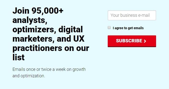
You’ll have to use power words. Telling a potential subscriber “Sign up for our newsletter” is not as persuasive as “Catch the complete XY guide for free”, or “Find out how I made $50,000 in a month”. This is the reason CXL uses solidarity when it comes to getting new subscribers.
Here’s an email subscription popup on their website:
Tim Ferris uses this technique in a more personalized way (‘Exclusive content’ ‘sent directly by me’)
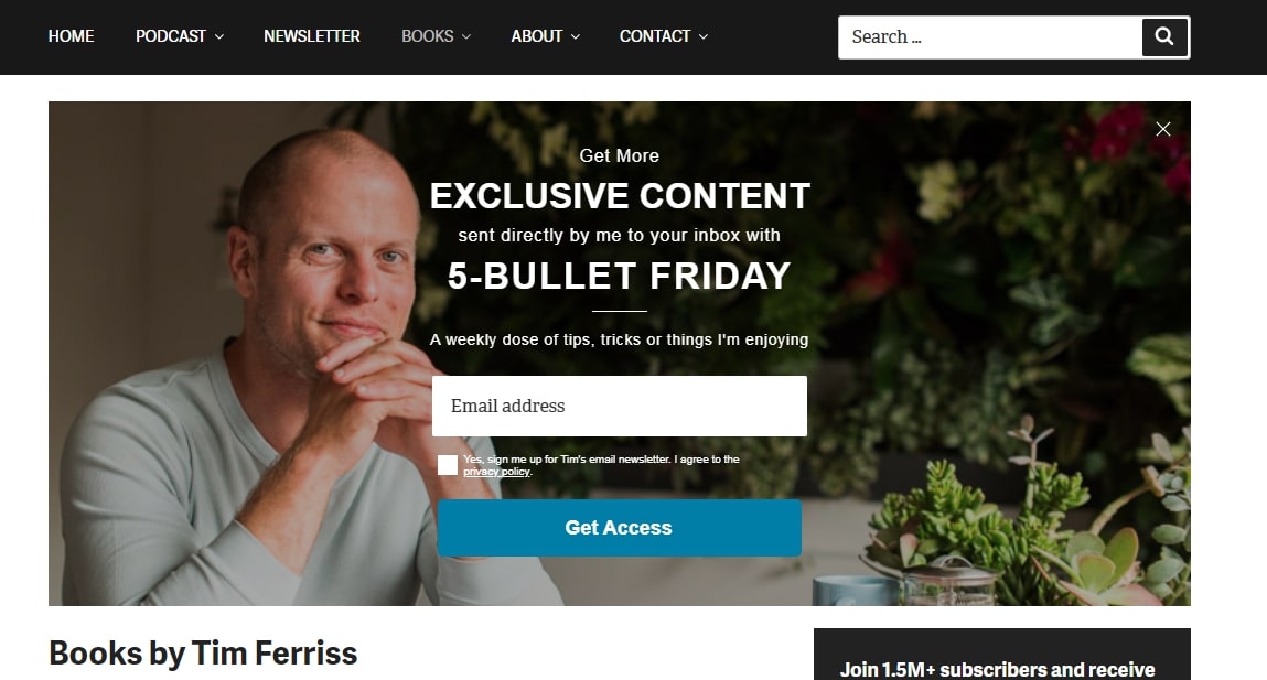
This approach is very powerful because it makes users the center of your attention.
Here are some power words:
- Free Download
- Rare
- Featured
- Exclusive
- Advanced
- Limited for X people
- Unlimited access
- Pro’s Secrets
- Access
- Special Offer
- Limited Time
Make sure not to use them too much. 1-3 Power words in your title and subtitle combined will do the magic.
30. Let Visitors Know They Are in Good Hands
Highlight how your product or service is going to benefit users by painting the picture of a better future. For example, highlight how your subscribers receive more discounts or get more clients. It’s all about incentives.
Starak bribes by offering his personal story:
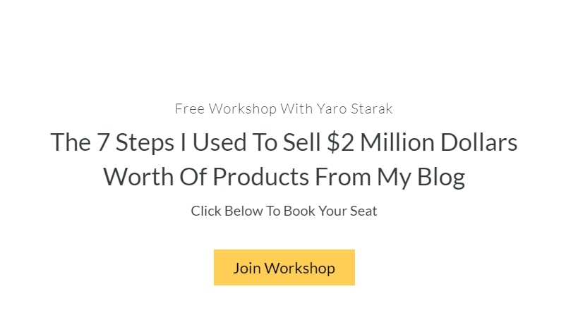
Reports show that sharing real-life stories and stats can be convincing.
31. Kill any ‘Normality’ in Your Call to Actions
Two things happen when you get asked to do the same thing over & over again:
- You start getting bored of these requests
- You automatically stop paying attention to them
And that’s exactly what you keep asking users to subscribe w– wherever they go. Also, words like subscribe, sign-up, register, and join are very common and tend to sound like a commitment.
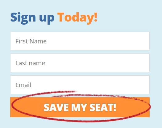
Have a look over these subscription boxes call to action:
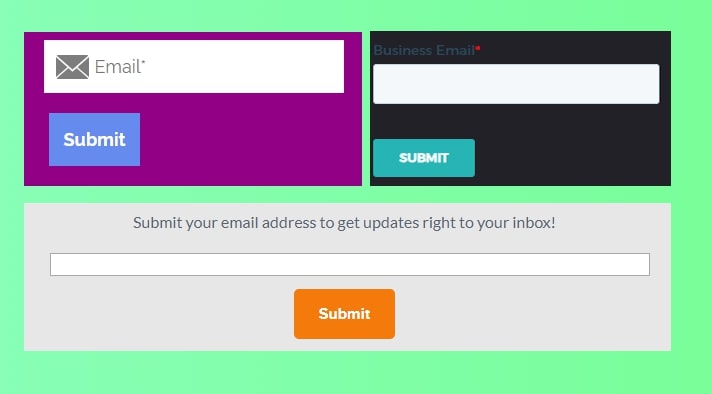
They are all the same!
So how to make your call to action look different? Two things:
- Benefit – what great thing do they get?
- Color – To make your CTA stand out to the eye, and also empower the benefit. Learn how to create the perfect Call to Action that increases conversions.
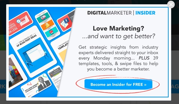
Here’s a great example:
32. Allow 2 Options: ‘Good’ vs ‘Bad’
Consider giving two options to users.
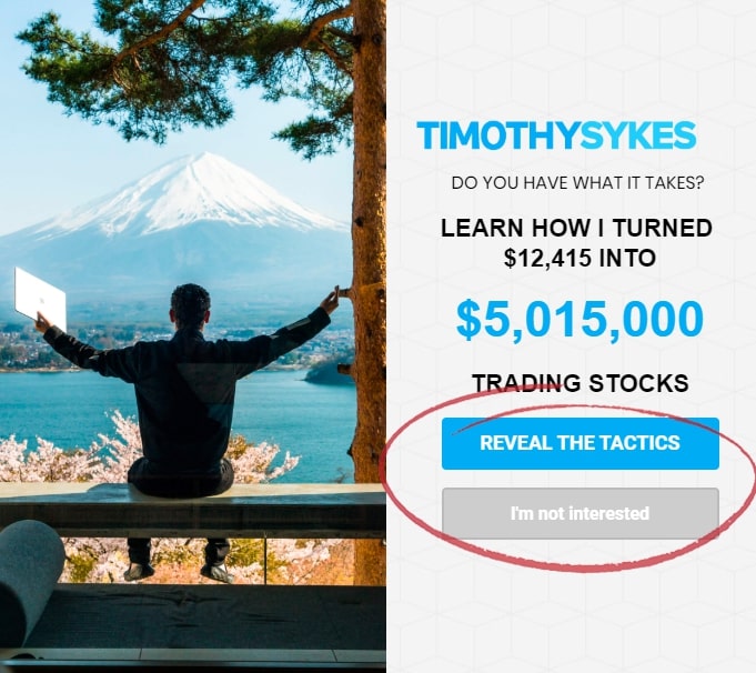
We’re more likely to do something if we’re given a choice. Do not force visitors to sign up, give them a choice. Also, make the other choice look ‘bad’.
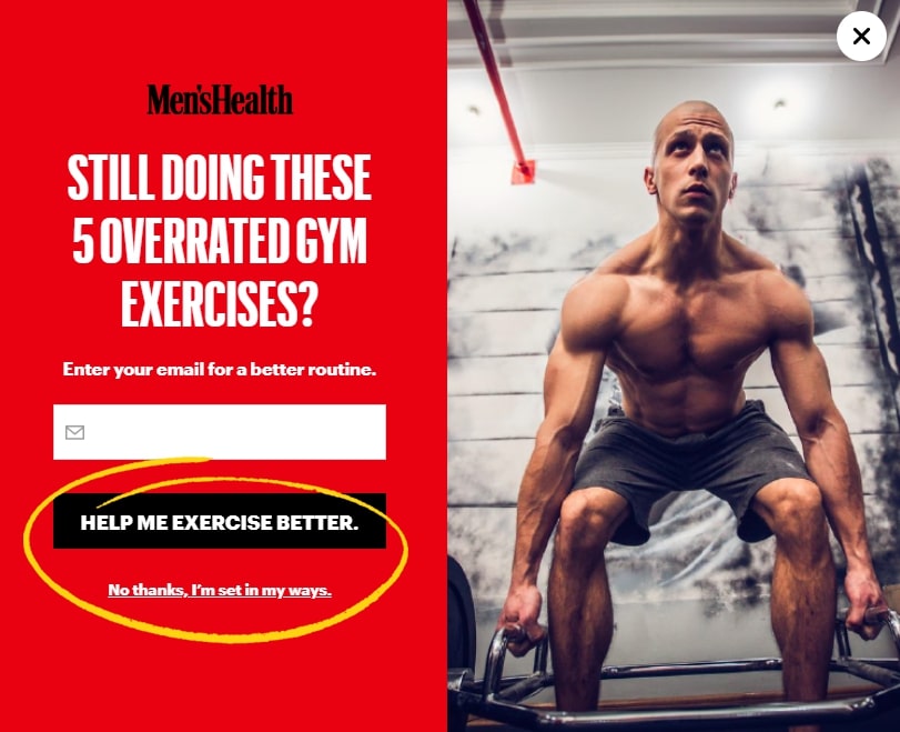
The effect is called Single Option Aversion, here’s an excerpt of Daniel Mochon from ACR (Association for Consumer Research) explaining this phenomenon;
“Single option aversion is a context effect whereby consumers are unwilling to choose an attractive option when no competing options are included in the choice set. Consequently, an option may be chosen more often when competing options are added”
33. Get Subscribers to Turn Them Into Buyers – Ads
Don’t use Ads for subscribers UNLESS you have a funnel built to convert your subscribers into buyers.
The reason is that these ads will not return their investment if you are not gaining money from subscribers.
This method is good only for businesses that have something to sell for their subscribers to be.
This is how it works:
- You’ll need a high-quality piece of problem-solving content.
- This piece of great content will be available freely in exchange for an email address on your landing or squeeze page.
- Your ad will be linking to your landing page.
- To make your ad extremely persuasive, use one of these headline formulas:
[Take this action] + [Specific Time Period] + [End Result]
For example:
Use This App for 5 Days and Gain 48% More Subscribers
[End result they want] + [Time period] + [Address the objections]
For example:
Sell 43% More Clothes on Amazon in 21 Days By Changing Product Pages
34. Offer Newsletter / List Discounts
Discounts were and always will be a great incentive. Offer members-only discounts to push people to sign up.
Of course, you can offer discounts without asking for people to subscribe, But, then you miss a great opportunity. My advice is that you use a combination of the two.
When there is a high intent to purchase, like a visitor adding products to the cart, it’s probably smarter to give him a discount right away so that his experience stays fluent.
On the other hand, if a visitor just reads your ‘top 10 X products’ article, it’s better to send him a discount through email, since he’s still comparing products.
You can get a higher conversion rate by sending a reminder with the coupon code to their email address.
Pro tip: Limit your coupon code for a certain time and pop a countdown timer while the coupon is activated.
Pro tip 2: Don’t use only discounts, give free shipping, gifts, upgrades, limited content, and whatever you believe may make people subscribe.
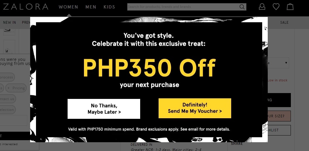
A huge benefit of this method is that you get to try ‘remarketing’ (through email) to whoever picks the coupon until they purchase.
Tools:
Giving coupons here & now is absolutely free with Adoric.
If you’d like to send the coupon through email, you’ll have to add your email service to the equation.
Just make sure your Adoric form is integrated with your email service and to the right list before sending an email.
Look for creating a welcome email in your email service, and make the coupon code the prominent point of this email.
Networking Can Help
35. Partner with People in Your Industry
You can expand your email list fast by being exposed to other people’s networks.
Here are some ways to do so:
- Co-host in their webinars
- Guest posts
- Co-promote content
- Participate in podcasts
- Co-create content
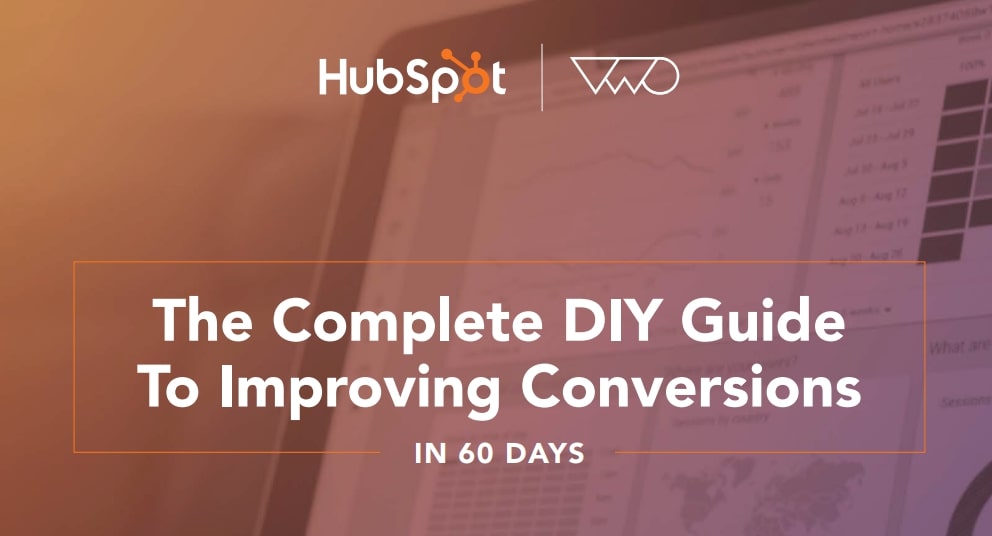
It can be as simple as co-creating a PDF, just like Hubspot & VWO did:
I know that as a smaller business/authority in your industry, you most likely don’t have a built network that allows you to just approach the big player.
So, how can you make stars in your industry notice you?
First, you’ll need to contact them, and there is one way to do it safely:
Piggyback.
That’s how you get into networking without having a prior connection. This way you have a much higher chance of getting a response. It is all about building connections. Take the first step and show interest in what they post.
The point is to make your potential future partner notice and remember you.
It’s best to start with some small talk, not rushing to ask for help. Complementing their actions is good. Adding a light question can be helpful as well:
- “Which tools did you use?”
- “What made you do that?”
Try to be as light and friendly as possible and avoid subversive talking.
Eventually, after getting answered, you’ll have to make a pitch.
A very popular name known to offer such services is Tim Ferriss.
Here’s a quote of Tim on networking:
“I do what I always do: find a personal e-mail if possible, often through their little-known personal blogs, send a two- to three-paragraph e-mail which explains that you are familiar with their work, and ask one simple-to-answer but the thought-provoking question in that e-mail related to their work or life philosophies. The goal is to start a dialogue so they take the time to answer future e-mails – not to ask for help. That can only come after at least three or four genuine e-mail exchanges.”
If possible, you can also consider influencer marketing and have others help you build an email list for a price.
36. “Refer-a-friend”
About 88% of consumers are more likely to perform an action if it’s recommended by someone they know.
Hence, consider asking people to share the content to spread the word.
It can result in a chain reaction (snowball effect) and you will soon double or triple your returns.
One way to make subscribers share your emails is to mention it on your email template or your electronic signature.
If you’re providing value via emails, they will get shared.
Real-life Email Collection Methods
37. Collect Emails During Events
Make every event count, virtual or physical.
Ask users to register to get access to a virtual event such as a conference.
Similarly, you can provide a form to those who visit your company event.
People who know you personally are more likely to share their personal details with you.
Remember that people who attend such events are proactive and hungry for valuable content. Plus, they’re more likely to convert and recommend you to others.
You can do so by distributing feedback forms, business cards, etc.:
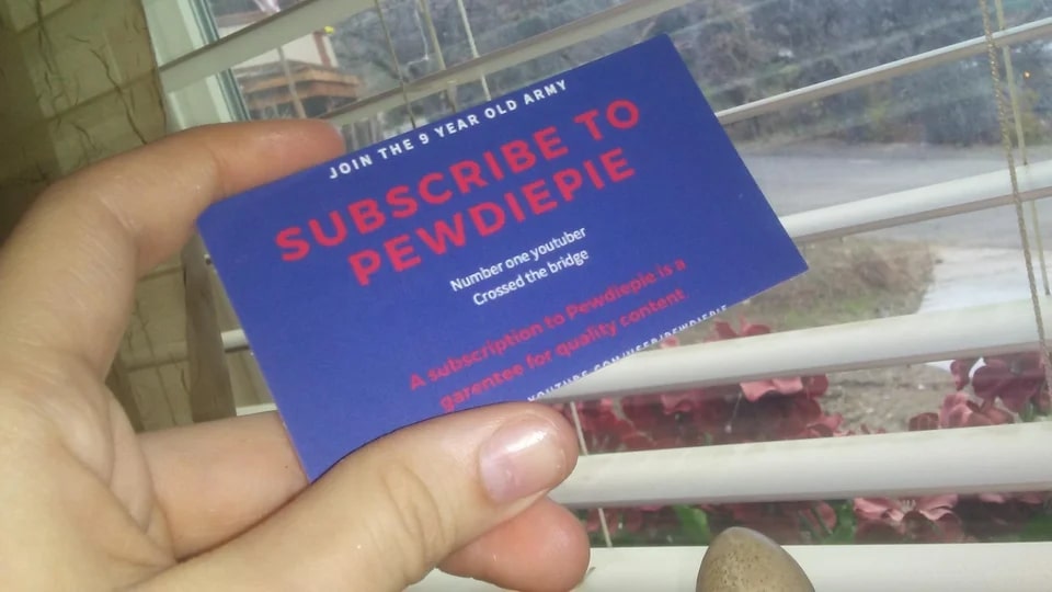
Posted by ThiccUncle on Reddit
Pro tip: Read this guide to learn how to handle your business card.
38. Make it Super Easy with QR
QR codes are now native to most smartphones and about 60% of people use them on a daily basis.
They make it easier to share information and perform tasks.
You can use a tool like QR code generator and add a code to whatever you print. Users will be able to scan it and land on your landing page and sign up.
Instead of talking about subscribing, you can put a cool sentence like ‘be ahead, stay updated’ or ‘scan me!’ below your QR code, just like William Taylor did use QR code generator:
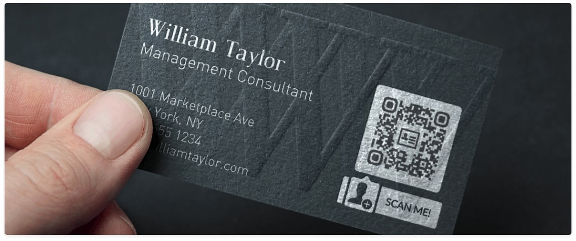
If you already took the card, won’t you scan it?
Launch Your Email List Building Arsenal Today
The key lies in using CTAs and telling people to sign up by spreading the word in a variety of ways.
Remember to avoid spamming people and shy away from asking for information that you do not need, i.e: gender, age, address, etc.
Also, let people know they will always have the option to subscribe.
Find what works for you and stick to it. Check our free step-by-step checklist if you’re still having trouble.

