A Shopify landing page, when designed properly, can help you convert your visitors into subscribers and buyers.
Designing a Shopify landing page that converts is both art and science. However, that doesn’t mean you have to be a guru designer or a conversion optimization expert to create one. You just need to understand what a landing page is about.
And that’s what this post is about – to help you master the art of creating Shopify landing pages that work.
Landing pages come in many forms: squeeze, splash, and product landing pages are good examples. Of course, there are many more, but those three are the major ones.
In this post, we will dig a bit deeper into the subject of landing pages to help you understand what they are about.
In addition to that, you will get to learn how to create one and what tools to use. To wrap things up, we will share examples of inspiring landing pages for Shopify.
Let’s get into it already!
What Is a Landing Page?
Simply put, a landing page is a page where a web user “land” after clicking a link or a button.
For example, there is a Try our app for Shopify button on our homepage.
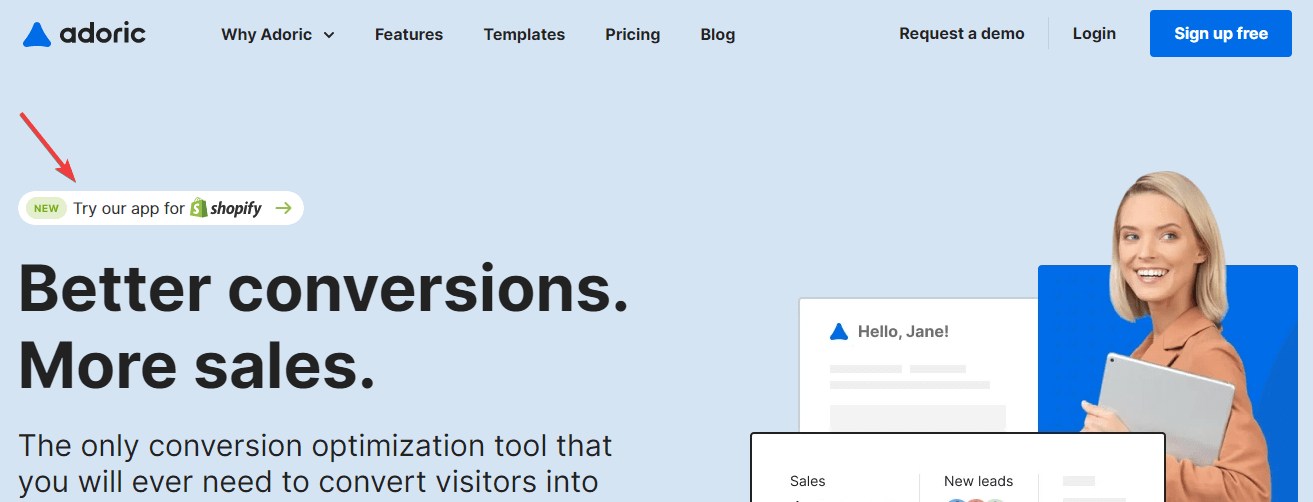
If you click that button, you will land on this page:
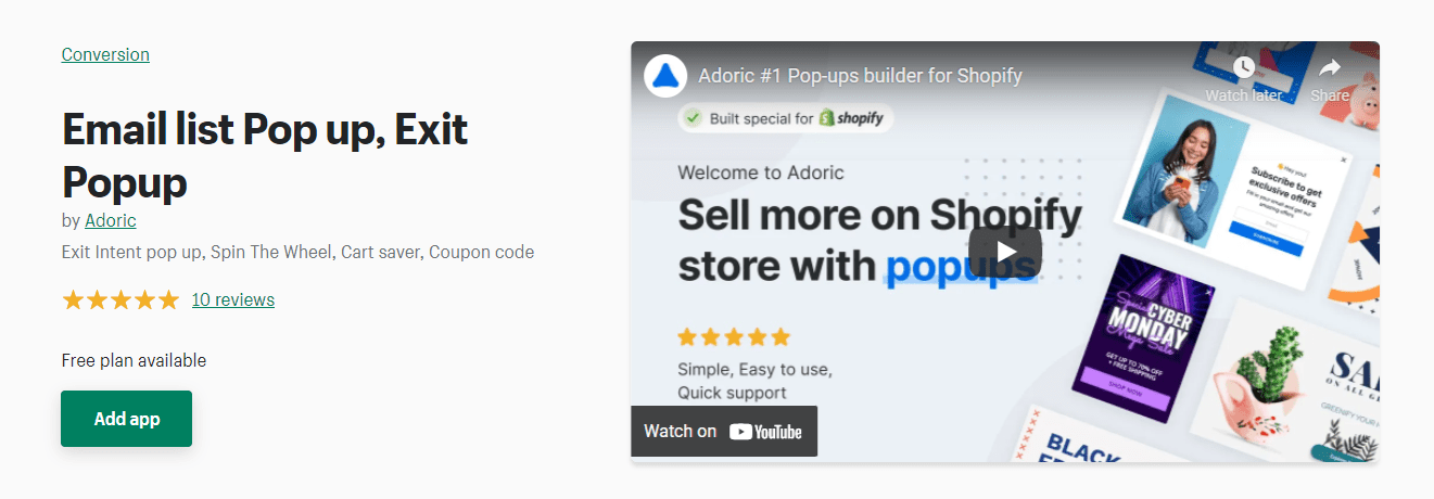
Think of that page as our app landing page on Shopify.
Getting the idea?
But not all landing pages are created equal. In fact, not all pages can pass for a landing page.
A landing page has one specific purpose: to get users to act.
This action could mean making a purchase, signing up with an email, booking a demo, visiting another page, etc.
So, any page that doesn’t do that isn’t technically a landing page.
What Makes for a Good Shopify Landing Page?
How do you know a good landing page when you see one?
Here are some of the features of a Shopify landing page that converts.
1. Clear, Concise Heading
You only have a limited time to capture the attention of users that interact with your landing page. One sure way to hook your users is by writing a catchy headline. And not just catchy, but also concise – straight to the point.
Have a look at this page from PrettyLitter.
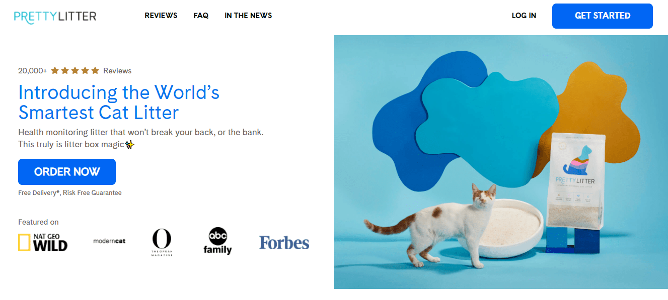
You can easily tell that this website is all about cat litter from the bold, attention-grabbing “Introducing the World’s Smartest Cat Litter” headline.
That’s what your headline should do – tell your visitors what your store is about in the shortest way possible.
2. A Compelling Call-to-action (CTA) button
Did you notice the conspicuous “Order Now” button on the Pretty Litter page we just reviewed? It’s so bold that it makes you want to click on it.
That, also, is another characteristic feature of a well-designed landing page.
Your call-to-action button ought to be compelling to stand a chance of getting your visitors to act.
3. Feature-rich Above-the-fold
Still referencing the Pretty Litter page, did you notice that all the relevant information and features of the page are placed in the above-the-fold section?
The above-the-fold section of a page is the part you see as soon as you land on it without scrolling.
This also makes for a high-converting landing page.
4. Eye-catching Imagery
Words may not always be enough to capture the attention of your visitors; eye-catching pictures are better suited for the job.
So, do well to add breath-taking images to your landing pages – it can help boost your conversion rate.
5. Free of Navigational Links
Your landing page won’t yield meaningful results if you cannot keep your visitors focused on it. The best way to do that is by eliminating elements that can distract their attention – particularly navigational links.
Adding navigational links to your landing page will make it easy for your visitors to navigate away. And you certainly don’t want that.
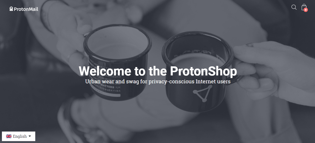
Have a look at this landing page from ProtonMail. Notice how the top section is completely free of navigational links?
Why Do You Need a Landing Page for Your Shopify Website
The number one reason you need a landing page is to boost your conversion rate. When designed and implemented properly, landing pages can make it easy for you to convert your visitors into subscribers and buyers.
Another reason to use a landing page is to lessen your bounce rates. Why is that so?
Sending traffic to a page that isn’t optimized for conversion will only lead to a high bounce rate. A high bounce rate comes with many other problems: high ad costs, lower ranking on Google, etc. You definitely do not want that.
Finally, a well-designed landing page can help create a good impression on the minds of your visitors. They will see your business as professional and will most likely trust your business the more.
How to Build a Landing Page on Shopify
Creating a Shopify landing page that converts isn’t rocket science. Plus, you don’t have to be a developer or a genius designer to create one.
That being said, here are viable methods for creating a landing page on Shopify.
1. Using the Native Shopify Page Builder
As you already know, Shopify comes with a native page builder feature that makes it easy to create pages on your website in minutes. You can use it to create a simple landing page on your website.
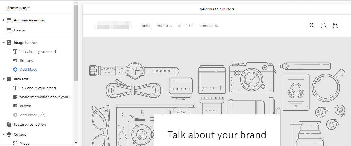
The problem with using this page builder feature is that it is limited, so you may not be able to customize your landing page as you wish. You would have to edit your theme’s core code to edit the page to your heart’s content.
Unless you are a Shopify developer or can afford to hire one, we don’t recommend this approach. Rather, use an app, which brings us to the second strategy.
2. Using an App
You will find many Shopify landing page builder apps on the Shopify app store. One of the notable apps is Pagefly.
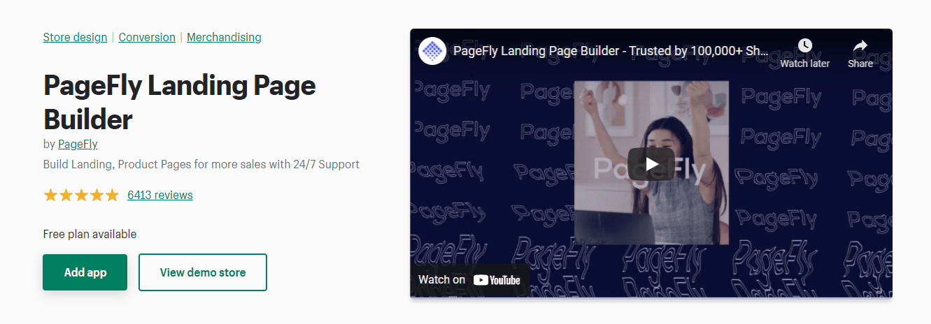
The Pagefly app makes it easy to create high-converting pages on your Shopify website without writing any code.
What kind of page can you build with Pagefly?
- Sales landing page
- Pricing page
- Product page
And lots more. The app comes with many pre-made page designs you can quickly edit, customize and deploy to your website without hassles.
You can start using Pagefly for free. But you are only limited to 3 pages on the free plan. To get the most out of the app, you’d have to upgrade to the Pay As You Go ($29/month) or the Enterprise ($199/month) plans.
Aside from Pagefly, other page builder apps you can try include Shogun Landing Page builder, Gempages, etc.
3. Using a Third-Party Builder App
If using Shopify page builder apps doesn’t work for you, try using a third-party plugin. These third-party page builder plugins are packed with a lot of features that make them a powerful alternative to Shopify page builder apps.
Some of the popular plugins include Unbounce, LeadPage, etc.
These plugins support plug-and-play integration with Shopify. In plain English, you can easily add these plugins to your Shopify website with ease.
How to Optimize Your Shopify Landing Page for Conversion
It’s not enough to create a landing page; you must put in the effort and time to optimize it for conversion.
Here are a few things you can do to optimize your Shopify landing page to convert better.
1. Make Your Headlines Pop
The average web user is a lazy reader – often, they scan the headlines on a page without reading the body text.
You’d be leaving a lot of money on the table if your headlines are unstimulating.
How do you make your landing page headlines pop?
Let the benefits of your product scream through them. In other words, let your visitors see the instant benefit of using products through your headlines.
Have a look at this example from Luxy hairs.

Another thing: try to keep your headlines brief, sweet, and straight to the point.
2. Tell Your Visitors What You Want Them to Do
Do you want visitors to shop, sign up for your mailing list, or click through to another page? Tell them!
And the best way to tell them is by infusing a compelling call-to-action (CTA) button.
3. Add Social Proof
Visitors will naturally have misgivings about your product. One sure way to disarm them of that misgiving and get them to buy from your store is by adding social proof to your page.
By social proof, we mean testimonials, reviews, and possibly a money-back guarantee.
Shopify Landing Page Examples
Before wrapping things up, we would like to show you some Shopify landing page examples you can take inspiration from.
1. United Blue Product Landing Page
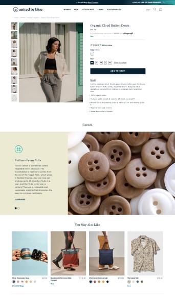
One thing that makes this product landing page shine is the stunning pictures it has been packed with. These pictures alone are enough to make a prospective customer buy from the store.
Did you also notice the attention-grabbing “Add to cart” button in the above-the-fold section? Take a cue from that when creating your page.
2. Savanna
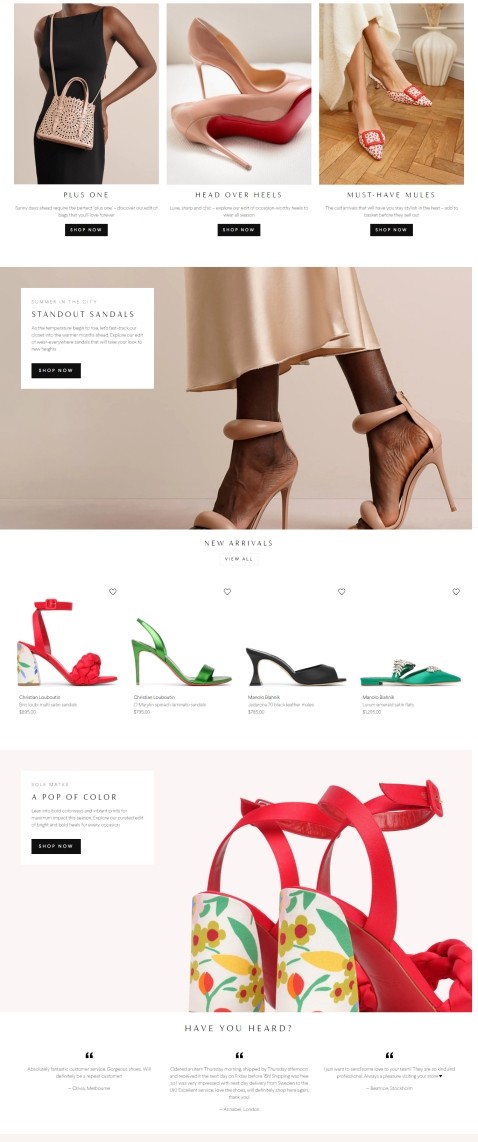
This page checks off a lot of remarkable features; captivating imagery, a conspicuous CTA button, product benefits, etc.
Most importantly, customer testimonials have been added to the page, making it more effective.
Wrapping It Up
A thoughtfully designed landing page is a must-have if you want to boost your Shopify conversion rate and grow your sales.
With all we’ve shared in this post, creating one shouldn’t be hard.
In addition to a landing page, you also need a stunning popup. Popups are conversion optimization marketing tools you should have in your marketing arsenal.
Adoric makes creating attention-grabbing, high-converting popups for your Shopify website a breeze.
Why not give Adoric a try today and watch your sales shoot for the skies.

