If you’re trying to market your site and make more sales then it’s important that you know what website bounce rate is all about.
Lack of this knowledge can make or break your site. In this article, we’ll discuss what it means and how you can reduce it.
What Is Bounce Rate?
Bounce rate, defined in percentage, is the number of users or visitors who leave a page without taking a specific action, such as finalizing a purchase, downloading a file, etc.
Before moving ahead, let’s make it clear that it is impossible to have a 0% bounce rate unless you have very few visitors. Not everyone who lands on your webpage or website will be interested in what you have to offer. However, there are ways you can reduce bounce rate, and in this post we will show you some of them.
Why Is It Important to Control Bounce Rate?
Now that you know what bounce rate means, let’s talk about its importance.
Remember that users who land on your site are likely to be interested in what you have to offer. But, if they bounced off right away then it means you failed to keep them engaged. It’s a loss because the user may go to someone else and make them money.
Plus, it’s also a ranking factor according to this Backlinko report. Pages that have a low bounce rate are more likely to rank on the first page of Google.
Lastly, a very high bounce rate indicates there’s something wrong with your site. It could be anything from a design flaw to poor content.
What’s a Good Bounce Rate?
It can be hard to give a number because it depends on a variety of factors including the niche and age of your site as highlighted below:
- Retail and eCommerce sites: 20% – 45% for e-commerce and retail websites
- B2B sites – 25% – 55%
- Lead generation site – 30% – 55%
- Non-eCommerce sites – 35% – 60%
- Landing pages – 60% – 90%
- Blogs, news sites – 65% – 90%
Blogs typically have very high bounce rates – up to 90 percent. Ecommerce sites can have a rate as low as 20 percent. Moreover, it also largely depends on where your traffic is coming from.
Users who come to your site via e-mail marketing, for example, tend to stay on it longer than users who land on your site via organic search. Nonetheless, according to this GoRocketFuel report, the average rate is between 41 and 51 percent.
If you’re confused about what a good bounce rate is, make sure to compare your bounce rate to other businesses in your niche. You can easily find the bounce rate through tools like Google Analytics.
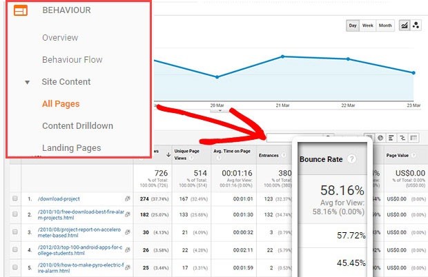
Google Analytics bounce rate section offers some important details.
The tool can only tell you if you have a high or very low bounce rate, but it cannot lower it for you.
Why is My Bounce Rate so High?
It can be difficult to correct a problem if you do not know what’s causing it. So, let’s first talk about what causes visitors to bounce.
The Page Isn’t What They Expected
So a user searches for ‘best shoes’ and lands on a page that talks about the qualities of best shoes.
Assuming the user is looking to buy the best shoes, he or she may bounce off because the person isn’t interested in knowing about shoes, he’s only interested in buying a pair.
Messy Design
Nobody likes a website that looks ugly. Believe it or not, a large number of people will judge your site based on how it looks.
Look at this design:
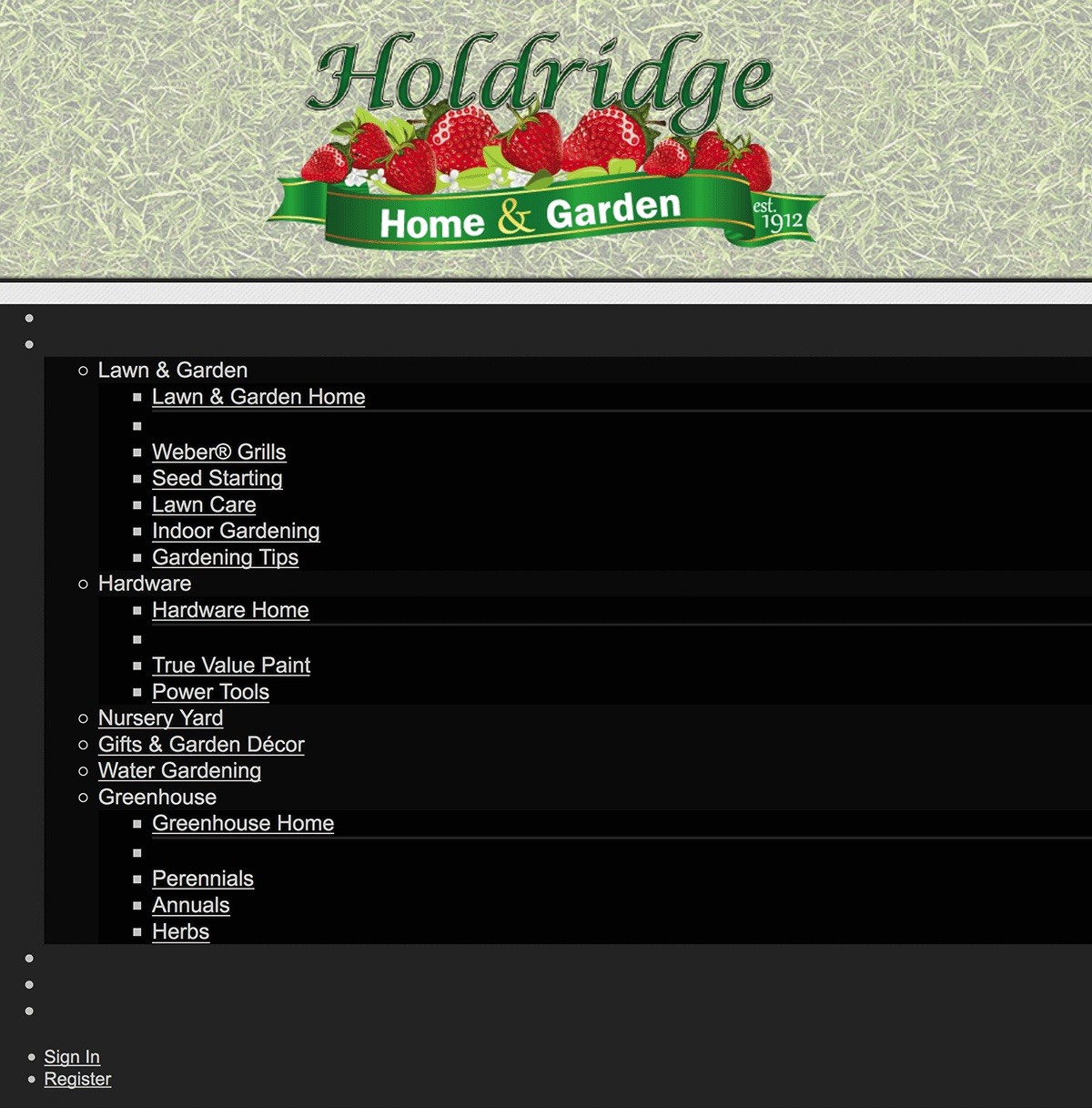
Most users will bounce off right after landing because the site looks unprofessional.
Bad UX
This is another important factor.
A site that’s hard to use or navigate doesn’t attract users.
The easier it is to find what one needs, the lower will be the bounce rate.
Users Found What They Needed
A user looking to read about ‘qualities of a leader’ may land on your blog, skim the blog in a few seconds, and close the page because he or she is not interested in anything else.
In addition to this, a user may open multiple sites at once – all discussing the same thing – he or she would close your site if they got what they needed from another site.
The key to increasing revenue for any business lies in understanding and maximizing average order value. Whether you’re selling Veautie physical products or digital services, increasing your average order value by just 10% can significantly boost your bottom line.
How to Improve Bounce Rate: 12 Tips to Reduce Bounce Rate
#1 Add Videos To Your Page
Pages that contain videos tend to enjoy lower bounce rates, as proven by Wistia. The company nearly doubled its average time on a page by embedding YouTube videos. “People spent on average 2.6x more time on pages with video than without”.
The concept is simple. Users love videos. Most people prefer to watch and not read. This is important from other perspectives as well since we tend to remember more of what we watch compared to what we read.
Backlinko found that embedding videos to pages can reduce the bounce rate by up to 11 percent.
However, you have to remember a few things when adding videos. They must be relevant and of very high quality. For example, a page about ‘how to cook rice’ can contain a video explaining the process.
You can upload the videos to your server, or host it on YouTube (for free). However, make sure to avoid auto-play as it can be distracting.
While videos are useful, not everyone who lands on your page might be interested in watching a video.
They might be listening to a song or file, which can get disrupted if the video on your page begins to play automatically. If you wish to play the video on its own then at least make sure it’s mute.
#2 Make Sure to Add a Search Bar
The search bar helps users find what they need. Make sure to keep the search button wide and clearly visible.
According to a report published by Jakob Nielson, the search box should be at least 27-character wide. This is very important because the average bar is only 18-character wide.
Not many people pay attention to this fact because it is possible to type longer queries even in short boxes, but the problem is that users will not be able to see the entire query due to the size of the bar. This can make reviewing or editing the query very difficult.
A very good option to solve this problem is to introduce a dynamic search bar that gets bigger automatically as one starts to type in the box.
Another good option is to make the bar sticky and fix it at the top so users can easily find it. There’s no point in having a search bar if nobody can see it.
#3 Do Not Neglect Loading Speeds
Today’s users are impatient. They will never stay on a webpage that takes too long to load.
According to a Decibel Insight’s report, pages that are slow to load have a 72 percent higher bounce rate than sites that are fast to load. But the question is – how fast should a website be?
First of all, a website that takes longer than 3 seconds to fully load is considered to be extremely slow. For best results, your website content must load in less than two seconds.
A fast-loading site has low bounce rates, and tend to rank high on Search Engine Result Pages (SERPs.
For this reason, it makes sense to always check your site’s load speed.
To do so, go here and run a comprehensive test.
Here’s what you can do to improve load times:
- Minimize HTTP requests
- Combine and minify files
- Defer JavaScript loading
- Minimize time to first byte
- Find a good host
- Avoid auto-play
- Compress your site
- Enable caching
Check this page for some more tips on how to improve page speed, and hence reduce your website’s bounce rate.
#4 Display Special Offers On Your Page
The key lies in enticing users and making them stay on the page by offering them something exciting in return.
You can introduce special discount codes to make people want to check other pages and stay on your site. Consider using countdown timers. As explained in our How to Use Countdown Timers to boost Conversions with Examples article, countdown timers can be very effective in boosting conversion and improving bounce rates.
Look at eBay for some inspiration. The eCommerce store displays special offers and discounts on the top that are hard to miss.
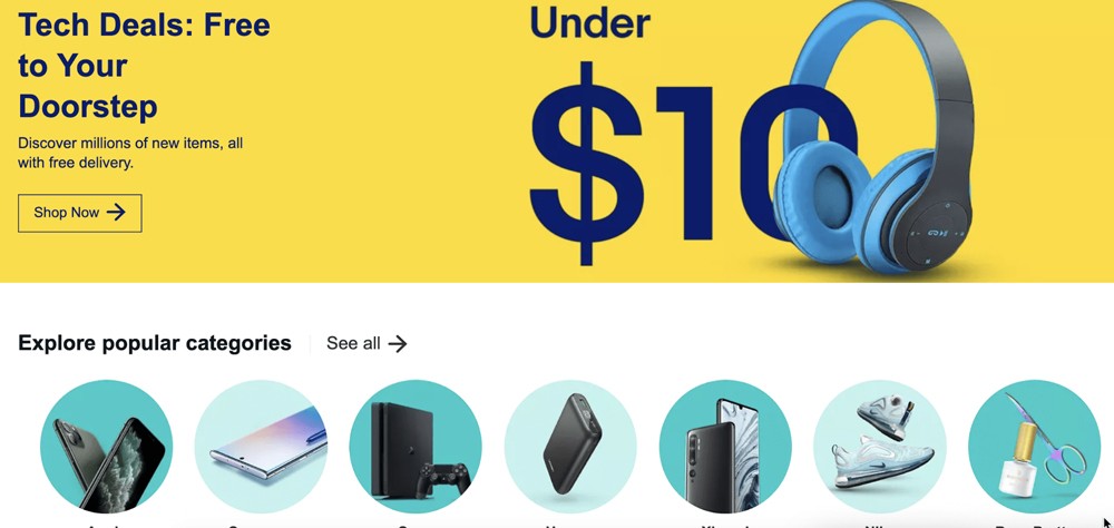
For this trick to work, the offer displayed should be highly relevant and personalized. For example, if your page is about pets, then the ad should be about cat feed, vets, etc.
#5 Use Smart Formatting
As explained earlier, users do not enjoy sites that look messy and ugly.
It doesn’t matter how valuable or informative your content is, nobody is going to stay on the page and read it if it looks visually unappealing.
Here are tips for improving the visual appeal of your website’s contents:
- Use small paragraphs so that it doesn’t look too text-heavy
- Use visuals like images and videos to keep people engaged
- Take care of spacing to ensure the page looks good
- Use clever subheadings so that users can immediately know what you’re offering
- Use bulleted points to highlight important messages (as I just did!)
This will allow users to quickly skim through your content and identify points that are of value to them. However, you must know where to draw the line.
Do not make the mistake of using unnecessary headings or introducing images in every post. It just ruins the look and makes the page difficult to navigate.
#6 Compare Time Spent and Bounce Rate
Identify whether the problem is related to one webpage or the entire site.
The time spent on your site is a very important metric to consider. For example, if the overall time spent is good but the bounce rate is high then the problem might be with the content on specific pages.
Similarly, if the bounce rate is high and the time spent on your site is very low then the content might be misleading or there might be issues with the design.
Make sure to compare different figures to identify what’s causing bounce rates to be high.
#7 Get Rid of Distractions
Giving your visitors so many choices can be distracting. So also is loading up your website with excessive information, and using bad fonts.
This can lead to confusion and impair action.
Simplify the design, reduce clutter, and get rid of distractions.
This is very important for landing pages. So, choosing the right design or WordPress themes – if you’re using a WordPress site – that can meet these criteria, are important They need to discuss one element only.
Think from the perspective of users.
Let’s say a user is looking to purchase a .com domain and lands on your page:
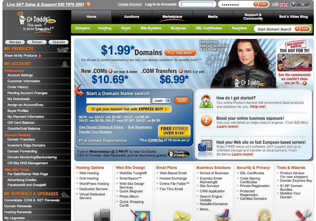
The page looks highly cluttered and offers a lot of things. This may lead to confusion and force the user to press the X button.
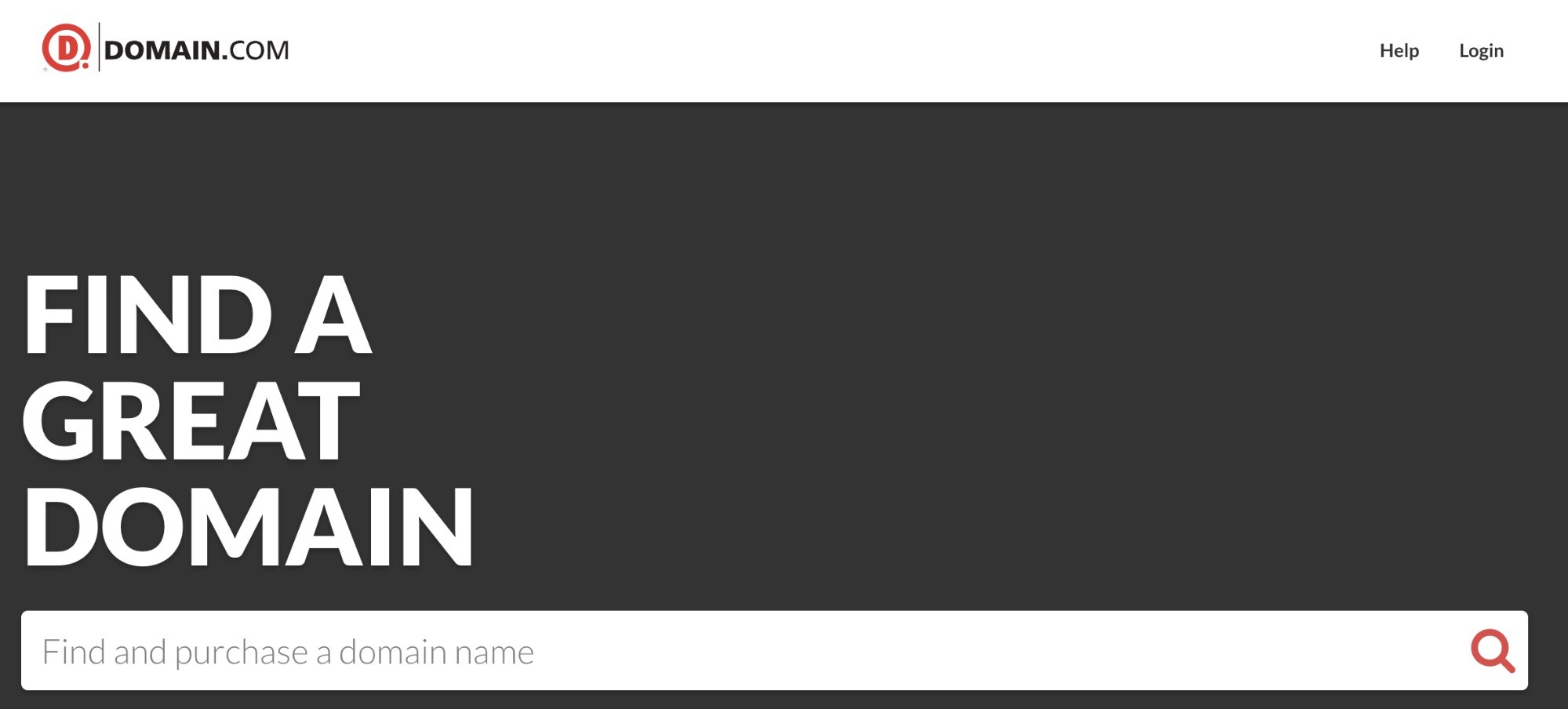
Look at the above example. The page is clear.
When a user lands on this page, he or she will not be distracted. The user can quickly search for available domains and go ahead with the process.
If you’re not sure what elements on a page are distracting users then consider using A/B testing. Adoric offers this feature and can make it easier to identify flaws.
Check out our A/B Testing: How it Works and Why You Need It article to know more.
#8 Offer The Right Help
Users do not have the time to stay on a phone and wait to get connected to an agent.
They want to get answers to their questions right away. Hence, make sure to include a FAQ section on every page (where possible) and have detailed resources or knowledge section that answers all questions a user may have about your business, product, or service.
In addition to this, consider introducing the live chat feature. About 79 percent of customers prefer live chat as it helps save time. Plus, it’s the support tool with the highest customer satisfaction rate at 92 percent.
Not all businesses offer live chat and many still stick to traditional phone and email support options that are more costly and time-consuming.
Make it easy for users to connect to an agent. It is one of the best tricks to reduce bounce rate.
Place floating live chat buttons on your page. This will not only reduce the bounce rate but also improve conversion.
#9 Improve Your Content
Improving content offers several benefits. It increases conversion, educates visitors, and improves the bounce rate.
We have already talked about using images, videos in your content, and following smart formatting to ensure your pages are easy to skim through. However, that’s not all that matters.
Above all, your content must be informative and relevant. Do not create pages for the sake of it. Make every word count and add a CTA on the page. This simple trick can reduce bounce rate and help you make more sales.
Relevancy is a major issue because your page may end up ranking for keywords that it doesn’t cater too well. The best way to solve this problem is to see what keywords your pages are ranking for and to make changes to your content accordingly.
In addition to this, consider adding a jumpable table of contents so that visitors can quickly find what they need.
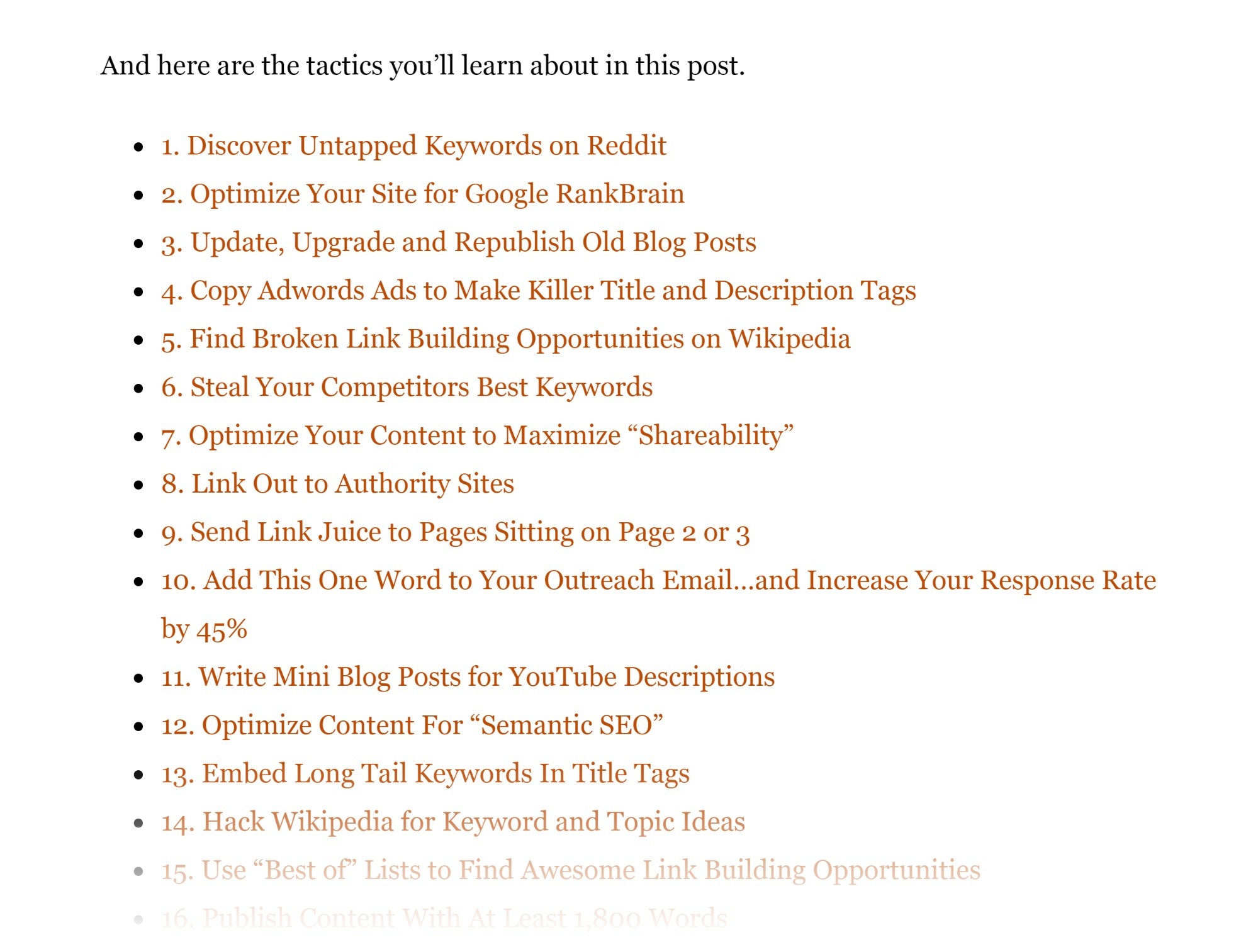
This will decrease bounce rate and keep users glued to your page.
#10 Do Not Neglect Internal Links
Want to enjoy a low bounce rate? Make sure to use a clever internal linking strategy.
Internal links are effective in keeping people on your page and pushing them to check more of your content. However, do not make the mistake of adding links to every other word.
Only link to pages that add value to the page. Otherwise, the page will end up looking messy and unprofessional.
The best strategy is to link to pages that are relevant to your content. For example, an article on SEO should only link to pages that discuss or explain SEO and not pages that explain other topics.
#11 Remove Ads That Are Intrusive
We like ads, they help websites earn money and can be used to promote specific products and services. But, the fact remains that ads can be intrusive. This is why a large number of internet users use ad blockers.
Visitors want to be on a site that offers a non-intrusive experience. We suggest that you use native ads as they do not affect the browsing experience and are quite effective as well.
Do not place ads where visitors are more likely to search for information, i.e.: search box, content area, and menu bar.
#12 Use Exit Popups
A good way to increase engagement is to use exit-intent popups. They are not only used to target abandoning users but have also been proven to be effective in increasing engagement.
“People are growing increasingly intolerant of popups. If you’re using them, think twice, then check your bounce rates and think again”.
The key lies in making an offer that’s hard to resist.
Use personalization and make an offer based on the customer’s experience on your site.
For example, if he or she looked at a specific product, highlight how very few are left in store or offer a discount on it.
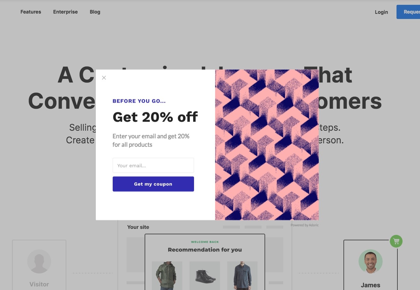
Adoric Exit Intent popups can be used to create compelling exit-intent popups. You can choose from a variety of impressive templates.
