Cart abandonment is a common problem most businesses battle all the time. If you run a store online, there is a good chance you are having the same problem.
Almost all kinds of businesses face this problem, and while some have found ways to overcome high cart abandonment rates, many are still stuck, and yet to figure out a solution.
In this article, we’ll explain the concept of cart abandonment and provide valuable tips on how you can reduce it.
What is Cart Abandonment?
The term is typically used in eCommerce to describe a situation where shoppers show interest in products, add them to the cart, but leave the website before completing the purchase.
They can leave the site or abandon the process at any stage including the final stage where they have to make payment or click the ‘Confirm’ button.
According to reports, the average cart abandonment rate across all industries is 69.57 percent. It amounts to about $4 trillion in lost sales.
No company can ever have a zero percent cart abandonment rate because some users will always have a reason to abandon a purchase. According to a 2017 study, about 59 percent of all internet users have no true intention of making a purchase. They’re just ‘window shopping’ on the internet.
Still, shopping cart abandonment statistics show that there are ways to keep buyers interested in what you have to offer.
5 Reasons Why Visitors Abandon Your Cart
Before finding a solution to cart abandonment, it’s important you first know the reasons behind it.
Shortly, we shall be discussing some of the major reasons.
A Poor Shipping Policy
High shipping costs is the number one reason why buyers abandon carts.
Ideally, you should offer free shipping. Remember that about 61 percent of buyers are likely to cancel a purchase if they do not find the option to choose free shipping. Also, about 79 percent of buyers said that they are more likely to choose a store that offers free shipping.
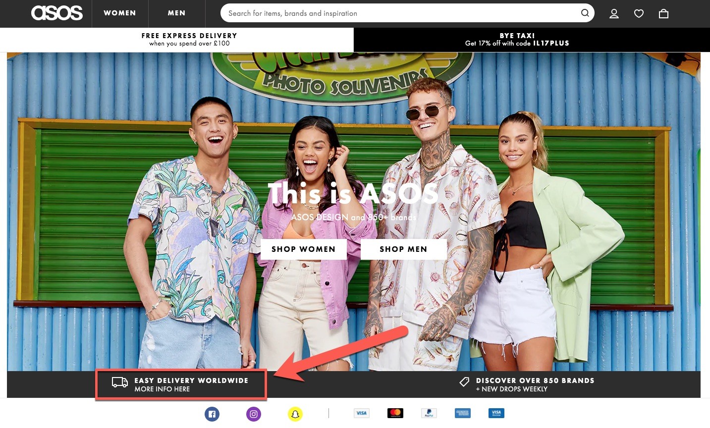
About 91 percent of buyers agree that free shipping is a great motivator and can make them a regular consumer. Similarly, 67 percent of buyers say that they would purchase more items to be eligible for free shipping.
To off-set the cost of free shipping, you can put a threshold, i.e.: free shipping when you spend $100 or more. Companies like Amazon and eBay use this trick to motivate people to buy more.
In addition to free shipping, consider offering same-day shipping as 54 percent of US consumers prefer a company that offers it. We must also mention that only 15 percent of consumers in the US seem to be happy with shipping options online stores offer.
Amazon seems to be doing pretty well since about 30 percent of buyers seem to be happy with its shipping policy. The company offers free shipping, same-day shipping, and 2-day shipping on a large number of purchases.
They Do Not Trust Your Site
Users who land on your site for the first time, or who do not have an existing connection or relationship with your platform may take some time to trust you with their credit card.
Customers are afraid of filling transaction forms. They do not like the idea of providing personal details such as their phone numbers, email addresses, credit card details and addresses to people they do not trust.
Buyers know the risk of data theft is always there. You have to convince users to choose your business by showing the steps you’ve taken to protect their data and identity.
Highlight companies or names you’re affiliated with and mention the steps you’ve taken to safeguard your visitor’s interest. This includes using SSL certificates, getting verified by credit card companies like MasterCard and Visa, and using a reliable antivirus program.
Make sure to place logos clearly on your website. About 61 percent of consumers avoid buying for a site that does not display trust logos.
In addition to this, you can also offer a money back guarantee. It’s an easy way to win a new customer. Consumers are more likely to buy from a website or store that offers a guarantee that ensures their money is safe.
Clearly highlight your refund policy and make sure to tell users they’re covered if they do not receive what they expect. Since it’s common for online marketplaces to promote false products, a money back guarantee can be very helpful in convincing consumers to complete the checkout process.
You Do Not Offer their Preferred Payment Method
Payment processing can be a complicated job for businesses but that doesn’t concern your customers. They want fast and easy payment processing and about 56 percent of online buyers want to see multiple payment options.
Consumers want to see a variety of payment options.
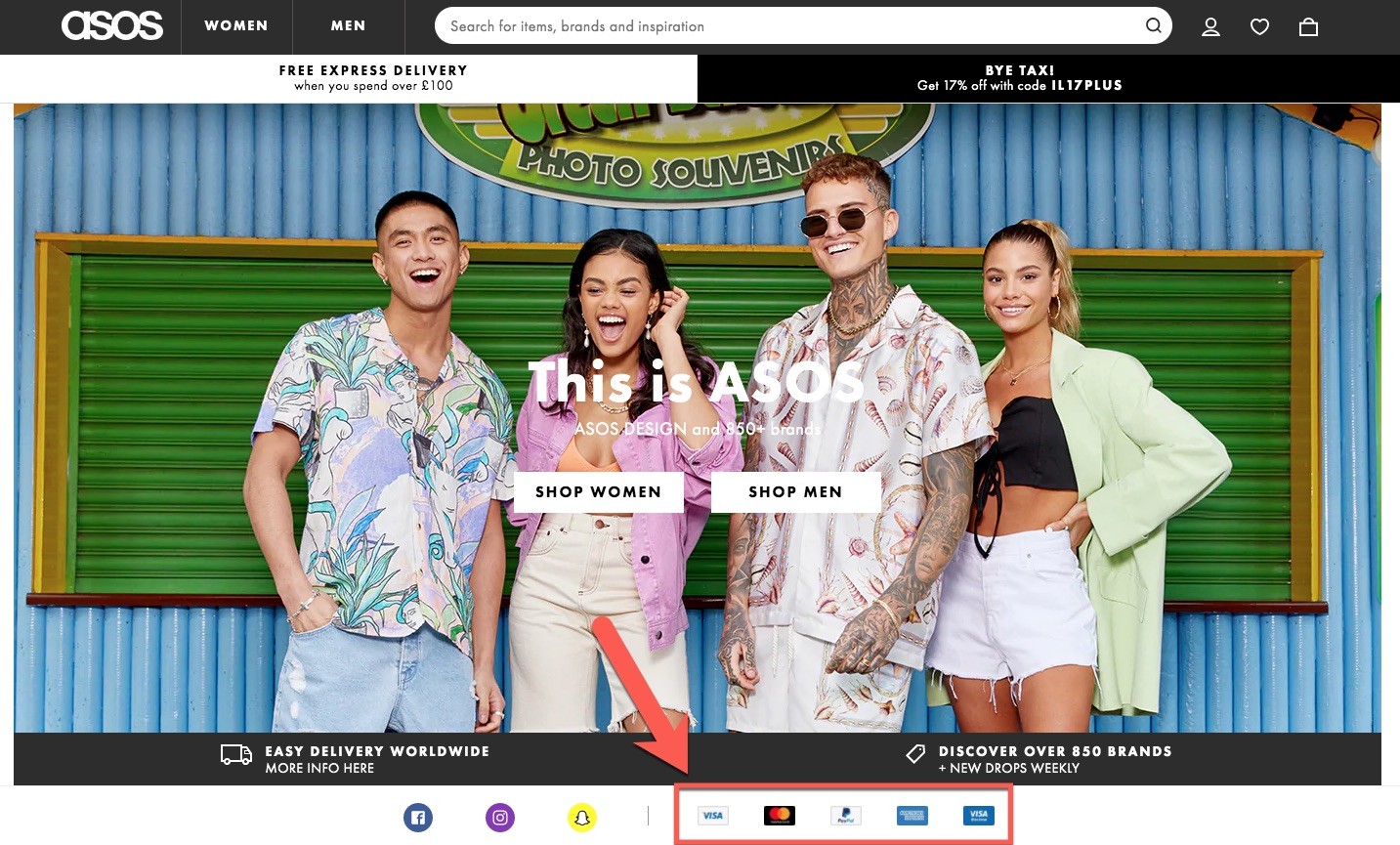
Some popular choices include online wallets like PayPal, credit and debit cards, and even cash on delivery. However, new names like Apple Pay and Google Wallet are now also in demand.
The right option depends on where you operate. For example, PayPal isn’t available in some countries. If you want to make more sales there you must offer alternatives like 2Checkout.
You Ask to Sign Up for an Account
About 37 percent of buyers will abandon a cart if they’re required to make an account to complete the process.
The process can be both lengthy and complicated. The best way to solve the problem is to offer guest check-out.
There are reasons why companies encourage or require visitors to sign up for an account. According to this Moovweb study, logged in users typically spend 10 percent more than guest visitors. Still, companies should consider offering the option to check out without having to sign up for an account.
Failing to offer guest checkout can cause 14 percent of shoppers to abandon the purchase. You will have to sacrifice some data that can be very valuable for you but for most marketers it’s worth it.
We suggest that you give users both options – to sign up or to use the guest checkout feature. You can provide some perks for signing in. Booking.com, for example, offers Genius discounts to users who choose to sign up.
Such perks can push users to sign up and login instead of abandoning the cart.
Long and Complicated Checkout Process
Buyers are typically in a hurry to purchase. They don’t like unnecessarily lengthy and complicated checkout processes.
About 21 percent of online buyers will abandon a purchase if they find the process too complex.
Make sure the checkout process is clear. Users should not be forced to go to multiple pages to reach the cart or the end of the process.
Also, avoid asking for data that isn’t necessary. According to the 2017 Baymard report, most online stores contain more than 23 field elements during the checkout process, whereas one only needs about 14.
Do not ask for information that you do not need. Review the checkout process and make sure it’s completed in a swift manner without any hiccup.
Your Website Crashes
This is a no-brainer, most users will leave a website that crashes, especially if it happens during the checkout process.
Crashes can happen due to a number of reasons such as system issues.
In some cases, the website may crash during the payment process if it’s not able to form a connection with the payment provider. This might not always be in the hands of the store since you’ll have to trust the services of the provider you have selected.
On your part, be careful when selecting a partner. Choose reliable providers and makes sure to select a hosting company that offers a good uptime so that your site does not crash.
If you expect your site to be down due to maintenance or other such causes, flash a warning so that users are well aware of the risks.
Missing Information or Details
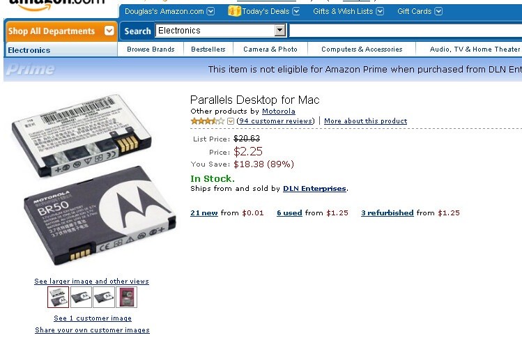
Consumers will leave a website that does not provide all the required details about a product or service. For example, the page below is bad as it tells nothing about the product.
Now look at this another Amazon example:

You will find everything you need on a single page.
Amazon allows sellers to upload everything from company manuals to reviews and descriptions. This is one of the major reasons why Amazon has been able to find such success.
Many users prefer to buy from Amazon because they know they will not have to do any research to find what they need and they’ll find everything on the web. Plus, they also have more trust on the platform due to its customer friendly policies.
Amazon allows buyers to check the FAQ section, go through reviews to know what real customers think, and check the description to know how a product works or what it offers.
Some sellers even add videos and detailed guides to ensure buyers have no confusion. You should also do the same if you wish to reduce the cart abandonment rate.
Surprises and Hidden Costs
Nothing annoys consumers like hidden costs. Imagine the horror of searching for a product under $10, selecting one, and seeing the cost skyrocket to $12 when you reach the final page.
Extra costs can be in the form of taxes, fees, and shipping. The situation can be tough for sellers but the truth is that consumers do not want to pay these ‘additional charges’, especially if they come as a surprise.
About 23 percent of buyers will abandon the process if they do not see the total cost up-front. Make sure to advertise costs on the product page. If you want to advertise the product for a lower price (minus extra charges) you can mention so on the page so that buyers know what they’re taking on.
7 Ways to Reduce the Cart Abandonment Rate
We have covered the reason with some great tips on reducing the cart abandonment rate but they alone may not be enough.
Here are a few more things you can do to reduce the cart abandonment rate:
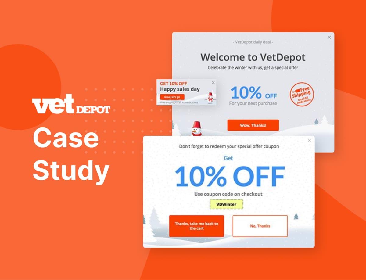
Use Exit-Intent Popups
We talked about the importance of exit-intent popups and what they can do for your website in our previous blog titled Exit Intent Popups: How to Use Them With Real-Life Examples.
Let’s talk about how they affect cart abandonment and why they’re so important.
Exit-intent popups can be defined as ‘a website’s last effort to stop a user from leaving.’
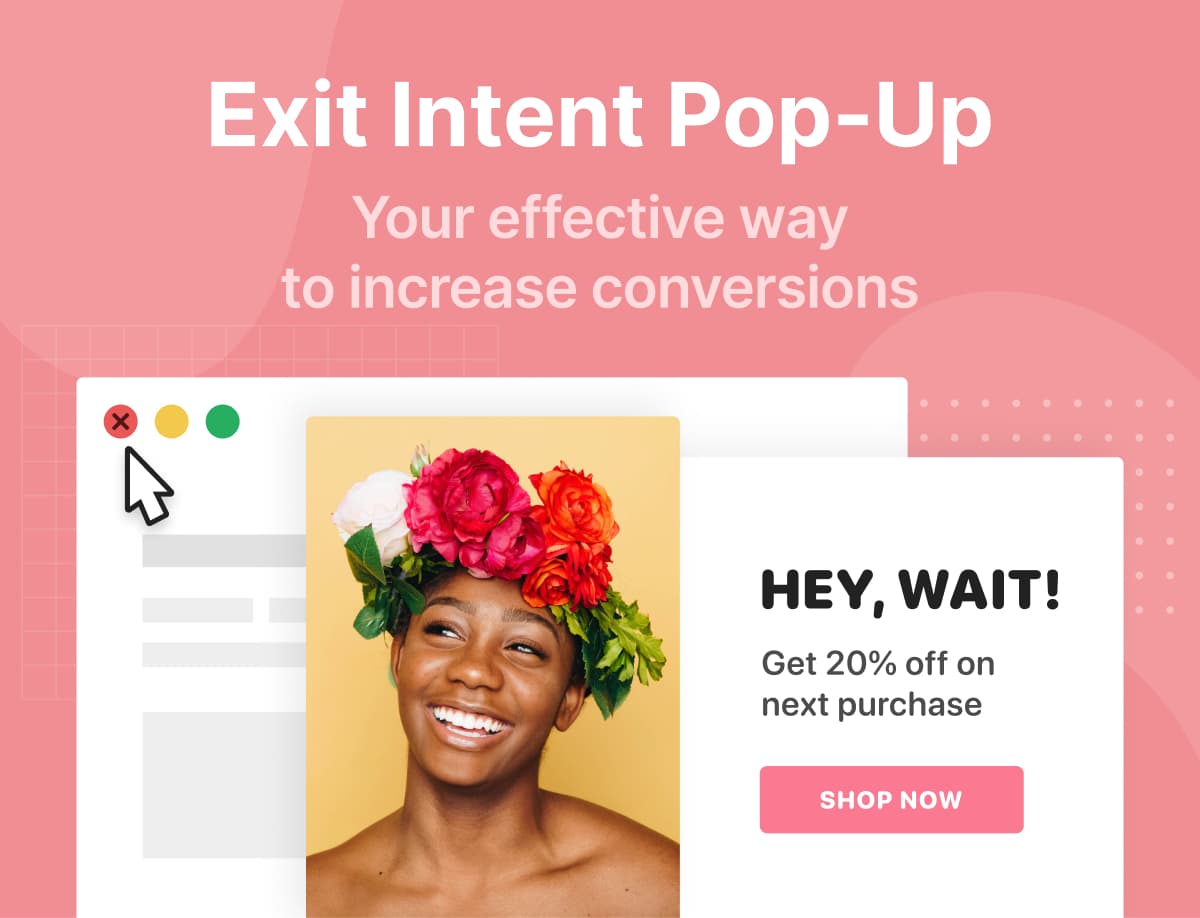
Once the system detects a user is about to leave the page, i.e. abandon the cart without completing the process, it will display a popup designed to motivate the user to complete the purchase.
We talked about several exit popups in our previous blog. Let’s talk about how exit-intent popups can be used to improve your conversion rate now.
You will have to understand why a user is leaving your site to be able to show the right popup.
For example, if you feel a user is leaving the site due to high prices, you can show a popup that offers a special discount code to the user to motivate him or her to finish the job.
Similarly, if a user is leaving the site due to expensive shipping, you can offer discounted shipping or free shipping, motivating the person to stay on your site and complete the purchase.
Exit-intent popups are effective and can be installed on almost all pages including your checkout and shopping cart pages. They’re useful even if the user does not make a purchase despite the ad.
First of all, since they’re displayed when a user has already decided to leave, they’re not as irritating as other popups. Plus, you will be able to get your visitor’s email, which you can use to send retargeting emails.
Remember that it takes up to seven attempts to convert a visitor into a buyer. You can send promotional emails to the visitor until the user is ready to buy.
You can use Adoric to create impressive exit-intent popups for use on your site or emailing campaigns.
Make Your Call to Action (CTA) Stronger
This might come as a surprise to some but CTAs are very important to make sales – even after a person has gone through what you have to offer and has added your product to the cart.
Not everyone who lands on your page lands with the intention to buy. Some are only interested in comparing products, prices, and understanding your website. However, if they’re on your site, they’re a potential client and if you play it right, you might be able to convert your visitor into a paying customer.
Tell the visitor what to do by using signs such as arrows. This can be very useful for a new user who doesn’t know your layout.
Highlight the basket or checkout button once a product gets added to the cart. Customers do not enjoy wasting time waiting for the checkout button, they want things to be quick.
You can offer a one-click checkout option as well. The key lies in highlighting what you have. It doesn’t matter how easy the checkout process is if your visitors do not know about it.
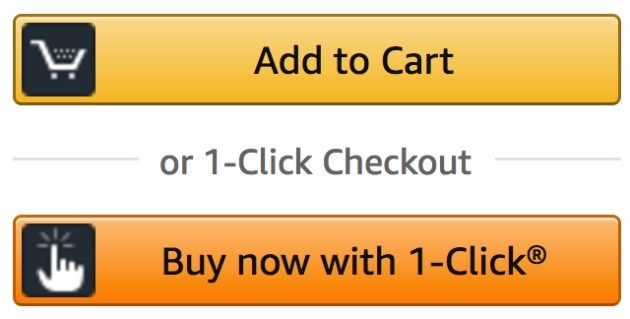
Use side bars and tickers to highlight the CTA so that your visitor can complete the process.
Allow Users to Save Carts
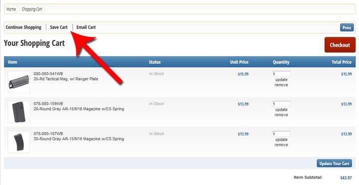
As mentioned earlier, not everyone lands on a page to make a purchase. But, at times, people who browse your site with the intention to buy a product may get distracted due to emergencies such as a crying child or a ringing phone.
They may quickly press the X button and forget about your site. The next time they wish to make a purchase, they will either have to Google again and go through the entire process or they’ll forget about your site and land on your competitor’s platform.
Moreover, more than 80 percent of buyers are comparison shoppers. They open multiple sites, compare several products, and choose what they find most suitable. Some users spend days comparing products and reading reviews.
This is why it is important that users have the option to save shopping carts so that you can retarget to reach users who previously showed interest in what you sell.
Also, if someone lands on your site and sees items added in the cart, they might go ahead and make a purchase. About 24 percent of customers demand the ability to save shopping carts because they offer ease.
It’s a great option because it benefits everyone involved. As a seller, you’ll be able to make more sales and as a buyer your visitor will get to save time and energy.
Make Sure Your Page Loads Quickly
A lot of users choose online shopping because it’s quick. This is why it is important that you pay special attention to this factor.
Remember that more than 50 percent of visitors will leave a website that takes more than three seconds to load.
A consumer looking to compare items may have several tabs open. He or she may not wait for your page to load if all other pages have loaded. The user may go ahead and close your tab resulting in you losing a customer even if you offered the best product at the cheapest rate.
So, work on your speed. You can use Google speed checker to know how fast your website is. Be careful about speed on all devices since a lot of users now use mobile devices to make purchases.
Use a Progress Indicator
A progress indicator does a simple job, it creates a sense of ‘incompleteness’ that can push buyers to complete the checkout process.
Most popular online stores use this technique to push buyers to not abandon carts.

As seen above, they place a progress bar on the page that shows the user how many steps are remaining to complete the process. This technique has been proven to improve conversion rate.
We know that people do not like unfinished jobs. If you show a buyer an unfinished task, they might go ahead and complete it. Also, a progress bar makes users feel positive as they know exactly how close they are to completing the process.
Use Scarcity and Popularity
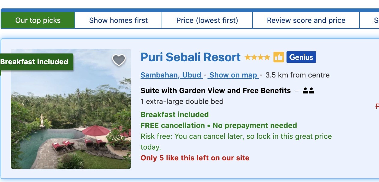
Users are more likely to spend on goods that appear rare or popular. Known as social proof, it creates urgency by showing users they may miss out on a product if they don’t buy it now.
There are several strategies to do so. You can highlight how many units you have left in the inventory or how many people have bought it in the last 24 hours. Many sites like booking.com use this technique as seen highlighted in red below:
In addition to this, you can add a countdown clock to highlight special deals and flash sales. When customers feel they may lose out on a good deal in a few hours, they may go ahead and complete a purchase.
Offer Live Chat and Support
Think about why companies spend thousands on good sales agents – because they can convert visitors into buyers. It can be hard to do so on the internet since sellers don’t come face to face with buyers. Hence, your best bet is to work on customer support and offer live chat so visitors can quickly get answers to their questions.
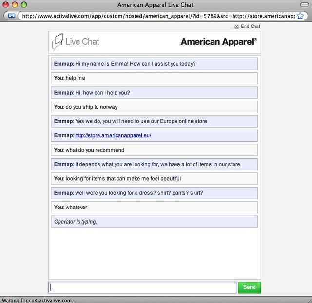
Adding a FAQ may do the job but it may not always be enough. Buyers may choose to leave your site if they do not see the option to get in touch with you and get answers to your questions
So make sure to place floating contact us buttons including WhatsApp, Facebook, and live chat.
If you can’t afford staff then you can use a bot to answer questions.
Use Adoric
Keeping the best for the last.
You can use Adoric in a lot of ways to improve your website’s cart abandonment rate.
The software is designed to convert visitors into customers. It does so by offering a variety of features:
- Free graphic elements to make your pages more attractive
- Countdown to create a sense of urgency
- Multi step messages to improve your CTA
- Embed videos to explain more about your product
- Exit-intent popups for excellent results
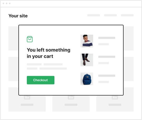
Go here to see a complete list of features.
Cart Abandonment Solutions: Conclusion
We hope these cart abandonment recovery tips will help you get better results. Understand top reasons for cart abandonment and get rid of the objections to reduce cart abandonment.

