Mobile traffic contributes to the highest percentage of global web traffic. As an e-commerce website or blog owner, the vast majority of visitors and potential consumers most likely use their smartphones to access your website. So, why do desktop users convert more than mobile’s?
The thing is, mobile users have fairly different behaviors than desktop users. A couple of factors, including users’ location, internet connectivity, and attentiveness, contributes to these behavioral differences.
This is one reason why using the same conversion strategy for both platforms is counterproductive. You’ll also need to optimize your website for smaller screens if you want to decrease bounce rates and make more sales.
Several factors can affect mobile conversion rates negatively. This article will outline some of the most effective ways to your website’s mobile conversion organically.
Here are points we will be looking into in this post:
- What is Mobile Conversion Rate Optimization?
- How to calculate mobile conversion rate
- Why is mobile optimization crucial?
- 8 strategies for improving your mobile conversion rate
- Wrapping it up
But before we get into the details, let’s define what mobile conversion rate optimization means.
What is Mobile Conversion Rate Optimization?
Mobile conversion rate optimization is the process of improving your conversions, particularly macro-conversions.
Macro-conversions, simply, are your major conversion goals. They can be anything from completing a sale to generating more leads or getting visitors to sign up for a webinar.
The main purpose of optimizing your mobile site is to include your mobile audience in your conversion strategy.
With over 52% of web traffic coming in from mobile users, more businesses are designing their online platforms with a mobile audience in mind. As such, you should take mobile conversion optimization seriously.
How to Calculate Your Mobile Conversion Rate
Calculating your mobile conversion rate is pretty easy using the formula below:
Conversion rate = (conversion/ total visitors via mobile) * 100%
For example, if your website received 15,683 visitors in the last two months, and 432 were able to convert, your conversion rate over those two months is 2.75%.
Note that conversion rates may vary depending on your industry, business, and traffic quality. Keep that in mind when checking various statistics for what counts as a good conversion rate.
Why is Mobile Optimization Crucial?
Mobile traffic represents the highest volume of web traffic. However, desktop leads tend to convert more.
Why is this? Unlike mobile users, desktop users are usually more relaxed and less likely to be on the quest for immediate information. Also, besides accessing the internet using cellular networks, mobile users use a smaller screen, which makes their browsing experience different from desktop users.
In light of these, your mobile CRO should concentrate more on speed and accuracy than your traditional optimization. While the general rule of CRO still applies, more details need to go into making your website appear welcoming to mobile users and ultimately get them to convert. If you don’t want to lose customers due to neglecting these little details, it’s important to provide both desktop and mobile users a quality experience on your website.
That being said, let’s move on to discuss 8 ways you can boost your mobile conversion rates.
8 Strategies for Increasing Your Mobile Conversion Rate
#1. Design for a Mobile
CRO (Conversion Rate Optimization) for mobile is a different ball game when the user is easily distracted or out and about. Two things you want to sort out right away is making your website navigation a breeze and tailoring its content to fit smaller screens.
First, you need to improve your user experience by ensuring that all features are well-arranged and easy to navigate. You don’t need your mobile site to have many heavy images.
Try to give your visitors a concise, yet detailed menu that shows your key products. That way, it will be easier to access all areas of your website without getting overwhelmed with all the details.
Another way to make things easy for your mobile visitors is by integrating autofill into your website. This function automatically inputs details that have been provided earlier, thus saving users time as well as the inconvenience of typing into small fields.
Asking your visitors to manually fill out form fields can make them want to abandon your website. As such, it’s best to use autofill. Plus, it helps prevent form errors.
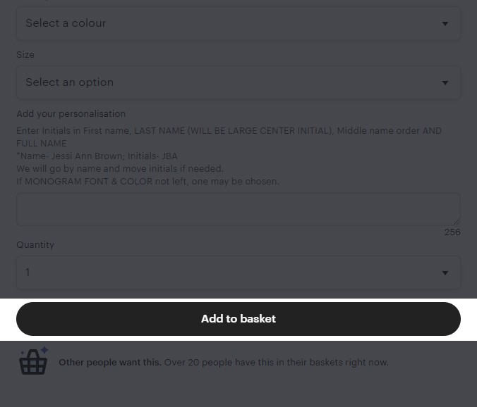
Using large buttons for your call-to-action (CTA) can equally help improve your users’ experience on mobile.
The reason is, while it’s easy for desktop users to click on small CTA buttons with cursors, mobile users have to tap on their screens continuously to achieve the same.
So, by all means, make your CTA buttons as big as possible, just as Etsy does.
#2. Keep It Simple
Keeping your page design simple has a two-fold benefit: first, it helps improve your website’s load speed and user experience.
Speed is something you cannot compromise on your mobile website, especially when a delay in load time can reduce your conversion rate by as much as 7%.
To improve your overall site speed, reduce visual content such as large-sized images.
While a good user experience partly depends on good visuals, you don’t want to bog down your site with irrelevant images and videos.
#3. Integrate On-Page Product Recommendations
On-page product recommendation is mostly used by e-commerce websites to improve their users’ shopping experience.
Implementing on-page product recommendations can also enhance the user experience. Customers can easily see relevant products without having to navigate endlessly through your website.
One of the best ways to go about on-page product recommendations is suggesting products similar to what a customer is viewing or has recently viewed.

The ASOS page above has items suggested at the bottom that are closely related to what is being viewed. Also, the design allows you to scroll through various recommendations while still staying on the same page.
#4. Take Advantage of Campaign Triggers
A study by Localytics revealed that triggered campaigns can increase engagement by 200%. Whether you are trying to sell a product or get leads, well-timed campaigns can incredibly boost your conversion rate. Some of the best tools to use in this context are pop-up ads and triggered emails.
Well-timed, mobile-friendly pop-ups and triggered emails allow you to automatically display campaigns without pissing off visitors.
With popups, you can promote your discounts and offers to your customers, easily. But for them to work well, you have to display them just when the time is right.
Showing your popups at the wrong time can lead to a high bounce rate, which is definitely not what you want for your website.
Additionally, you must bear in mind that mobile isn’t the same as desktop. As such, you can’t afford to have several pop-ups all over your users’ screen.
Due to limited screen space, filling up your page with multiple pop-ups will overwhelm your prospects and affect website navigation.
A better approach is to place one CTA on each key page of your mobile website. Consider using Adoric’s targeting and trigger features to improve sales conversion if you own an e-commerce website.

Above is an example of how Cosmetic Capital effectively infused a pop-up on their product page. The pop-up invites users to enter their emails to get 5% off their purchases. Also, users can scroll through the page seamlessly without the pop-up getting in their way.
#5. Provide E-wallet Payment Method
Due to payment method distrust, a whopping 19% of customers abandon their carts. With the abundance of financial information stored on smartphones, buyers want to be sure their financial details are secure.
The best way to address such concerns is to offer e-wallet payment methods such as Android Pay, Apple Pay, and PayPal.
Digital wallets are secured with multiple layers of encryption which makes them the safest option when making online purchases. For eCommerce websites, an easy and safe payment process is the last step towards achieving macro-conversion.
Digital payment methods also go a long way in making payments intuitive and seamless on mobile platforms. One of the biggest challenges customers face while shopping on their smartphones is having to fill in billing information on smaller screens. The process is mostly viewed as inconvenient or laborious.
Improving your website features for mobile use allows customers to pay for items in their carts without having to re-enter financial information every time they make a purchase. Digital wallets are your best bet if you want to make checkout easy and convenient for your customers.
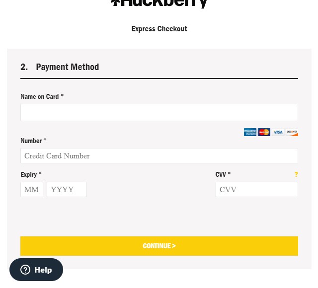
In the example above, you can see that Huckberry offers its customers different payment options. This includes Visa and Mastercard, American Express, and Discover.
#6. Prioritize Privacy & User Trust
How safe are the personal information users’ entrust you with? Until you guarantee your mobile visitors that their personal information is safe with you, they won’t convert.
Mobile users are more likely to have their passwords, app login info, and financial details stored on their phones. So, they tend to be extra vigilant about the websites they visit.
Here are some of the ways you can get your visitors to trust your website:
- Make your website secure with HTTPS that can enhance the trust of users and encourage them to deal with the site in a confident way. To build privacy and trust, you can go with different SSL certificates like RapidSSL certificate and other branded SSL certificates from GlobalSign, Sectigo, etc. It builds a secure tunnel between the server and the browser for smooth and secure data transition.
- Add trust badges to your web page. Trust badges let your prospects know they are on a legitimate site and all data shared are safe and secured.
- Display testimonials and reviews from other customers to prove your legitimacy. The more testimonials you add, the more people will trust you.
#7. Use Stronger CTAs
Call to action buttons are powerful tools you use to get visitors to perform certain actions. This could be making a purchase, signing up to your mailing list, etc.
While every visitor that browses your site is a prospective client, not all of them have the intention to buy. Some visitors come to your page to compare prices, check product details, or learn more about your website.
But with a strong CTA, you can convert this set of visitors into customers.
A good CTA should be clear and straightforward – it shouldn’t leave your visitors wondering what exactly you want them to do.
Also, it must be easy to find, and clear enough to guide your customer to make the required move.
You don’t want to bombard users with CTAs to the extent that they stop taking them seriously. However, they need to be visible enough to make an impact.
Let your visitors know what action you want them to take by using strong command verbs such as “Shop,” “Download, “and “Subscribe” as your CTA. To infuse a sense of urgency or enthusiasm, try using phrases like “buy now and get 40% off!” and “Sign up Free.”
For example, have a look at one of our CTAs here at Adoric.
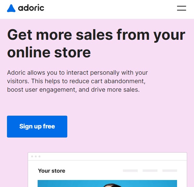
Notice how big the “sign up free” button is on mobile? That’s how yours should be, too.
#8. Optimize Your Site for Search
Your mobile site greatly affects your online visibility. Why? Google uses a mobile-first index when ranking web pages. This means crawlers locate your mobile web page first before your desktop site.
Most of the strategies you need to adopt to optimize your website for mobile users are what we have discussed earlier. These strategies include improving user experience and navigation on your website and ensuring all pages are well designed.
However, you also need to optimize your website for search. One of the ways you can go about this is by writing keyword-rich meta descriptions for your blogs and pages. In addition to that, embed your target keywords into your post and page titles.
Optimizing your mobile site for search engines makes it easy for your customers to find your products by placing your content display on search results. On the contrary, using the wrong title tags will attract the wrong audience, lead to low click-through rates, and in turn, result in higher bounce rates. Google’s mobile testing tools can be used to check the performance of your site and get useful suggestions on how to solve issues.
Wrapping it Up
Optimizing your website for mobile has lots of benefits, most of which we’ve looked into in this post.
So, if you haven’t started already, it’s about time you did.
Thankfully, we’ve shared with you quite a number of strategies you can use for this purpose.
Mobile conversion optimization is not limited to what we have discussed above. New ideas on how to improve conversion rates are discovered every day as market trends evolve. Implement the most suitable strategies for your business to get the best results.
Remember, the focus should be on speed, efficiency, and convenience. Ensure you provide a good user experience to keep your visitors engaged and eager to return for future purchases or more content.
We hope you have found some useful tips in this article to help boost your mobile conversion rates. For more powerful tools to optimize your website, start your journey with Adoric by signing up for a free account.
