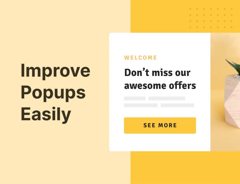
Believe it or not, pop-ups work – that’s why you see them everywhere. If you want to connect with users, have them give you their email plus contact details to create powerful marketing funnels, popups will make that happen.
We’re going to walk you through key design basics you will want to think about when intending to generate high conversions and transform your business.
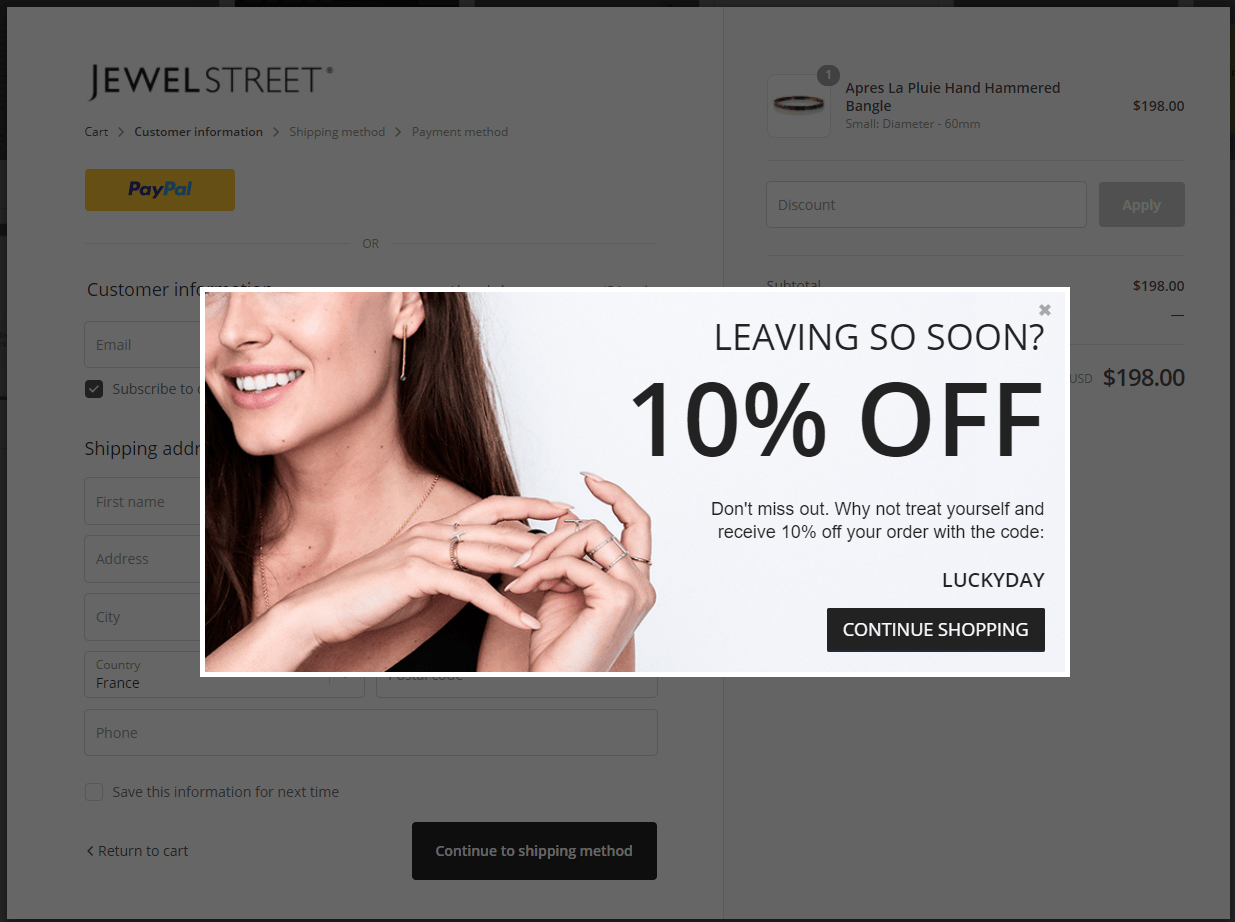
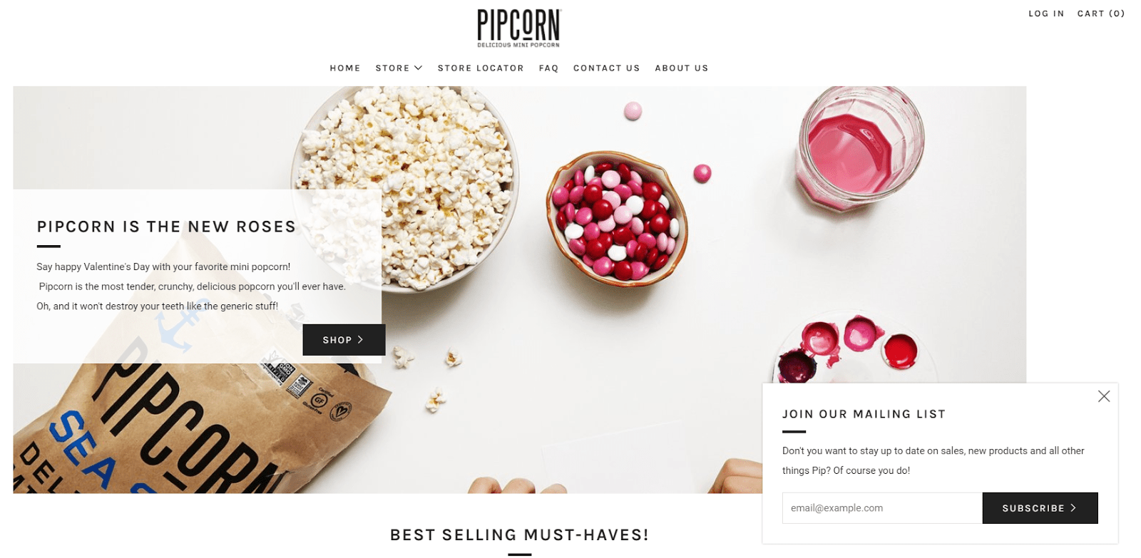
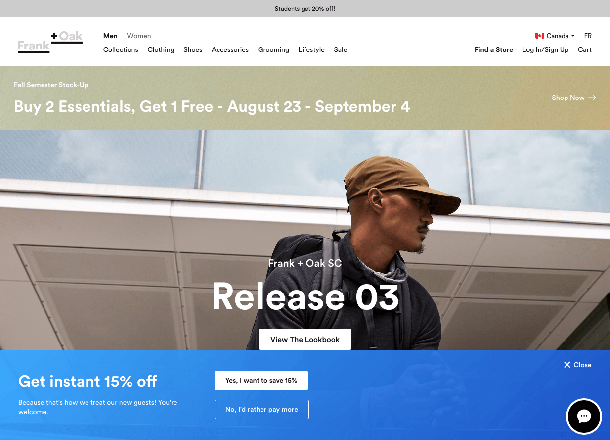
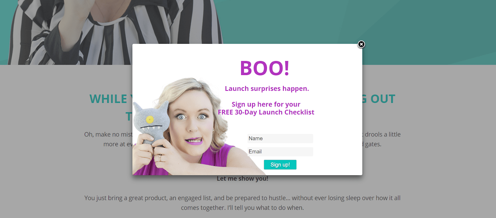
Centered popups always catch the eye
Some customers will tell you that popups that appear in the middle of the screen annoy them, but they will certainly catch the eye. With this type of popup, you’re forcing people to look at what you show them, so you might want to think about the right time to deploy it.
It’s no use having it appear over your website’s pricing information because all this will do is distract the reader at a crucial moment. Choose the moment wisely, deploy them sparingly, and you’ll have everything you need to catch the eye.
For instance, you can choose to pop a discount message only to users who added certain products to their cart (via Adoric Events or Cookies) and are about to leave (via Adoric Exit Intent).
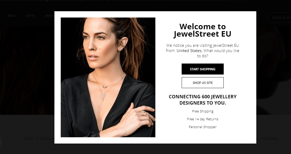
Community-focused popups are super effective
The CEO of PickWriters spoke on the matter recently: “The big reason why so many popups are annoying to users isn’t that they are advertisements: it’s because they are often far too generic. Try to put the focus on a specific group of people or startups or a community that you want to attract. If you already have an established community of loyal customers, use their reviews as a part of your pop-ups.”
You can photograph a product and put it on your popup with no problem, but it’s far harder to do it with a service. If you are a SaaS company, a platform, or an app, then it can be hard to know what to do. “In such cases, you can use special SaaS marketing email templates and include information about your services, functionalities, and even digital products.
Alternatively, you can add countdown timers to your popups. Countdown timers are effective at creating a sense of urgency, which in turn helps to boost conversion.
Emphasize your product benefits
If you have a product that’s designed to look great and appeal to people with a particular taste and style, then you need to show it in all its glory. Take the time to produce a stunning vision that does your product justice, while showing it doing its thing in a real-world setting.
In another instance, if your product meant to be educational, you will probably need to emphasize the “power” of the knowledge inside, etc.
Every product has its benefits, so you should emphasize different once you do that, you’ll be able to get people to punch in their email address without a moment’s thought.
Add such vivid images or even short videos of satisfied people using your product to your popups because they will instantly attract the attention of the viewer more. Considering how everything focuses on aesthetics nowadays, invest some time and creative energy into perfecting the product’s presentation in your popup.
Keep it simple
If you have a clean, crisp, and minimalist brand, you’ll need to create a popup that maintains this clear sense of identity. Going for something high energy and sales-orientated isn’t the way to go in this instance, so keep your brand identity at the forefront of your mind when designing the popup.
Keep the background to your core color, pop your customized logo at the top, and place a simple tagline underneath it. There’s no need to ask for contact details explicitly, the input field will be more than enough.
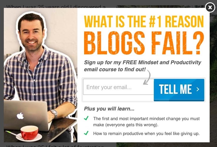
Deploy a call to action that doesn’t make users think
Calls to action don’t always have to tell the audience what their next step should be. Sometimes it’s more effective to ask a question that will spark their interest and urge their necessity to know the answer.
Take as an example Yaro Starak who is using this tactic on his blog. He used the popup to state a question to which every blogger will want to know the answer without thinking, and that is how he will get their information.
Sometimes minimalism is all needed
Sliding down the page and having a popup appear subtly in the corner is a good way of approaching things. This can give the impression that it’s there to help your customers get the answers they want, and enables you to avoid that horrible spammy look that instantly puts most people off. If they keep scrolling for long enough, you could even set it up so that it slides back out of the way.
Bars have no chance to annoy users
The simplest, most unobtrusive form of a popup is the bar. For best results, you want to have it either at the very top or very bottom of the screen. Keep the text to no more than a 5-word tagline, and only have one input field. If your customers want to use it, they’ll know what to do.
Any popup can turn into a bar by adjusting its position and extending it’s width to the maximum. The best part is that all the smart triggers & audience conditions can be applied to horizontal layouts according to the banner design.
Add a fun spirit into your popups
Putting a simple smiley face on your products or deploying a cute mascot is a sure-fire of getting people’s attention. Follow the crowd with this one and you’ll be able to engage with far more customers than you would if you took a more overt approach to lead generation.
Moving things are harder to miss
Take things to the next level with a little animated icon, and you’ll be able to hold the attention of the viewer. Ideal if you want to put a smile on their face, so they’re more likely to put their contact details into your popup!
Adoric animations allow you to control the way your popup and its elements will pop, from entrance effects and directions to animation-delay and duration.
A message popup with animation. Create easily & for free on Adoric.
Word games are magical
Word games perhaps are not easy to do right, but one of the most productive animation styles when you nail it. Find a funny, lighthearted, and casual way to get your core message across, and you’ll reap the rewards as people tap in their details. Ideal if you want to make the process fun for everyone involved.
Create powerful popups & inbound marketing with Adoric
You surely have goals for your website. Adoric is the ideal software to create your inbound marketing by implementing content according to audience conditions and smart triggers.
Final Thoughts
Whether you run a company as big as Nike, or a startup fashion label, popups are a vital tool you need if you want to connect with more people. They’re a great way to get people to sign up for newsletters and alerts and are ideal for starting a targeted email list where you know everyone is interested in what you have to offer. Choose the right design to fit with the core identity of your brand, and you’ll be well on your way to growing your business.