Popups can be a great marketing asset or a nuisance….it depends on how you implement and use them.
Used correctly, they can help you generate massive sales. Plus, they can be instrumental in helping you grow your mailing list and win more subscribers.
We get it. Optimizing your popups for better conversion can be a lot of work. This is one of the major reasons people quit on them early. Tempted to quit too?
Hang in there a little more. In this post, we will show you tips to make your popups convert better in 2023.
Our goal is to help you generate more sales and take your business to a higher level with popups.
Let’s dive in right away.
What are Popups?
Popups are basically modal display boxes you see on a website. They often appear a few seconds after you land on a website. Sometimes, they are programmed to appear when you attempt to exit a page or click a button. They look something like this:
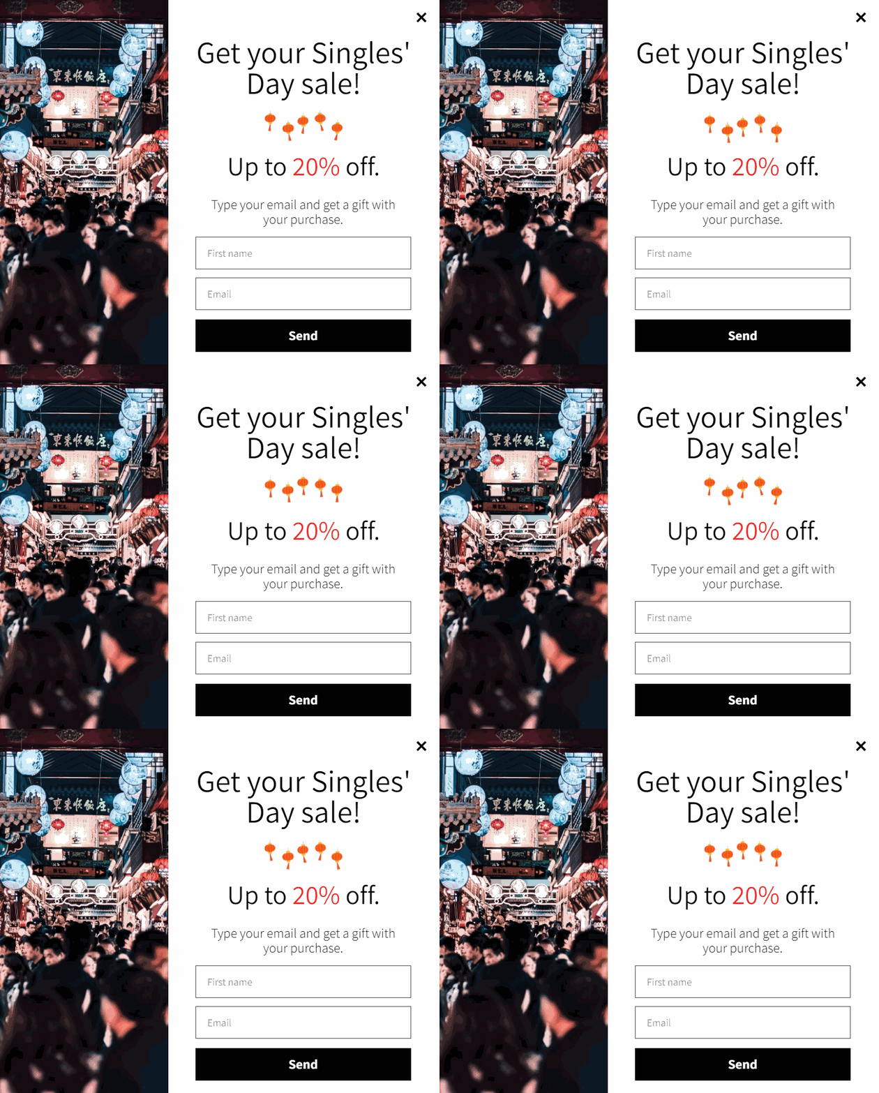

Though used for several purposes, the primary use of popups is to collect visitors’ information, such as email and phone numbers.
You will also find them useful if you want to create brand awareness, promote a new product, run a sales campaign, build your email list, boost sales and increase conversions.
No matter what goal you want to achieve with popups, it’s important to use them subtly so as not to annoy your visitors.
The problem, though, is that popups can be tricky to use. A study by Optimonk showed that the average conversion rate of popups is about 11%.
Achieving such a conversion rate can be challenging especially if you are new to using popups. But that shouldn’t bother you because we are about to share tips to make your popups convert better.
But first, let’s talk about some of the benefits of using popups.
Why are Popups Beneficial for Shopify Stores?
1. Popups Improve Sales
Popups can help improve sales on your website, no doubt! However, are you actually doing the right thing and organising the right metrics to measure your goals?
Well, popups are simple yet sophisticated tools to boost sales to your online stores. When used properly, they can be a tool to engage and communicate with your customers.
There are many ways you can use popups to improve your sales. One is displaying them when visitors attempt to leave your website. Technically, this is known as exit-intent popups.
Exit-intent popups are great for winning back shoppers who started checkout but didn’t complete it.


Also, you can upsell and cross-sell your customers with gamified popups. A good example of a gamified popup is the spin-to-win popup.
Adding a countdown timer to your popups can also make them more effective, as they are effective at stirring a sense of urgency in people. Also, showing your popups at the right time will increase your chances of conversion. For example, you can display them X seconds after visitors land on your page.
Talking about improving sales, we co-wrote an article with WideBundle in which we shares tips for improving sales and AOV (Average Order Value). You can read more about it here.
2. Popups Help You to Build Your Email List
The money, they say, is in the list. This statement couldn’t be truer when it comes to selling online. In essence, you need a large email list to improve your chances of making healthy sales.
Building a strong email list can be daunting especially when you try to collect emails manually after every purchase.
However, with popups, it is effortless. All you need is to entice visitors with a discount or a coupon in exchange for their email. Retargeting your popups can also work if you do it well.
3. A Great Tool for Customer Feedback
Popups are also a great tool for surveys and collecting feedback from your customers.
These feedback popups can be a single question or multiple choice question or a direct question depending on what you need answers to.
You can display them as an exit-intent popup with a cancel button that gives users the option to opt out of your survey.
These popups can help you to collect insightful messages when done right and make sure you don’t bombard your customers with too many survey questions.
Doing this may irritate customers and make your website a blacklist where you don’t want to be.
To rip these benefits, there are certain strategies you’ll need to incorporate into your popup to keep customers on your site and make purchases.
Next, we’ll discuss the tips to increase conversion rates with popups.
Strategic Tips to Improve Conversion with Popups
1. Set Attainable Goals for Your Popups
You do not want to use popups because other websites use them. A clear understanding of your popup goals and how to achieve them should be your paramount concern.
First thing, write out the objectives of what you want to achieve with your popups.
Do you want to use popups to create brand awareness, promote a product, run sales campaigns or build your email list?
Answering these questions will take you one step closer to attaining success.
Secondly is the timing for your popups. Displaying popups at the right time to your customers is one skill people tend to overlook which costs them more.
Showing popups too early on your site may annoy customers which can make them leave your website. Too late, the customer may not get to see them.
So, you need to understand your site visitor’s shopping experience to determine the most convenient time to display popups.
Next, is how you want to measure success with your popup campaigns.
How do you measure impressions, i.e. the number of people that saw your popup? The number of people that click on the popup, i.e. if people actually clicked on the call to action. Thirdly, the number of click-through rates i.e. the number of people that landed on the redirected or sales page.
2. Choose the Right Popup for Your Campaign
Using the right popup for the right purpose is equally important.
Popups for sales promotions may differ from the ones for lead generation, so it is best to use the right one for the appropriate occasion.
While at it, ensure you take the necessary step to keep it simple. Below are some tips you will find helpful.
For Lead Generation
A simple form with a clear caption and a subscribe button is the best option for your popup, you may want to include an image to give it a bright look.
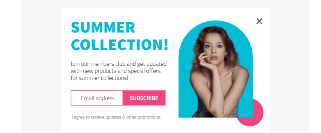

Likewise, you may want the popup to appear as a floating tab on the screen. This is the best when you don’t want to disrupt your visitor’s experience.


For Promotion
This is where good graphics is important. The popup needs to be bright, eye-catchy, colourful and flashy. Your customers need to see your offers and bonuses at a glance to achieve your goal.
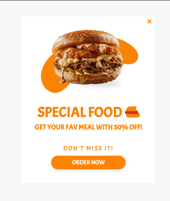

Gamification
Engage your shoppers and make popup fun with gamified spin-the-wheel popups. This is a wheel that gives your visitors a chance to win discounts by spinning a wheel of luck.
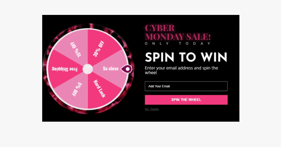

Customers spin the wheel to win any of the defined prizes. It is also a fun way of collecting customer email addresses in exchange for a prize.
3. Request only Vital Information
When creating your popup, you may be tempted to try to get lots of information from your customers.
These pieces of information may vary from their choice of products, and brands, their shopping history and journey or their private information.
While these may be good, they may not be the best tool to use for collecting these pieces of information.
Besides, people who have concerns about their privacy may feel threatened by your questions and move away from your page.
I know you don’t want that!
It is important to keep it short while you ask only critical questions such as the email address or phone number.
These pieces of information are enough to build your email contact list.
4. Always Create a Sense of Urgency
Creating a sense of urgency with shoppers will also help your popups convert better. To do so, you just need to entice them with an offer and give them a limited time to redeem it.
Phrases like “Limited number of products left”, “Offer ends soon” or “buy while it lasts” are some of the most used words.
However, the best way to create urgency on your popup is with the countdown timer. Very effective as it comes down live to the end of sales or promotion.
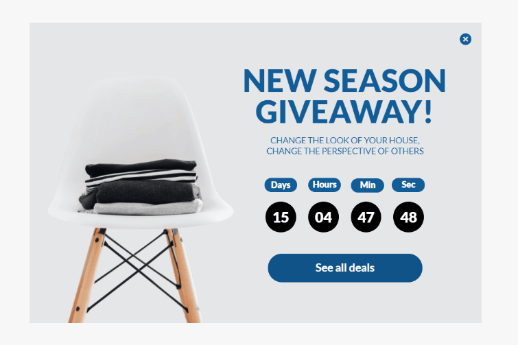

To customers who do not want to miss out on the sales, this will be a good reminder to shop before the end of the sales.
5. Be Creative
In creating a popup, there are basic factors to consider. When you successfully integrate these into your design, it will make your design stand out among its competitors. They are:
- Text Font & Size
- Colour Palette
- Imagery
Fonts
Use fonts that are easy to read. Use bold letter
The subheading and popup body should be written in readable fonts that can be easily seen at a glance on the popup.
Likewise, the button texts are not exempted. Button text needs to be visible to help the customer on the next line of action.
Colours
Colour is significant to great design. Dull colours will make the design boring, and too bright makes it difficult to read. There should be a balance of colour in your popup designs.
Use contrasting colours for your designs to make them visible and easy to read. Not too sure of what colour to use, you can always go with your website theme colour. It gives your site a sense of uniformity and orderliness.
Imagery
Though images are not mandatory in popups, it is preferable to add them. It helps to increase the aesthetic look and makes the popup stand out.
And you know, popups with images tend to convert better than those without. However, it is better to add images related to your marketing goals.
For example, if are running a discount sales campaign for luxury bags, it will be nice to include a luxury bag image so the popup can catch your visitors’ attention instantly.
6. Designs Should be Mobile-Friendly
Considering the fact that there are over 5 billion mobile phone users with access to the internet, needless to say, your popups should be mobile-friendly.
So, it is a good idea to create popups that look perfect on every mobile screen.
Importantly, you can create your own mobile-specific designs different from the desktop view. That is to say, your popups should have a slightly different look on mobile.
Luckily, there are some good popup apps that can create beautiful design templates you can choose such as this Shopify popup app.
7. A/B Test Your Popup
To further improve your popup conversion rate, you need to carry out multiple tests on different variations of your popups.
A/B testing is advantageous because it helps you to understand what your customers like and the things they need.
For some popup variations, you may want to use a different colour, timing of the popup, and design. You can also try using a different reward.
You could even take things a bit further by targeting different audience demographics.
With time and continuous testing, you will figure out what works best for your customers which will keep you ahead of your mates.
Conclusion
Popups are and will continue to be a great conversion tool that helps Shopify businesses build their email list, generate more sales and grow their brand awareness.
We believe with these 7 tips to make your popups convert you will be able to take charge of your popups and grow your business to the next level.
Ready to start creating attention-grabbing popups that get sales? It’s about time you added Adoric to your Shopify website. Adoric makes creating sales-driven popups a breeze.

