So, you have your eCommerce website up and running smoothly. Maybe you’re getting lots of traffic too. What if many of your visitors just look around to see what you’re selling, admire your website’s layout, and put some items in their cart, only to forget all about them?
This is called cart abandonment- and it happens a lot!
For today’s post, here are points we will cover:
- What is cart abandonment?
- What are cart abandonment recovery emails?
- 17 examples of cart abandonment recovery emails
- Best practices for writing and sending cart recovery email
- Conclusion
What Is Cart Abandonment?
In simple terms, cart abandonment happens when visitors add items to their cart but leave the website without buying them.
Sadly, cart abandonment happens often in many kinds of eCommerce businesses. In fact, in March 2020 alone, an alarming 88.05% of shopping orders were abandoned. A survey of online shopping cart abandonment between 2006 and 2019 puts the global cart abandonment rate at 69.57%. This amounts to a staggering $4.6 trillion in lost sales every year.
This means that if you have an eCommerce business, you are probably losing about two-thirds of the total sales you could potentially make to cart abandonment.
But there’s good news: there are a few ways to recover most of those lost sales. Some of them include using cart recovery emails, increasing the speed with which your website loads, optimizing your checkout process, and others which you’ll find here.
In this article, you will get to learn how cart recovery emails can help you win back abandoned cart sales.
What Are Cart Abandonment Recovery Emails?
Cart abandonment recovery emails are email sequences you send out to customers who failed to complete their checkout process.
How does it work? Usually, the user’s actions such as searches, carted items, and purchases on an eCommerce website are tracked and recorded. So, if the user adds items to their cart but doesn’t complete the checkout process, the eCommerce website recognizes their behavior to be cart abandonment.
If they signed in with their email address, an email sequence tailored to the user’s activity is automatically triggered. The email sequence reminds them about their abandoned items and encourages them to complete their purchase.
Wondering what a cart abandonment recovery email looks like? Here’s one from Dyson.
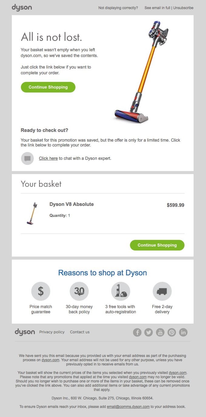

Here’s why it’s worth using the abandoned cart email strategy to get your visitors back:
- 45% of abandoned cart emails are opened.
- 21% of these emails get clicked on.
- Half of the visitors that click through these emails complete their purchases.
Putting together a cart abandonment email isn’t difficult.
To make things easy for you, we’ve compiled 17 examples of such emails that you can draw inspiration from.
17 Examples of Cart Abandonment Recovery Email That Worked
Is writing a recovery email looking like a daunting task already? Fret no more! Here are pro examples that you can get some ideas from:
1. MCM
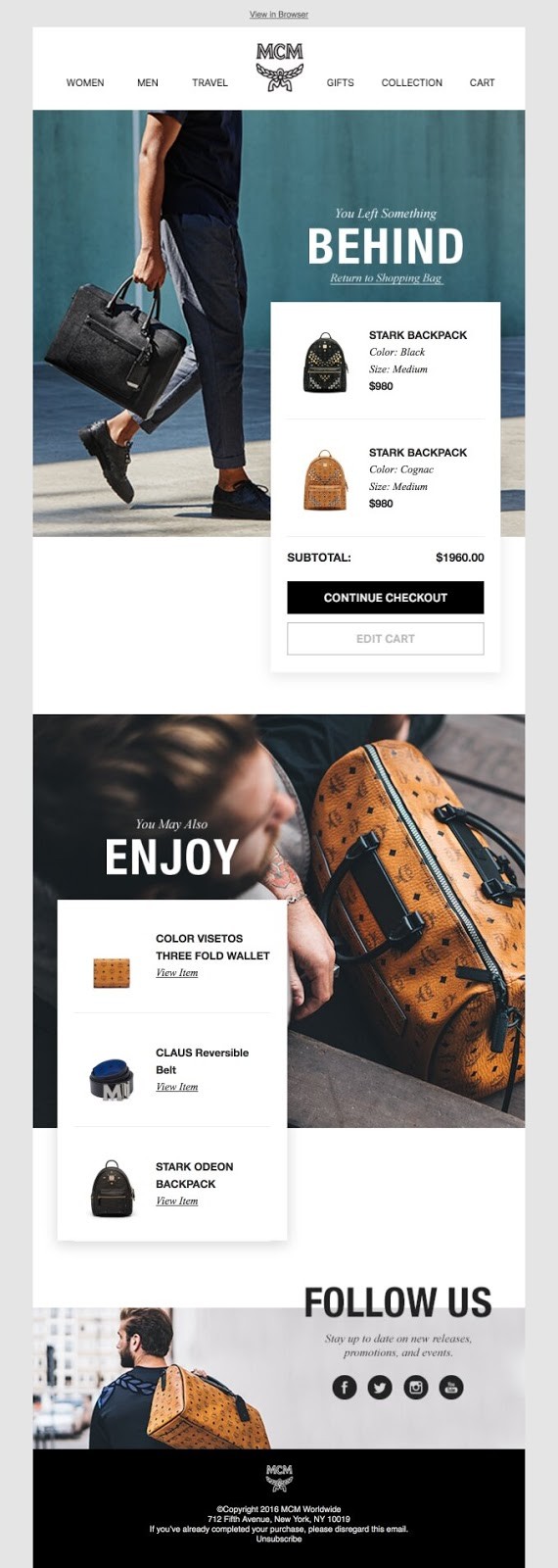

MCM, a leather luxury goods brand, makes its email copy simple and direct. They simply remind the abandoning visitor that they’ve “left something behind”.
In addition to that, they recommended three products that are related to what the visitor abandoned in their cart. That’s product recommendation at play.
Did you notice the overall design of the email? It is similar to their shopping page design. Apparently, they did this to keep the user experience consistent.
2. Society 6
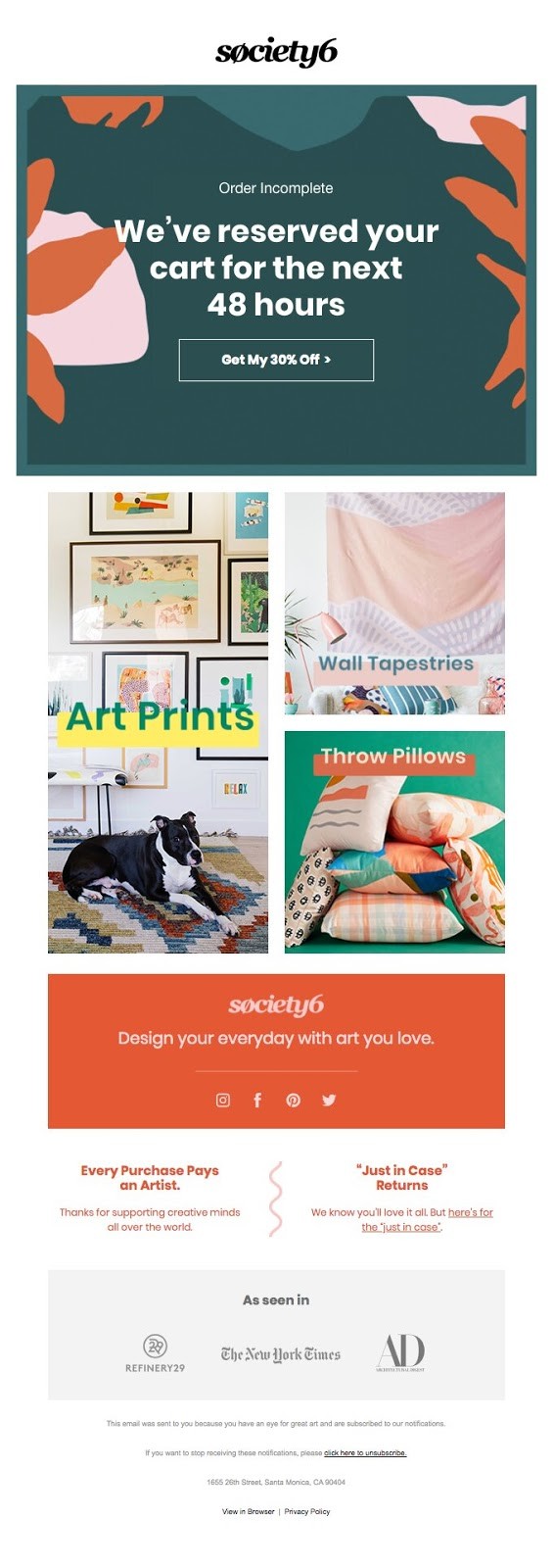

Using expressions that show scarcity makes your abandoning visitors respond faster. Society 6 uses this strategy in their cart abandonment email. They also threw in a discount to sweeten the deal.
The CTA button displays the discount offer which makes it hard to resist clicking on it. Combining these two strategies in one email increases the chances of getting a purchase out of the visitor.
Towards the end of the email, they tell their visitor where the proceeds from their purchase go: to supporting artists. That way, they trigger the sentiments of the customer who likes to support a good cause.
Knowing that many people have concerns about buying things online, they also highlight their return policy. With that, they assure the customer of a risk-free purchase.
3. Food52
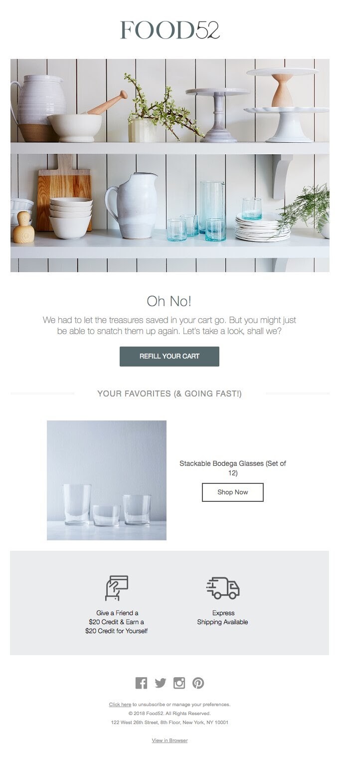

This is a follow-up cart abandonment email from Food52. The subject line –Oh, No!– gives a sense of urgency and rouses curiosity too. The customer feels like “I just must open this email”.
The email copy heightens the scarcity of the product, then gives the customer a sliver of hope that has them thinking they can get their items back if they can checkout fast enough.
The CTA is another opportunity for the customer to refill their cart. This is an excellent email copy that is highly compelling but balances its urgent tone with a CTA that is non-forceful.
4. Ugmonk
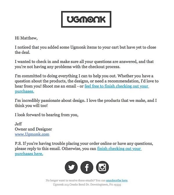

Ugmonk is a brand owned by Jeff Sheldon and prides itself on the simplicity of its products. So, it’s not a surprise that their cart recovery email is simple and written in a friendly and personal tone.
While there are no images or any other graphic elements, this email copy focuses solely on personalization. They also include two CTA links in the email that allow the customer to check out instantly.
It doesn’t just act as a cart recovery email, it also creates an opportunity to foster a relationship with the abandoning customer. After all, the end goal is to have loyal customers, isn’t it?
5. Lego
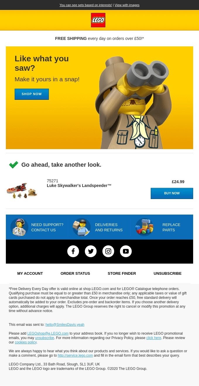

Lego starts by highlighting a free shipping offer that might interest the customer if they were scared away by shipping costs. They also tried to re-engage the customer by asking them if they liked what they saw.
They’ve also added two checkout buttons with different CTAs. This, added to the free shipping, helps to increase the chances of winning back a lost sale.
6. All Birds
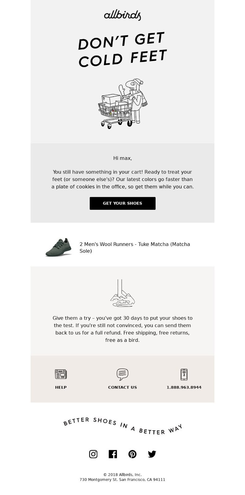

All birds, a footwear brand, infused humor into their subject line. This instantly engages the customer and prompts them to open the email.
They follow this up with a simple email copy that creates scarcity for the product. Did you also notice that the CTA button is too inviting to ignore? A click on it will take users back to their abandoned cart. Brilliant!
7. Doggyloot
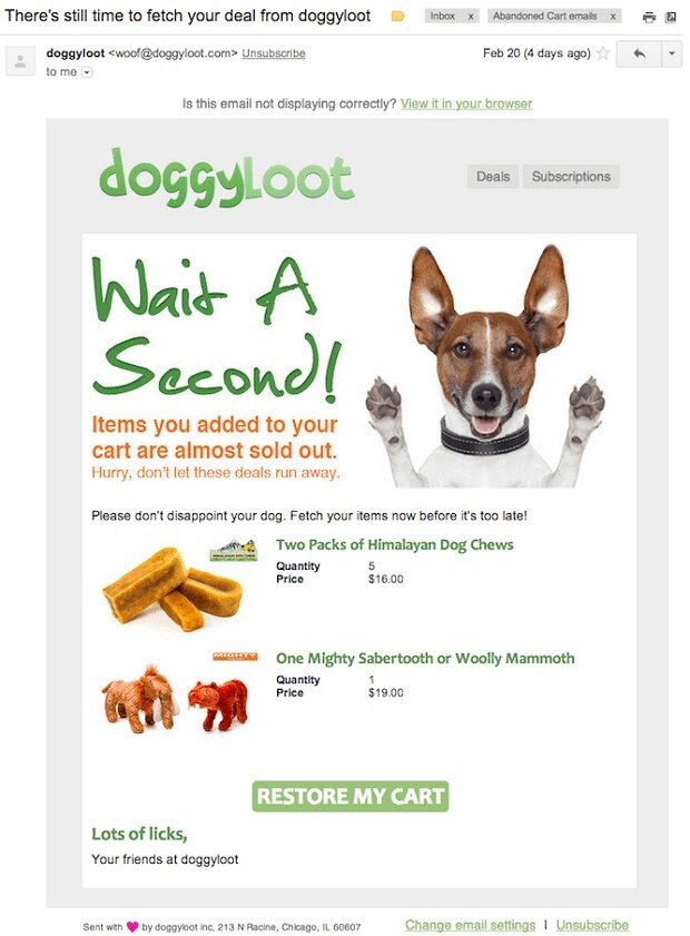

Doggyloot clearly understands its audience. Apart from images of the items in the customer’s cart, they also include dog imagery that is bound to pull at a dog lover’s heartstrings.
They also tell the customer that the products are in limited quantities thereby adding some urgency to their messaging.
By appealing to the emotions of its customer and creating a sense of urgency, the customer will likely complete their purchase without further hesitation.
8. Dollar Shave Club
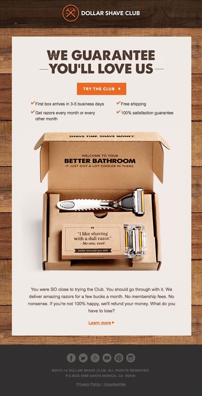

Dollar Shave Club is known for its laid back tone with which it addresses its audience. This cart recovery email is no different.
It starts with a bold guarantee that makes the customer want to read further for proof. This is followed up closely with a list of benefits the customer gets by completing their purchase. By putting the product in the spotlight at this point, it is easier for the customer to click on the checkout button.
Like Dollar Shave Club, highlighting the benefits that come with buying from you might be just what you need to get your visitors to clear out their carts.
9. Addidas


Adidas starts with an intro question that is bound to get the most uninterested person curious. The email copy continues with the same concerned tone. It also highlights an additional value that the customer gets from completing their purchase- the chance to get custom designs made especially for them.
If you also noticed, customer reviews take up a major portion of the email. This is one way to create FOMO (fear of missing out) with your abandoning visitors. Adidas adds another CTA just after for the benefit of customers that have to read that far to be convinced.
10. Huckberry
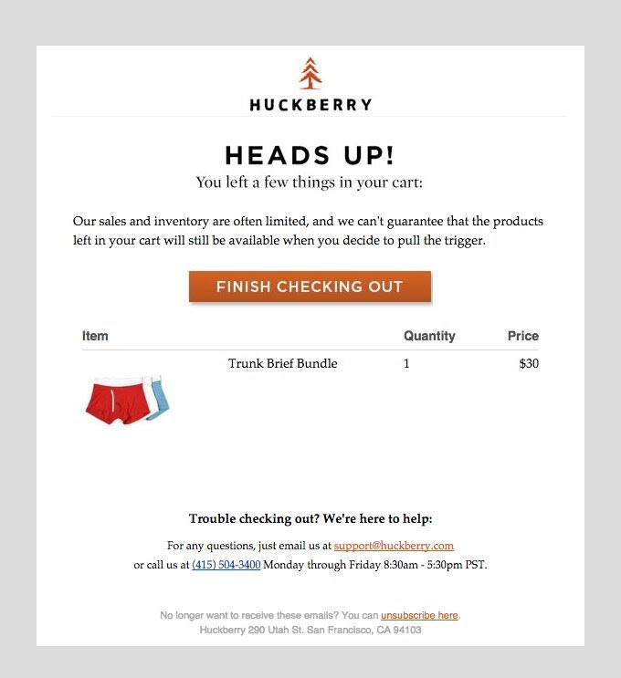

Huckberry adopts a simple design for its cart recovery emails. Their message is simple and straightforward too.
They are also sincere enough to tell the customer that they can’t guarantee that their items will still be available when they are ready to purchase them. Anyone would want to act fast after reading that.
11. Fabletics
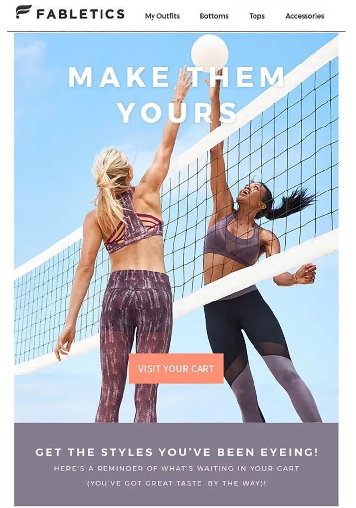

Fabletics is known for its sportswear, footwear, and accessories, hence the image in this cart recovery email. It uses very few words and simply says to the customer: “Make them yours”.
The bold-colored CTA button stands out in the email and prompts the customer to visit their cart- to complete their purchase, of course.
12. Amazon
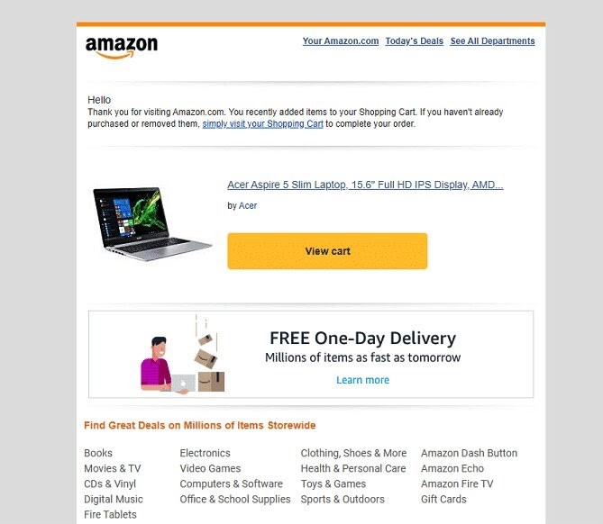

Amazon, though an eCommerce giant, still uses emails to drive sales. With a straightforward message and a picture of the carted item in their cart recovery email, they get many of their abandoning visitors to complete their purchases.
You can also see one of Amazon’s main selling points: free one-day delivery for its prime subscribers.
With this information, the abandoning visitor is more likely to click on the CTA button and complete their purchase.
13. Vans
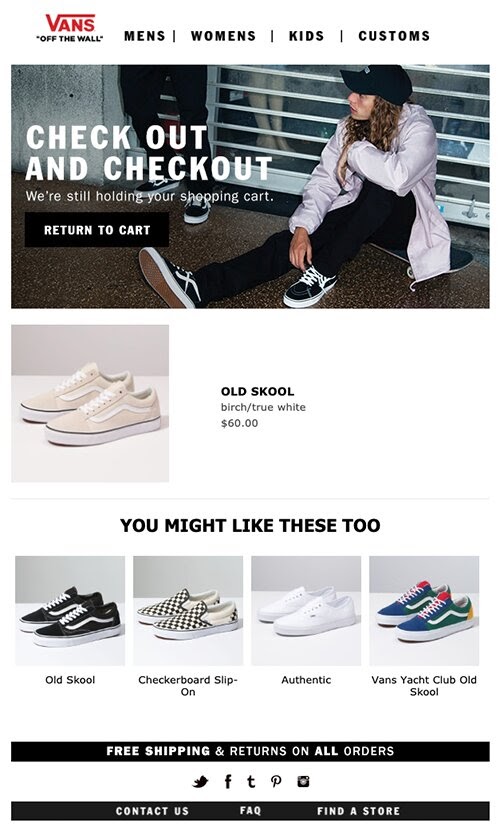

With this email, Vans not only aims to remind the customer about the item in their cart, but they also suggest similar items that they may like.
You never know, the customer might have abandoned the cart because they didn’t like what they saw. So, providing relevant product recommendations in your cart recovery emails increases your chances of having them come back.
Like MCM, Vans also makes its email layout look similar to its online store. The email also addresses concerns the customer might have about shipping costs- it highlights a free shipping offer.
14. Virgin Atlantic
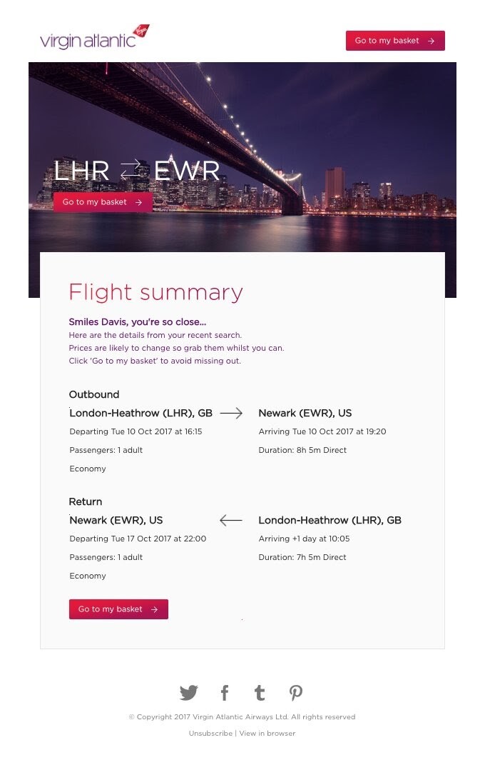

This email from Virgin Atlantic starts with a personalized introduction that immediately gets the attention of the customer.
With three look-alike CTA buttons placed strategically at different parts of the email, the customer can proceed to checkout at whatever point they decide to do so.
The email also includes every possible piece of information that the customer might need to complete their order. Adopting this strategy will make the checkout process seamless and speed up conversions.
15. Cali Fabrics
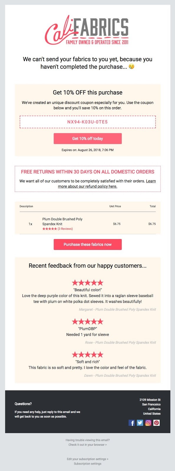

The personalization that plays out in this email from Cali Fabrics makes it an impressive one. The first statement of the email addresses the customer directly and ends with emojis. This gives a feeling of closeness between the customer and the brand.
Next is a coupon for a discount that has been created especially for the customer. The coupon has an expiry date to it, thus prompting the customer to take action quickly.
Cali Fabrics also highlights its return policy and includes customer reviews. So, the email takes care of many objections that may stop the customer from clicking the CTA buttons.
16. BaubleBar
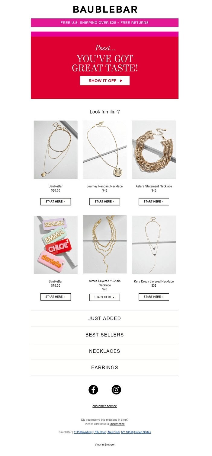

BaubleBar’s cart recovery email starts with a catchy and quirky headline. This tone is sure to appeal to its jewelry-loving audience.
The email doesn’t just applaud the great taste of the customer but also encourages them to show it off. How will people know you have great taste if you don’t buy the jewelry in your cart, right?
Under each carted item, there’s a checkout button which makes it easy for the customer to complete their purchase of whichever one they decide to buy.
17. Teefury
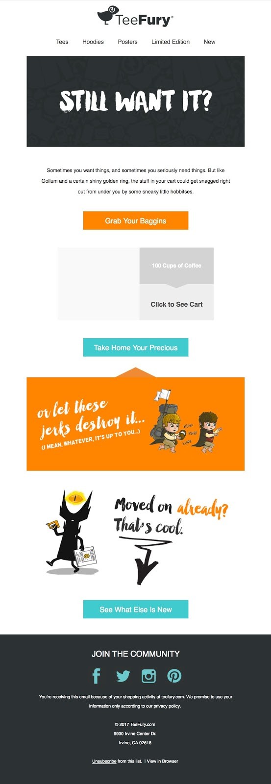

TeeFury is an interesting brand that caters to lovers of pop culture. So it’s no surprise that its cart recovery email copy is fun, humorous, and a bit unusual.
The email ends with an option that allows the customer to browse other items in case they no longer want the ones in their cart.
Like TeeFury, if you have a distinct brand voice, don’t hesitate to use it in your cart recovery emails.
Best Practices for Writing and Sending Cart Recovery Email
Want to create cart recovery emails like the examples above? Here are some abandoned cart email best practices that can help:
1. Create FOMO
People don’t like to feel left out. By using the FOMO (fear of missing out) strategy, you’ll be creating urgency with your abandoning visitors. This will make them want to take action fast before the deal goes away.
There are different ways to create FOMO with your cart recovery emails. Here are some ideas:
- Include a limited offer e.g. This 20% Discount Expires in 24 Hours.
- Tell them to take action before the items run out e.g. Visit Your Cart Before these Run Out!
- Indicate how many items are left in stock e.g. Only 3 Left.
- Highlight a deal and tell them not to miss out e.g. Don’t miss out on this deal.
- Include customer reviews or testimonials.
2. Personalize Your Emails
Your abandoned cart email strategy is only effective if it interests your abandoning visitors. One way to ensure this is to personalize your cart recovery emails. Did you know that personalized emails can increase your email success rate by 6x?
Here are a few ways to personalize your cart abandonment emails:
- Address abandoning visitors by name.
- Tailor the email content to reflect the likely issue that made them abandon their cart. For instance, if they added an out-of-stock product to their cart, send them a “back in stock” email.
- Include images of the exact items in their cart.
- Include tailored product recommendations based on what’s in their cart or previous browsing history.
3. Use an Attractive Subject Line
People get a lot of emails per day. Reports put it at 121 emails sent and received every day. The subject line of your email is the first part of your email people see. Therefore, you need a stellar abandoned cart subject line to get people to open your emails.
Your subject line should be simple, short, and compelling without being too aggressive. Aggressive headlines (e.g. “Buy Now!”) may be too forceful and can be annoying to some people.
According to a survey by Klaviyo, a leading marketing platform, direct subject lines that simply remind the abandoning visitor that they left something in their cart usually perform the best.
Subject lines with emojis add a personal touch to your email but usually perform just a bit below average. This doesn’t make it bad for business. Although, it may be a good idea to use it in addition to other types of subject lines in a series of cart abandonment emails.
Adding a discount to your subject line gets attention. Although they usually get a slightly lower open rate than average, 10.75% of them get clicked on.
Here’s a list of the best abandoned cart email subject lines we found:
- Did You Forget Something? (Casper, MCM)
- Psst…It’s Your Cart Here…Did You Forget About Me? (The Mountain)
- View Your Cart Now Before It Expires! (MAC Cosmetics)
- Oops, Did Something Go Wrong? (Pad and Quill)
- Empty Your Cart With 20% off. (Bonobos)
4. Include a Related Image
Images make your emails more engaging and help you extend your customer’s otherwise short attention span for a little longer.
Looking to increase the chances that your abandoning visitors click through your emails? Include images of the item(s) in their cart.
You can also include additional images of products related to what’s in their cart. This way, you’ll be giving them more product options in case they abandoned their carts because they changed their mind.
5. Include a Special Offer
Did you know that the topmost reason people abandon carts has to do with pricing?
Many people abandon their carts because they can’t afford the cost of purchasing the items they are interested in.
Giving special offers like discounts or free shipping will bring back visitors who abandoned their carts due to pricing.
6. Send More than One Email
Don’t send just one email and call it a day. It’s advisable to send up to three emails at certain intervals.
It doesn’t have to be tedious. You can have all three emails pre-written and automated. What this means is that they’ll be triggered on your website and sent to your visitors whenever necessary.
Sending emails one after another to achieve one goal like this is called a drip campaign.
If you decide to use a drip campaign, time the email properly to get the best results:
- The first email is a simple reminder that should be sent one hour after a user abandons their cart. The timing of the first email is just right because it’s not too soon to annoy the visitor. It’s also sent before the visitor has the chance to forget all about your business.
- The second email- a follow-up email- should be sent 12 to 24 hours after the first one.
- The last email should be sent a few days after the second one. This time, you can include a special offer to motivate the visitor for the last time.
7. Include a Checkout Button
Make it easy for people to complete their purchases by including a button that links directly to the checkout page of your website.
As much as possible, avoid adding unnecessary text along their checkout journey. This may distract them, and, hence, cause them to abandon the checkout process again.
Instead, use catch call-to-action text in your checkout button.
Here are some calls-to-action you can use as your checkout button:
- Visit Your Cart
- Resume Your Order
- Return to Cart
- Take Another Look
- Keep Shopping
Low commitment CTAs like the ones above are the best to use. They gently persuade your abandoning visitors to go complete their purchase without putting them under any pressure.
Conclusion
Cart recovery emails can earn you loyal customers and brand advocates. They also help you sell more. So what are you waiting for? Create your cart recovery emails today.
If you don’t want to create yours from scratch, you’ll find templates on Target Bay and Strippo. eCommerce platforms like Shopify also provide their users with customizable templates.
To send cart recovery emails, you’ll need an email list. Sign up on Adoric today for free to get access to tools that can help you grow a viable mailing list.
If you found this article helpful, do share it with your friends. You just might be helping someone’s business!

