Product page design influences order size by shaping how customers perceive value, discover additional products, and evaluate purchase options. A well-designed Shopify product page does more than increase conversion rate—it guides customers toward larger purchases through visual hierarchy, offer presentation, bundles, quantity breaks, and strategic decision framing.
Many merchants focus heavily on traffic acquisition while overlooking a critical reality: the product page is where average order value (AOV) is often won or lost. Tools like Adoric Bundles Quantity Breaks exist because product page design directly affects whether customers buy one item or several.
Why Product Page Design Impacts Order Size
Most shoppers don’t arrive on a product page intending to maximize their cart value.
They arrive intending to solve a problem, buy a specific item, or explore an option.
The design of the page influences what they notice, compare, and ultimately purchase.
When merchants think about AOV growth, they often think about discounts first. In reality, design frequently has a larger impact because design determines whether shoppers even see the opportunities to spend more.
A product page controls:
- Which offers receive attention
- How value is communicated
- Whether complementary products are discovered
- How easy it is to increase quantity
- How much mental effort is required to purchase
Order size often increases when buying more feels easier than buying less.
The Psychology Behind Larger Orders
Customers rarely calculate value objectively.
Instead, they rely on visual cues and shortcuts.
Several behavioral principles influence order size:
Anchoring
The first price or option customers see becomes their reference point.
For example:
- Single item: $20
- 3-pack: $48
- 5-pack: $75
The single item becomes the anchor. Larger options appear more attractive when the savings are clearly visible.
This is why quantity breaks often outperform generic percentage discounts.
Choice Architecture
Customers make decisions based on how options are presented.
A merchant selling protein powder could offer:
- 1 bag
- 2 bags
- 4 bags
The middle option often becomes the most selected choice when visually emphasized.
The increase in AOV comes from design, not necessarily from larger discounts.
Effort Reduction
Every additional click reduces the likelihood of larger purchases.
If customers must navigate away from the product page to discover complementary products, many simply won’t.
Keeping relevant offers visible within the buying flow removes friction.
The Product Page Elements That Most Influence Order Size
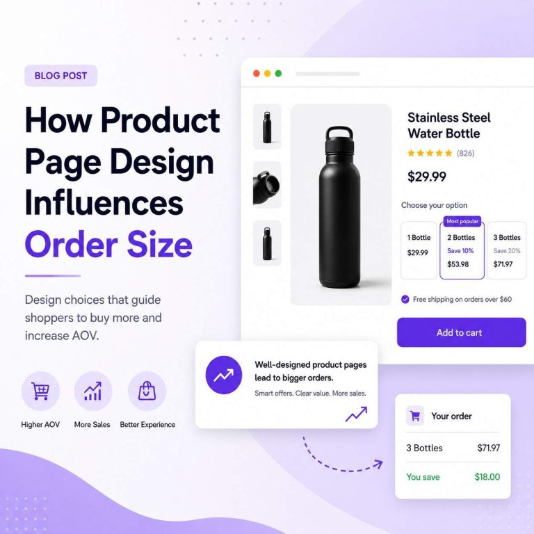
1. Quantity Selection Design
Quantity selectors are often treated as utility elements.
They shouldn’t be.
A plain quantity input encourages minimal purchasing behavior.
A structured quantity-break offer encourages comparison.
Instead of:
- Quantity: [1]
Present:
- Buy 1 — $20
- Buy 2 — Save 10%
- Buy 4 — Save 20%
The second format makes larger purchases feel like better decisions.
This is one reason quantity break campaigns consistently remain popular among consumable brands, supplements, pet products, and beauty stores.
2. Bundle Presentation
Bundles increase order size because they change the purchasing question.
Instead of:
“Do I want this product?”
The question becomes:
“Which package gives me the most value?”
Bundle design matters more than many merchants realize.
Strong bundle sections clearly communicate:
- Included products
- Savings
- Combined value
- Intended use case
Weak bundle sections force customers to calculate everything themselves.
For merchants exploring bundle strategies, our guide on The Role of Product Bundling in Ecommerce Growth provides a deeper breakdown of why bundles continue to be one of the strongest AOV levers available.
3. Visual Hierarchy Around Offers
Many stores accidentally hide their highest-value offers.
Common examples:
- Bundles below reviews
- Quantity breaks under product descriptions
- Add-ons hidden in tabs
Customers cannot act on offers they never notice.
The most effective product pages establish a clear hierarchy:
- Product value
- Purchase options
- Bundle or quantity incentives
- Social proof
- Supporting information
This ordering helps customers understand how to buy more before they become distracted by secondary content.
4. Add-to-Cart Area Design
The space around the Add to Cart button receives the highest attention on the page.
This area should contain:
- Bundle offers
- Quantity breaks
- Free shipping progress indicators
- Relevant add-ons
Not unrelated promotional messages.
Many successful Shopify merchants place Adoric Bundles Quantity Breaks directly near the purchase decision point because customer attention peaks there.
Real Shopify Examples
Apparel Brand
A clothing store selling t-shirts at $30 each could simply display a size selector and Add to Cart button.
Alternatively, it could offer:
- Buy 2 shirts → Save 10%
- Buy 3 shirts → Save 15%
The second approach encourages customers to think in terms of outfits rather than individual products.
Consumable Brand
A coffee subscription store might offer:
- 1 bag
- 3 bags
- 6 bags
Customers naturally understand future consumption.
Larger quantities reduce reorder frequency while increasing order value.
B2B-Lite Merchant
A business selling packaging materials may find that customers rarely purchase single units.
Displaying quantity tiers immediately communicates expected purchasing behavior.
In many cases, quantity breaks become less about discounts and more about setting purchase expectations.
Why Offer Structure Matters More Than Discount Size
One common misconception is that larger discounts automatically generate larger orders.
Often, they don’t.
A 20% discount hidden on a poorly structured page may underperform a 10% discount presented clearly.
The issue isn’t value.
It’s visibility.
This principle closely connects with what we discussed in How Offer Structure Shapes Customer Buying Decisions: customers react to how choices are framed, not just to the mathematical value of the offer.
Product page design is the mechanism that delivers that framing.
Common Mistakes That Reduce Order Size
Showing Too Many Offers
More options do not always increase revenue.
Customers faced with:
- Bundle offers
- Quantity discounts
- Subscription offers
- Add-ons
- Free gifts
- Coupon banners
may experience decision fatigue.
Prioritize the offers most relevant to the product.
Hiding Value Below the Fold
If customers must scroll extensively to discover savings opportunities, many never will.
High-impact offers deserve premium placement.
Making Customers Do Math
The best product pages calculate value for customers.
Avoid forcing shoppers to compare prices manually.
Show:
- Savings amount
- Percentage saved
- Price per unit
- Total value
Treating AOV Features as Separate Experiences
Bundles, quantity breaks, and add-ons should feel integrated into the product page.
They should not appear as disconnected widgets competing for attention.
The Trade-Off Between Simplicity and Revenue
There is a common belief that simpler product pages always convert better.
This is only partially true.
Simplification removes friction.
But excessive simplification can remove buying opportunities.
A minimalist product page may convert visitors effectively while limiting order growth.
The goal isn’t minimalism.
The goal is clarity.
The highest-performing Shopify product pages balance:
- Simplicity
- Discoverability
- Offer visibility
- Purchase flexibility
Customers should immediately understand both the product and the best-value purchasing option.
Product Page Design as an AOV Strategy
Many merchants view AOV optimization as a pricing exercise.
In practice, it is often a design exercise.
Product page design determines:
- What customers notice
- What they compare
- What they perceive as valuable
- Whether buying more feels natural
That is why product page optimization, bundles, and quantity breaks are so closely connected.
As discussed in our article on The Economics of Average Order Value in Ecommerce, sustainable AOV growth usually comes from improving purchase behavior rather than simply increasing prices.
The product page is where that behavior is shaped.
FAQ
Does product page design really affect average order value?
Yes. Product page design influences visibility, decision-making, and offer discovery. Customers are more likely to purchase higher quantities or bundles when those options are presented clearly.
What product page elements increase order size the most?
Quantity breaks, product bundles, add-ons, free shipping thresholds, and strong visual hierarchy are typically the biggest contributors to higher order values.
Are bundles more effective than upsells on product pages?
It depends on the product category. Bundles often work best when products naturally belong together, while upsells work well for accessories and upgrades.
How many offers should be shown on a product page?
Most stores benefit from one primary offer and one secondary offer. Too many competing promotions can reduce both conversion rate and order size.
Can a cleaner product page reduce conversion rates?
Yes. Removing friction helps conversions, but removing buying opportunities can lower AOV. The goal is clarity rather than minimalism.
Should quantity breaks appear above or below the Add to Cart button?
In most cases, quantity breaks perform best near the purchase decision area, either immediately above or immediately below the Add to Cart button where attention is highest.
Final Thought
If a customer lands on your product page today, is the page designed to help them buy the right amount—or simply the minimum amount?
The answer often reveals the next opportunity to grow AOV without increasing traffic.