One of the easiest ways to keep in touch with your customers is via email. But when you consider that the average person receives about 121 emails every day, your chance to stand out in your customers’ inboxes may begin to look non-existent.
That’s a problem you’ve got there. But how do you tackle it?
Simple. Use attractive, professional-looking email designs to grab your readers’ attention right from the get-go.
In this post, I’ll show you how to make your emails look fantastic in the easiest way possible. Here are the main highlights of this article:
- Why invest time in designing good emails
- Types of email designs
- 10 email design tips that work
- Where to get email templates
Why Invest Time in Designing Good Emails?
Email design is the process of creating and designing your emails to communicate your message with your target audience effectively, and at the same time, hold their attention.
Here are three main objectives for designing emails:
- To encourage your recipients to open the email
- A well-designed email is captivating
- To encourage them to take action immediately
Given the number of email messages the average person receives every day, not everyone will read every word of each email they receive.
People are used to scanning and retaining only the information they need while filtering out the rest. So, it is no surprise that most people don’t read beyond the first line before abandoning an email.
However, an attractive email would encourage your target audience to give you a chance and read what you have to say.
You can design almost any type of email – whether you are marketing your goods to prospective customers, sending out transactional notifications to existing customers, or reaching out to people for business partnership or sponsorship.
Types Of Email Designs
There are different types of email designs that you can adopt for various business purposes. These are the three most common types:
1. Emails with Plain Text
This type of email does not require you to use any graphic elements – just plain text. It is the most common type of email format.
It is best used to communicate important information that might get lost in the distracting aesthetics that other formats may have. It is simple to create.
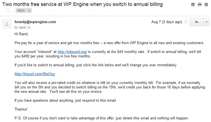
The plain text design makes a good choice for internal communication within your company. If you must use it for marketing, the trick is to use stellar copy, make it concise, and personalize the email as much as you can. Here’s a typical example of a plain text email:
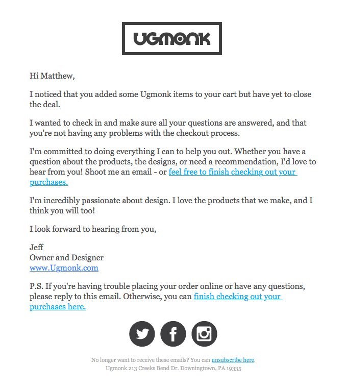
You can combine this email format with some HTML elements like in the example below. With this, you can include clickable buttons and links.
2. Rich HTML Emails
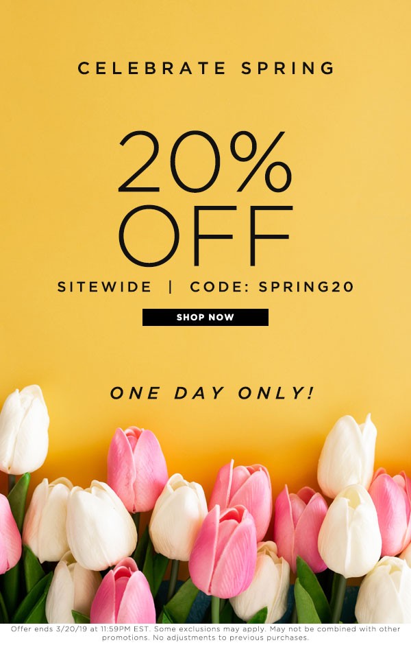
The rich HTML email has a more attractive design. Hence, many businesses prefer to use it. It looks similar to landing pages that you find on many websites.
The rich HTML email designs are colorful, creative, and have a combination of beautiful images and attractive typography.
This type of design is very flexible. So, you can use it for any form of business communication- whether with your customers or staff. When correctly done, you can leave a lasting impression on your recipients.
Here’s an example by Simply Soles.
The only downside with this type of email design is that some browsers may not be capable of opening them.
So, exercise caution when using them.
3. Interactive Emails
The interactive email design is a relatively new type of design. It involves coding elements of the email to produce a design that is very pleasing and engaging.
With this type of email design, your recipients can add items to their carts, take a quiz, or watch a video without having to go outside their inbox. In this example from BBC below, the recipient can select an option without leaving their inbox.
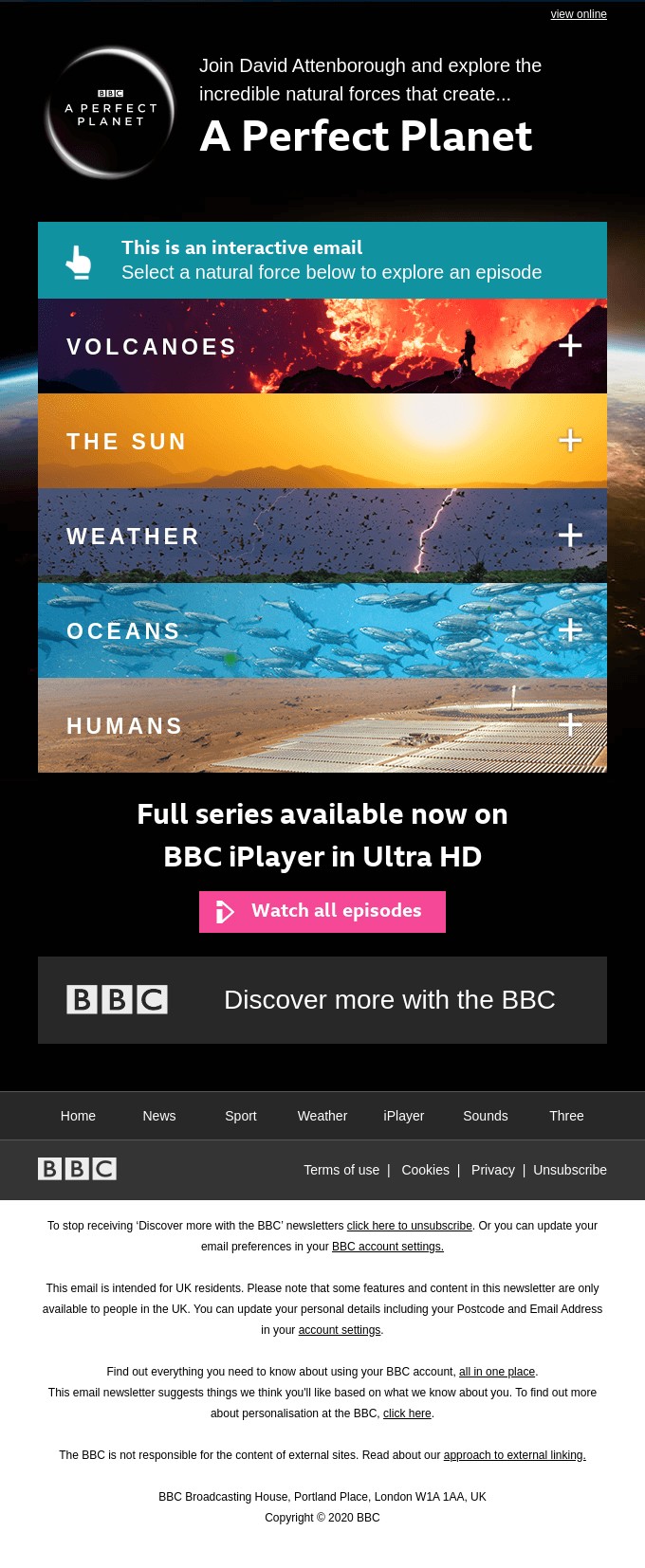
While this design is engaging, it has some cons. One major challenge is that most email service providers do not support this email format.
10 Email Design Tips That Work
Here are some email design guidelines and tips on creating the best email newsletter for your audience:
1. Know Your Target Audience
The first email design guideline is figuring out who your audience is. It is only when you know your recipients you can understand what design elements will appeal to them.
If you don’t have a target audience yet, you’ll have to build an email list before going on with the rest of these tips.
This is where Adoric comes in:
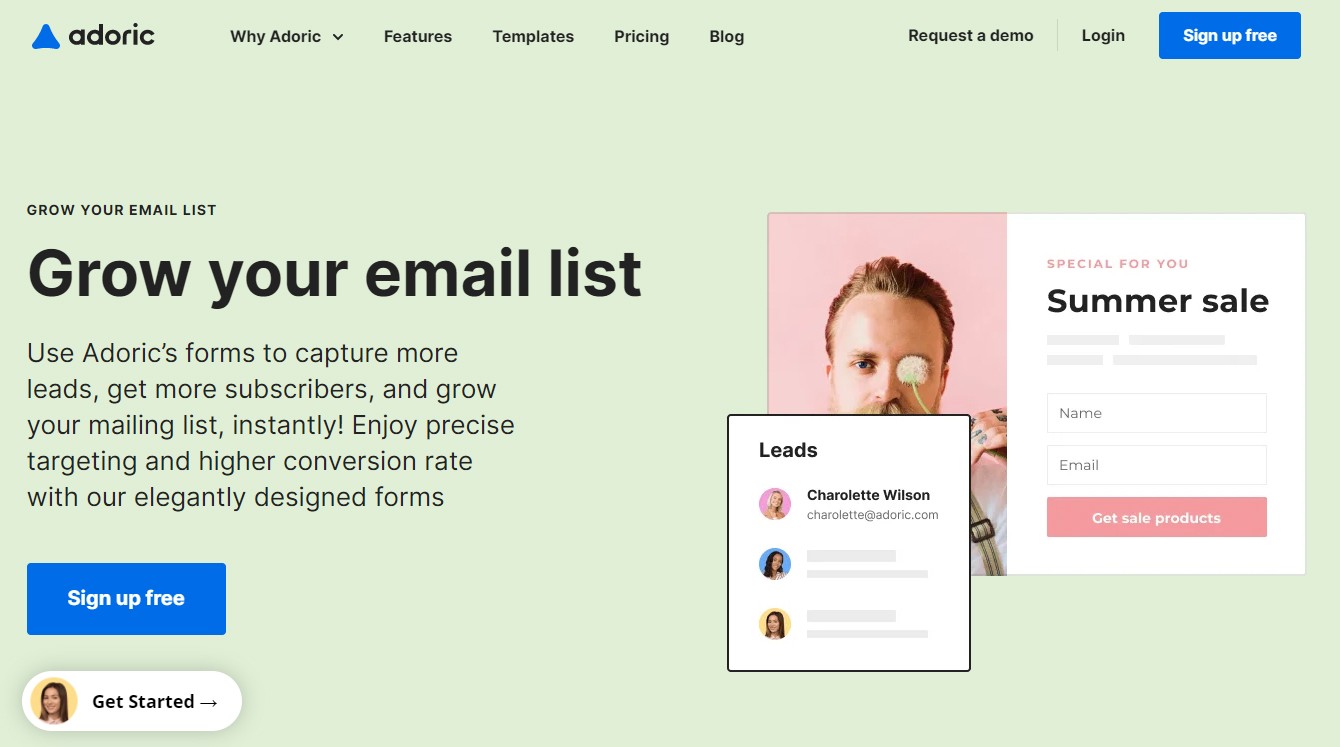
Adoric is a powerful lead generation tool that lets you convert your website visitors into email subscribers using attractive opt-in forms.
It lets you embed these opt-in forms on your website as popup boxes, slide-in boxes, or floating bars.
There are many professional and attractive templates to choose from. Also, Adoric lets you customize these templates using its inbuilt drag-and-drop editor, as shown below.
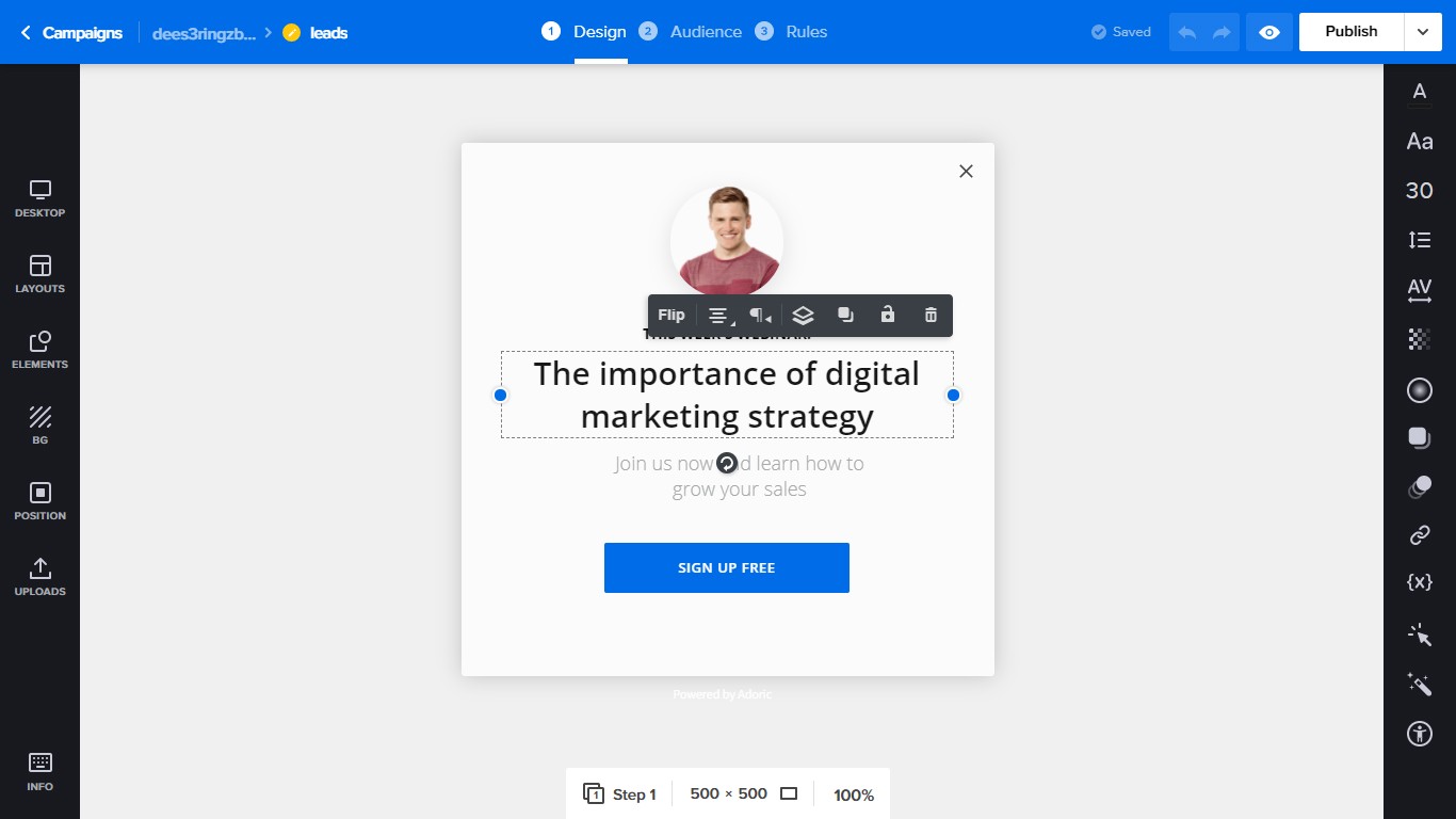
What’s more, with Adoric’s targeting and trigger features, you can display these forms to your web visitors when they are most likely to give you their email addresses.
The emails you capture are then stored in your Adoric account, and you can retrieve them at any time.
Want to build your email list right away? Sign up on Adoric for free.
2. Pick a Format
Now that you have an email list, choosing a format for your email is next.
It is essential to pick a convenient format for your audience and still allows you to achieve your goal of sending the email. When choosing a format, consider what devices the majority of your audience is likely to open your emails with.
For example, if your goal is to get your recipients to take action without leaving their inboxes, you want to use an interactive email format. However, you’ll want to make sure that your audience uses devices that can access this type of email format.
3. Avoid Using Distracting Elements
While it is good to add lots of creativity to your email design, moderation is important.
Let your design communicate your information clearly. Avoid unnecessary clutter that would be a distraction to your recipients. Your message should be the priority of your email- that’s why you’re sending the email anyway.
The layout of your email should be well-organized. Also, ensure you use colors that complement each other. A tip to help you easily maneuver this process is to use a simple email design template and then customize it with your preferred design elements as you go.
Also, use lots of white spaces to make your emails easy on the eye.
4. Ensure Your Designs Are Mobile-Friendly
According to Statista, approximately 4.66 billion people in the world are active internet users. Of this amount, 92.6 percent (or 4.32 billion people) use mobile devices to access the internet.
Since people spend more time on their mobile devices, it makes sense that they would also prefer to access their emails on it.
When designing your emails, use templates or design elements that are suitable for mobile devices. Your email’s width should easily fit within a phone’s margins; the fonts should also be legible on a smaller phone screen.
Consider using adequate line spacing and strategically placing your CTA button so your readers can easily click on it with a thumb. Ensure you preview your emails to see how they display on different devices before sending them out.
5. Use an Interesting Preheader
With emails, first impressions are everything. With attention spans getting shorter every day, you need a way to keep your audience attracted to your emails from the beginning. An interesting preheader can help you do this.
Your email preheader is the part of your email that gives your reader a preview of what your email contains. It usually comes right after the subject line. Here’s an example:

To make the most of your preheader text, include graphic elements like emojis, keep it short, and try to include the best summary of your email content.
If you’re looking to pique curiosity from the start- and you should- include a call-to-action. Your preheader text is also an excellent place to use personalization. By simply using your reader’s first name, you can get them hooked, like in the example above.
6. Use Legible Font Sizes
No one likes to strain their eyes while reading on their computer or phone screens.
Small fonts make email content difficult to read, so it makes sense to avoid them.
As such, use fonts that are bold – they help to improve the readability of your emails.
7. Use Images
Pictures, videos, and gifs are good ways to communicate information effectively. Not only do they let you express yourself easily, but they are also engaging and aesthetically pleasing to your readers.
A long draft of text in an email can be very boring to look at. Your readers might even lose interest before they get to the end.
Pictures, on the other hand, are graphic, vivid, expressive, and evoke emotion. Pictures get the message across to people faster than words do.
One way to use pictures correctly is to insert graphics after every few sentences.
It is, however, important not to overuse pictures. Also, your images should align with the information you’re giving and should be of the correct size.
8. Use a Convincing Call-to-Action
The whole essence of email marketing is to get people to act. This could mean getting them to visit your website, make a purchase, or tell their friends about your product.
But you need a CTA for this to happen.
After creating an email with the perfect design elements, you equally need a call-to-action to enable you to achieve your goal of sending out the email in the first place.
Position your email’s call-to-action such that your audience can find it easily. It should have a bold color, and your CTA copy should be firm yet encouraging.
9. Tell A Good Story
People need to understand that you are more than just a brand trying to make a profit. They need to understand that your business is made up of a team of real people with real stories.
Everyone loves a good story. Engage your readers’ imagination with stories about your business and employees. Stories are a powerful way to connect with people and increase brand loyalty.
Convey your information in these fun stories. By engaging your readers with these stories, you’ll make them see the bigger picture of your brand with them in it.
10. Feedback and Analytics are Important
An email newsletter should be a 2-way communication method. As much as you are giving out information, you should welcome feedback too.
Feedback not only gets your audience involved in your business but also encourages engagement.
Feedback also provides ideas with which you can improve your marketing strategy.
Analytics is also as important as feedback. It is important to constantly track your email analytics to know when you need to change certain parts of your emails. Remember that data does not lie.
Where to Get Email Design Templates
Starting your email design from scratch can be tedious. While this allows the design to be entirely yours, you’ll have to spend a lot of time and resources in the process.
Not only does designing an email from scratch require time and money, but it also requires coding knowledge.
If you can’t afford these, ready-to-use templates are the way to go.
Email design templates are ready-made email designs. These designs come in various types, and you can often customize them to best suit your preferences.
So, where exactly can you get these templates?
1. SendBlue
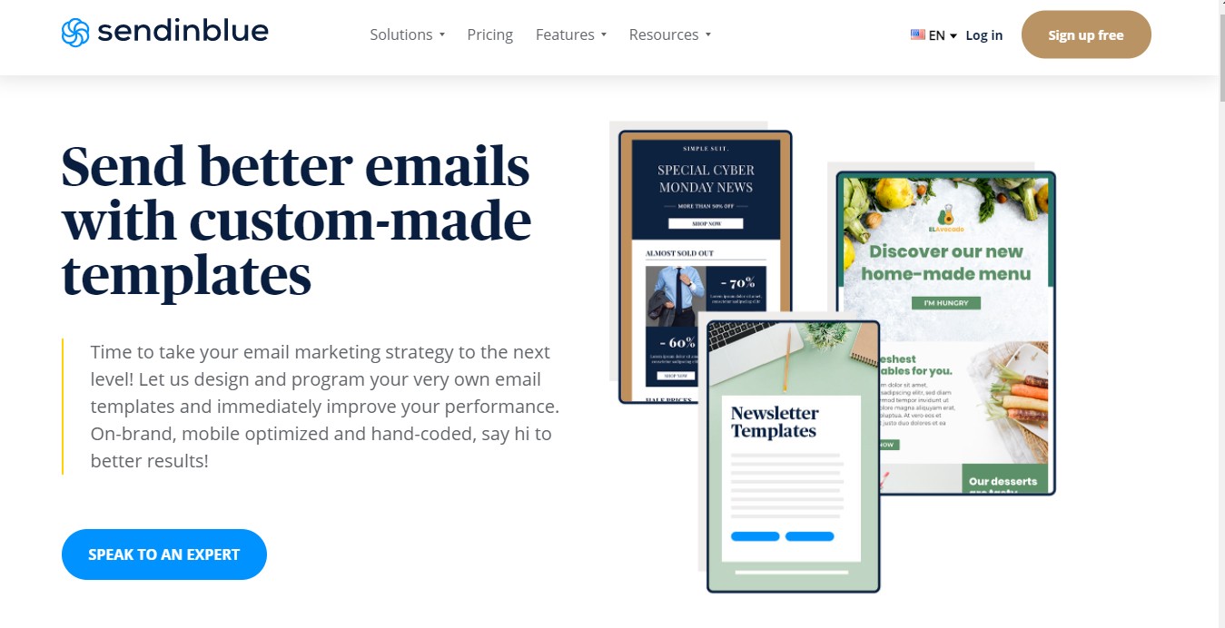
Sendinblue helps you to create emails for better marketing. It allows businesses to program and design customizable emails on request.
With Sendinblue, you can create optimized professional-looking emails. It offers just the right amount of text-to-image ratio, format, and strong CTA.
It also provides 60+ email newsletter designs. You can customize these templates using the drag-and-drop builder.
Sendinblue also provides fully responsive HTML templates that you can use across several devices. These templates are glitch-free, professional, aesthetically pleasing, and do not require you to have any coding knowledge.
2. Stripo
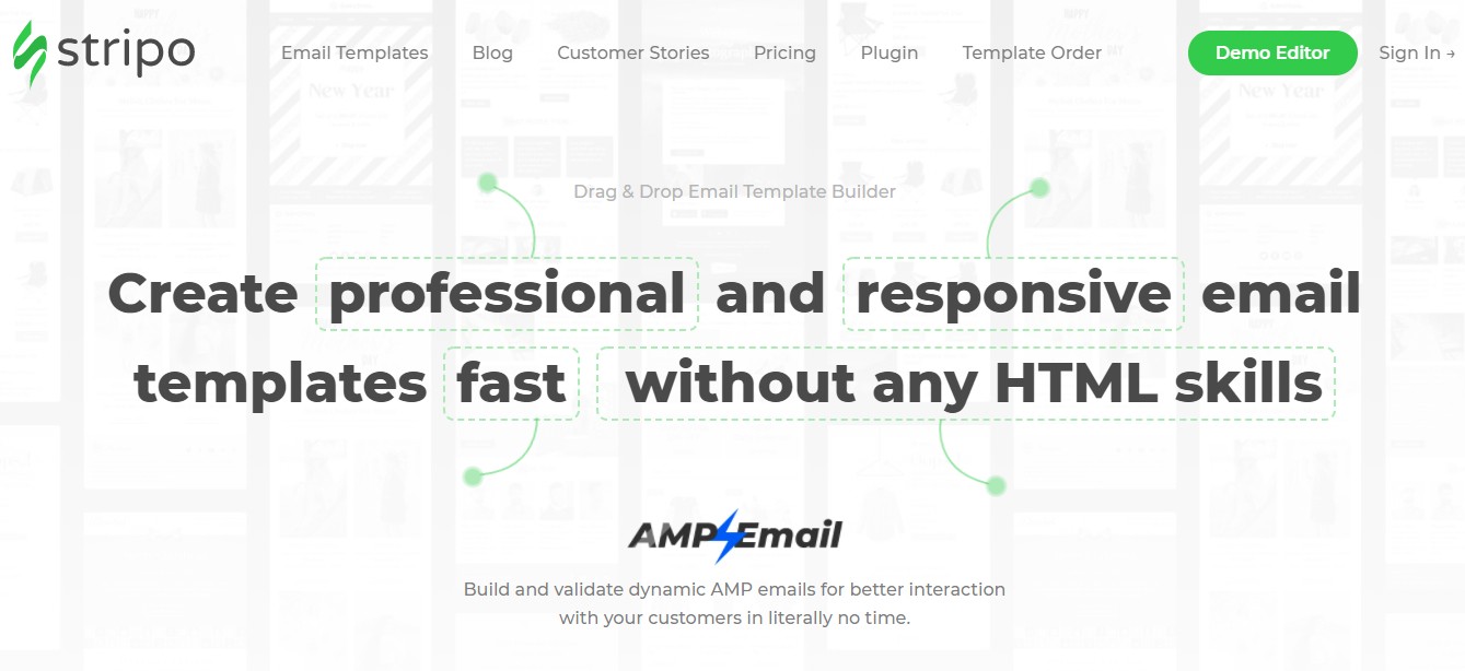
Stripo is another platform that provides email design solutions for businesses.
It lets you build professional and responsive email newsletters without any coding knowledge. It is easy to use and provides tons of templates and design elements that are perfect for your email marketing.
Stripo is fast, easy to use, and allows you to preview your design across different devices before sending it out.
Stripo also provides advanced design tools for creating AMP emails, a library to store created templates, and can integrate easily with an email service provider.
3. Email on Acid
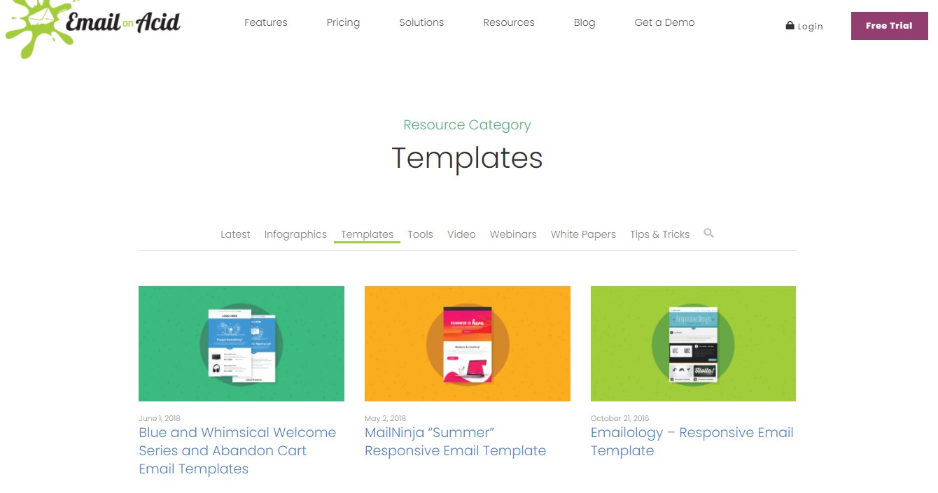
It doesn’t matter what type of campaign you have in mind, Email on Acid provides the perfect tools for creating emails for business.
Trusted by brands like Coca-Cola, Verizon, and Samsung, Email on Acid provides professional email designs that your readers will find attractive.
Email on Acid also provides you with a few free templates to test their features before making any commitments.
4. Litmus
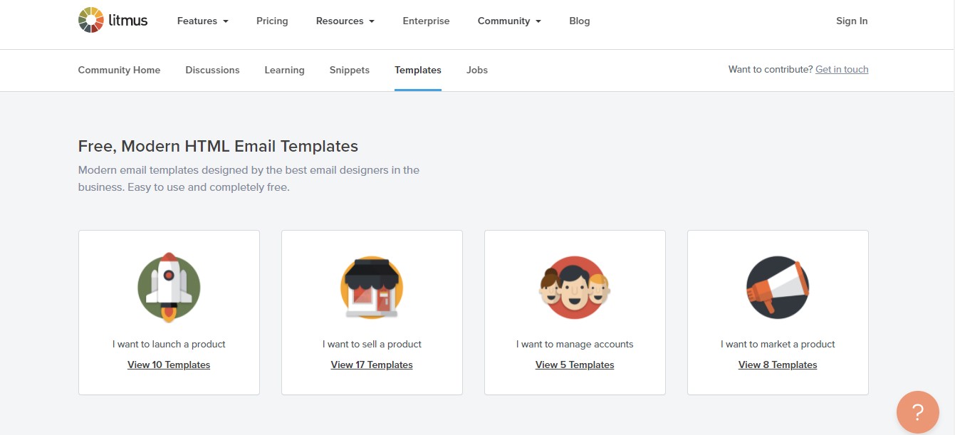
Litmus provides you with free email design templates that work. These templates, according to Litmus, are super responsive.
With more than 27 free templates to choose from, you can get started on your email marketing campaign in no time.
5. Dyspatch
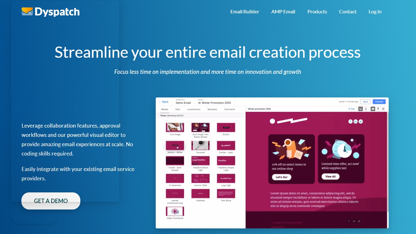
Dyspatch is another email builder that allows you to create and optimize your emails.
Dyspatch helps to take care of creating your email designs from start to finish. It offers a ton of features and elements to help you speed up the process of designing emails so you can send them out in no time.
Conclusion
Email design is an integral part of a good email marketing strategy. It can help you improve your engagement and conversion rates. With the tips and resources I have shared with you in this post, you can start cranking out awesome-looking emails in no time.
Whatever you do, ensure that the design you use doesn’t distract your audience from your message and call-to-action.


