A large number of businesses use email marketing to reach a wider audience. Statistically speaking, 85% of B2B businesses actively use email marketing in their content promotion efforts.
Interestingly enough, email marketing offers an ROI of up to 4,400 percent.
Email marketing requires constant hard work since email databases degrade by around 22.5 percent per year. You must have an up-to-date email list if you want to have good results.
In this article, we’ll highlight ten reliable tools to build an email list fast
10 Tools to Build Your Email List Fast and Easily
1. Popup
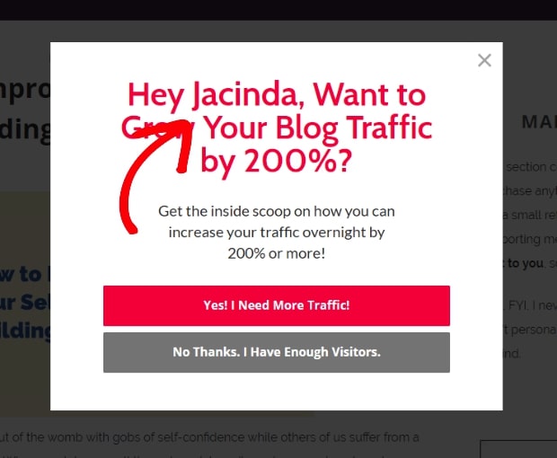

Wikipedia defines popup as “a graphical user interface display area, usually a small window, which suddenly appears in the foreground of the visual interface.”
It is one of the most popular email list-building tools with a conversion rate of up to 9.28 percent. However, it can be a little complicated to use popups as shown by an experiment conducted by Matthew Woodward.
The popup caused a reduction in the number of visits and average time spent on a page. It shows that people do not like popups, which is why about 25 percent of internet users use popup blockers.
Here’s what you can do to get better results:
1. Avoid Using Entry Popups
Popups work well when users expect them. Do not make the mistake of showing popups to users right after they land on your page. This will not only prevent them from reading the content that they might be interested in, it can also cause them to leave the page.
Consider delaying the display of your pop-ups based on how much time a user has spent on your page or how many pages he or she has gone through.
Entry popups, however, can be effective in some cases. For example, they can work for ecommerce stores. You can offer a special discount to new visitors or buyers in exchange for their email address.
2. Use a Simple Design
Keep your popup as simple as possible and avoid using off colors or fonts that are difficult to read.
Use the ‘less is more approach’ and only ask for the information that you need (name and email, for example). Use colors that go well with the theme of your site.
3. Focus on a Single Goal
A popup should serve a single purpose – to collect email addresses. Do not use it to collect other information such as birthdays or addresses.
Also, avoid providing too much information via the popup as it can leave your visitors overwhelmed, causing them to neglect the Call To Action (CTA).
4. Create Targeted Popups
A one-size-fits-all strategy doesn’t work for popups. Consider dividing your visitors into specific segments based on level of engagement, location, traffic source, cart value, and other such variables.
Write customized messages for each visitor based on your target variables.
5. Update It Regularly
Test and optimize your popups regularly, but not too often. Run a popup campaign for a few weeks, and then analyze its performance. Also, consider weaking your popup design and messaging based on seasonal changes, such as Black Friday.
You can create a special popup during Christmas and special events to push more people to sign up.
Adoric’s drag-and-drop builder can be used to create and place popups on your website or page. Plus, it offers insights to help you understand your popup’s performance so that you can make changes accordingly.
2. Exit-intent Popup
Exit-intent popups are quite like traditional popups but they work differently.
They are a lot more effective than traditional popups.
Exit-intent popups are shown when a user attempts to exit your site. They’re effective because they don’t affect the user experience since the visitor has already decided to leave your site. An exit popup is a website’s last attempt to prevent a user from leaving.
For exit-intent popups to work, you must know what’s causing users to leave your site. It could be a variety of reasons including high prices, poor website design, or failure to find whatever information they are looking for.
If implemented properly, exit-intent popups can help reduce the rate at which visitors abandon your website.
Here are some creative ways you can use exit-intent popups
1. Offer Special Discounts
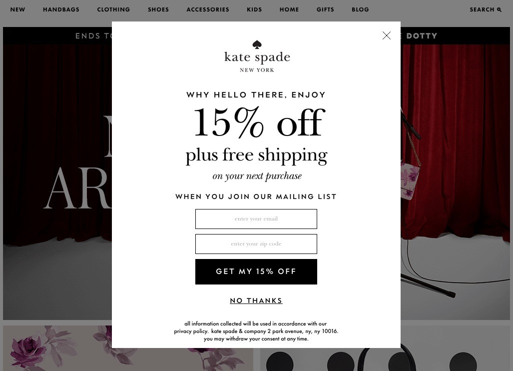

Special discounts can help retain customers who find your products or services too expensive.
You can offer a special discount code that customers can use now or in the future if they wish to buy products at a lower price.
In the above example, the company is offering a 10 percent discount to customers and instead of using the ‘Subscribe’ button, which is boring, they’ve used a ‘Get my Discount Now’ button.
The CTA text is more efficient as users will feel that the code will benefit them, whereas the subscribe option might make them feel that they’re benefiting the company.
2. Personalize Your Message
Personalization can be used to increase loyalty and make people take your desired action.
We must mention that personalization doesn’t only refer to using the name of your potential customers, it also refers to the referral source, customer’s location, and other such factors.
3. Create a Sense of Urgency
Urgency and scarcity can be an effective way to keep your visitors engaged. The idea is to make them feel they’d lose out on a good opportunity if they don’t take your desired action, as quickly as possible.
It can be highlighted in a lot of ways, such as by mentioning how many people have booked a specific product or how many items are left in store.
4. Offer Free Shipping
Free shipping can help win back up to 44 percent of lost customers.
You can display a popup with the option to email a free shipping code in exchange for the user’s email address.
Alternatively, you can allow users to apply coupon right away as seen below.
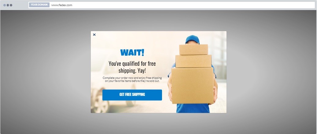

The example above can help you make more sales, but it might not be the best option to collect emails as it doesn’t have an email address section.
Still, if the customer chooses to buy, you might end up with his or her email address as it will be required during the checkout process.
One of the easiest ways to promote your free shipping offer is by using our free shipping bar feature, which allows you to create a floating bar that displays free shipping information on a website.


The good thing about this is that there are a lot of free shipping bar templates you can pick from and customize quickly to your taste.
5. Give a Free Trial
It is common for sellers of digital goods to offer free trials. This trick can be effective in cases where the potential buyer doesn’t trust your site or would like to know more about what you offer before they decide to pay.
Adoric can be used to create exit intent popups. It comes with several triggers and scheduling options that can be used to get good results.
3. Sticky Bar


Sticky bars are an excellent tool if you are looking to convert visitors into customers, but without irritating them.
Usually, they are fixed at the top section of your website, and stays there even when a visitor scrolls down your web page.
They offer more conversions with less intrusion. ticky bars can be used to promote discounts, free shipping, free trials, etc.
Here’s how to get more out of them
1. Decide Where to Place It
Sticky bars can be placed either on the top or bottom of the page. With Adoric, it is easy to decide where you wish to place your sticky bars.
You can place them at the top, bottom, and even center of your website. Regardless of your placement option, they will stick and stay in place as visitors scroll down or up your website.
2. Customize According to Your Website
The bar should mingle well with the theme of your website and not stand out like a sore thumb. We offer several ready-to-use templates you can place on your site. Many of these are customizable giving users the option to change color, font, etc.
Go through available options and pick a design that syncs with your website’s theme. The bar should be visible and hard to miss but it shouldn’t look out of place.
3. Understand Your Audience
Sticky bars are more popular among very old and very young users as they enjoy the additional support it offers. Consider this option to gather email addresses if your audience falls within this demographic.
4. They Shouldn’t Be on Every Page
Sticky bars are suitable for actionable websites like ecommerce stores. They work well on pages that have long-form content. They shouldn’t be placed on pages that have no space to scroll up or down. For such pages, you can use other tools discussed in this article.
4. Slide-in Scroll Box
Slide-in scroll boxes are also an effective, non-intrusive tool you can leverage to grow your email list.
They appear on the page as the user scrolls down. With Adoric, you can make a slide-in appear after a user has scrolled a certain distance down your page.
Slide-ins can be used to:
- Create a lead magnet which you can use to collect emails
- Collect customer feedback on specific products or pages
- Offer coupons and discounts to reduce cart abandonment
- Improve user engagement on your website
- Highlight related content and product
Slide-in scroll boxes are noticeable and sit silently, which makes them quite efficient. They do not affect the flow of a page or cause any disturbance to the user.
Here are a few things you can do to get more out of slide-in scroll boxes:
- Personalize your campaigns by making them relevant to your visitors. For example: new user discount for first time visitors.
- Avoid showing the same campaign again and again as it can affect user experience.
- Make sure to create short but attractive CTAs.
5. 2-step Opt-in Campaign
Users who land on your page for the first time might be apprehensive of sharing their contact details. This is why we suggest that you use a 2-step process to ease them into handing over the required information.
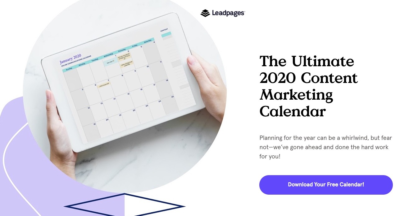

Look at the image above, those who land on the page will have the option to download a free calendar. The page does not ask for email addresses or other such information, which can help attract more users.
Once visitors click on the ‘Download Your Free Calendar’ button, they will be taken to a page where they’ll be asked for their contact information.
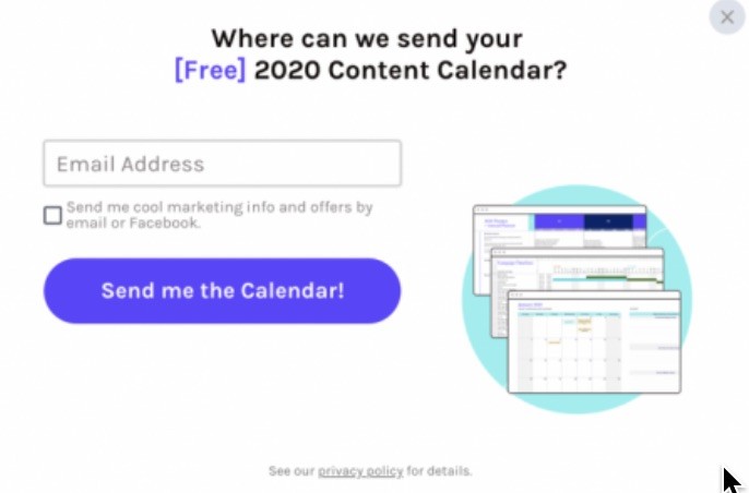

Those who land on the second page are more likely to give their email address as they’ve already shown interest in the free calendar. Plus, they’ll understand that it is not possible to get the link without giving the email in return.
Psychology comes into play here. According to Psychologist World, “this strategy can be used to persuade people to agree to a particular action, based on the idea that if a respondent will comply with a small initial request, then they will be more likely to agree to a later, more significant, request, which they would not have agreed to had they been asked it outright.”
Another psychological phenomenon linked to this strategy is the Zeigarnik effect. According to this concept, people are likely to finish what they’ve started.
When you show a popup asking people to share their email address, you’re the one starting the process. However, when users click on your first form to download a free calendar, they’re voluntarily starting a process, which they might complete.
6. Countdown Timer
Countdown timers can be used to grow your email subscriber list. We covered the topic in detail in our blog titled How to Use Countdown Timers to boost Conversions with Examples.
A countdown timer is a “virtual clock that counts down from a certain date or number to indicate the end or beginning of an offer or event.”
Countdown timers are typically used to make more sales but they can also be used to grow your newsletter list. Countdown timers create a sense of urgency by making the user feel that ‘time is running out’.
If you are interested in growing your email list then use countdown timers to promote special events such as webinars, the release of a new product, seasonal discount, etc.
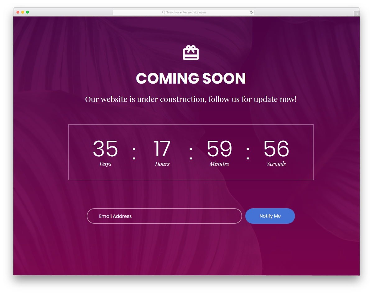

The above image is a good example of using a countdown timer to collect emails. However, only use this to promote events or happenings that people are likely to be interested in.
This option is suitable for almost all kinds of websites. You can use Adoric to create compelling countdown timers that look good and help you get more emails.
7. Audience Targeting
We can’t overemphasize the importance of targeting the right audience with your campaign.
Audience targeting refers to segmenting consumers into different groups based on demographic data or interests.
Segmenting your audience is important to create campaigns that align with consumers’ lifestyles, however that’s not the only benefit of consumer targeting. This can also help you build your email list fast.
Targeting will allow you to choose the right method and technique to get users to share their contact information. For example, someone who finds your products too expensive might not be interested in giving their email address to you if all you offer is a guide on how to use your product.
You will have to offer a free trial, discount code, free shipping, or other such promotions to get people interested.
In the same manner, gender, age, location, and other factors come into play as well. Let’s say you offer clothes for pregnant women. Most people who land on your page would be interested in purchasing pregnancy clothes, but they might not always have the intention to buy it right away.
Let’s think of three different demographics:
- A woman in her early 30s: She’s likely to be pregnant and might be looking for a dress for herself.
- A man in his early 30s: He might be interested in buying a dress for his partner or friend.
- A woman in her 70s: Since she can’t be pregnant, she might be looking for a dress for her daughter, family friends, etc.
You can’t use the same lead magnet or popup to get all three users to sign up. The first one might be interested in a guide on ‘How to Look Good During Pregnancy’ but the other two would be more interested in guides such as ‘How to Buy Clothes During Pregnancy’ or ‘X Perfect Dresses for Pregnant Women’.
You will never be able to figure out what to offer a visitor without proper audience targeting.
8. Timing and Triggers
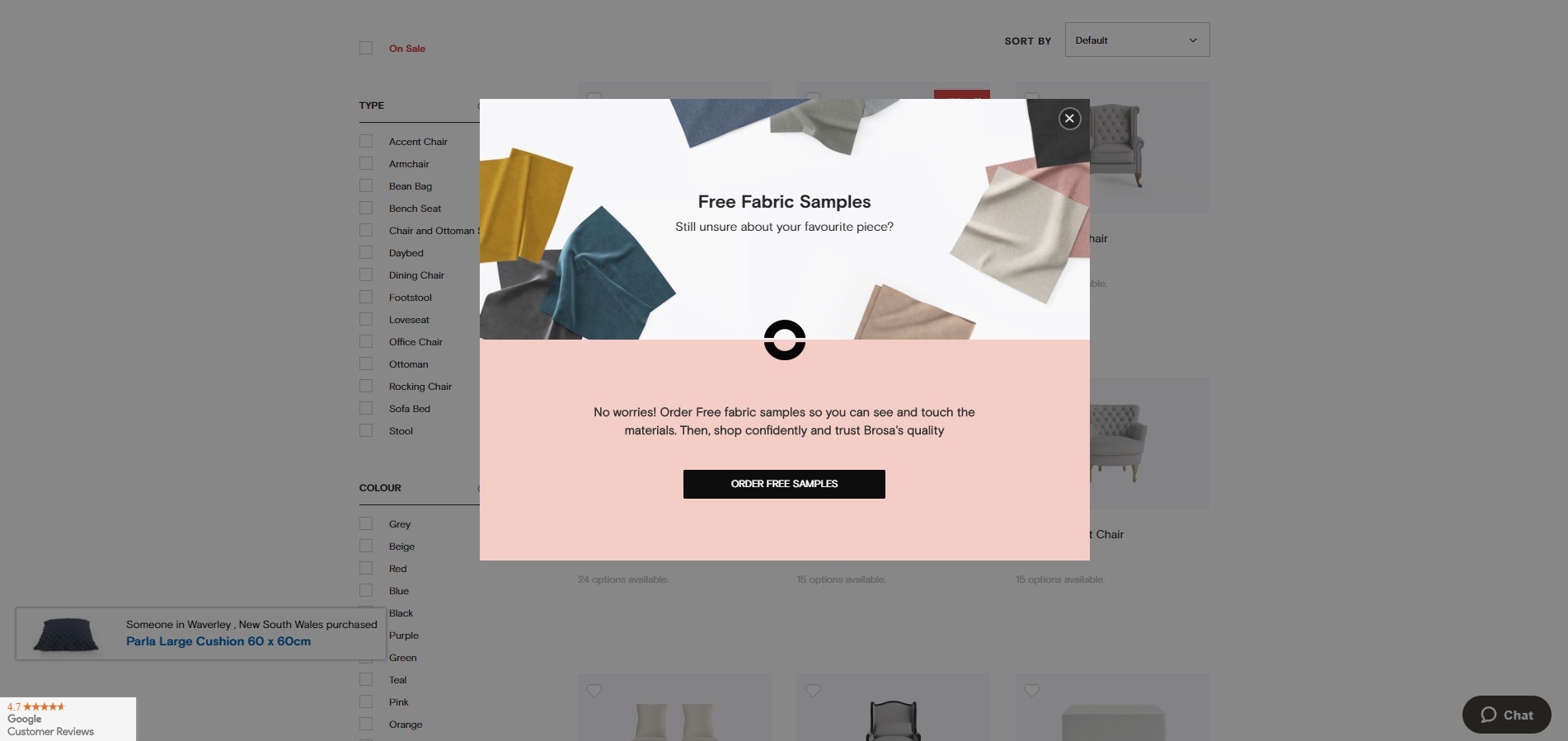

These factors decide when to show a specific message – such as a popup – to your visitors.
Let’s explain each:
- Timing: This decides when a specific message will display, i.e.:
-
- After a user has spent 60 seconds on your website
-
- Right after a user lands on a page
- X seconds after a page loads
- Trigger: A specific message will display when a user takes a specific action, i.e.:
-
- Goes to close the page.
- Lands on your page from a specific source like your landing page or Instagram
- Scrolls over a clickable image or link
- Trigger based on browsing history
With Adoric, you can set multiple triggers and timing settings according to your requirements. We suggest that you use A/B testing to see what works and what doesn’t.
9. In-page Opt-in Form
In-page opt-in forms can be used to capture email leads. It’s an opt-in form you can place natively right within your post or page, without really disrupting your readers’ flow.
These forms are good at attracting people who are truly interested in your business or what you have to offer. With opt-in forms, it isn’t about attracting people, it is about targeting people who are already captivated. However, you have to be careful when creating an opt-in form.
It should be easy to see, short, and simple. Avoid asking for information that you do not need. If you’re interested in building your email list then only ask for the name and email address. Remember that forms with two fields do better than forms with one field.
Users do not enjoy long forms. They’re complicated and time-consuming. Keep it short and use future forms to grab more information from your visitors.
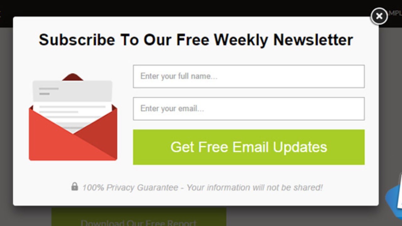

The form should clear potential objections, highlight specific terms, and what users are opting for.
The above example guarantees 100% privacy, which is a common concern among users since companies are known to sell email addresses.
10. Surveys
The purpose of a survey is to collect your visitors and customers’ feedback. But with some tweaking, you can use them to capture emails and build your mailing list.
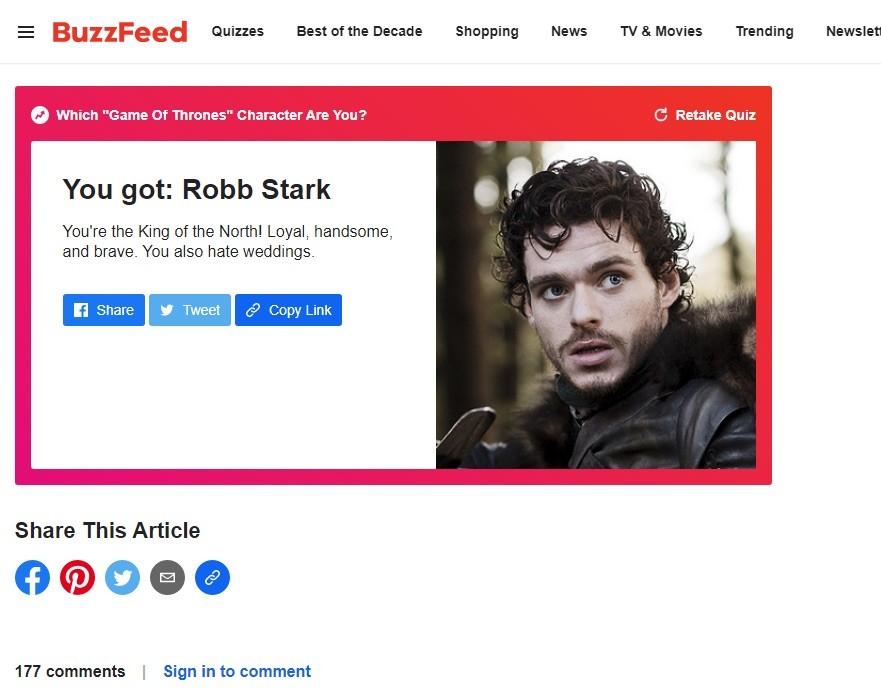

Websites like Buzzfeed use this strategy to collect emails. Here are ways you can optimize your surveys:
- Complete a survey on the website and email results
- Share survey with friends and family via email
- Opt-in to receive the latest surveys via email
In addition to surveys, you can also include quizzes that make people take notice. They can be based on politics, entertainment, or general lifestyle.
Come up with topics that your audience is more likely to be interested in.
We hope these easy ways to grow email lists will help you capture more email addresses. Email addresses are changing at a rate of 31 percent per year.
Adoric offers all this and much more. Sign up today for free and see what it can do for your brand.
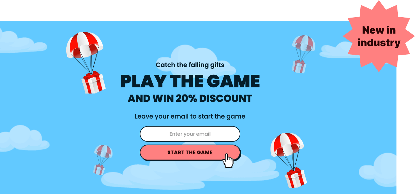
11. Falling Gift Game Popup
Gamifying your visitors’ browsing experience using our innovative falling gift game popup has numerous benefits. One is that it can help boost engagement and make them stick around longer on your website. Plus, compared to other gamification methods like spin-to-win(18%), falling gift game popups enjoy a better conversion rate (30%).
Creating falling gift game popups is very simple in Adoric, and you can do so in a few steps.
