
The Call to Action, more commonly known as the CTA, is a marketing term designed to encourage a specific response.
The purpose of a CTA is to tell your visitors or readers what to do, i.e: make a purchase, sign up for a service, share feedback, etc. It’s very important to have a refined CTA because site visitors or your readers may not always know what you expect them to do because there are many things to do on a webpage – read more, sign up for a newsletter, request a demo, give feedback, etc.
You will find CTAs all around you, from newsletters to social media posts to blogs to videos. They can be in different forms including a sign up page, a button, and a text line.
Sadly, about 70% of businesses do not have a CTA and a large number of businesses who have a CTA do not know how to utilize one. In this article, we’ll talk about how to create the perfect Call to Action.
Let’s get started:
What Sets Apart a Good CTA?
In simple words, a good CTA is one that offers good returns, i.e: conversion rates. You want more and more people to take your bait and perform your desired action. However, remember that the average conversion rate for a call-to-action element is only 4.23% across all industries.
A good CTA is clear and generates curiosity. It must deliver what you promise without wasting time, i.e: if you ask visitors to click to ‘download our eBook’ the link should take them to the eBook page and not anywhere else.
7 Tips to Create the Perfect CTA
Call to actions are meant to help businesses find more buyers and increase sales but not everyone uses them right.
Here’s how to create CTAs that work:
#1 Use Clever Verbs and Attractive Words
CTAs need to be concise and clear. Do not use a lot of words. Be crisp and to the point.
Your audience should immediately know what they’re supposed to do, otherwise they’ll move to the next page and you will end up with a lost opportunity.
A very good way to attract your visitor’s attention is to use action verbs. Here are some of the most popular options:
- Shop, Order, or Buy
- Subscribe or Download
- Find More or Show me How
All these examples ‘push’ visitors to take action. In addition to this, there are other words that users find attractive. These include:
- Free
- Discount
- Profit
- Trial
- New
- Secret
- Now
- Increase
- Discover
- Secret
- More
Keeping this in mind, a CTA can be:
- Order Your Free Trial
- Subscribe to Enjoy a Discount
#2 Create a Personalized Statement
It’s important to speak directly to your readers. Unbounce saw a 90% increase in conversion by changing the word ‘you’ to ‘me’ in their CTA. Readers should feel that the offer is for ‘them’.
‘I Want to Save Money’ is a better option than ‘Click Here to Save Money’.
If you’re using email marketing then you can even use real names of your customers. This will make them feel that you truly care for them and that the email has been personalized for them.
The CTA must appear tailor-made for your audience. Think of a business that sells bridal outfits. While a bridal outfit is linked to fashion that’s not what sells because when it comes to marriages, emotions get involved.
Your CTA must consider this element. The page shouldn’t only highlight how fashionable your dresses are but also how they can make the bride’s special day more special. You have to form an emotional connect with your audiences.
#3 Offer a Solution
Competition is tough and users have various options. You must give them a reason to happily do what you want them to do. This can end up being very complicated because, in most cases, you would require their time, money, or both – things most users are not readily willing to share.
Revisit our first tip, we talked about using special words that readers find attractive. Most users on the web are looking for a solution to their problem. The problem can be anything, a lack of money, pesticides, or a cooking competition.
Your job is to identify the problem and present a solution that makes them feel like it’s giving them more than what it’s taking away.
The purpose of a CTA is to get people excited and present your product or service as a solution to their problem. In some cases, you may have to use the content on your page to first highlight their problem before coming to the solution.
For example, if you sell umbrellas the page must talk about how damaging it can be to go out when the sun is shining, it’s snowing or raining. Once you have highlighted the problem, you can plug your product by using CTAs like:
- Protect Me Against The Rain
- I Am Ready to Protect Myself
These CTA examples are personalized, include some attractive words, and offer the umbrella (your product) as a solution. But, they may not be enough to get people excited. There are hundreds of pages selling umbrellas, some selling it at a lower price. Why should the person choose you? They’ll do so if you highlight your USP, which can be anything from low price to durable goods.
#4 Know Where to Place the CTA
This is one of the most important factors yet very few people pay attention to this. You can’t place your CTA button anywhere you like. The complexity of a page dictates the placement of the button.
If the page is small and it contains very little text or information then you can place the button above the folder. For longer pages, the CTA can go below the folder. However, this is not a hard and fast rule.
As a business, you want every visitor who lands on your page to at least read your CTA. Sadly, about 55% of visitors only skim through the page and close the window in about 15 seconds. This means you will not have a lot of time to make an impression. However, some experts argue that good content can keep users interested.
MECLABS conducted a test to gauge the importance of the placement of the CTA button. They designed two pages:
- A long page with informative and clear content and no distracting elements with the CTA placed at the bottom.
- A short page with a distracting menu bar and poorly created content with a CTA button at the top.
They found that longer and simpler pages enjoy a higher conversion rate – up to 220%. It’s believed since the longer page had more information in a clear manner, users did not quit the page and continued to read the content. But, this may not work if you’re targeting mobile users since they do not enjoy scrolling.
This is why some experts suggest placing two or more CTAs on a page.
Another question is which side to place the button on. Most experts agree that right is always the better option due to the Gutenberg Diagram.
According to the diagram, there are two spots on a page where users are more likely to take action. These spots can be reached by drawing a Z on the page.
#5 Be Creative
When it comes to CTAs, it is all about being creative. While you can place a boring text CTA on your page, the truth is that it will not provide good results because text CTAs usually get ignored.
Nobody is going to find out what you’re selling if it’s woven in your text and doesn’t stand out. This is why you need to be creative and use different elements to highlight your CTA.
First of all, it’s best that you use a button instead of text. There are several things you must consider when designing your CTA button:
- The Size
According to reports, the average button is 47.9 pixels tall. However, some websites use larger buttons – up to 50 pixels tall. You will also find smaller buttons – as small as 20 pixels. While they work, they may not be very beneficial since Apple suggests touch points to be at least 44 pixels tall. This, however, doesn’t mean you can opt for bigger buttons as very large buttons end up distracting users and can even cause them to leave a page.
- The Shape
Buttons do not have to be boring. You can come up with different shapes including rounded buttons and buttons with square edges. Some pages get very creative with buttons and use unique shapes such as arrows. There’s no right or wrong here, choose what works for you.
- The Text
When it comes to text, pay attention to the size, length, color, and font. Make sure to stick to fewer words that are easily readable. Users must not squint to read what’s written.
- The Color
Using colors is a clever way to highlight your call to action button. Believe it or not, colors can have a major impact on your conversion rate.While the right color depends on factors such as the background color and images on your page, orange and green tend to be the best performing colors. Understanding color psychology can help you come up with the right color for your page. Some colors are known to have psychological effects, i.e: blue is related to trust and calmness, red is considered a sign of warning, and green is linked to nature.
#6 Get Rid of Distractions
Distractions can be defined as copy or design elements that distract readers and prevent them from taking your desired action.
Distractions occur when you try to achieve too much. We end up bombarding users with ads, information that they do not need.
Too many headings, multiple CTAs, bad colors or text, pop ups, and discount offers are the biggest distractions. Your landing page should ideally be used for a single offer.
#7 Choose the Right Type of CTA
There are various types of CTAs and while they’re all beneficial, the right option depends on factors such as your requirements, audience, and purpose.
- Lead Generation
You will typically find these on blogs at the end of a post, as a floating banner or in the sidebar. They must be eye-catching and very clear. - Form Submission
This method is used to gather information and create a mailing list. For best results, make sure to only ask for information that’s required. - Read More
This option is used when you want users to open another page instead of displaying the entire page. It allows more content to get featured on your home page and can be useful in retaining users and improving the bounce rate. - Service or Product Discovery
This CTA typically uses a button to educate visitors more about what you have to offer. It generally links to the product page that the user is interested in. - Social Sharing
This option encourages readers to share your content. It’s used to improve engagement and help posts go viral. - Lead Nurturing
This trick is used when you’re trying to convert potential customers into customers. You must entice them to ‘pay’ by offering discounts and other such perks. - Event Promotion
This CTA is used to market an event such as an online or in-person conference. Such CTAs can be placed anywhere as you want to spread the word and have more people attend the event. - After Sale
This option is used when you want to make sure your customers turn into long-term clients. This one is highly personalized and gives users a reason to come back to your website. It can be in the form of a discount code, feedback form, product recommendations, etc.
3 Perfect CTA Examples
You will find a variety of CTA examples all around you. Here are some of the coolest:
Netflix – Sign up Free for 30 Days
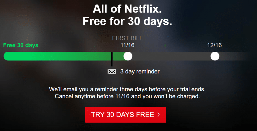
This CTA uses action verbs, gives users a reason to sign up, and nips the fear by giving visitors the option to cancel anytime.
As you can see in the screenshot, the page is very clear, makes good use of space and colors, and sticks to one offer instead of presenting too much information to the reader.
Michael Words – I Am Ready to Increase My Sales

This page uses two CTAs, the first button motivates users to know more and the second one pushes them to make a purchase by highlighting the benefit, i.e: increased sales.
The text is short, clear, easy to read, and there is no clutter on the page.
Blogging.org – Countdown Clock
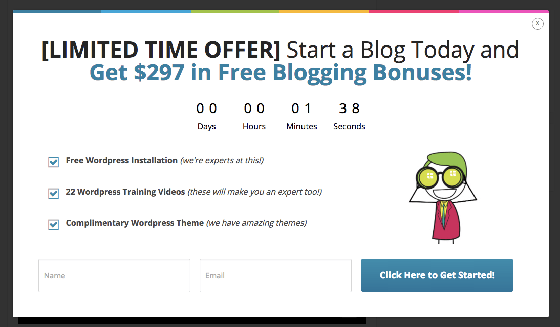
This page uses a timer as a CTA to create a sense of urgency. The timer makes visitors feel that they’d lose a very good deal if they do not make a move right away.
It sticks to one offer and uses white space to keep the page neat and attractive.
2 Bad CTA Examples
When there are good examples, there are also bad CTA examples. Let’s have a look at some:
Firefox – Distractions
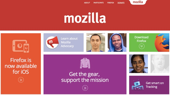
Firefox appears to be bad when it comes to CTAs.
Look at the above page, it uses a lot of colors and images that distract the user.
The purpose of the page is to make users ‘download’ the app but the message gets lost in the shuffle and the download button appears more of a box and less of a button.
Autodesk – Lack of Clarity
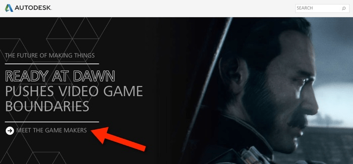
This CTA is very unclear, users do not know what ‘meeting the game makers’ means or what the company is trying to achieve here.
Are they trying to sell games or offer discounts? Such CTAs do not give good results.
Pro Tip: Use Analytics and Compare Options
Merely having a CTA is not enough, you must take steps to know how it’s performing and bring changes to your strategy as needed.
A/B testing can be a reliable way to compare different options and find what works for you.
Pro Tip 2: Make Use of a Messaging Tool Like Adoric
Taking care of CTAs can be quite tiring, it’s best to turn to a tool like Adoric so that all your Call To Actions are taken care of.
Our tool comes with a bunch of amazing features including forms, 10,000 free graphic elements, hundreds of templates, countdown, multi-step messages, and grids.
With this tool, you will be able to choose from a variety of fonts and create and manage campaigns without any trouble. It can be used to create kickass CTAs and marketing campaigns. Go here to sign up for a free campaign and know more about how Adoric can help you.