The e-commerce industry has one of the lowest average conversion rates. Currently, it stands at about 3%.
But what if you could increase this to 25%? Is that even remotely possible? It is, and with the right pop-up campaign, you can achieve this feat.
Why personalized popups are great for increasing conversion rates
Because you can easily adjust the popup to fire according to triggers & conditions which fit your audience and the call to action.
You can create journeys that make users gobble up your content. Though intrusive, pop-ups are a great tool for email list building.
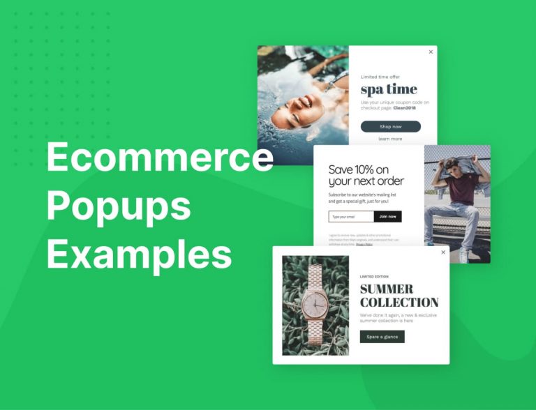
Here are 8 professionally designed, tested-and-trusted popup examples for inspiration. If you care to know why they work, we’ve provided a detailed explanation beneath each popup.
By the way, all the examples presented can be used as templates in Adoric’s editor.
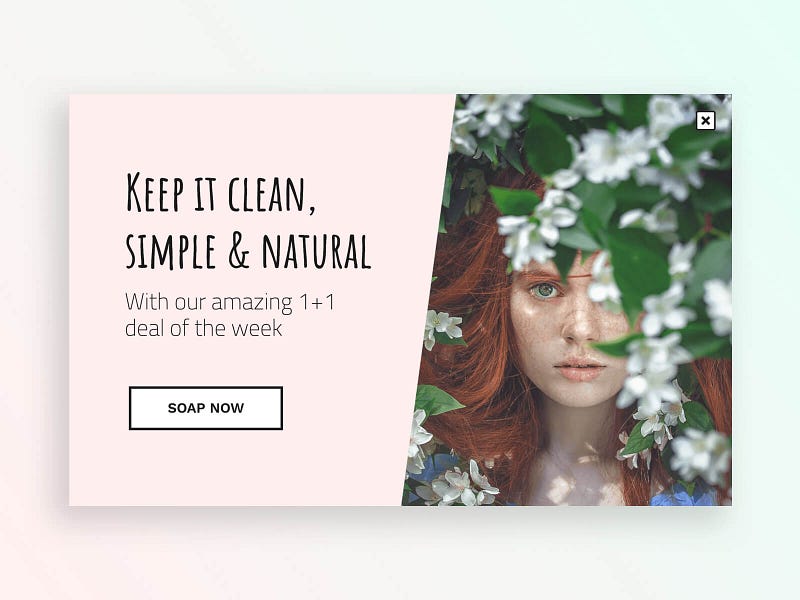
A promo popup that gives the customer everything they love, TWICE.
The science behind
Genius titles are rare, but here is one. We all know that keeping things clean & natural might not be simple, so we sandwiched these words with a simple sauce, made of soap.
Playing with words is amusing and connecting if used with users jargon. Visuals-words correlation is important, so we have a simple but beautiful picture of a young woman in nature.
It is also emotional. The offer is coming right after the connecting part for a reason, the decision will be easier. The call to action also deserves a mention, because it strengths the image in the mind of the user and it is fun.
Who should see it
- Users with a medium to high chance to convert
- Subscribers, readers, followers
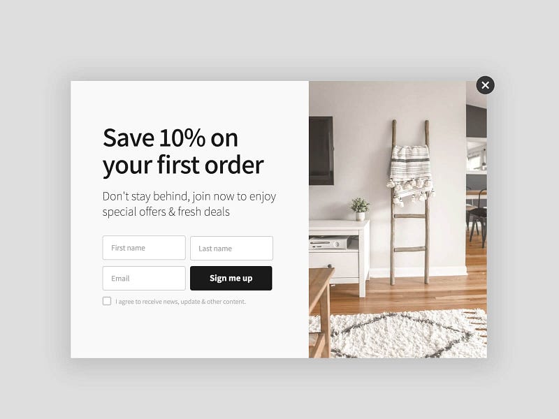
Subscription popup with a discount to turn visitors into buyers
The science behind
Funnel steps are progressive. But firing a popup like this push people from the beginning of the funnel to the end.
The design if clean, modern & sharp. If it represents what you’re selling — that will catch the eye of the right people.
Offering 10% discount in the first order is like a ‘dare you’ challenge, and if it’s not enough the following words are suggesting that you might stay behind with your old furniture.
Having your subscriber’s name is always good to create a stronger bond. The little checkbox should be a must-agree if you wish to deliver a newsletter besides a discount.
Who should see it
- Users who match your personas
- Users who have a medium to high chance to purchase, i.e users that already added a product to cart and have visited your website for 30+ minutes
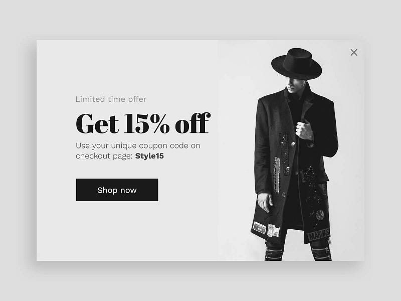
A classic discount promo popup for those you already know
The science behind
Drama is generated by black & white colors and a very dramatic guy
After we played with some viewer emotions, we highlight the 15% discount so they get pushed into action.
Simplicity is key here because the emotions generated and incentives given are enough to pull the call to action.
Who should see it
- Users who show interest to purchase
- Returning customers
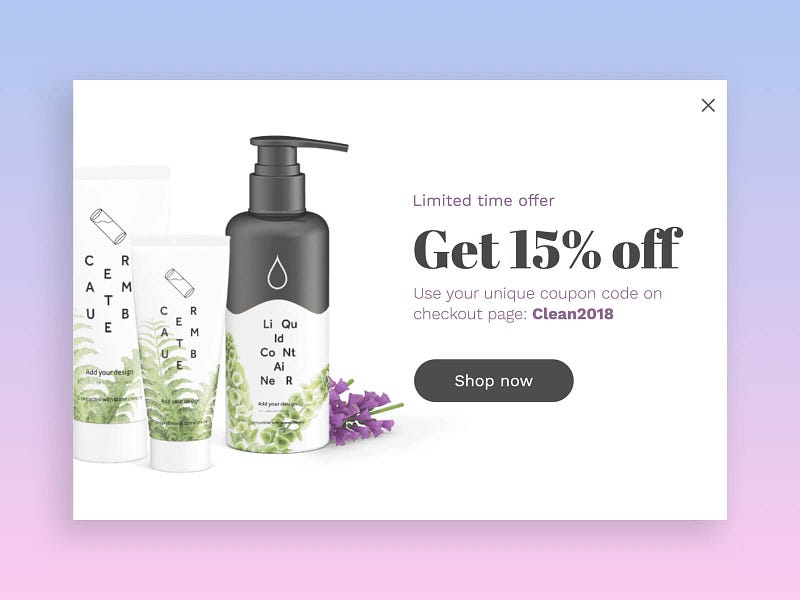
A discount promotion popup to increase revenue
The science behind
The high-end product and image are eye-catching. We highlight the 15% discount so viewers get emotional with the offer.
If they already start reading we arise their fear of missing out with a limit of time. Using the word checkout page and then giving a promo code is preparing a perfect land for the call to action — Shop now.
Who should see it
- Users who show interest to purchase
- Users who try to exit from your website
- Returning customers
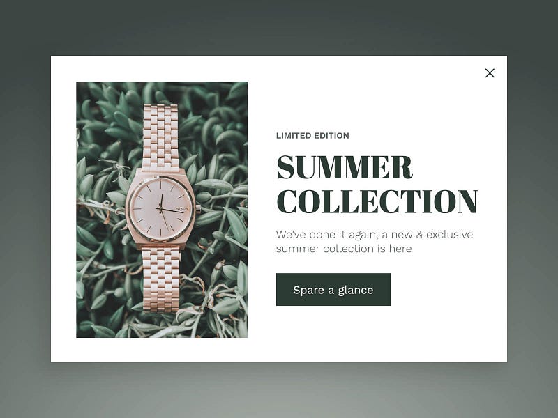

Promotion popup to show how great is your new collection
The science behind
The people who this collection is designed for will fill connected to the image. Why? An image of a luxurious-looking watch in an unusual background- this is contrast.
Besides, contrast being an eye-catcher, this is a thick hint of how the collection looks like. Words strengthening the feel of uniqueness: Limited Edition, Summer Collection, Exclusive. ‘spare a glance’ is letting the user feed his curiosity about the question ‘what is so exclusive over there?’
Who should see it
- Returning customers
- Users with high chance to convert, i.e the people this collection is designed for.
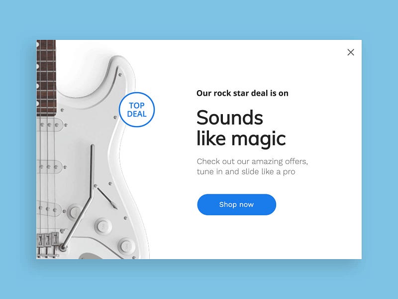

A promotion popup that convinces to check your deals
The science behind
The visuals here are subtle and attractive, just like any invitation should be like.
The titles use words who connect directly to this amazing guitar and with any guitar lover, making the targeted viewer feel emotionally connected.
The call to action is so direct because the target audience should be convinced by now.
Who should see it
- Users with high chance to convert, i.e users who added more than 2 items to the cart
- Returning users
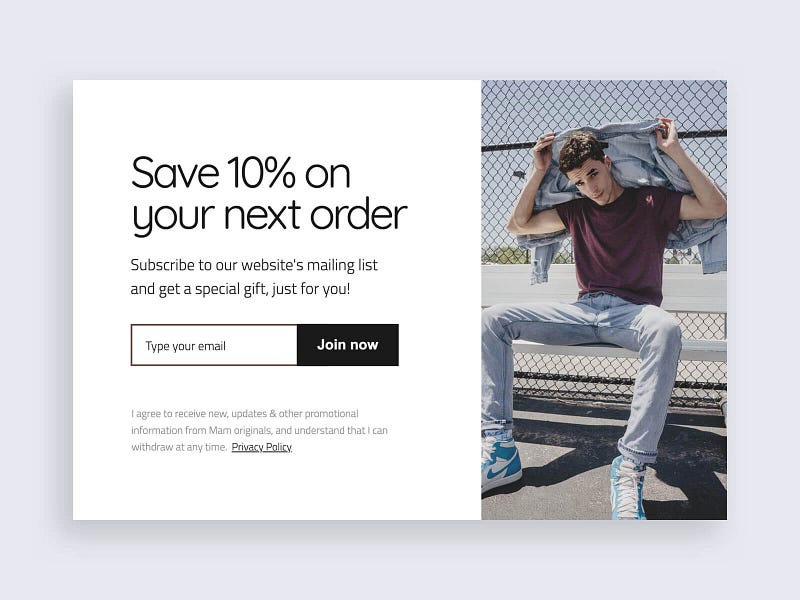

A common email subscription popup with a discount
The science behind
Simplicity is all over this popup, the design and photo are clean but common, perhaps this is the clothing style of the audience An incentive like a discount will increase the chance target audience will subscribe.
Who should see it
- Users who have a good chance to convert
- NOT returning customers or existing subscribers
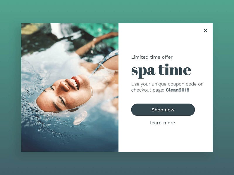

Seductive promotion popup
The science behind
Coupon code is a great way to make potential buyers buy. Happy sensations with great energy are delivered by the great photo and the title.
A slight urgency is pushed with a limit of time so viewers won’t get too nonchalant and forget to purchase. The chances of spa lovers to connect to this popup and buy are high
Who should see it
- Best customers
- Users who show medium to high interest in purchasing


The science behind
Everyone loves vacations and discounts. Combining two things people love in one sentence will make their chance to react much higher.
The visuals and typography are simple to let the statement stay clear and highlighted. Slight hint of adventure is giving by the image.
Who should see it
- Users who showed interest and are about to abandon
- Users who consume your content and have a chance to convert
Liked the popup examples above? Let them work automatically on your website. Just pick the template in our editor.

