Do you want to make it easy for shoppers on your website to add products to their carts, regardless of the page they may be on? Shopify add-to-cart popup is your best bet.
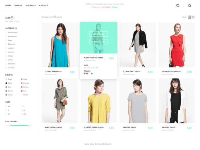
Add-to-cart popups, like the one shown below, are an excellent marketing tool for promoting flash sales and reducing cart abandonment. In addition, these popups can help you grow your sales tremendously if you put them to good use.


That being said, let’s now show you what add-to-carts popups are really all about and how to implement them on your Shopify website.
What Is a Shopify Add-To-Cart Popup, and How Does It Work?
An add-to-cart popup is a popup that comes up when customers add products to their cart, making it easy for them to checkout. It can also be a tool that nudges your store visitors to add products to their cart and pay for the items. The good thing about add-to-cart popups is that you can set when they show up on your visitors’ screens. For example, you can make them appear 2 minutes after a visitor lands on your website.
The Shopify app store has plenty add to cart apps that enhance customer experience on your store, and we’ve shared the best 10 add-to-cart popup apps on our blog already.
Where to Implement Add-To-Cart Popup
Where you implement the add-to-cart popup on Shopify is equally as important as how you use it. Here are some of the best places to add an add-to-cart popup to your website.
Homepage
When visitors arrive on your website, the homepage is likely the page they will see first. Therefore, having the Shopify cart popup feature on your homepage is a no-brainer. The good thing about this feature is that it helps your store design to stand out from the rest.
If you’ve ever noticed, many Shopify websites look alike. But if you want to create a Shopify website that is catchy and more engaging, an add-to-cart popup can do the trick.
Besides making your website look unique, add-to-cart popups can also help to boost sales. How exactly, you may wonder?
For instance, if potential customers visit your website and arrive on your homepage. They may have difficulty deciding which page to visit first and what product to see. A Shopify add-to-cart popup showing products on discount can nudge them in the direction you want, thereby improving your conversion rate.
Product Page
Activating the add-to-cart popup on your Shopify product page makes it easy for customers to shop for items without exiting the product page. If you are offering coupons or discounts on items worth a specific amount, the product page is a great place to display them.


Once the Shopify cart popup triggers notifying visitors of what is in store for them, they will be more eager to complete their purchase. Add a quick call to action before visitors can qualify for the offer. You can ask for their email address to receive the promo code or subscribe to your store to activate the code.
Collecting visitors’ email addresses help you build an email list for marketing and retargeting.
Ensure that your visitors get the coupons or discount code immediately after fulfilling the call-to-action so they can checkout without delay. And to prevent cart abandonment.
Cart page
Another strategic place to add an add-to-cart popup is your cart page, as doing so can help reduce cart abandonment. This is because your cart page is where shoppers are most engaged. So displaying your add-to-cart popup there will most likely nudge them to make a purchase.
And contrary to what you might be thinking, displaying an add-to-cart won’t annoy shoppers but rather motivate them to complete their buying journey.
Conclusion
Shopify add-to-cart popups are an excellent marketing tool to boost your store performance and increase revenue. For best results, combine them with other types of popups, such as email capture popups.
Ready to add an add-to-cart popup to your website? There is no better tool to use than Adoric.
Adoric lets you create stunning, conversion-driven add-to-cart popups and add them wherever you want on your pages.
Why not add Adoric to your Shopify website right away to see it in action?


