If you want to make more sales, you’ll have to win more customers. However, increasing conversion rate can be very hard considering the fierce competition out there in the market.
E-commerce is a highly competitive industry. There are more than 7 million online stores, many selling the same products that you do.
Though difference in prices is a major deciding factor for consumers, there are other points they take into consideration before making a purchase.
It’s those points we will be looking into today. The goal is to help you identify key areas where you can make optimizations so as to improve your site’s conversion rate.
In this article, we’ll talk about conversion rate optimization and how to increase ecommerce conversion rate.
Sites like yours that are trying to get product and content in front of the right people, to get people to opt-in, engage, or buy.
What is Ecommerce Conversion Rate?
Ecommerce conversion rate can be defined as the percentage of visitors who land on your website or page and make a successful purchase.
This is of huge importance because the average conversion rate is as low as 3 percent for most industries. This is pretty, but it does end up in hundreds of successful conversions since most major sites receive thousands of visitors.
Let’s do a bit of maths now.
Assume you receive 100,000 visitors per month and your conversion rate is 2 percent.
This means only 2,000 of these 100,000 visitors end up making a purchase. Fortunately, there are ways to push this number up.
If you optimize your site properly, your conversion rate can climb to 4%.
How To Optimize Ecommerce Website
Here are 17 ecommerce conversion optimization hacks to get you started:
1. Pay Special Attention to the Call-To-Action (CTA)
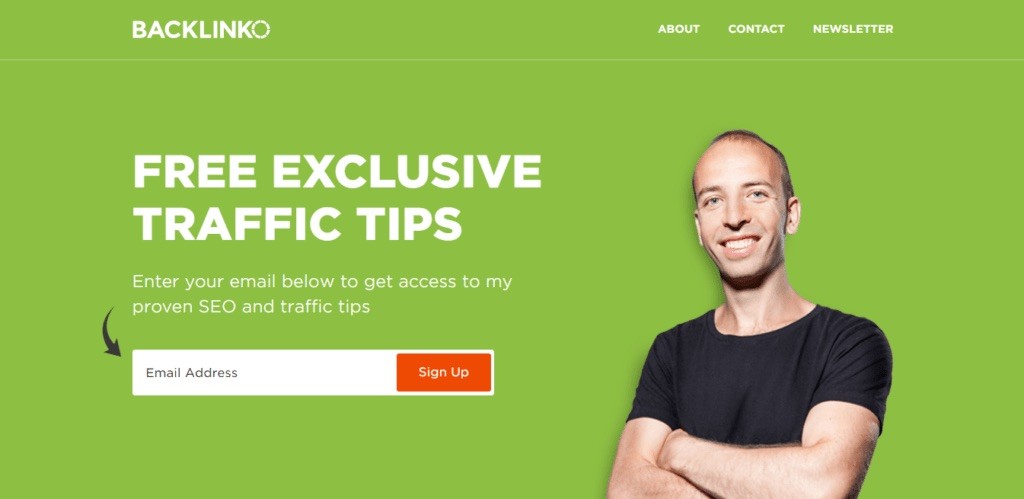

The CTA is used to tell users what action you would like them to perform. It encourages a specific response and can be very effective in boosting conversions as discussed in one of our previous blogs titled How to Create the Perfect Call to Action to Increase Conversions.
According to reports, about 70 percent of businesses do not have a CTA on their website despite CTAs offering an average conversion rate of 4.23%.
Customers might not always know what you expect them to do, hence make sure to include CTAs on every page. A CTA can be in the form of a button, a phrase, a video, a hyperlink, or an infographic.
The right option depends on several factors including your target audience and motive. For example, a video can be a good option if the purpose is to tell users how your product works so they can buy it.
Another very important factor is the placement of your CTA. While placing the CTA on the top appears to be a good strategy, it’s not always the most efficient one.
Find a place where users are more likely to notice the CTA. If it’s a small page – such as a product page – then the CTA should be at the top or bottom. It can be in the form of a button like ‘Buy Now’, ‘Purchase’, or “Save money”.
Your choice of words is of huge importance. Typical words like ‘buy’ or ‘purchase’ don’t do as well as personalized messages like ‘I Want to Save Money’.
In addition to this, pay attention to the design of your CTA button. It should be very neatly visible and not stand like a sore thumb on the page. Merely changing colors can affect your CTA as seen in the case of Andreas Carter Sports.
The company went from green to blue. This small change saw a 50 percent reduction in cart abandonment rates.
2. Make Sure Your Website Loads Fast
About 53 percent of visitors will leave your site if it takes more than 2 seconds to load. Buyers have a lot of options, if your website is slow to load, they’ll move to your competitor and might never come back to your site.
A delay of milli seconds can cause conversion to reduce by 7 percent. Look at big companies like Amazon and Walmart, they pay special attention to speed. You will notice they follow the minimalistic approach to ensure pages are quick to load.
Walmart, which makes a lot of sales online, saw an increase of 2 percent in conversions for every one-second improvement in speed. If you’re not sure how long it takes your site to load, simply go here and run a test.
You must make sure to check speeds in different regions, especially if you target international visitors. The speed depends on a variety of factors including:
- The quality and location of your servers
- Scripts used on a page
- The size of videos and images
All these factors can affect page loading speed. Choose a hosting plan that offers good speed. You should ideally choose a hosting company that offers to host your website on a server that’s located in your target country.
For example, hosting a site in the US can be bad if most of your visitors are in Japan or Australia. Your website will be slow to load due to the physical distance between the host and the target country.
In such a case, look for a company that has servers in Japan, Australia, or neighboring countries.
Next, pay attention to images and videos. Videos should only load when a user scrolls down to it, and not automatically when the page is loaded. Also, optimize images for mobile and web. The smaller the size of an image, the faster your website will be to load.
See to it that your images are saved in jpeg format. The reason is, jpeg images take up very little server space. Also, make sure there are no script or cache related issues as they can affect speed.
3. Offer Discounts and Special Packages
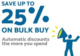

Discounts are a good bait to attract prospective customers.
It’s believed that 92 percent of buyers in the US use a discount code or coupon throughout the year. However, the demand for discounts typically goes higher during holidays.
It’s believed that offering a discount is more useful than increasing quantity. This is why we encourage companies to concentrate more on offering discounts and less on increasing quantity. Offering discounts by companies in their stores has always been a successful strategy that can be calculated by the simple profit formula of maths which derives and tells you the profit and loss share.
This is also because by reducing prices, you can cater to more people. Someone might find your product too expensive at $55 but affordable at $50. By offering a discount of just 10 percent, you might be able to attract thousands more buyers.
There are several ways to offer a discount including value packs that can help increase sales by 73 percent. In addition to this, you can offer discount codes that can be used right away or in the future to encourage users to come back and make more purchases.
Another popular way to offer discounts is to have seasonal sales that can also prove to be effective in getting rid of old stock. However, be careful as consumers often perceive discounted products with poor sales.
4. Try Email Marketing
Email marketing offers an ROI of up to 4,400 percent, which makes it one of the best methods to increase conversion.
This incredible marketing technique can be used to get in direct contact with your clients and potential buyers, which makes it a good option to win back lost customers.
Some people argue that email marketing isn’t as popular as it used to be, but let us remind you that about 91 percent of buyers still check their emails every day. Moreover, it’s the marketing method with the highest average order value.
The problem, however, is that email marketing can be a little difficult to master. You’ll first have to get people to sign up for your newsletters and then come up with interesting content to convert them.
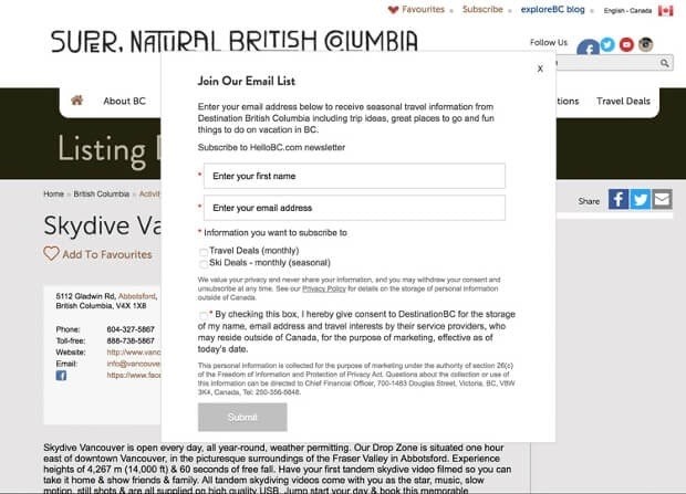

The process can be a little time-consuming, but it is worth the effort.
Adoric can help you grow your email list by creating compelling forms and popups to capture prospective customers’ contact information.
We discussed some great tips in our previous blog titled Beginners Guide to Creating Powerful and Effective Lead Magnets. Have a look at it if you’re having trouble generating leads.
Consider breaking your audience into segments and coming up with personalized messages to ensure they convert. A good way to save time and money is to automate your email marketing efforts.
Automated emails average 152 percent higher CTRs and 70.5 percent higher open rates than traditional emails.
About 82 percent of businesses use email marketing technology in their marketing efforts. Companies that use automation tools see conversion rates as high as 50 percent.
You have to concentrate on two things – getting more people to sign up and coming up with a message that makes them take your desired step, i.e: make a purchase.
The message should be very well written. Keep it crisp and personalized. You can include special discounts and offers in the email to get people excited about what you have to offer.
5. Offer Free Shipping


Let’s get straight to the point: free shipping can help attract more buyers as 80 percent of users look for a store that offers free shipping.
People don’t like to pay for shipping and many will quit your site if they find shipping too costly.
By offering free and same day shipping, you can increase conversion by 20 to 40 percent.
Remember that you can get consumers to pay more if you offer free shipping. Using this conversion optimization strategy will go a long way in helping you to make more sales.
6. Consider Coming Up With Free Trials

Free trials help to win people who do not know, understand, or trust your product or site.
Freemium conversion rates hover between 2 to 5 percent. This means only 5 percent of users who choose to try out your free trial will turn into paid consumers.
This might sound like a bad number but if you add this 5 percent to your average conversion rate of 3, your total conversion will go up to 8 percent, which is pretty impressive.
As a business, you should work to get more people to try a free demo. According to reports, free demos that do require a credit card offer higher conversion rates – up to 40 percent.
This is because free trials that require a credit card bring in qualified users. To get good results, you must aggressively promote your free trial offer so that more visitors know about it.
7. Use Social Media
Social media can be used to increase conversion by attracting good leads. There are billions of people on Facebook, Instagram, Snapchat, and other social media platforms. You should work on a reliable strategy to target these people and turn them into paying consumers.
Businesses seem to be pretty good at using social media to attract users but very few know how to use social media platforms to improve conversion.
They generate engagement and get feedback but it very rarely converts into profit.


A very good way to use social media to increase conversion is to concentrate on user-generated content. You can encourage consumers to wear your brands and share a picture on social media using your brand hashtag while choosing the best post to feature on your page.
This will not only help promote your business but also give people a reason to buy what you have to offer. Consumers want to be recognized. Getting featured on a business profile can mean a lot to them.
In addition to this, use a mix of videos and images. According to reports, 90 percent of online buyers say that videos are very effective in making purchasing decisions.
You can post reviews, how-to guides, and buying guides on your page to educate consumers and convert them. It might also be a good idea to collaborate with an influencer to promote your products or services.
People trust influencers as much as they trust friends and family members. Find influencers by scraping Google and choose” someone who has a large followership and reputation
8. Take Care of Mobile Users
Mobile usage has grown by leaps and bounds in the last few years. Google loves websites that are mobile-friendly since about half of all internet users are on mobile.
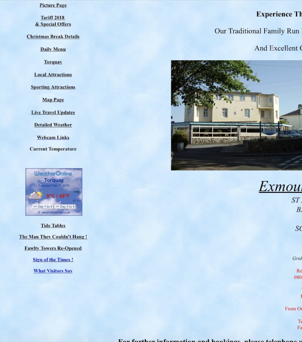

Non-responsive sites look bad and unprofessional as seen above. Users who land on such a site will most probably quit it and turn to websites that work well on mobile devices.
If your website runs on WordPress, you can easily find mobile-friendly themes you can use to bootstrap your design.
To test the mobile-responsiveness of your website, go here.
9. Improve Design
Whether a user is on a mobile device or a computer, he or she expects your website to be easy to navigate. A website that is bad on the eyes or hard to navigate will lose visitors.
Use color and contrast psychology to come up with colors that look good and go well in sync with the theme of your site.
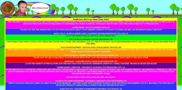

The example above has a lot of colors that don’t only look bad but are also difficult on the eyes. Plus, the font is also very difficult to read. It doesn’t matter how informative the content is. Most people will quit such a website.
For better user exprience, the font should be big and easily readable. Moreover, categories should be clearly divided so that users can easily find what they need.
10. Use Search Engine Optimization (SEO) in the Right Manner
While the main purpose of SEO is to bring traffic to your site, it can also be used to improve conversion.
Think about how you present your site on search engines.
It shouldn’t only be about getting more people to visit your site. For an ecommerce store, it’s never about the number of visitors. It’s always about the people who buy.
You have to pay attention to factors like keywords, META description, and title.
Let’s say you sell sunglasses and you rank well on search engines for the keyword ‘buy sunglasses’.
This keyword is self explanatory. People who search for this term will be interested in buying sunglasses. The page that ranks on Google should ideally be your product page.
This happens when we use wrong keywords on the wrong page. You have to be careful about what keywords a page ranks for and what the page actually offers.
If users land on a page that contains the history of your company or product reviews, they might leave the page right away and look at other options because they’re not interested in reviews, they’re only interested in buying.
Mixing search engine optimization and conversion rate optimization can be a little tricky job. Audit your site and make sure content goes well with what you offer.
Pay attention to what Google Analytics has to say. The bounce rate can be a very good indicator. A low bounce rate indicates your page offers irrelevant or poor content. If such is the case then consider updating it.
11. Add a Search Bar
About 30 percent of ecommerce site visitors use the search bar to find what they need. Little wonder why users who use the search bar are twice as likely to convert.
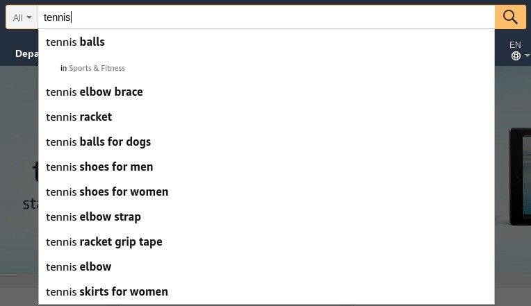

Consumers who land on your site might be looking for something specific. They don’t always have time to go through all products, which is why most prefer to use the search feature.
Make sure to place it prominently and to add filters so that users can search based on color, size, and other such factors.
12. Add Credibility to Your Website
Consumers who land on your website for the first time might not have a lot of faith in what you have to offer. A reliable way to win such consumers is to appear authentic.
Share details regarding your business such as team members, physical address, photos, and phone number. In addition to this, mention some awards or licenses you have acquired.


Moreover, you can display information related to your parent company, if it’s known and registered, as seen above.
13. Display Social Proof
People prefer buying products that are safe and reliable. Show what others think of your site by displaying reviews and testimonials since about 92 percent of users check online reviews before they make a purchase.
Reviews make businesses look credible. However, you must make sure to keep a balance between positive and negative reviews as websites that only display positive reviews appear unauthentic.
14. Make It Easier to Check Out
A lot of consumers leave during the checkout process because they find it problematic as discussed in one of our previous blogs titled Top Reasons for Shopping Cart Abandonment – and How to Fix It.
Make it easier to check out by offering guest checkout, removing hidden costs, and allowing users to save carts.
These small steps can increase conversion and encourage users to complete the process instead of abandoning their cart.
15. Offer Multiple Payment Methods
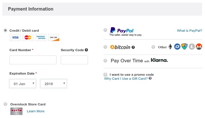

Give buyers the option to choose from multiple payment methods including cash on delivery, PayPal, credit and debit cards, and other online payment options.
Consumers are used to specific payment methods, especially when it comes to ecommerce sites. Not everyone’s comfortable giving out credit card details and some like to use online wallets since they’re considered safer.
16. Build Trust With Your Buyers
Lack of trust is one of the major reasons why consumers abandon a site. You can build connections with your potential clients by being transparent and answering all their questions.
Have a detailed return policy, privacy policy that answers all questions a user may have about your company.
In addition to that, you can create a detailed FAQ page that answers every possible question a prospective customer might have.
17. Improve Your Customer Support
Offer excellent customer support so that your users can reach you whenever they want to. Companies have been able to increase conversion by up to 156 percent just by improving customer support.

The secret lies in being available and handling customers’ queries and grievances in a professional manner.
Live chat can be of great help here but other options like phone support and email support fit quite well.
Bonus Tip: Use Falling Gift Game Popup
Allowing your visitors to play interactive games to win coupons/discounts will not only help boost engagement on your website but will also help uplift your conversion and sales. This is exactly what the falling gift game popup is all about.
How Does Falling Gifts Game Work?
Well, it’s pretty simple. First, a popup appears moments – typically less than 30 seconds, depending on your settings -after a visitor arrives on your website. It could be a full or half-display popup. On the popup, users will see balloons falling through and then be asked to input their email addresses (this is where the coupon code will be sent after making a win).
All the user needs to do is click on the falling balloons to reveal the gifts embedded in the balloons. Depending on how you set the system, they might have to attempt several times to win a gift, which is usually a coupon. For now, you can only allow them to try 1 to 6 times.
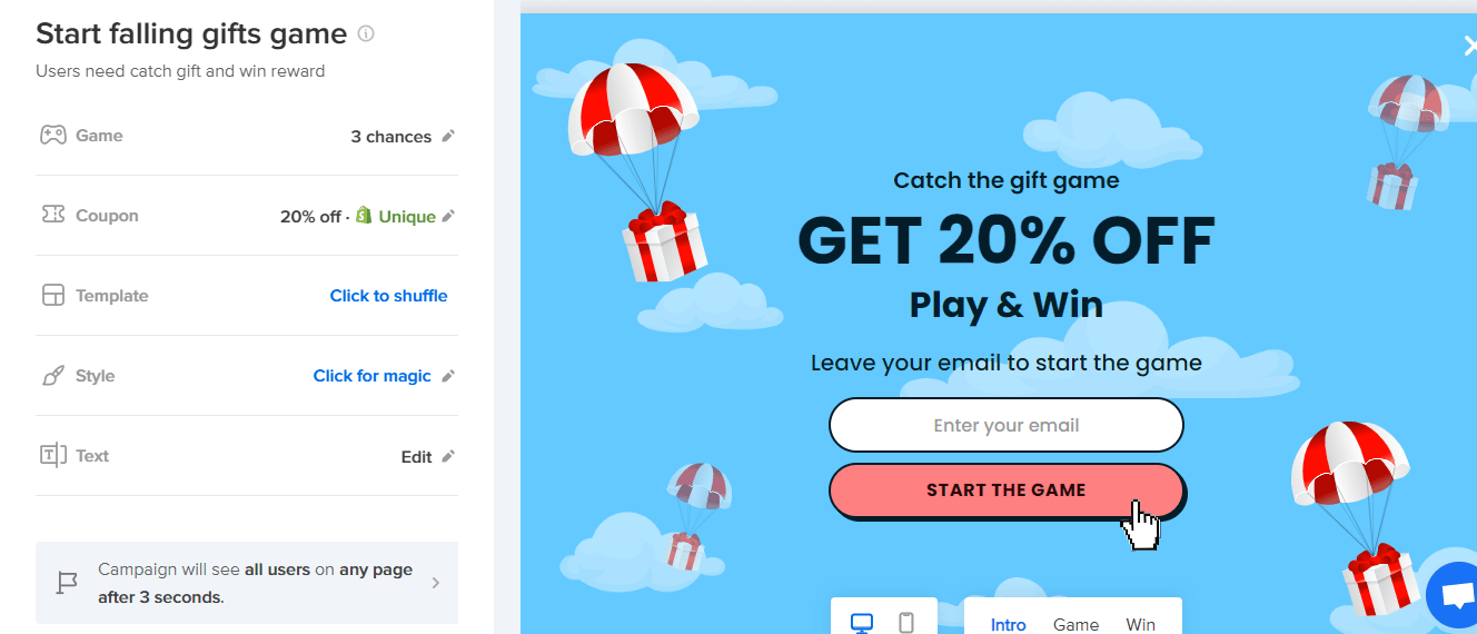

Setting up the falling gift game is very simple, thanks to our intuitive, drag-and-drop editor.
Also, Offer Free Shipping
Using the falling gift game might not always be enough to improve your conversion rate; you need to take things a step further by offering your customers free shipping. If you decide to use this strategy, you need to let your customers know you offer free shipping by finding a way to display it on your website.
This is where Adoric’s free shipping bar tool comes in handy.
With Adoric’s free bar tool, you can create an attention-grabbing floating bar to promote your free shipping offer.
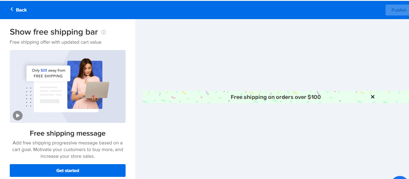

You don’t even need to start from scratch; just pick a floating bar template and edit/customize it to your heart’s content.
Ready to try out our free shipping bar feature? Sign up for an account right away.
Conclusion
We hope these ecommerce hacks will help you make more sales. Consider using a mix of these marketing strategies for your eCommerce business and pay attention to the numbers so that you know what effect each has on your conversion rate.
