Conversion rate problems are a very serious issue for website owners. It happens when a website gets good traffic but has little engagement, subscription, or sales to show for it.
To put it in another context, conversion rate problems occur when a lot of people are visiting your website, but they aren’t signing up for your email list, trying a demo, signing up for an account, or buying anything. They just leave almost as soon as they come.
This can be very frustrating.


The good news, though, is that conversion rate problems can be fixed – only if you know what mistakes you are making. Consequently, identifying and rectifying these mistakes will make your website convert better.
And that’s what this post is about; to help you identify these mistakes and also provide you with tips to solve them.
But first, how do you calculate your conversion rate?
Conversion Rate Formula
If you can’t accurately measure your website’s conversion rate, you will have a hard time improving it. The easiest way to calculate your website’s conversion rate is by using the formula below:
Conversion rate = Total number of actions / Total number of interactions * 100
Confused? Let’s explain.
Conversion rate is calculated by dividing the total number of actions people performed by the number of people who interacted with your website, email, ads, etc. and then multiplying it by 100.
For example, if 1000 people visit your website in a day and only an average of 15 subscribe to your mailing list, your website’s conversion rate will come out at 15/1000*100, which equals 1.5%.
If an average of 100 people reach your checkout page, but only an average of 2 eventually make a purchase, your conversion rate becomes 2%.
Or if you send out an average of 5000 emails every month but only 50 people click on the links in your emails and make a purchase, your conversion rate is 5%.
As you can see, there are several yardsticks for measuring conversion rates. You can measure it based on the number of clicks, subscriptions, sales, shares, and many more.
Factors That Affect Conversion Rate
A lot of factors can influence your website’s conversion rate. The 4 major ones are:
- Load speed: a slow-loading website hardly converts
- Design: cranky, poor design won’t get your website anywhere
- Website copy: you need to write compelling web copies to improve your conversion
- Mobile-friendliness: mobile-friendly websites convert better than those that are not
Okay, that’s about it for factors that affect conversion rate.
Let’s now get into the main gist of this post: mistakes you are probably making that are hurting your chances of conversion.
8 Mistakes That Kill Conversion Rate
A lot of things can ruin your chances of converting visitors to your Shopify website into customers. While some are beyond your control, most others are.
That said, here are 8 mistakes you are likely making that are making your website not convert as you want:
1. Your Website Is Poorly Designed
First impression matters a lot. The same holds true for websites.
The thing is, you have a severely limited time, which is about 7 seconds, to make a good impression on people visiting your website. This is because people are just impatient.
Failure to impress them in that short little time will result in them leaving your website. Conversion equals zero.
This is why we can’t overemphasize the importance of putting in the effort to make your website pop.
A good-looking website with an excellent user experience will always convert better than a website with a crappy look.
Have a look at these two websites. Which do you think will convert better?
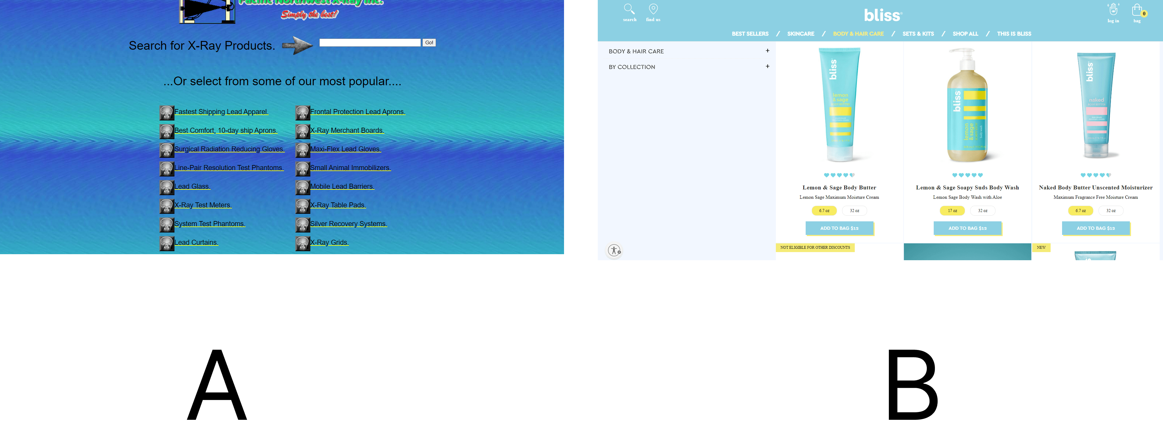

Website A is clunky, distasteful, and repelling, isn’t it? Whereas B is neatly laid-out and attractive, and so will naturally convert better.
Luckily, you don’t have to be a guru UI/UX designer or a geeky front-end developer to create a website that commands attention and converts. One easy way to go about this is to pick a nice Shopify theme for your website.
These themes are easy to customize, have a good visual appeal and are mobile-friendly. All you have to do is pick the one you like – either paid or free – and customize it to your heart’s content.
2. Sending Traffic to the Wrong Page
Another common mistake we see a lot of Shopify merchants make is driving traffic from their Facebook/Google ads to their Home, About, and, even worse, Contact page. Doing so hurts their chances of conversion and they don’t even know it.
People that land on your website when they click an ad expect to see exactly what they clicked on. Sending them to your homepage in the hope they will navigate through your maze of pages to the specific product they were looking for is a fatal mistake.
If you do so, they will leave your website faster than a hot knife through butter without buying anything or taking any action.
So if you run an ad that promotes a product on your website, direct traffic to that specific product page, not your homepage. The same goes for your links on third-party websites; ensure there is a match between them and the page they point to.
While you are still at it, fix all broken links on your website. Broken links are links that point to dead pages – that is, non-existent pages on a website. Technically, they are called 404 pages, and you must have seen them a lot of times on other websites.

3. Showing Your Popups at the Wrong Time
Pop-ups are a great conversion rate optimization tool, which when used correctly can convert your visitors into customers and boost your sales. The emphasis here is “correctly”.
This leads us to the third mistake you are likely making: using popups incorrectly by showing them at the wrong time.
Wrong timing is when you display your popups immediately after visitors arrive on your website. Doing so will irritate them and make them want to leave your website immediately.
For this reason, the best time to display your popups is when visitors have engaged with your website. The easiest way to know when visitors have engaged with your website is when they start to scroll down your page.
Another good time to show your popups is when they attempt to exit your website. If you use the right popup tool, displaying your popup at the right time wouldn’t be much of a problem.
And what better tool to use than Adoric?
Adoric has smart triggers that enable you to display your popups at the right time. For example, you can make your popups appear when visitors have scrolled a certain distance down your page, clicked on a button, performed a certain action, or attempt to leave your website.
4. Targeting the Wrong Audience


Everyone is not your customer. That’s one ugly truth you can’t run away from.
So the earlier you identify your target audience – that is, people who actually want to buy what you sell – the better for you.
How then do you know your target audience? There are a couple of ways to go about it, and here are a few of them:
- Spy on your competitors to see who they are selling to. They are also your potential customers.
- Check Google Analytics. It will give you insights into the kind of people visiting your website and what they are actually looking for.
- Do a quiz. Ask your website visitors what they actually want and then listen.
- Create a buyer persona. Buyer personas are simply the profiles of people who will likely want your product.
- A/B test. Experimenting a little to figure out your ideal customers isn’t a bad idea.
5. Lack of Social Proof
Did you know that people look at reviews all the time before making a purchase? As for numbers, some studies suggest that almost 100% of online buyers check for what others are saying about a product before buying.
And they do so for a good reason: our natural bandwagon instinct. More often than not, we do things because everyone else seems to be doing them. We buy clothes, smartphones, etc. because everyone else around us is buying them.
This also explains why we trust what people – both the ones we know and the ones we don’t – say about a product so much.
In marketing, this is known as social proof.
Social proof comes in many forms, but the commonest ones are reviews, testimonials, star ratings, and the number of times a product has been purchased.
If none of these is present on your website, you will find it extremely hard to convert your visitors into customers.
And the earlier you take corrective measures the better for you because social proofing helps to build trust with potential customers.
Lucky for you, social proofing your website for optimum conversion is anything but hard; you just need to use the right set of tools.
Shopify apps like Rivyo and Loox make it easy to gather reviews from your customers and display them on your website.
6. Your Checkout Process Is Complicated
Watching visitors leave your website without buying anything or subscribing to your newsletter is painful. But what hurts the most is seeing them exit your store after initiating checkout.
Technically, this is known as cart abandonment.
It happens when shoppers add products to their carts but fail to pay for them.
Cart abandonment happens for a number of reasons, most of which you have no control over. For example, someone can come to your website, add a product to their cart, get distracted and forget about the cart.
That’s definitely not your fault.
Nevertheless, you can also be a culprit. In fact, if shoppers abandon their carts at an unusually high rate, chances are you doing something wrong. And the most likely suspect is your checkout process.
A complicated checkout process is the bane of good conversion, and so should be dealt with squarely.
Here are a couple of things you can do to smoothen your website’s checkout:
- Use Shopify’s accelerated checkout button
- Eliminate distractions
- Use guest checkout
- Offer multiple payment options
- Accept payment in multiple currencies
7. Your Website Isn’t Mobile-Friendly
Did you know that mobile-friendliness is one of the factors Google uses to rank a website on search engine result pages (SERPs)?
This shows you just how important having a mobile-friendly website is.
Statistically speaking, about 60% of all website traffic comes from mobile devices. So if your website isn’t optimized for mobile users, be sure you will lose them.
Thankfully, you don’t need to write complicated code or hire a developer to make your website mobile-friendly. Building your website using a mobile-ready Shopify theme will do the trick.
You will find several mobile-friendly themes, both free and paid, in the Shopify theme store.
8. No Live Chat
Shoppers, particularly first-timers, will need help as they move along their buying journey on your website. They will have questions that need to be answered, too.
For example, they might want to know about your return policy or if you offer a discount for bulk purchases.
Now setting up an FAQ page and slapping all the answers to these questions might seem like the most logical thing to do – and really it can work.
But there is a flaw to this setup. Firstly, this can only work if your shoppers are aware the page exists. Secondly, sending them to your FAQ page can short-circuit their buying journey, making them exit your website.
Thirdly, there is a very good chance they won’t find what they are looking for there.
For all these reasons – and many more – you are better off offering them a live chat. Doing so ensures they get help when they need it, and this can motivate them to go through with their purchases.
Conclusion
So there you have it; 8 mistakes you are probably making that are affecting your website’s conversion rate. These mistakes can be fixed, and we’ve shown you how to fix them.
Ready to deploy smart popups to your website to boost conversion and, consequently, sales? Add Adoric to your Shopify website right away!

