If you are looking for ways to increase your Shopify store sales and revenue, optimizing mobile product recommendations is a sure-fire approach.
A recent study showed that the mobile commerce market contributes nearly 73% of the total market, with sales projected to hit $620 billion in 2024. Mobile shopping has become an integral part of consumers’ lives.
With more and more shoppers turning to their smartphones and tablets for browsing and purchasing products, optimizing mobile product recommendations has become essential for online retailers.
In this blog, we will explore strategies and best practices for optimizing mobile product recommendations on Shopify to enhance the overall shopping experience and drive revenue. Let’s get started.
Understanding the Importance of Mobile Product Recommendations
Why mobile product recommendations? Mobile devices have taken over desktops as the primary means of accessing the internet. It’s now essential to make mobile commerce a critical aspect of your business strategy.
However, mobile users have distinct behaviors and preferences. Catering to their needs can lead to improved engagement and conversions.
Mobile product recommendations serve as personalized suggestions to users, guiding them towards products that align with their interests and preferences. Likewise, they help to increase the average order value, reduce bounce rates and encourage repeat purchases. This enhances customer retention and loyalty.
Shopify Built-in Mobile Product Recommendation Features to Try
Shopify offers various built-in recommendation features that you can integrate while optimizing your store for mobile. Utilizing these features can provide a head start in optimizing mobile product recommendations:
1. Related Products
Shopify allows you to display related products on product pages, offering customers a chance to explore complementary items. By showcasing products that complement the one the user is currently viewing, you can gain their attention and encourage extensive browsing.
2. Recently Viewed Products
Implementing a “Recently Viewed” section can be an effective way to remind users of products they have shown interest in. This feature enhances user experience by allowing them to quickly revisit products without having to search for them again.
3. Best Sellers and Popular Products
Highlighting best-selling and popular products on the mobile storefront can create a sense of urgency and social proof, nudging customers towards products that have gained the trust of other shoppers.
4. Featured Collections
Curating collections based on themes or occasions can help mobile users discover products that suit their current needs. Utilize eye-catching banners and images to draw attention to these feature collections.
5 Tips to Optimize Shopify Mobile Product Recommendations
Working with Shopify’s built-in features is good. However, you can incorporate other external strategies to further optimize your mobile product recommendations.
1. Mobile-Friendly Product Recommendation Widgets
Widgets are small applications designed to display relevant information about specific features, services or contents. They are also used to perform specific functions.
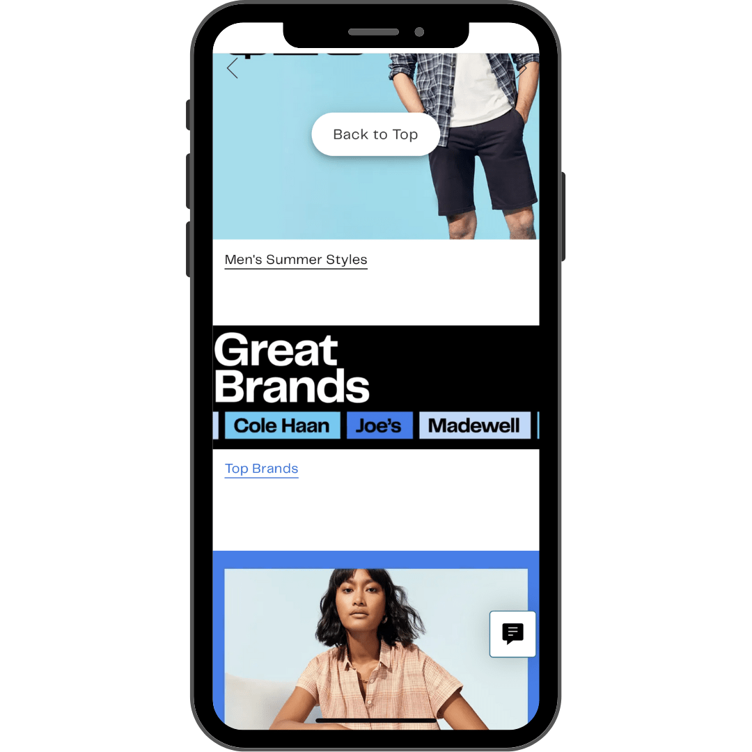

For mobile, these widgets need to be responsive, functional and user-friendly. A good widget has the ability to adjust to any mobile device irrespective of screen size and resolution.
How to Know Your Product Recommendation Widgets Are Mobile-Friendly?
1. It needs to be Responsive
Your mobile product recommendation widgets should automatically adjust their size layout and content to fit the user’s device. This ensures that users can interact with the widget effortlessly, without the need for constant scrolling or zooming.
2. It should have Adaptive Content
Mobile Shoppers know what they want to buy and have zero tolerance for delay. Your widgets should only display the most important details about a product or service, what your customer wants to see.
3. Touch-Friendly
Given that mobile devices rely on touch-based interactions, mobile-friendly widgets are designed with larger touch areas, making it easier for users to interact using their fingers.
2. Enable Push Notifications
Push notifications are short, attention-grabbing messages sent directly to a user’s mobile device. Done well, they build audience engagement and enhance user retention. 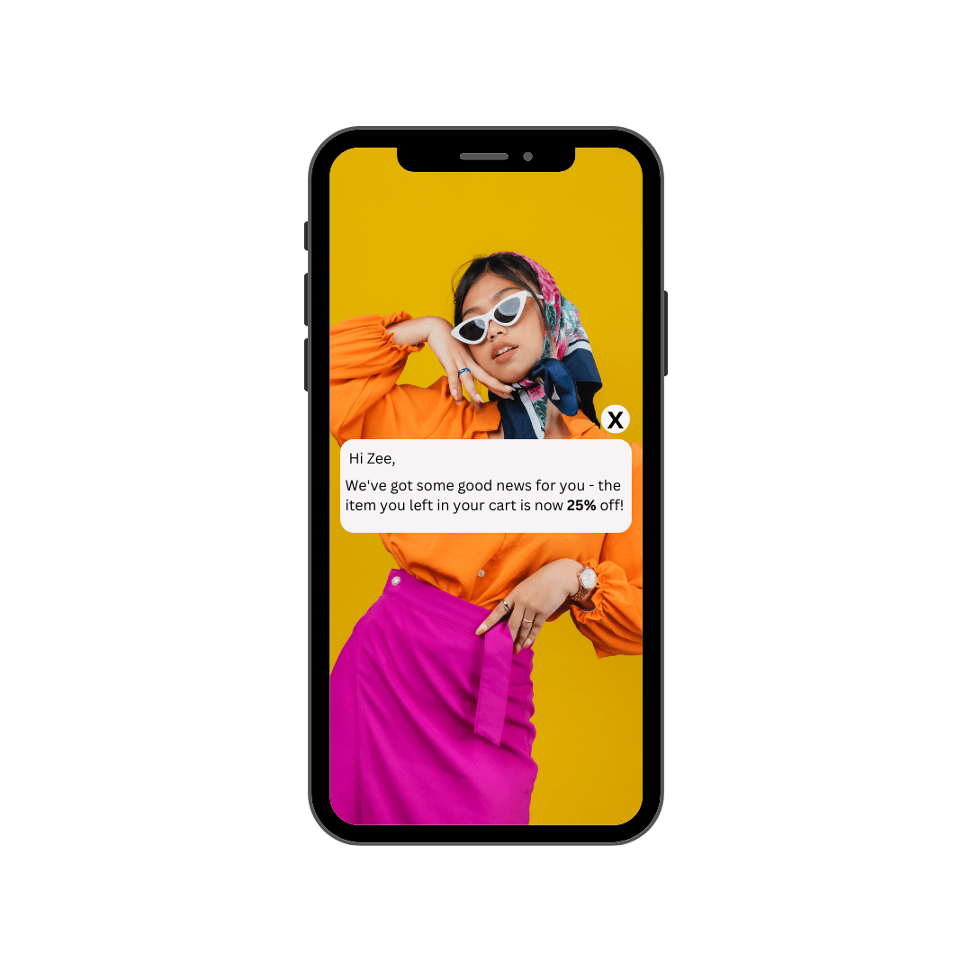

Use push notifications to recommend products to your customer through their mobile device.
Why is Enabling Push Notifications Important?
1. Real-Time Updates
Push notification enables real-time communication, making it possible for apps to deliver up-to-date product recommendations. It keeps users engaged with the app and fosters a sense of urgency, boosting overall conversion rates.
For instance, if a user has abandoned a shopping cart, the app can promptly send a notification with a discount offer on the abandoned items, encouraging the user to complete the purchase.
2. Personalization and Contextualization
Push notifications can be highly personalized based on user behavior, preferences and historical data.
By leveraging user insights, the app can send tailored product recommendations that match individual tastes and interests. This level of personalization increases the chances of users finding the notifications relevant, leading to higher click-through rates and conversion rates.
3. Location-Based Recommendations
Location-based targeting is a powerful feature that push notifications can leverage to enhance product recommendations. Apps can deliver notifications with location-specific offers or based on a user’s proximity to a physical store or a particular event. This level of relevance makes users more likely to act on the recommendations, driving traffic and conversions for businesses.
3. Perform A/B Testing to Streamline Performance
Conduct A/B Testing to streamline performance by understanding what types of product recommendations resonate with your users. By experimenting with different messaging, timing, and content, you can optimize the performance and know how and what to recommend to your customers. This increases the likelihood of users engaging with the recommended products.
4. Create Designs to Align With User Behavior on Mobile Devices
Layout and organization are important when designing product recommendation banners and sections. Make your design appealing and eye-catching to grab the attention of the customers on their mobile devices. Avoid large product recommendation boxes that overshadow the test and content on your Shopify store. Also, your boxes should not be too small to be insignificant.
It is best to analyze and understand how mobile users behave, and how they interact with products in your store. This will help you to evaluate what your users find interest in, and create design around that to enable you to improve their performance.
5. Optimizing Visuals and CTA to be Mobile-Friendly
Visuals are an important part of your mobile product recommendations. You need something to get your customer’s attention while scrolling through their mobile.
A well-placed and visually appealing recommendation is likely going to get more conversions than a poorly designed one. Also, your product description needs to be visible and easy to read to let your customer know what they are buying.
Another thing to consider is your CTA (call-to-action). Since you are optimizing your product recommendation for mobile, your CTA needs to be bold and visible.
A good CTA is one step closer to conversion. It should be a button that will take the customer to the next line of action, be it the checkout page or the landing page. Your CTA should include a clear path to the next step.
For mobile, it is preferable to have your CTA take up the full width of the smartphone or any of the smaller devices and have a color that contrasts with the site’s background. Having tacky and poor product recommendation designs and CTA will affect your sales and the overall business revenue.
Other ways to optimize your Mobile Design
1. Mobile-First Design
Design your product recommendation section with a mobile-first approach. Ensure that the layout, images and text are optimized for smaller screens and quick loading times.
2. Strategic Placement
Place product recommendations in prominent areas of the mobile storefront, such as the homepage, product pages and shopping cart. Utilize scrolling banners or carousels to showcase a variety of products without overwhelming the user.
3. Simple Navigation
Make it easy for mobile users to explore recommended products with a clear and intuitive navigational system. Use filters and sorting options to refine the recommendations based on user preferences.
4. Limited recommendations
Avoid overwhelming users with too many product recommendations. Limit the number of suggestions to maintain a clean and uncluttered mobile shopping experience.
Conclusion
Optimizing mobile product recommendations for your Shopify store can significantly enhance the shopping experience for mobile users, leading to increased conversions and revenue. By leveraging our discussed strategies, you can create a compelling and tailored shopping journey for your customers.
Remember to continually test and iterate on your strategies to keep pace with evolving customer preferences and behavior.

