Building an email list is essential to success in business. It can be used to market new products, keep clients loyal, and inform prospects about the latest offers and products. An empty email list, however, will not be able to do all these, which is why businesses spend thousands on growing their email lists.
Most businesses and marketers use email opt-in popups to generate sign-ups and grow the list. Despite what naysayers may say, email newsletter popups are quite effective and can help you quickly build your email list, if used right.
According to reports, the average conversion rate for email popups is about 3.09 percent, which is pretty good when you compare the number of people who visit the average website. Companies that switch from a static, traditional opt-in form to a kickass popup form may see an increase of nearly 100 percent in signups.
This is why it is important to use them. They can help generate email lists and find new subscribers at a very affordable rate.
Whether you’re looking for newsletter pop-up ideas, email subscriber pop-up inspiration or tips on how to create a pop-up subscription button, you have landed on the right page.
In this newsletter popup guide, we’ll talk about newsletter popup HTML code, best email subscription pop-ups, and newsletter popup designs.
What is an Email Popup?
The term can be confusing for some. Traditionally, when we refer to email popups, we’re referring to lightbox popups. These popups typically appear on top of a page that you’re viewing. They usually darken the page behind them and become the main focus of the page.
Why Use Email Pop-ups?
The answer is simple – because they offer high visibility, and have a high return on investment. Popups can sometimes be invasive. This is the reason why some consider them a nuisance.
This is why it is believed that about 25.8 percent of internet users use some kind of popup blocker. Companies have now started to offer a warning if a popup blocker is being used.
Some even present valuable information in the form of popups to force users to stop using a blocker or to add the site to exceptions.
Let’s now talk about how they work and why they’re so effective. We know that most users do not scroll down to the bottom of a web page, which means footer banners and CTAs in the end never get an impression.
This is of huge concern because a large number of marketers embed their subscription form in the footer. A popup solves this problem by making it hard for users to miss your signup form.
In addition to this, popups are quite easy and fun to use. They come with a bunch of segmentation and targeting options that allow marketers to push special offers and messages that increase the conversion rate by getting more people to sign up.
Secondly, pop-ups are highly customizable. Popups are technically not a part of the webpage they’re displayed on. They appear on top of your content, which means you can come up with any design that you feel is suitable.
More creativity, at the end of the day, means more conversion. You can use different colors, design, images without caring about what’s in the background. The popup, however, must look relevant to what is being offered.
Creating Newsletter Popups: 10 Tips to Follow
So, let’s now talk about some newsletter popup best practices that can help you get better conversion rate.
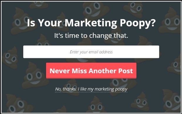
#1 Don’t Neglect the Importance of Design
A popup has to meet two major requirements – stand out and be attractive while blending well into your basic design.
The latter is typically not a major problem as popups do not really appear on the page. You can use a contrasting style or color but it should still be in sync with the overall theme of your site so that it doesn’t look out of place.
The popup should feel like a cohesive part of your page, rather than an intruder.
Using complementary or similar fonts, colors, and images can do the trick.
Consider this example:
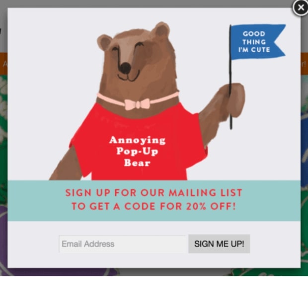
This cute popup syncs well with the website. It uses similar images and colors. Users don’t feel as though they’re being shown something irrelevant. It feels like a part of the page without being a part of it.
A good way to stay relevant is to use your company’s name, logo, tagline, or products on the newsletter popup as seen here:
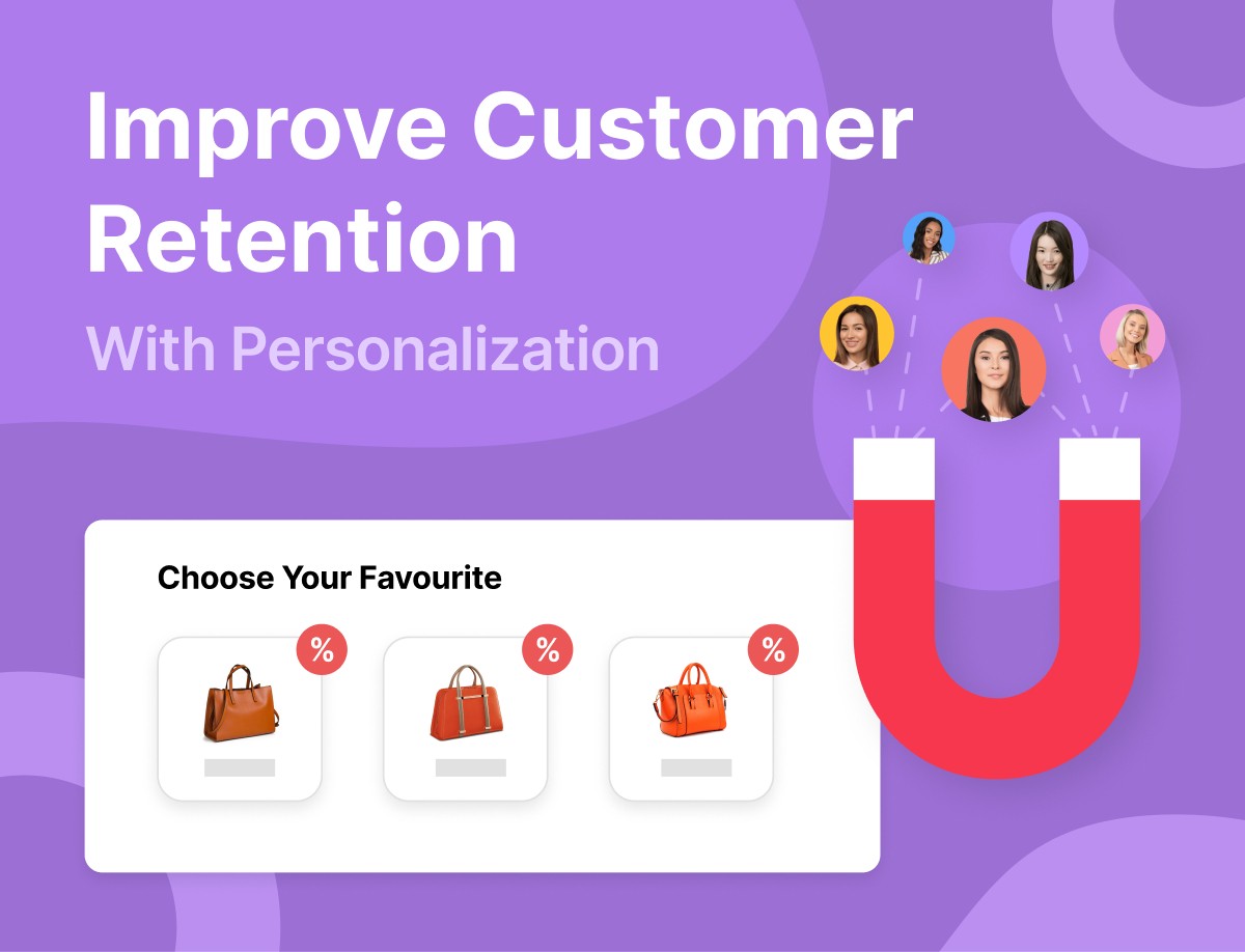
#2 Use Personalization to Connect with Your Audience
Personalization can be very effective when it comes to email newsletter popups.
It makes a popup appear more friendly and less intrusive. Now, the question is – how do we personalize popups when we have no personal information of the visitor?
Personalization doesn’t only end at using your visitor’s first and last name. By this, we mean to display a popup that appears relevant to what a user is interested in.
Most companies use cookies to find this information. You can personalize pop-ups based on referral sources. Referrer Detection technology makes it possible to detect a visitor’s origin.
You can make your newsletter popup connect with:
- Pages the visitor checked last
- The content the visitor engaged with
- Information such as whether it’s their first visit or not
Such small changes can be very useful. According to HubSpot, personalization can improve conversion by up to 202 percent.
The problem, however, is that personalization can be quite deep and marketers can end up wasting a lot of time and money on managing this aspect of a newsletter popup campaign.
As a marketer, you should know when to stop. Don’t get too technical. Here are some ways to get started:
- Most visited content – create relevant, unique popups for each piece of content that receives a lot of traffic. For example, if a specific product gets more visitors, you can create a campaign that targets people who are interested in that product as they’re more likely to buy it and it could end up being your top-selling item.
- Top referrers – create an email popup campaign for visitors who come from a specific site. For example, if you’ve written a blog post on a different site that brings you a lot of traffic, you can create a campaign to specifically target those visitors as they’d be interested in a specific topic.
- Returning visitors – they need to be treated differently as they’re typically already aware of what you do. The best way to greet such visitors is to display a “welcome back” message while tying it in with a subscription request.
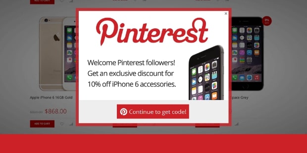
Popups for users who reach your site through social media can be useful as well. Customers who find your ad or post on Facebook or Pinterest and click on it should get a popup related to the specific ad:
You will have to pay attention to the numbers to figure out the type of personalization that works best so you can focus your efforts on it.
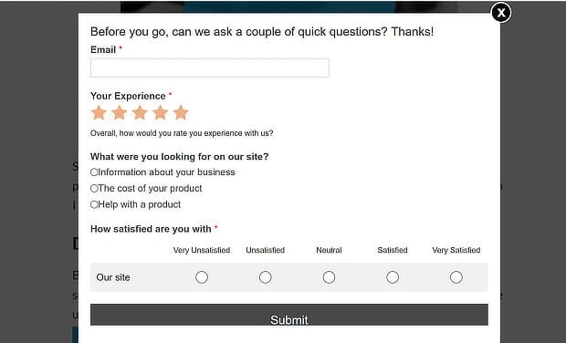
#3 Don’t Forget to Add a Call to Action (CTA)
A popup should be very clear with a single CTA. Avoid adding multiple CTAs. They will confuse your visitor and may force the user to click the dreaded ‘x’ button without providing the required details.
Remember that popups interrupt the experience, your aim should be to quickly get your required details and exit. It should appear neat and clean. Users aren’t going to read what it says, they’re interested in other things. Check our How to Create the Perfect Call to Action to Increase Conversions guide for tips on creating a CTA.
Look at these two examples:
And
Which one do you like or which one do you think will be more effective?
The second one, of course. Why? Because it’s neat and clear.
The first popup might contain valuable information but it’s not something users on the site are interested in at that point of time.
The second one does a clear job, it tells users what they’ll get and what they have to do to get it. No time wasted.
#4 Make a Kickass Offer
Think about newsletter popups from the perspective of a visitor who’s seeing them.
It’s essentially a one-sided affair. You expect the visitor to provide details such as name and email, but what do you have to offer in return?
“Updates”? Well, sorry, but most users are not going to bite the bait. They’re not interested in updates.
Users want something beneficial in return, something that’s going to be of use.
Give them a reason to take a minute to provide the required information.
The truth is that people love special offers and incentives. You can offer anything from a free eBook to coupons to free shipping.
Look at the example below:
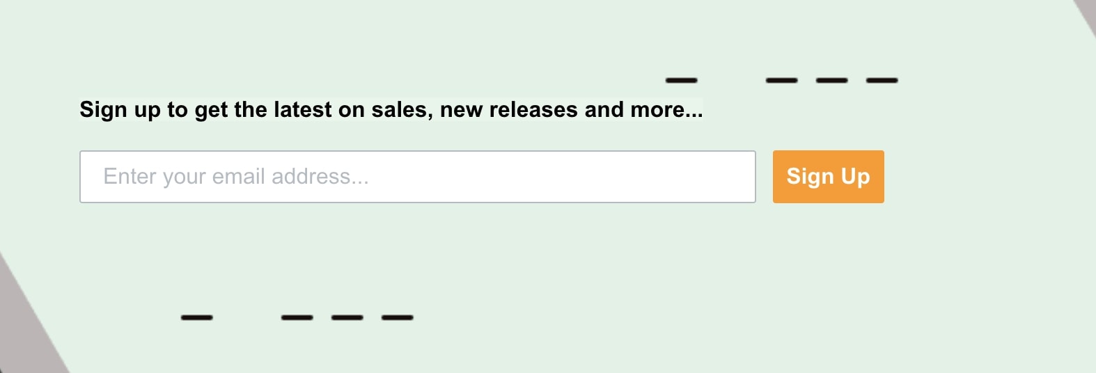
The website isn’t offering anything except for new releases and more. Most users aren’t interested in receiving marketing emails that are of no value to them.
Now look at this example:
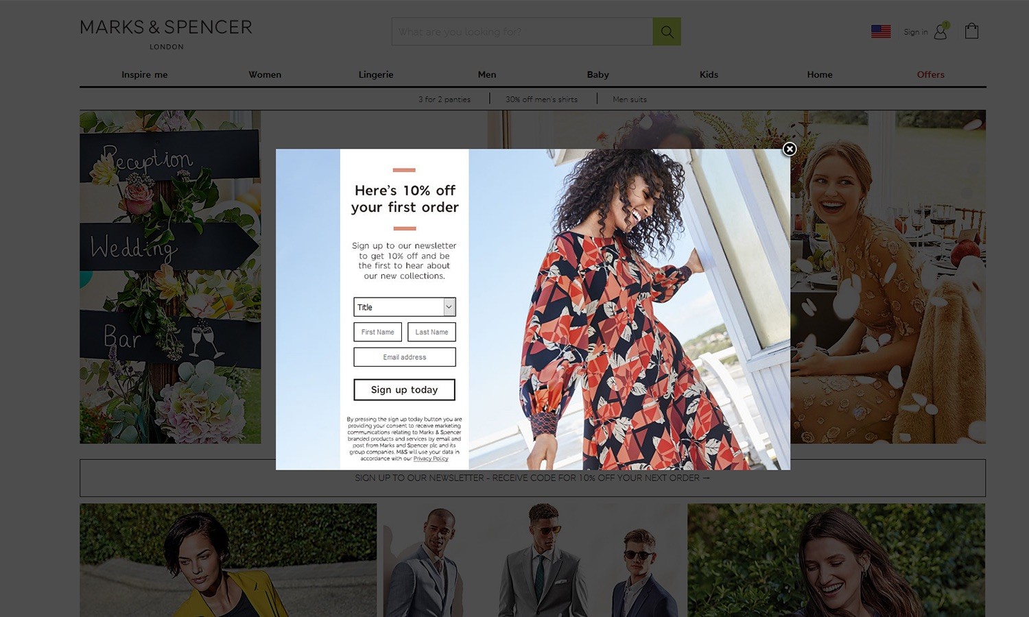
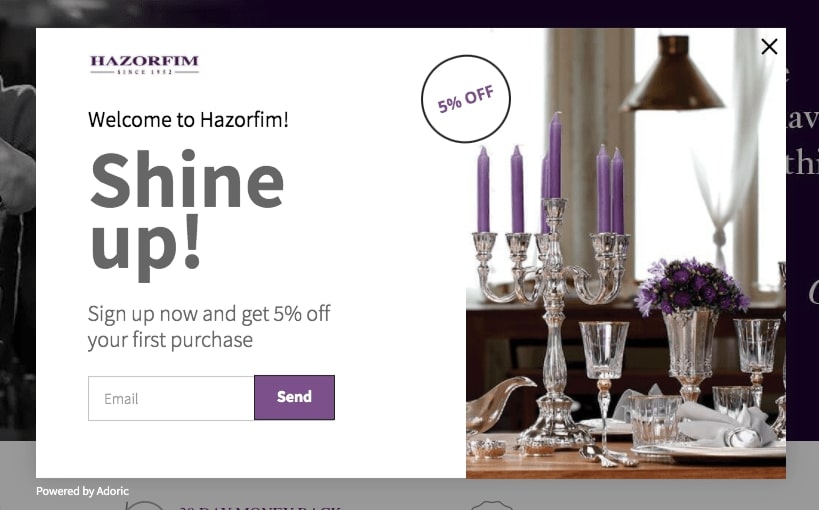
The company is offering incentives in the form of a 10 percent discount. Someone interested in buying from the site may easily provide the email in exchange for a discount code.
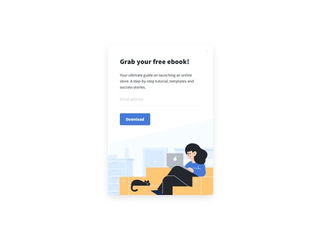
In addition to this, you can also offer free eBooks as seen here:
Spend a little more time on your campaign and consider combining personalization and lead magnets to offer visitors exactly what they’re interested in.
For example, someone who lands on your page after reading a review of a book should see an offer related to the book. Similarly, someone who lands on your page after looking at generic bicycle reviews should see offers related to bicycles.
#5 Know When to Launch a Newsletter Popup
How do you react when you land on a website and you have a popup waiting for you. Most people don’t like it. It leaves a bad impression on them and may force them to leave the website.
A smart marketer is one who knows when to launch a newsletter popup. You should allow people some time to engage with your website and know what you have to offer.
The truth is that not everyone who lands up on your site might be interested in what you have to offer. Plus, new users who are visiting your website for the first time may have trust issues.
Smart users do not provide email addresses or other details to people or websites they do not know or trust.
There is no general consensus as to when a pop-up should be displayed. From the screenshot given below, it might be a good idea to wait for a user to browse at least two pages before displaying a popup.
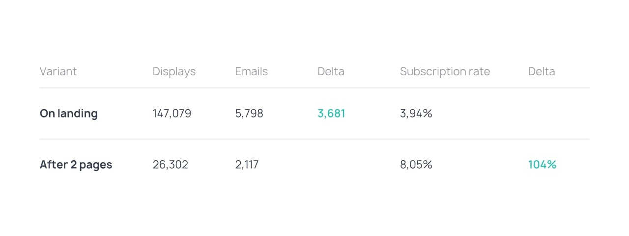
As you can see, the conversion rate on landing is 3.94 percent, whereas the conversion rate after 2 pages is 8.05 percent – more than double. However, this might not always be effective and depends on a number of factors including the nature of your site and visitors.
It might be a good idea to use A/B testing to know what works and what doesn’t.
Here are some good triggers to try:
- Time spent – wait for a user to spend a few seconds or minutes on a website before displaying a subscription popup.
- Pageviews – allow the visitor to explore the website a little by opening multiple pages before displaying a popup for email subscription.
- Exit intent – display a newsletter popup when a user is about to exit the page. Neatly made exit popups can save up to 15 percent of users.
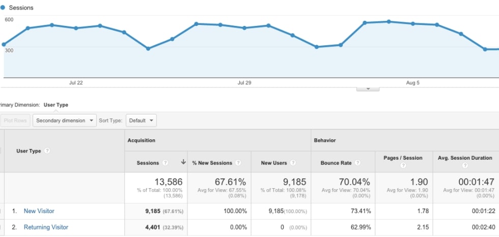
Spend a little time understanding your users and study some metrics such as the average time a user spends on your website. Google Analytics can be used to access this information for free.
This information can help you decide when to display your best newsletter popups.
#6 Optimize Your Popups for Desktop and Mobile Devices
It’s believed that more than 51 percent of users use mobile devices to access the web and the number is expected to grow to 72 percent in the next five years.
Hence, it’s important that you pay special attention to the device your visitors use. Google Analytics can provide you this information. Campaigns should be platform-specific. Salt Strong got a 185 percent increase in conversion by adding popups for mobile platforms.
This is because your traditional popup may not appear well on a mobile screen due to the difference in screen sizes.
#7 Set Proper Targeting Rules
Targeting can be very tricky as it involves a lot of elements.
We already discussed personalization earlier in this article, but that’s not all a marketer has to take care of in order to create a kickass campaign.
You should clearly define how frequently a visitor sees a popup, in addition to who sees it. Those who have already subscribed, for example, should not see a ‘subscribe now’ popup.
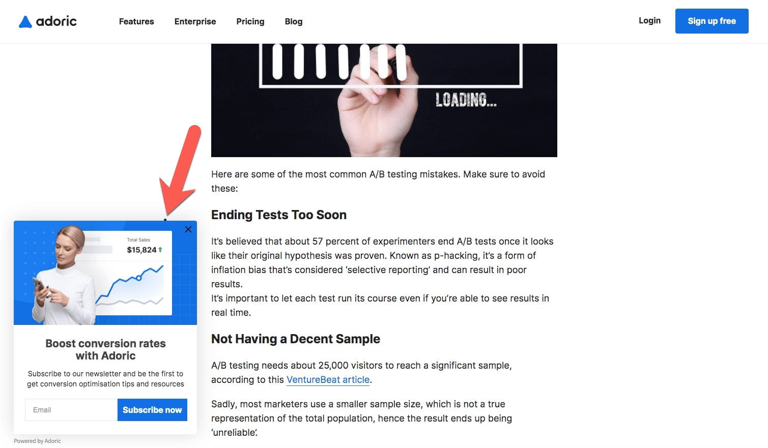
Also, set different rules for new and returning customers. For example, you can display this popup for returning visitors that already added products to the cart in previous sessions:
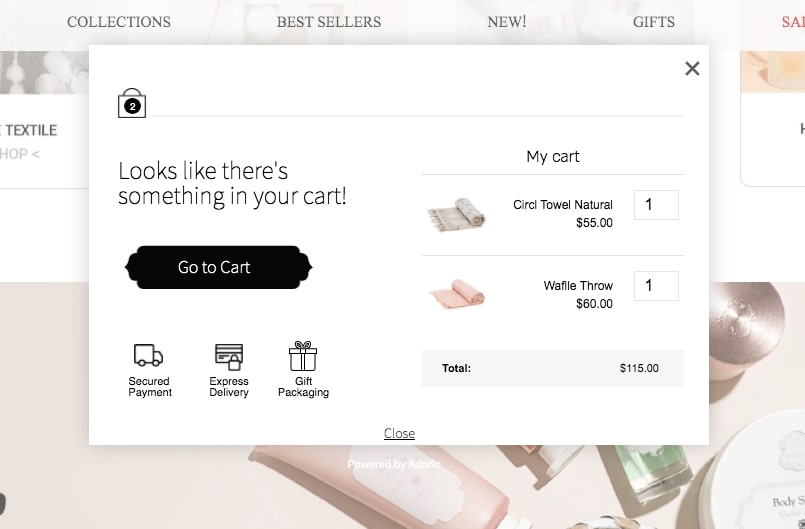
This popup was made with Adoric’s dynamic content feature. The tool makes it easy to create pop-ups by automatically pulling the required cart info and showing it in a personal way to returning visitors who have something in the cart. This kind of pop-up decrease cart abandonment rate.
Adoric is suitable for detecting new users as well. You can opt for something like this:
Remember that most visitors will not subscribe no matter how impressive your popup is. This is just how marketing works.
Seeing the ad, again and again, can be very irritating. Ideally, a user should see an ad only once in 48 hours. So, make sure to create a subscriber pop-up that only appears when it’s needed.
#8 Don’t Be Too Aggressive
Do not create a very aggressive subscription pop up. Instead, look at subscription pop-up examples and choose one that appears friendly. You can also experiment with a number of newsletter signup popup options to see what works for you.
For example, you can use an exit-intent popup:
Or, you can opt for a landing page popup:
Here are some popup options that aren’t considered aggressive:
- Slide-ins
- Floating action buttons
- Notification bars
They all work but they all may not work on your visitors. Consider using A/B testing to create multiple campaigns and comparing results to find the most feasible option.
How to Manage Newsletter Popups
Whether you’re interested in a pop-up newsletter subscription form for WordPress, or a pop-up newsletter subscription form for HTML, Adoric has got you covered.
While you can use a pop-up subscription box WordPress plugin, it might not be the best option since plugins can be a little complicated to use. Similarly, pop-up subscription box Wix can be a trouble to deal on its own.
Adoric can handle it all for you. The tool can be used to set up a WordPress email subscription pop up, a WooCommerce newsletter popup, and a Shopify newsletter popup.
It supports all websites including custom sites. Our top designers have worked hours to create tons of amazing templates that can be used easily by utilizing the Plug&Play integration option.
Adoric supports almost all major CRM and email providers. Go here to know more about how Adoric works and contact our team if you have specific questions. We’re available on email, live chat, and phone.