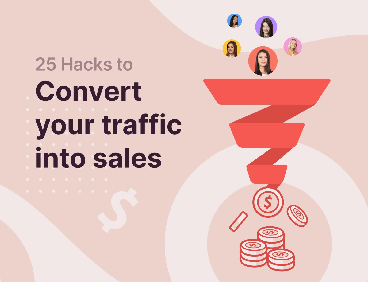
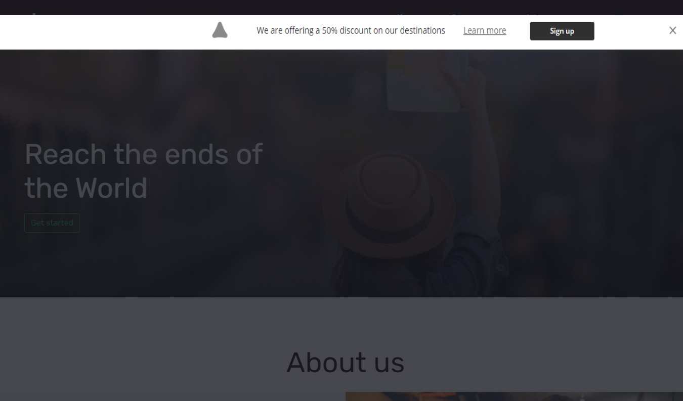
Have you been looking for a detailed guide that explains how to convert your website traffic into leads and sales? You are in luck because you just found one.
Truth be told: attracting meaningful traffic to your website is hard work. Making sales and conversion from that traffic is a lot harder.
And if you aren’t making sales – or at least getting visitors to sign up to your mailing list – on your website, what’s the point of having it?
Why invest your time and energy into attracting visitors that won’t convert?
This is synonymous with having lots of people window-shopping at a physical store, with few, or worse none, actually making a purchase.
You definitely do not want that. It’s bad business!
Are you having difficulties converting traffic to your site into leads and sales?
Well, you can turn the tide today and start winning by doing a few things.
In today’s post, we will be sharing with you 25 hacks you can use, irrespective of how good or bad you are at marketing, to boost conversions and drive more revenue.
Here they are:
-
- Attract the right traffic
- Keep your website design simple
- What makes you better than competitors?
- Make your website trustworthy
- Take reviews seriously
- Display testimonials
- Optimize your sales funnel
- Write better sales copies
- Make your CTA buttons shine
- Be strategic with your CTA placement
- Stop directing visitors to your homepage
- Be generous with freebies
- Gamify your visitors’ experience
- Segment your audience
- Product recommendations is a must
- Loyalty programs still work
- Use popups to win leads
- Use slide-in to boost conversion
- Floating bars work like magic
- Capture exiting visitors
- Up your game with two-step popups
- Live chat anybody?
- Offer money-back guarantee
- Track your conversion
- A/B test your ideas
But first, let’s see 5 likely reasons why are getting traffic but no conversion.
5 Reasons Why You Are Getting Traffic but No Conversions
Imagine for a moment that you have a car and it suddenly breaks down while you are on the road with it.
What will you most likely first do to put the car back in shape?
Find out where the problem is coming from, isn’t it?
That’s basically how things work.
So, until you first know the possible reasons why your visitors aren’t converting, finding a solution might be a problem.
Reason #1: Your Website Is Attracting the Wrong Traffic

How do you imagine things will turn out if, let’s say, you went about marketing baby skincare products to adult men?
You will surely make some sales, but it will definitely not be enough to pay for a burger.
So, if your website isn’t converting as you want, there’s a good chance that you are attracting the wrong set of people.
How do you fix this problem?
Stick around; we will get to that shortly.
Reason #2: Visitors Don’t Find What They Are Looking for Quickly
Did you know that the average attention span of a web user is about 15 seconds?
That means you only have 15 seconds to convince a visitor to stay or move to the next tab opened in their browser.
But is it even possible to make your visitors see reasons to stay on your website within that short time span?
Truth is, you alone can answer that question. Just do the right thing, and you might never have to worry about losing your visitors.
One of the things you can do is directing visitors to the right page that best fits their needs, and not just your homepage.
More details on that in a jiffy.
Reason #3: Too Many Popups Are Showing on Your Website
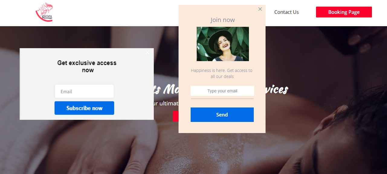
Popups can be annoying. But if you implement them right, they won’t be.
That said, one mistake you can’t afford to make is showing too many popups at a time on your page.
Or, perhaps, showing them on every page on your website. That, too, is a grave mistake.
If you have been getting huge traffic but no meaningful sales and conversion, you are probably getting it wrong with your popups.
It’s about time you did something about that.
But what exactly should you do?
- Show one popup at a time on your homepage
- If possible, restrict your popups to one or two pages
- Use slide-ins instead
Reason #4: Your Website Is Difficult to Navigate
Poor user experience is a real deal-breaker you shouldn’t take likely. It comes in many forms:
- Difficult or confusing navigation
- Text and images slammed all over a page in an unthoughtful way
- Slow loading
- Illegible text
- Poor or outdated design
You won’t want any of those to be present on your website.
Take a look at this website. What do you think is wrong with it?
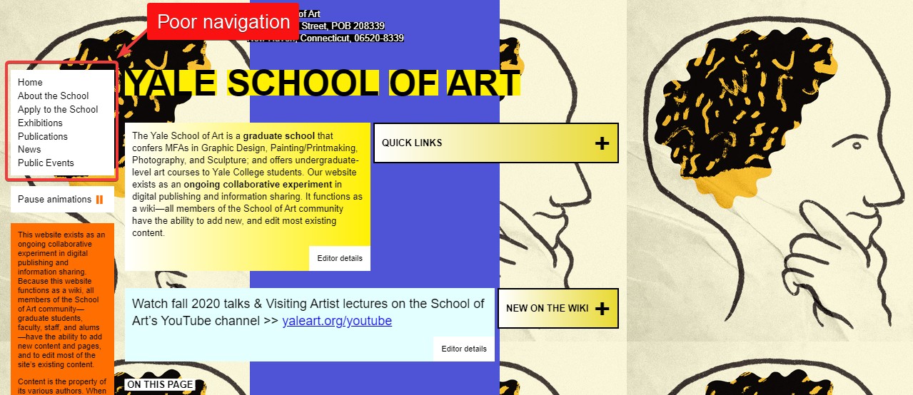
The navigation is so poor that a visitor might miss it. On top of that, the user experience is terrible, and the design sloppy.
Does your website remotely look like that? If it does, it needs a serious facelift.
Reason #5: Your Sales Funnel Has Leaky Holes
Not every one that arrives at your site will make a purchase – that’s the hard truth. As a matter of fact, only a small fraction of your visitors will eventually become buyers or subscribers.
So, how do you go about nurturing casual visitors into customers?
Simply by building a sales funnel. Or conversion funnel, as it is also known.
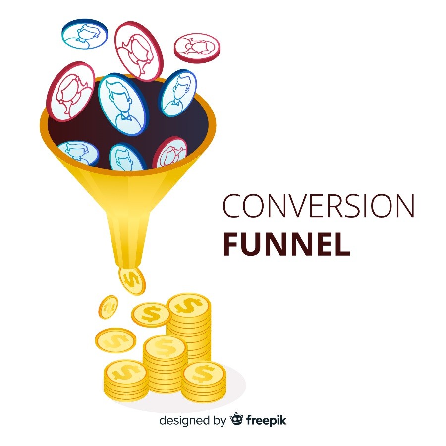
But if your sales funnel isn’t properly optimized – or has leaky holes – you won’t see the sales and conversion you so desire. Not to worry, I will show you how to fix that in a moment.
25 Hacks to Convert Your Traffic into Leads and Sales
Now you know the possible reasons why few out of the several thousand visitors to your site convert, it’s about time you took action.
Here are 25 things you can do to see the conversion and sales you have for long wanted.
1. Attract the Right Traffic
Earlier on, we told you that one of the reasons why you are not getting sales is that you are attracting the wrong audience. It then follows that attracting the right solution will help fix the problem.
There are a couple of ways to go about that.
One is auditing your SEO strategy. This will particularly be effective if most of your traffic comes through search.
During the auditing process, check to see if you have been targeting the wrong keywords.
But what exactly are “wrong” keywords? How best can they be described?
They are:
- Keywords that don’t relate to your website. For example, let’s say you run a food blog. But keywords like “best denim” appear across your pages and URL. That’s the wrong keyword.
- Another are keywords that are too generic. For example “shoes”. Someone who makes that query might be looking for the sneaker shoes, the best hack for fixing a broken shoe, the definition of a shoe, etc. Steer clear from such keywords.
- Keywords that lack buying content. Consider two imaginary visitors A and B. A finds a sneakers website by searching for “Nike sneakers”. B does the same, but uses“red Nike sneakers free shipping”. Which will most likely make a purchase? You know the answer.
So, check to see if your website is ranking for these keywords and fix things up. You can take assistance from the online rephraser to write sales copies in a new and effective way. It paraphrases sentences without affecting their actual intent and provides you with a convincing sales copy in seconds.
Another way to attract the right traffic is by promoting your website to the right social media platform.
For example, if you sell a Saas product, your potential audience will likely not be on Facebook nor Instagram, but on LinkedIn.
It’s the reverse if you sell fashion items.
2. Keep Your Website Design Simple
One of the hardest things in life is keeping things simple. That’s why you see lots of “colorful” websites with lots of web page transitions that are, as a matter of fact, difficult to use.
Keeping your website simple in design helps to improve your user’s experience.
And the better your website’s user experience, the more conversions you will get. That’s a no-brainer.
Of course, you don’t have to be boring all for the sake of keeping things simple. The key is blending simplicity with elegance.
As an illustration, which of these two websites is more visually appealing?
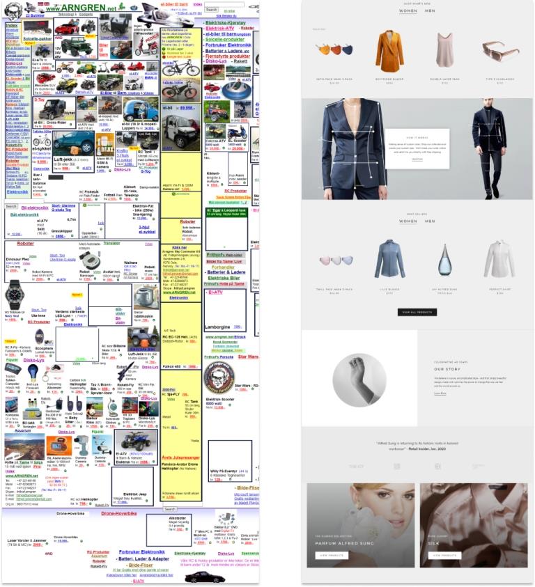
The one on the right, apparently. It’s simple, yet elegant.
Bonus point: If you don’t have a good web design skill and your website runs on WordPress, just head over to the themes repository and pick any of the available website templates. Most are free, simple, and elegant.
3. What Makes You Better Than Competitors?
How many tabs do you typically open when searching the web? Probably 4 to 5, if you are like most average web users.
But there are times things get messy like so:
Where am I heading with this?
A visitor coming to your website will probably have visited 4 or more other websites before arriving at yours.
That means they must have checked out your competitors, and are probably looking for a better offer.
As such, your unique selling proposition needs to shine brightly.
In other words, visitors need to see what makes you different from others – and as quickly as possible.
If it’s better pricing, let them see it without having to scroll far down.
Or, if your free trial is longer than others, make it clear from the get-go.
By so doing, you won’t lose visitors to your competitors.
4. Make Your Site Trustworthy
Did you know that 86% of your potential customers will first have to trust your website before making a purchase?
Thus, if your website doesn’t look authentic and trustworthy, don’t even think about conversions and sales.
How do you make your site trustworthy?
I figured out that knowing what makes it untrustworthy in the first place will help you find answers to that question.
So, here are 10 things that make a website look untrustworthy
- Unsecured connection. By this, I mean hosting a site on HTTP instead of HTTPs.
- Old-looking design.
- Bogus, unverifiable customer testimonials.
- Grammar errors spurting all over the place
- No money-back guarantee
- You use stock images…especially those with watermarks
- Dormant social media account
- Unclear shipping information
- No return policy
- Your website lacks reviews and customer testimonials
Hence, if any of these are present on your site, it’s about time you did something about it.
5. Take Reviews Seriously
Remember the last time you bought stuff on Amazon. You most likely checked to see what other customers said about the product before making a purchase, right?
The same is applicable to your website.
Make your site look trustworthy by displaying verifiable reviews left by your customers in a conspicuous way.
One of the ways you can go about this is by importing reviews from your Google My Business page to your website.
Scared you will have to write complex lines of code to accomplish this?
Not to worry; you can use any of these WordPress plugins to pull that off.
6. Display Testimonials
Just like reviews, testimonials, as well, are important for improving conversions.
Here are some interesting facts that prove that testimonials are the real deal:
- 92% of people will likely purchase a product if it is recommended by someone they know
- If the recommendation is coming from someone totally strange to them, 72% will buy still
- 88% of web users trust online testimonials as much as they trust personal recommendations
- Testimonials make your visitors 58% likely to convert
These are enough reasons to take testimonials seriously.
Like reviews, you can add testimonials to your website via a plugin. Testimonial widget, Strong testimonial, etc. are some good plugins – for WordPress, though.
7. Optimize Your Sales Funnel
Earlier on, I mentioned having leaky holes in your sales funnel as one of the top leading reasons for your poor website conversion.
It then follows that optimizing your sales funnel for better conversion can improve your lot greatly.
Need an in-depth insight into what a sales funnel is all about? We’ve got a meaty tutorial you will find helpful.
In the time being, here are some hacks for optimizing your sales funnel and fixing up leaky holes.
- First set up a conversion goal funnel via Google Analytics. This will help you keep track of your website’s conversion.
- If you haven’t created a custom landing page for your offers, go do so now. Unbounce can help you with that. Thus, you don’t have to know how to code to build a landing page.
- Continually A/B test your website elements.
- Polish up your CTA buttons. Make them more catchy, inviting to click, and noticeable.
8. Write Better Sales Copies
Are you one of those marketers who suck at writing sales copies? You had better started to improve at it because it is through a solid sales copy that you can convince visitors to act.
Thankfully, writing a convincing sales copy isn’t as hard as it might appear.
Here are a few things that if you do them will make your copies shine:
- Personalize your writing. Write as though you are writing to an age-long friend
- Weave in power words into your copies. These are words that compel readers to act.
- Stress hard on the benefits of your offer, not features
- Less is always more
A little word of encouragement: will attempting to improve your writing skills, you won’t be a pro copywriter right out of the gate. It will take a while to hone your copywriting skill. So, keep at it.
9. Make Your CTA Buttons to Shine
What action, exactly, do you want visitors to take on your website?
Do you want them to check out your product offering? Or, would you prefer that they sign up for your mailing list?
It’s only through a CTA that you get to tell them.
And by the way, CTA is the acronym for Call-To-Action.
Getting the idea?
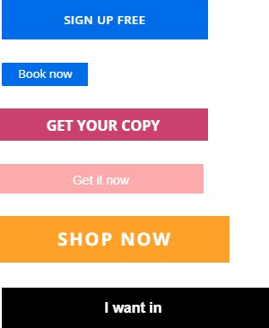
One more thing: creating an attention-grabbing CTA is important but more important is placing them right. They have to be visible enough on your website, else their purpose will be defeated. Details on this shortly.
We’ve created a detailed guide you can reference to learn more about creating effective Call-to-actions
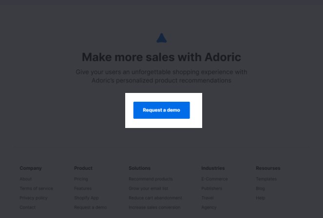
10. Be Strategic with Your CTA Placement
Creating a captivating CTA button that gets clicks is one thing. Yet another is placing them where they will enjoy maximum visibility.
And if you thought that placing your it above the fold, as seen below, is all there is to it, think again.
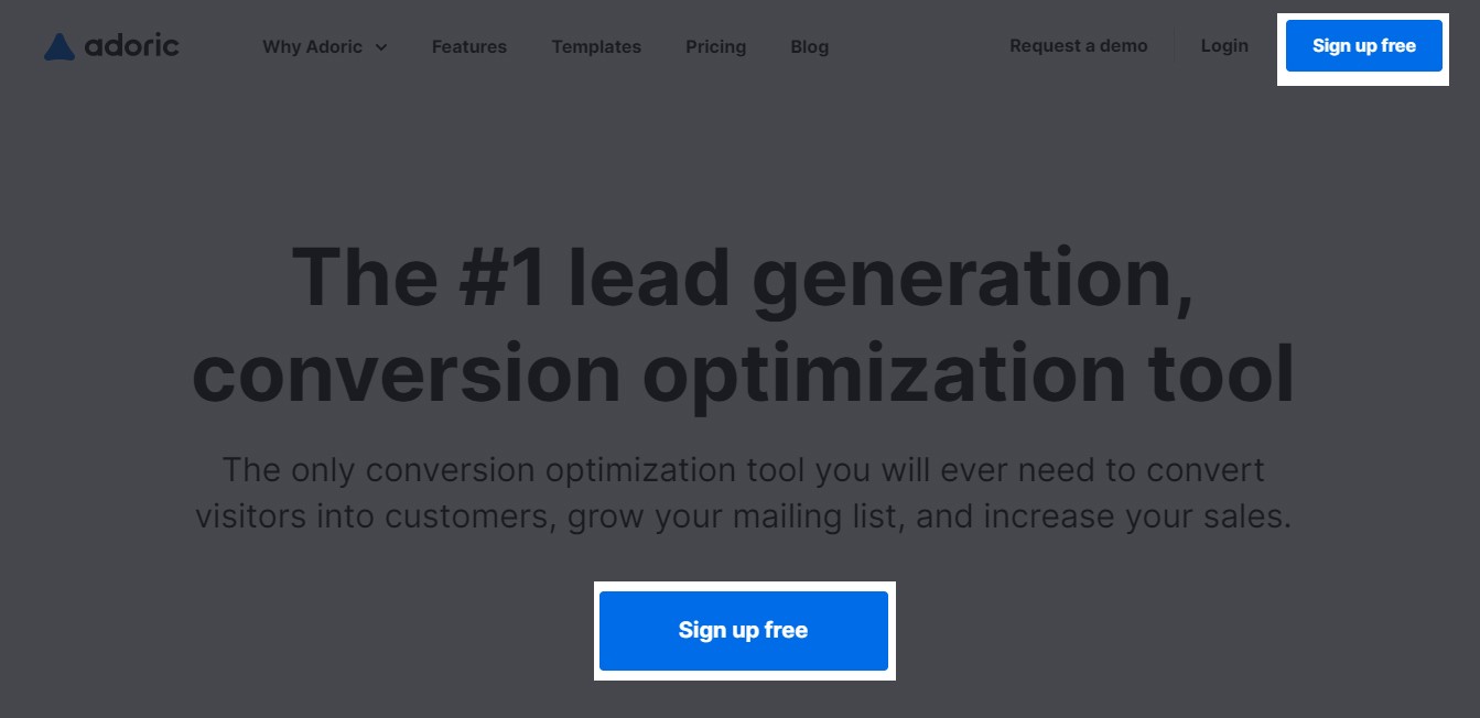
You know why?
Today’s web users have become scroll-centric. They will instinctively scroll down your web page upon landing on your website.
As such, placing your CTA buttons at random points on your page will help make them more visible, and, hence, improve your conversion rate.
With that said, here are some strategic placement points you will want to try out.
- Above the fold – of course
- Random spots below the fold. For example, within a blog post
- Sidebars
- Sticky navigation bar
You could even add one above your footer just like we did.
11. Stop Directing Visitors to Your Homepage
One of the reasons you might not be getting sales despite seeing huge traffic is that you are directing visitors to your homepage.
Or worse, a dead page.
Let me expatiate a little.
Say, for example, you want to promote your product by running an ad on Facebook. And your goal is to get as many people as possible to buy the product.
What do you think will happen if you directed traffic from Facebook to your homepage, rather than the particular product page you want visitors to land?
Loss of sales. Simple.
So, start optimizing your sales funnel by directing visitors to pages that deliver the most value – and not generic pages they won’t find valuable.
12. Be Generous with Freebies
It’s easy to ask people to subscribe to your mailing list, sign up for an account, download your app, or make a purchase on your website.
Where the real work lies is in giving them a reason to.
Until you answer the “why should I care” question bubbling in the minds of your visitors, enjoying optimal conversion will be a pipe dream.
This is where freebie marketing comes into play.
Enticing people with free stuff is an age-long marketing strategy that still works today.
So, what freebies can you give away?
- Free trial
- Free shipping
- Discounts and coupons
- Free consultation
- Free download
As a rule of thumb, the freebies that you give away should be valuable. Else, your efforts will go down the drain.
13. Gamify Your Visitors’ Experience
Ooh, how we love games! They are fun, engaging, and are boredom breakers.
What’s your favorite game? Pokemon Go, Candy Crush Saga, or Mario?
Okay, we have digressed, but the point here is that you can infuse the elements of gaming – fun, and engagement – into your users’ experience.
Doing so will not only help to improve engagement on your website but also bring you closer to your ultimate goal: win more leads and sales.
But how? Wouldn’t that require you to hire a team of app developers? Not at all.
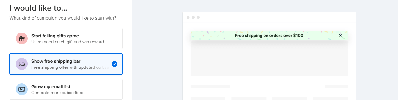
One easy, result-guaranteed method you can adopt is deploying spin-to-win popups to your website.
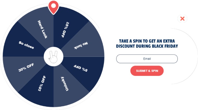
As the name suggests, these are popups that allow users to play the lucky wheel game in the hope of winning a coupon.
Thankfully, we have tons of spin-to-win popup templates in our repository you can get started with. Just pick which suits you the best.
Use Falling Gift Game Popup Instead
If you don’t fancy spin-to-win popups, you can try our falling gift game, which is also a gamified popup. The cool part is that our falling gift game converts better than spin to wins. In an experiment we conducted, we discovered while spin-to-wins get 18% conversion, it’s 30% for falling gifts. Plus, this is an innovative tool for eCommerce as no one but us has developed it.
How Does Falling Gifts Game Work?
Well, it’s pretty simple. First, a popup appears moments – typically less than 30 seconds, depending on your settings -after a visitor arrives on your website. It could be a full or half-display popup. On the popup, the user will see balloons falling through and then be asked to input his/her email address (this is where the coupon code will be sent after making a win).
All the user needs to do is click on the falling balloons to reveal the gifts embedded in the balloons. Depending on how you set the system, they might have to attempt several times to win a gift, which is usually a coupon. For now, you can only allow them to try 1 to 6 times.
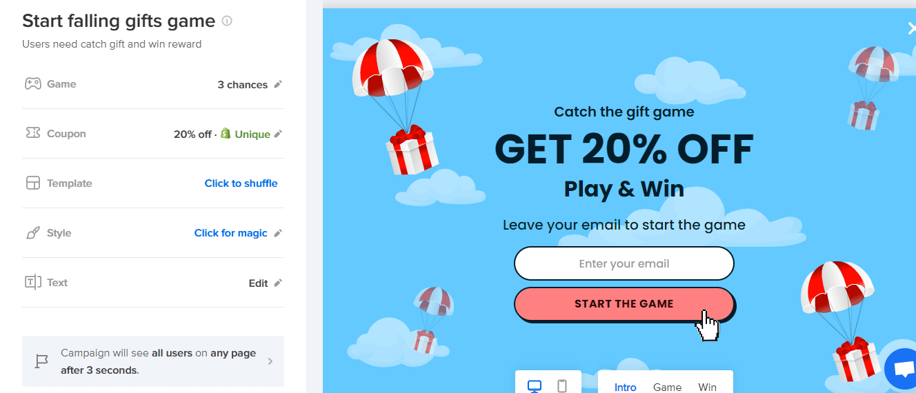
Setting up the falling gift game is very simple, thanks to our intuitive, drag-and-drop editor.
Sign up for an account with us to try out the falling gift game to experience an uptick in your conversion rate.
14. Segment Your Audience
Truth be told: not all visitors are the same. The simple reason is that people are different. Preferences, hobbies, behavior, location, occupation, language, devices, etc. are all different.
As such, it would be unwise to treat everyone that comes to your website in the same way. You can’t offer them the same content or product suggestion.
If you do, not only will your website suffer poor user engagement, you will likely lose the very audience you are trying to appease.
For this reason, the importance of segmenting your audience can’t be overemphasized.
Audience segmentation offers several benefits, namely:
- Better engagement
- Reduced cart abandonment
- Increased customer loyalty
- Higher conversion
But won’t implementing audience segmentation require some technical skills?
Well, it does require, but with Adoric, you don’t have to know a lick about coding to infuse segmentation on your website.
Our smart segmentation engine allows you to group your audience based on:
- Language
- Visitor type (returning or first-time)
- Geolocation
- Language
And lots more.
15. Product Recommendation Is a Must
In addition to segmenting your audience, one other step you can take to personalize your visitors’ experience in deploying product recommendations to your website.
As the name implies, product recommendation involves recommending products – or content for a publishing website – to visitors which they will most likely find useful – and valuable.
You’ve probably seen product recommendations at play a couple of times.
Here’s one on Amazon:
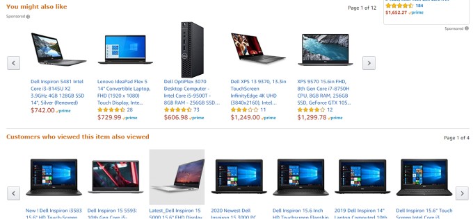
And did you know that 35% of Amazon’s sales come from product recommendations?
This is clear proof that product recommendations actually work.
When you recommend products that best fit your visitors’ preferences and tastes, your sales will soar.
Interestingly, Adoric can also be of help here. With our recommendation algorithm, you can recommend products to your visitors based on:
- Random products
- Most viewed
- Best selling
- Bought together
- Recently viewed
Need some help? Why not reach out to our team right away.
16. Loyalty Programs Still Work
Sometimes, retaining your old customers and keeping them happy is better than hunting for new prospects.
You know why?
It costs 5 times more to acquire a new customer than to retain an old one.
On top of that, you can increase your profits by 25% simply by increasing your customer retention efforts by 5%.
Aren’t those interesting facts already?
One easy way to retain your old customers, and hence make more sales, is by rewarding them for their loyalty.
Free product samples, coupons, discounts, free shipping, redeemable bonus points, cash backs, and lots more. These are rewards you can weave into your loyalty program.
To make life easy for you, here is a list of plugins for WordPress you can use to manage your loyalty reward programs effectively.
- WooReward
- Gratisfaction
- myCred
But if your online store runs on Shopify, here are plugins you can use:
- Smile: Rewards and Loyalty
- Loyalty, rewards, and referrals
- Loyalty
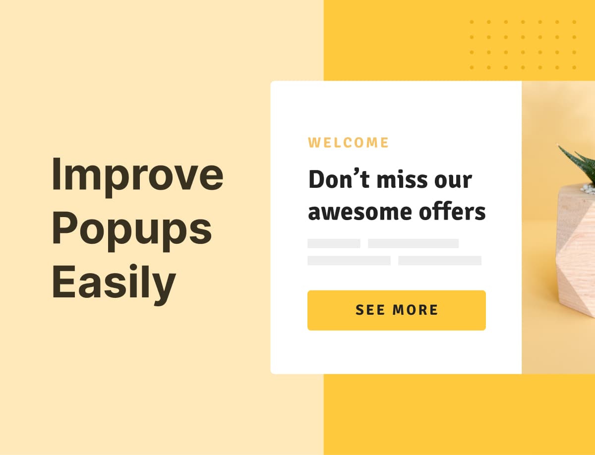
17. Use Popups to Win Leads
One of the reasons why you are getting clicks but no conversions is that your visitors are simply not seeing your offers. And not because they are blind; your banner ads are just not just attention-grabbing enough to make them take notice.
To combat banner blindness and increase your leads, conversions, and sales, use popups instead.
I know, popups can be annoying. But they don’t have to be for your visitors. With smart targeting and triggering, they can work well for you.
This means you can make your popups to show at the right time and to the right people.
And what better popup solution would you use than Adoric?
Adoric allows you to display your popups:
- Some seconds after a visitor loads your page
- When they start to scroll down
- As soon as a visitor attempts to leave your website
- When they click or hover over an element
Plus, you are at liberty to set your own custom trigger event.
We’ve got a shipload of pre-designed, ready-to-use popup templates you put to use right away.
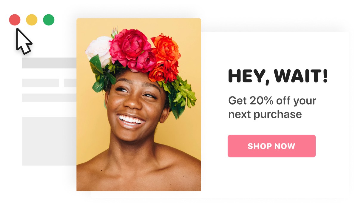
18. Use Slide-ins to Boost Conversion
Like popups, slide-ins can also be instrumental in helping you beat banner blindness. They are the little popup box that you see slide in from the corner of the screen, hence the name.
Unlike regular popups, slide-ins are less intrusive. And they aren’t infuriating.
And best of all, they enjoy better visibility than popups. This is because they can stick fast to users’ screens even as they scroll down your page. But without being annoying.
You can promote just about anything with slide-in popups: seasonal sales, lead magnets, email opt-ins, and lots more.
Just like popups, we’ve also got a huge collection of slide-in popup templates you can pick from.
19. Floating Bars Work like Magic
What if you are not a fan of popups nor slide-ins. Is there any other alternative to those two?
Yes, there is.
Floating bars!
They are the horizontal ribbons that lie across the top of a website – or the bottom, in some instances.
You’ve probably seen them a couple of times before.
With floating bars, you can accomplish just about any marketing goal you may set your mind on:
- Capture your users’ email/contact info
- Drive traffic to a specific landing page
- Encourage visitors to visit your social media page
- Generate more leads
- Pass an announcement. For example, you just redesigned your website and feel it is needful for your visitors to know about it.
That’s not even all; you use floating bars to display free shipping on your website. One excellent tool to use for this is Adoric’s free shipping bar feature.
With this feature, you can create elegant-looking, attention-grabbing floating bars to display your free shipping offers to increase sales. Shoppers love free shipping offers.
Our shipping bar templates are easy to customize and there many to choose from.
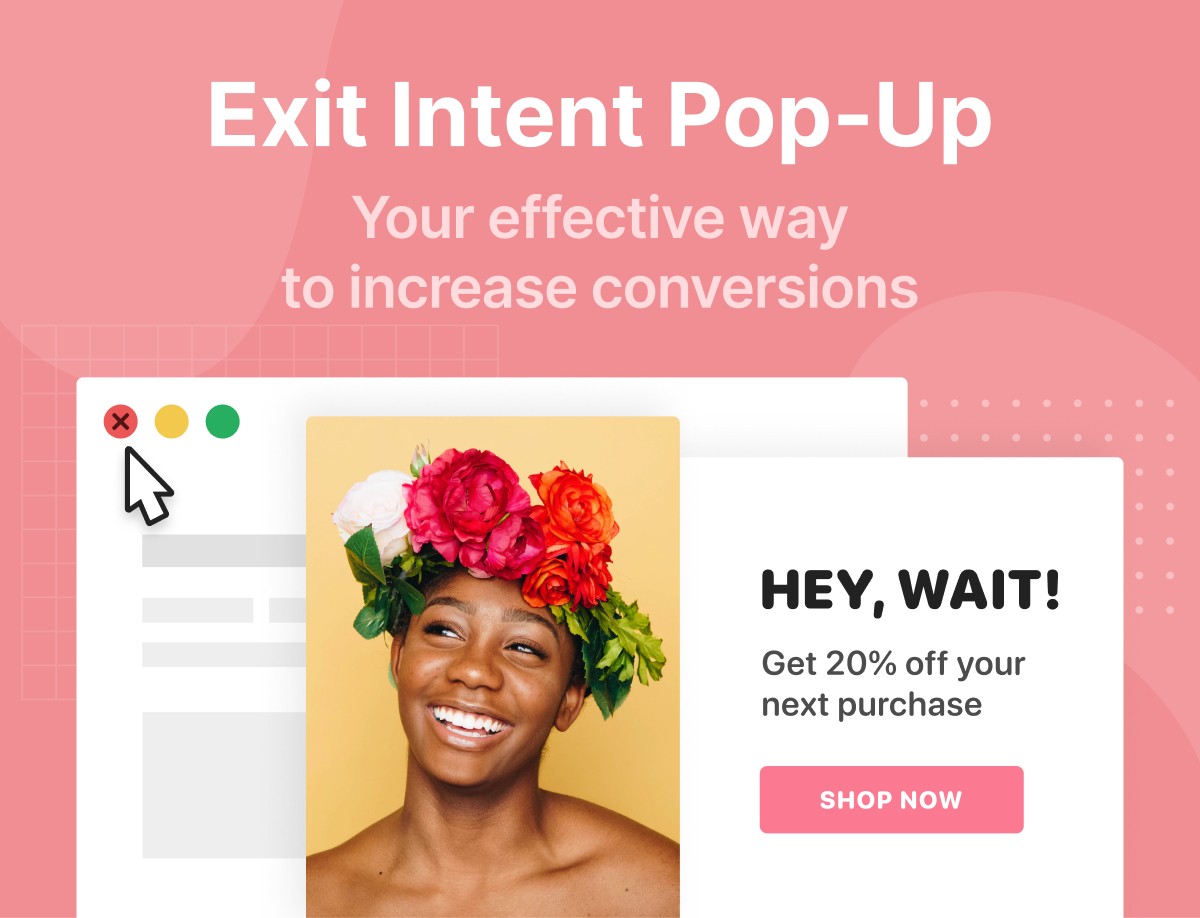
20. Capture Exiting Visitors
Our natural human instinct is to take flight the instant we encounter an unpleasurable situation. This might explain why visitors abandon your website no sooner than they arrive.
Now, a lot of factors can be responsible for the abandonment: maybe they couldn’t find what they are looking for fast. Or, perhaps, your website’s UX isn’t appealing enough.
The possible reasons are just too many. But that’s not really our concern.
What you should really concern yourself with is capturing those abandoning visitors.
This is where Exit-intent popups come in handy.
As the name suggests, exit-intent popups are there to help you capture the attention of abandoning visitors.
Typically, they are automatically displayed the instant a visitor motions to leave your website.
With exit-intent popups, you can:
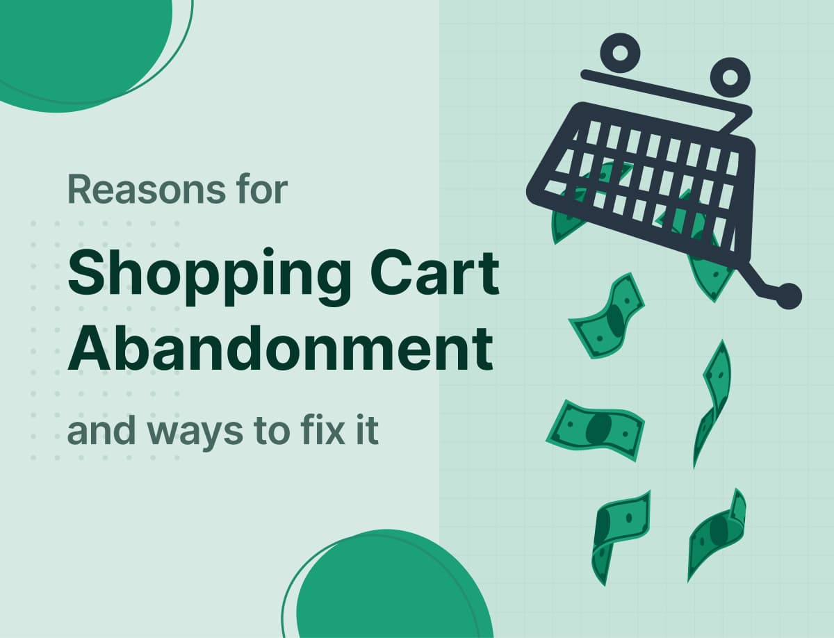
- Encourage visitors to complete their checkout. This will help to reduce cart abandonment
- Grow your email list, hence win more leads
- Ask users to take a survey
- Prompt users to reach out to you
- Promote offers, discounts, and lead magnets
21. Up Your Game with Two-Step Popups
Have you tried both regular and exit-intent popups, yet nothing meaningful to show for it? You should try a two-step popup.
A two-step popup – or Multi-step popup as some prefer to call it – takes users through 2 or more steps before completing an action.
Typically, it starts out by asking users a question – usually a Yes/No question. If they click No, the popup closes – no further questions asked.
But if “Yes” is what they went for, they will be redirected one or two more times until the action is completed.
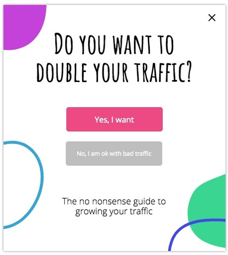
But won’t taking users through multiple steps anger and make them abandon your website?
Quite the contrary.
As Zeigarnik – a Soviet psychologist – observed, people tend to complete whatever action they willingly chose to start. This is known as the Zeigarnik effect.
This means with the two-step popup, you can increase your conversion rate quite remarkably.
22. Live Chat Anybody?
How would you feel if you arrived at a website only to discover you had no way of contacting whoever is behind it?
Or maybe the only available way to do so is via a boring contact form.
Frustrating, right?
That’s exactly how your visitors feel if they have no means of reaching out to you – fast.
And this frustration leaves them with no choice but to close your website and go elsewhere.
By adding a live chat feature to your website, you can actually combat this problem, and, in turn, improve user engagement.
Other benefits of implementing a live chat are as follows:
- Increase in customer satisfaction
- Your cart abandonment problems, if you suffer any, will reduce
- It helps you build trust with your potential customers
Here are some hand-picked live chat plugin solutions you can use on your WordPress website.
- Tidio live chat
- JivoChat
- Crisp live chat
And for Shopify, here are a couple of solutions you can try out
- HelpCenter
- Tawk.to
- LiveChat
23. Offer Money Back Guarantee
Offering a money-back guarantee can really help your business grow if done properly.
When you do so, you lay the foundation needed to build trust with potential customers.
It also helps to minimize, if not eliminate, the fear and hesitation which your visitors will naturally have when looking to make a purchase from you.
Need some more convincing reasons?
A money-back guarantee will help to:
- Get more people to try out your product, hence boosting sales
- Give you a competitive edge
- Ultimately fetch you more sales
24. Track Your Conversion
After following all the steps shared so far, the next step, apparently, is to know what is working for you and what is not. For that to happen, you need a way of tracking your conversion.
And there is no tool that is better suited for this job than Google Analytics.
With Google Analytics, you can get first-hand insight into critical data you need to effectively track your conversions.
Using this data, you can make intelligent, informed decisions as to how to improve your conversion.
Google has got an in-depth tutorial you can reference to set up conversion tracking on your website.
25. A/B Test Your Ideas
I hate to break it to you, but not every hack shared in this post will work – no matter how hard you try.
Heck, you could even try an entirely different tact not covered here, and won’t still see meaningful results. Or maybe see, but far from what you expect.
Don’t go beating yourself up when you notice this – it’s not your fault, but the way things are.
For this reason, you have to keep A/B testing your ideas.
When you A/B test, you try different ideas simultaneously until you figure out which works.
For example, if you noticed that exit-intent popups aren’t killing it for you, switch things up by using a gamified popup instead.
Of course, A/B testing takes time and effort, but in the end, it will always pay off.
Conclusion
So there you have it: 25 hacks to better convert traffic to your website into leads and sales.
If you’ve got any questions, or need some form of assistance, don’t hesitate to reach out to us.