Are you getting many visitors on your eCommerce website but can’t get them to buy your products? It’s an indication that there might be something wrong with your checkout process.
Thus, you need a strategy to optimize your checkout. And your checkout page is the best place to start from.
How am I so sure of this? If you look through the top reasons shoppers abandon their carts, most of them have to do with checkout pages.
So, why should you optimize your checkout pages? To minimize cart abandonment.
Yes, you can’t completely eliminate it, but you can reduce how often it happens.
And like I said earlier, your checkout page is a great place to start. Optimize your checkout page, and you are halfway through solving your cart abandonment problems.
Want to increase your revenue, sales and retain your valuable customers? Optimizing your checkout page will go a long way in helping you achieve these goals.
Because every sale is crucial to the prosperity of your eCommerce site, optimizing your checkout page will make it easier for your visitors to complete their purchases.
That said, let’s get into these checkout optimization strategies already!
Tips For Optimizing Your Checkout Page
Below are some of the best checkout practices for reducing cart abandonment and increasing sales on your eCommerce website:
1. Make Use of Exit-Intent Popups
Exit-intent popups are very important but underrated too. They are primarily used to win back visitors who are trying to exit your website. It simply stops them in their tracks and gives them a chance to rethink abandoning your website.
How do exit-intent popups work? Exit-Intent popups work by monitoring your visitor’s mouse movement. Once this technology detects a user’s cursor moving close to the top boundary of your website, it would activate a pop-up.
You can enable an exit-intent popup on your checkout page and watch it work wonders in reducing cart abandonment.
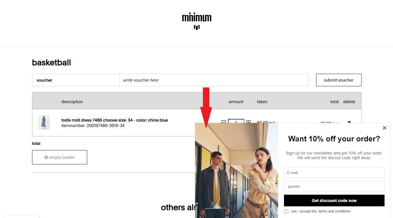
Exit-intent popups are dynamic, so you can customize them to ask questions, request email addresses, or offer your customers discounts or free coupons when they attempt to exit your website.
Minimum Fashion, an eCommerce store uses this strategy. It shows an exit-intent popup with a discount offer as soon as you attempt to leave the website.

2. Take Advantage of FOMO
You’d be amazed at how much difference it’ll make when you create FOMO, or Fear of Missing Out, with your visitors. FOMO helps you give your visitors a sense of urgency. It is a fail-proof marketing strategy that almost always guarantees that your checkout page will bring you more sales.
It simply involves presenting your potential customers with an irresistible offer and making them feel like they will never get it again if they missed out on it.
Nobody likes to miss out on a good offer they might never get again.
One good way of using FOMO is by offering your visitors a coupon. Then let them know that they have a limited time to redeem that coupon, after which it would expire. A countdown timer can help with this.
Ready to create a FOMO effect? Adoric has got a countdown timer feature that you can put to good use.


3. Remind Customers of Their Abandoned Carts
As odd as it might sound, customers sometimes forget that they have products waiting in their carts. Other times, people add products to carts and save them for later. The problem is ‘later’ never comes, and their carted items remain unpurchased.
As a website owner, you have to remind them of the items in their carts – if you want to make sales anyway.
Send your customers cart recovery emails like this one from Huckberry to remind them about their abandoned carts. This will go a long way to improve your checkout process.
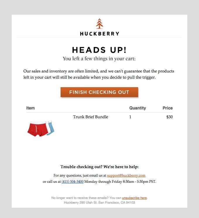

Huckberry included a button that links directly to the customer’s cart for a more straightforward checkout process. This helps to minimize the chances of a user abandoning their checkout before the process is completed.
If possible, you can also offer a discount or coupon to persuade your customer further to complete their purchase.
It is important to send the first email 24 hours after they have abandoned their cart as it would be more effective.
4. Avoid Hidden Costs
Hidden costs are annoying and can piss your customers off. It can make them decide against buying your product. This is why they are a leading cause of cart abandonment.
No one likes it when what they thought was affordable suddenly increases in price upon reaching the checkout page.


Amazon knows how important this tip is. Hence why they highlight all the extra costs associated with a product. Like in this backpack.
It is important to highlight every extra fee at every step of the eCommerce checkout process. Don’t wait till your customers get to the checkout page before surprising them with additional fees.
If you don’t, these additional costs will quickly become hidden charges.
5. Make Multiple Payment Options Available
Don’t make it frustrating for your users to find a convenient payment option. Potential customers often abandon their carts simply because they cannot find a payment option that works for them.
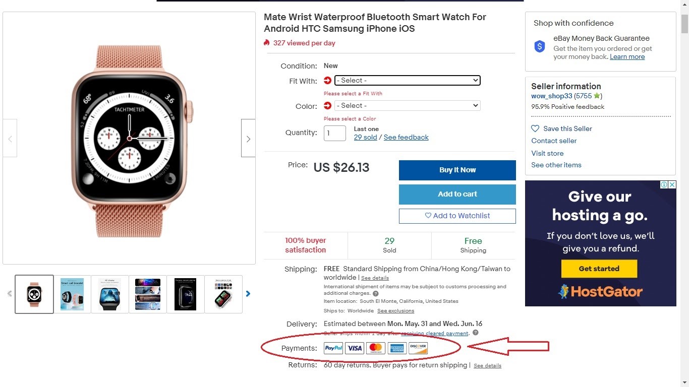
Include as many payment options as you can such as PayPal, Debit or Credit card payment. By so doing, your visitors won’t have a reason to abandon their checkout process.
See how eBay displays their payment options for this watch. Allowing their visitors to choose whichever one works for them.

6. Make Use of Live Chat
Do you want to give your customers an easy, efficient way of contacting you via your website? Live chat is the solution.
By offering your visitors a live chat, you would be greatly improving their browsing experience.
It also improves trust as it gives your visitors the impression of talking or chatting with a friend or acquaintance.
With live chat, customers can ask questions when they encounter problems before and during the checkout process and get replies fast. It also provides you with the opportunity to know how to improve your checkout process.
Here are some live chat solutions you can use on WordPress or Shopify:
7. Make Payment Details Requirements the Final Step
How suspicious would it be if you were required to submit your payment details before anything else during a purchase? Really suspicious, isn’t it?
Customers need to trust your website.
Asking for their credit card information, for example, too early in the checkout process makes it seem like that’s all you’re interested in. This can make your website look like a scam or phishing site.
When it comes to your eCommerce checkout flow, it is important to go subtly. Ask for details such as name, phone number, and shipping address before asking for sensitive information like their card details.
It makes your eCommerce site more trustworthy and keeps your visitors from exiting at the checkout stages.
8. Emphasize on Their Security
Customers like to know that their personal information, especially their card details are safe on your website. This is why building trust with them is important.
Help your customers trust you by ensuring that whatever details they input on your website are safe.
Here’s an example of a secured website. Did you notice the little padlock icon on the address bar?
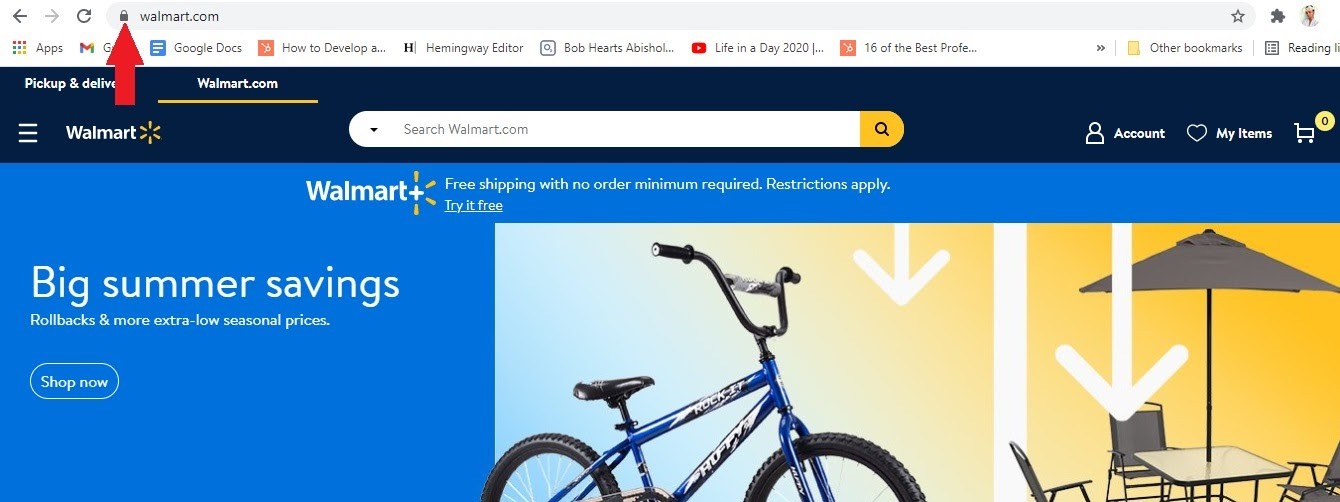

When people feel comfortable about their security, they will find it easier to input their card details to purchase an item on your checkout page.
9. Implement Guest Checkout
While it might make sense to collect the data of everyone that makes purchases on your website, it is not always the right move.
First-time visitors may find it annoying if they are required to create an account before they can complete the checkout processes.
Use a guest checkout option to make it easier for first-time visitors to make purchases on your website without the need to create an account. Here’s an example of a guest checkout option on Etsy.
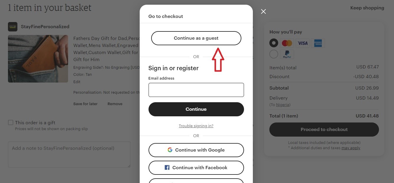

If you must ask your visitors to create an account during the checkout process, make it optional. Simply let them know that creating an account will enable them to get alerts for future offers and discounts.
10. Get Rid of Ads
Allowing ads on your website is a great way to make some extra money. However, when they appear on your checkout page, your visitors may find them annoying and distracting. They can also make your checkout process longer than necessary.
Take these ads and any other distracting features out of your checkout pages. This will go a long way in encouraging shoppers to go through with the purchasing process and help you reduce shopping cart abandonment.
11. Optimize Your Checkout Button
Another important checkout element that you should pay attention to is your checkout button. Make your checkout button stand out on your checkout page.
It should be attractive enough to encourage your shoppers to click on it.
For example, Sriracha 2 Go’s call-to-action button doesn’t just match the color theme of the page but also stands out. This way, the customer does not doubt where to click to buy the product.
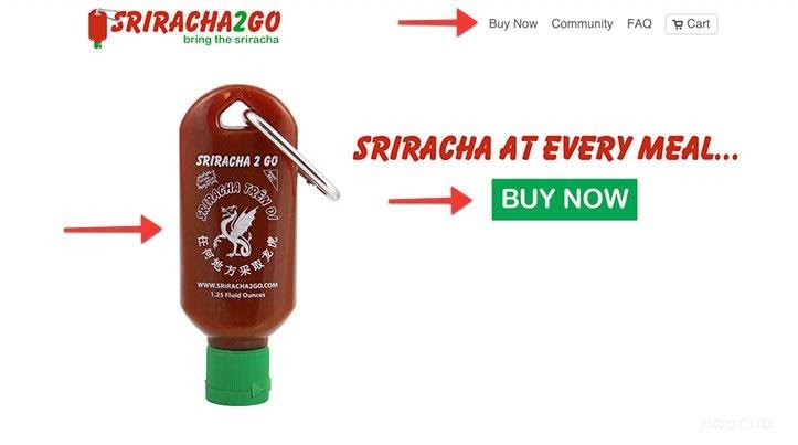

Your checkout button should not only be the right color, font, and shape. More importantly, it should contain the right call-to-action. CTAs go a long way in helping your visitors decide whether to go through with your checkout process or not.
12. Make Use of Product Recommendation tools
Not only are product recommendation tools helpful in helping customers speed up their shopping, but it also helps to make sure they do not forget to make a necessary purchase.
Product recommendation tools work by recommending related products based on a customer’s search or browsing history. For example, this tool might recommend a mouse or laptop bag when buying a laptop on Amazon.
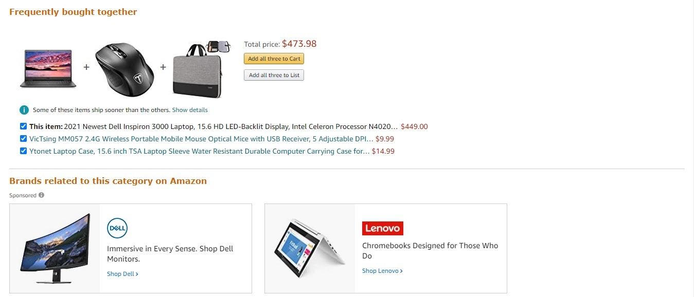

This helps your customers make sure they have everything they need before clearing their cart at the checkout page.
13. Show Total Stock Available
This is another important, yet underrated, method of optimizing a checkout process. Let your customers know how many units of product are left upfront. They shouldn’t get to find out upon reaching the checkout page. You could incur their wrath.
With this information, they will know if you have the number of units they want to buy or if the item is out of stock so they can look for an alternative.
Thankfully, you don’t need to write a code or hire a developer to achieve this. Inventory tools like Zoho Inventory or eComdash can help.
If a product is out of stock already, you can recommend other alternative products that they might be interested in.
14. Offer Free Shipping
Most customers back out of the checkout process as soon as they realize that they can’t afford the shipping fees. Offering free shipping is one way to optimize your checkout page and reduce cart abandonment on your eCommerce sites.
Customers like to feel like they are saving money, and taking advantage of free shipping will definitely make them happy.
If you can’t afford to offer free shipping, make it available as a special offer. For example, you can allow free shipping only if your customer purchases items totaling up to a certain amount.
This will encourage people to go through with the checkout process.
15. Show Customers How Much They Can Save
Who doesn’t like to save money from their purchases? Another smart strategy that can help you optimize your checkout process is to show your customers how much money they can save by buying an item.
There are various ways to go about this. When you offer them discounts, display the item’s original price. E.g., Product A formerly cost $X but now costs $Y.
See how Etsy implements this strategy on its checkout page:
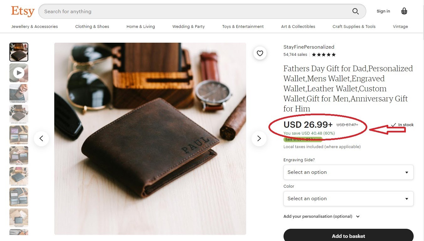

On the checkout page, you can also show your customers the total amount of money they will save by completing the checkout process. Chances are they will want to take advantage of any opportunity to save money.
Thus, they will eagerly complete their purchases.
16. Show Customers Your Checkout Flow
Simplify your eCommerce checkout flow by showing customers what stage they are in. It will enable them to know how many more steps.
You can do this by numbering the steps like so: 1 of 4, step 2 of 4, etc., or using a checkout progress bar positioned clearly at the top of the page.
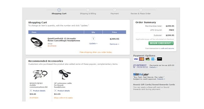

Make the checkout process easier for your customers by helping them to visualize the whole checkout flow at a glance.
17. Show Customer Reviews
71% of shoppers feel more comfortable buying a product after seeing reviews. To optimize your checkout process using this strategy, show reviews of previous customers for each product.
Your visitors need to know that whatever they purchase will be satisfactory and that your website isn’t a scam. Introduce a medium for customers to drop written reviews or star ratings on your website.
It helps to build trust and encourage customers to complete their checkout.
18. Reduce Form Fields
Don’t make potential customers have to fill lengthy forms just to make a purchase. It can be really–I mean really–frustrating.
Get rid of unnecessary form fields on your checkout page.
Reduce the number of required fields they must fill.
How Adoric Can Help Improve Your Checkout Process
That was a long one, wasn’t it? Definitely!.
But before I wrap things up, I will like to show you some of the tools we’ve got here at Adoric to put these tips to good use.
Ready? Let’s roll!
- With Adoric’s exit-intent technology, you can use popups to subtly drive your visitors back to the cart page and make them complete their purchases.
- Adoric offers countdown timers to add to your campaigns so as to create FOMO with your visitors. This will get them to complete the checkout process faster.
- Want to collect your visitors’ email addresses for sending out cart recovery emails? Adoric allows you to deploy opt-in forms on your website. You can create these forms from scratch using our drag-and-drop editor. Alternatively, you can pick from our pre-designed templates and tweak them.
- Adoric’s powerful product recommendation lets you suggest relevant products to your visitors. Thus, it’ll be easier for them to complete their shopping and seamlessly go through the checkout process.
Conclusion
Optimizing your checkout process is key to reducing cart abandonment.
So, why don’t you use these checkout optimization tips and watch your conversion rate soar steadily?
Did I forget to mention that you can start right now by signing up on Adoric for free?

