Looking for a detailed guide to using popups on Shopify to drive conversion and sales? Read on because this guide is for you!
Love or hate ‘em, popups are here to stay. They have become part and parcel of e-commerce. And you can’t avoid using them if you are serious about converting your website visitors into customers.
Needless to say, pop-ups can be tricky. If implemented wrongly, they can counter your original goal of generating sales by driving away your customers. Heck, they could even increase your website’s bounce rate, consequently your ranking on Google.
Nevertheless, they can be a great marketing asset. Used correctly, popups can help you gain a lot of customers, generate more sales, build user engagement, reduce cart abandonment…the list is endless.
But all those can only happen if you understand how popups work and how to use them effectively. And that is what this guide is about!
Let’s dive in right away!
What Are Popups And Why Should You Care?
Put simply, a popup (or window popup as some people prefer to call it) are modal display boxes that “pop up” on websites to engage visitors. You’ve seen them a million times already – unless you’ve never used the internet before (which we know isn’t true).
They look something like this:


Wait a sec, is popup the same as pop-up? What about “pop up”? Does it mean something different?
Well, popup, pop-up, and pop up all mean the same thing. It’s just a matter of personal preference.
Popups have many use cases. For example, they are used for getting user consent for cookies. They look something like this:
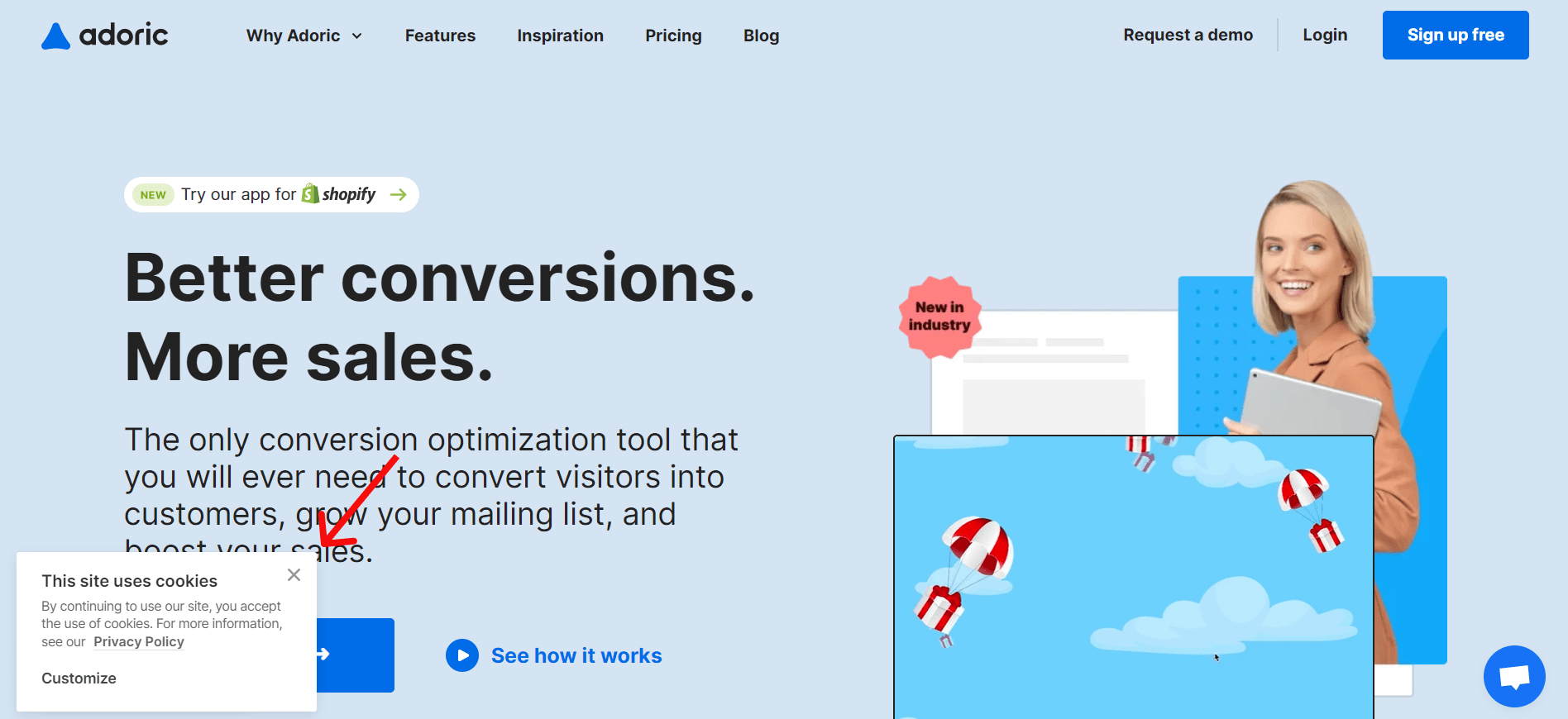

Technically, these are called cookie consent popups – or banners.
Besides asking for cookie consent, pop ups are also used to generate leads. By leads, we mean potential customers who are interested in your product and willing to buy from you.
This explains why most popups you see online ask for your email.
Additionally, popups are also great for running promotional campaigns, making an announcement, redirecting traffic, etc. More details shortly.
What Is the Conversion Rate of Popups?
But how well do people interact with popups? To put it in another context, how effective are they at serving their intended purpose, such as generating leads and building engagement?
A lot of studies suggest that the average conversion rate of top-performing website pop-ups is about 10% to 11%. It takes a lot to reach “top-performing” status, and only a few popups ever get there. Probably like 2 to 4% of all popups on the internet.
As for the rest, their conversion rate is between 2 to 5%. Could be more, could be less. But at least this gives you a fair idea of how well popups convert.
The conversion rate of your website popup depends largely on the design and your implementation strategy. Not to worry, we will talk about this in detail shortly.
Types of Shopify Popups
All popups are not the same. While some are designed for the sole purpose of collecting emails, others are primarily used for winning back abandoning visitors or redirecting traffic.
In fact, not all pop-ups “pop up”. Some slide in, and others don’t even move – they remain at a fixed spot as visitors scroll up and down your webpage.
That said, here are the many types of popups you can use on your website.
1. Regular Pop-ups
These are the popups you mostly see – and likely used on your website as well. They are often rectangular and tend to appear in the middle of a website.
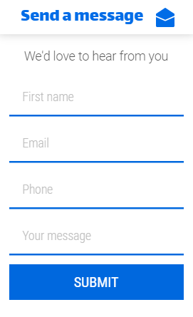

These popups are mostly used together with lead magnets – which are basically freebies like e-books, videos, etc. These freebies are used to attract potential customers. They are also used for announcing promotional offers, like Valentine, Christmas, Black Friday, etc. sales offers.
Regular popups are easy to set up and they usually don’t need advanced customization. This makes them an ideal choice if you are new to the whole popup thingy.
2. Slide-ins
As the name suggests, slide-ins are popups that “slide in” rather than “pop up”.
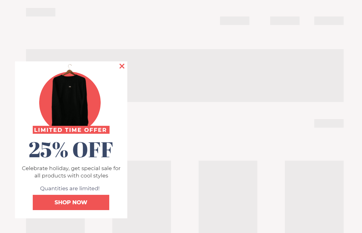

Why would anyone want to use a slide-in instead of the standard popup?
The reason is simple. Popups can end up annoying your visitors no matter how well you implement them. They tend to have an ‘in-your-face’ attitude, making people dislike them.
This is why slide-ins are a better option. Instead of popping up, they subtly slide in from the side of your visitor’s screen, sometimes without them even noticing.
Even though they are subtle, slide-ins still command attention.
3. Sticky Bar
What about making popups stick around on your pages instead of popping up or sliding in? This is where a sticky bar (which is the same as a floating bar) comes into play.
Sticky bars are a perfect option for making an announcement on your website. You will also find them useful when you want to run a free shipping promotion on your website.
Like slide-ins, sticky bars aren’t intrusive, even though they are attention-grabbers.
4. Exit-intent Popup
Displaying popups immediately after visitors arrive on your website is a bad idea. If you do so, you might piss them off, making them abandon your website almost as soon as they arrive.
What to do: wait until they are ready to leave your website before displaying any popups. Technically, this is called an exit-intent popup.
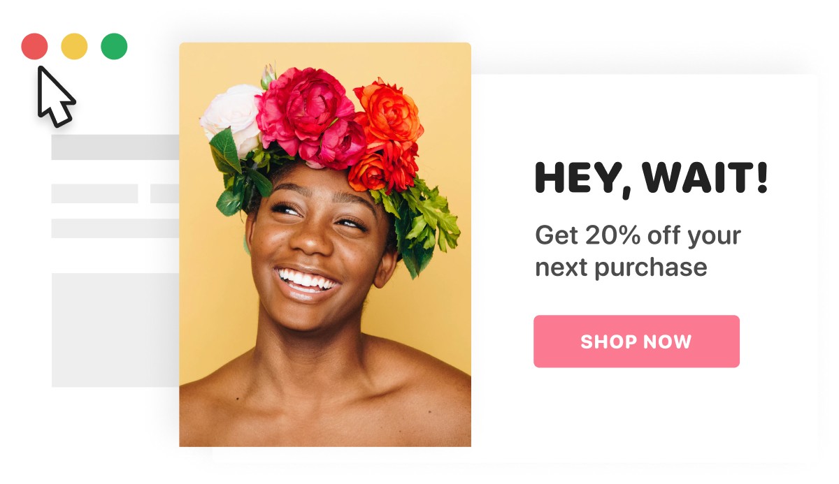

Exit popups are popups that show up when visitors motion to exit your website. Their primary purpose is to win back abandoning visitors. This makes them ideal for abandoned cart recovery.
5. Gamified Popups
Regular popups can be boring. People have seen them a million times already on different websites. You can bet they aren’t looking forward to seeing them on yours either.
So why not spice things up a little by using gamified popups instead?
As the name implies, gamified popups are popups with gaming mechanics embedded into them. They let you give your website visitors a chance to win discounts, free shipping, and other interesting freebies by playing fun games.
A good example is the spin-to-win popup. It gives visitors a chance to win a coupon simply by spinning a wheel of luck. Whatever value the wheel pointer falls on becomes their winning.
It looks something like this:
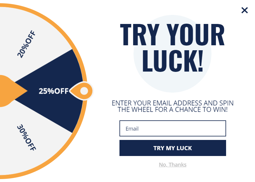

Other forms of gamified popups include scratch-to-win and our very own Falling Gifts popups.
6. Multi-step Pop ups
Wouldn’t it be nice if you could display a special “thank you” note each time visitors submitted their emails via your opt-in popup? It sure would!
This is where multi-step popups come into play.
Multi-step popups, basically, are popups that, well, have more than one step – usually two to three.
So in the first step, you might ask visitors for their emails. In the second step, you might display a thank you note, present them with a gift, or ask for additional information.
1. Boost Conversion
The primary purpose of using popups is to make your website convert better. This makes them an excellent tool for capturing your visitors’ attention and nudging them to perform a desired action – such as making a purchase.
Additionally, they are an excellent tool for promoting flash sales and promotional offers.
2. Reduce Cart Abandonment
Cart abandonment is a very serious issue in e-commerce. Studies suggest that as many as 70% of all shoppers abandon their carts before completing checkout.
Now, while there is no magic bullet to solving cart abandonment, using popups on your Shopify website can help.
There are two ways to go about this.
One is to display an exit-intent popup to shoppers attempting to exit your website. The popups should contain items they left in their carts and haven’t paid for yet.
The second method is to display popups to returning visitors who left your website without completing checkout, showing them the content of their uncompleted carts in the popup.
You can spruce things up a bit by enticing shoppers with a discount. For instance, you can offer them a 15% discount if they complete their abandoned carts.
3. Personalization
Using popups on your website gives you a chance to personalize your visitors’ shopping experience. The reason is that with popups, you can recommend products your customers will likely want to buy, based on their shopping history and preferences.
Personalizing your visitors’ experience not only sweetens their shopping experience but also makes them want to buy more. This means more sales for you.
4. Build Your List Fast
The money, they say, is in the list. This is to say, if you want to generate revenue from your site, you first have to build an email list.
Using popups on your website is the most efficient and fastest way to build your email list.
Adding an opt-in newsletter form to your footer or sidebar might work – but certainly not as efficiently as you would expect.
So, you are better off using popups if you want to grow your mailing list as fast as possible.
5. Make More Sales
Got an irresistible Easter, Christmas, or Black Friday sales offer you’d like your visitors to know about? Using a popup is the way to go.
You could even add a countdown timer to your popups to create a sense of urgency. That way, potential customers will act faster instead of dilly-dallying, thus ensuring you generate a lot of sales.
What Makes for a Good Shopify Popup?
A poorly-designed popup won’t get you anywhere. So also does a poorly-implemented popup. This then begs the question: what makes a good popup?
While there are no laid-down rules anywhere for creating popups, keeping the guidelines below at the back of your mind will help you create a better popup.
1. A Good Popup Is Enticing
Displaying popups for the sole sake of it – or because everyone else does it – is a bad idea. Your popups need to be enticing to stand a chance of converting your visitors into shoppers or email subscribers.
How do you know when your popup is relevant? An illustration will help you figure that out.
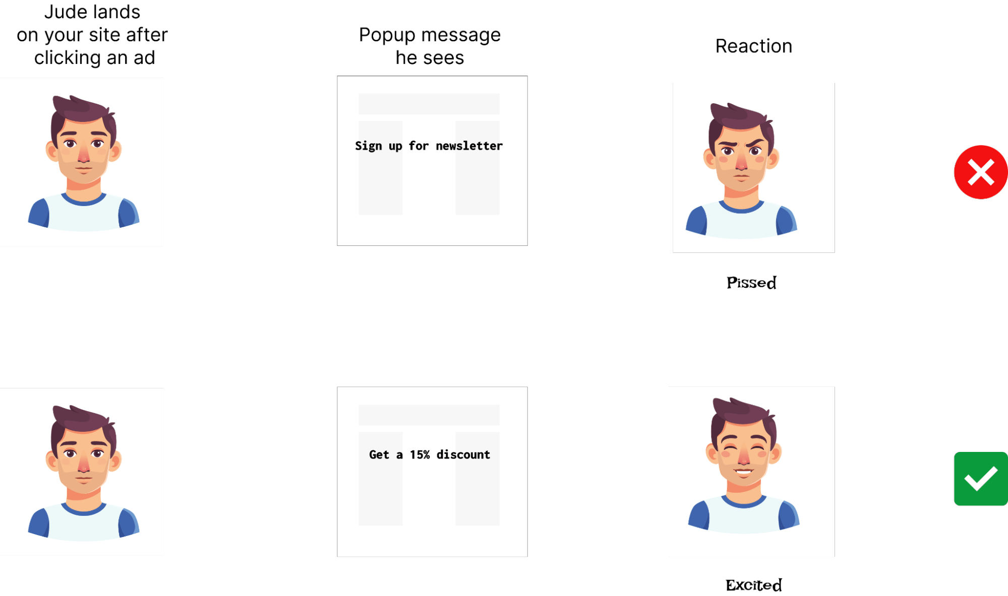
Let’s suppose you are running an ad on Facebook and Jude clicks on your ad. On arriving on your website, Jude immediately sees a popup asking him for his email. He will likely get pissed and leave your page.
But if he sees a popup offering him a 15% discount, he will likely get excited and want to buy your product.

2. A Good Pop-up is Relevant
A good popup isn’t only enticing but relevant too.
Let’s illustrate another example.
Andrea, an avid skateboarder sees your ad on Facebook that promotes a skateboard flash sale.
Andrea clicks on the ad, which immediately takes him to your product page. While still browsing through the page, a full-width popup shows up on Andrea’s screen, asking him to download a book that promises to teach him how to become a better skateboarder.
What do you think will happen? You guessed right!
The best thing to do is show Jude a popup showing products he will likely want to buy and possibly add a discount.
Keeping your popups relevant will help to improve conversion. Plus, it can greatly reduce the bounce rate on your website.
3. A Good Popup Shows up at the Right Time
Right timing is one important key to succeeding with popups. The reason is that popups have an intrusive tendency, which can be annoying. And you definitely wouldn’t want to annoy visitors with your popups.
When is the best time to show your popups? From experience, this is when visitors have engaged with your content.
For instance, when someone arrives on your website, you should wait a few minutes before displaying your popup. If possible, wait until they’ve scrolled a certain distance down your page.
4. A Good Popup Is Concise
It can be tempting to pack a lot of stuff into your popups when creating them. Don’t fall for that temptation.
Instead, keep them as concise as possible. In essence, keep your copies short and sweet, use images that communicate something, and avoid using colors abusively. Keep it simple!
You’d be surprised that your rather simple popup will convert better than a complicated popup with so many bells and whistles.
5. A Good Popup Is Personalized
If you want to make your popups convert better, you should show them to the right people, at the right time, and with the right content.
For example, if you sell men’s and women’s wear on your Shopify website and you display a popup that promotes a loafer shoe for men, you won’t make many sales.
Instead, display popups based on your visitors’ gender.
For the women, show them a popup that promotes a wedge, a purse, a fancy necklace, etc. You could even take a step further by promoting products that fit their purchasing power.
As for the men, you can promote suede and loafer shoes, shirts, and wristwatches – these are products that tickle their fancy.
Uses Cases for Pop-Ups on Shopify
Here are some common uses of pop-ups:
1. Upsells and Cross-sells
You don’t necessarily need to get more customers to generate more sales. Sometimes, you just need to find a way to make the few customers you have to buy more.
This is where upselling and cross-selling come into play. Upselling your customers involves convincing shoppers to buy a pricier product. Cross-selling, on the other hand, is the practice of getting people to buy additional products, often for a discount.
We have a detailed post on upselling and cross-selling on our blog. You might want to check it out.
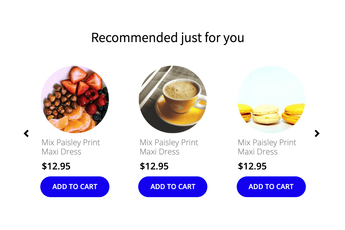

Popups will come in handy when you want to run upsell and cross-sell campaigns on your website.
2. Surveys
Popups aren’t solely meant for marketing purposes. They will also come in useful when you want to do a survey to glean insights from your visitors and customers.
Doing a survey with a popup enables you to understand what your customers want and tailor your product offerings accordingly.
3. Webinar Signups
Got an upcoming webinar you would like your visitors to know about and sign up for? What better tool to use for this than a popup?
Used effectively, popups can help drum up many attendees for your webinar.
4. Run a Free Shipping Promo
High shipping cost is one of the major reasons why shoppers abandon their carts. Studies suggest that as many as 80% of shoppers abandon their carts due to high shipping costs.
Intuitively, offering customers free shipping will help reduce cart abandonment on your website. But this can only work if potential customers know that you offer free shipping from the get-go.
This is where the free shipping bar comes in handy.


With these popups, you can entice your customers with free shipping to buy more from your store.
5. Product Recommendation
Personalizing your shoppers’ experience by recommending products they will likely want to buy based on their purchase history, geo-location, gender, etc.
This is another area where popups come in useful.
With popups, you can suggest products initially viewed but never bought, products they added to their cart but didn’t complete the purchase, trending products other shoppers are buying, etc.
7 Tips to Make Popups Work Well on Shopify
People often give up on their first few attempts at using a popup. This is because getting your popups to convert the way you want can be tricky. Tricky, but not impossible.
With the right strategy, you can drive your conversion rate way beyond your imagination.
That said, here are 7 tried-and-true tips to make your popups convert better.
1. Show Your Popups to the Right People
One important key to achieving your marketing goals with popups is showing them to the right people.
You have to identify your target audience and show them the right popup if you really want to enjoy good conversion.
For example, if you sell to customers in Europe and the US, it won’t make sense to display your pricing in only dollars ($). You have to segment your audience and display your product pricing based on their location.
You might also want to display popups based on your visitors’ status.
For example, it’s best to show email opt-in popups to first-time visitors. That way, you will have their emails and sell later to them via email marketing if they don’t buy anything.
For returning visitors, you might want to show product recommendation popups, as they will most likely engage with them.
2. Show Your Popups at the Right Time
It’s not always enough to show your popups to the right people. You also have to go the extra mile by displaying them at the right time.
Displaying your popups at the right time will make them less annoying, encouraging your visitors to engage with them.
When is the best time to show your popup? As we mentioned earlier, the best time to show your popups is when your visitors have engaged with the content of your website.
This could be some seconds after they land on your page when they start scrolling down your page, when they click on a button, or when they are about to exit your website.
Most popup builder tools give your flexible controls over your popup display.
For instance, Adoric gives you 5 different popup trigger options to make your popups more engaging: Time frame, Page scroll, Exit intent, Mouse click, and special event.


3. Add an Enticement
You will want to hook your visitors’ attention right from the very moment they see your popup. Using attractive images and a powerful copy might work – but not as much as using an enticement. And what better enticement to use than a coupon?
Believe it or not, people love coupons – and they will go to any length to get them.
Don’t believe us?
According to Statista, 90% of US consumers admitted to using coupons at some point.
86% of millennial shoppers said coupons can entice them enough to try a new brand.
Believe us now? The truth is that e-commerce and couponing are inseparable. Using them well can win you a lot of customers and boost your sales.
Have a look at these two popups and tell us which you think will convert better.
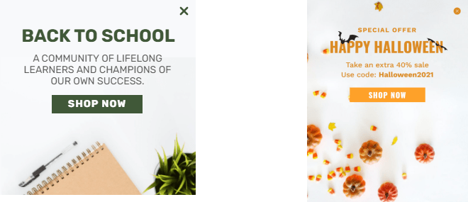

The one on the right, isn’t it?
Adding an enticement to your popups will give your visitors a reason to want to engage with them.
4. Use Relevant Images
Let’s say you sell leisure wears in your store and want to use popups to drive sales. Which of these popup designs do you think will drive the most sales?
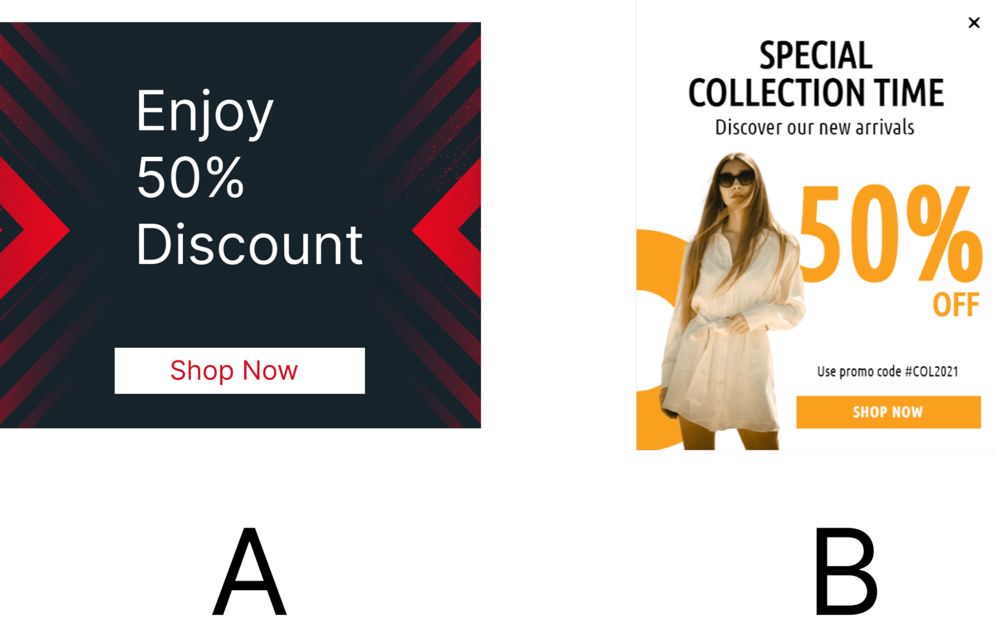

B, right?
The truth is that people are lazy readers. More often than not, it’s images that get their attention not text. This is why it is important to use images that are relevant to the message you are trying to communicate.
If you sell bags and want to use popups to promote your products, ensure the popup has the image of a bag.
In essence, use relevant images.
5. Add Gamification
Wouldn’t it be nice if you could spice things up a little and make your popups more fun and engaging? It surely would. This is what gamification is all about.
Adding gamification to your popups is the practice of adding gaming elements to your popups to make them more fun. Now not everyone will want to play the game in your popup for many reasons.
To overcome this apathy, you need to reward visitors with coupons and discounts for playing your games.
One popular gamified popup you should try is the spin-to-win popup. It’s a popup that gives visitors a chance to win coupons by spinning a wheel of luck.
Another cool gamified popup you can try is our very own Falling Gifts popup. On this popup display, visitors will see falling gift boxes. All they have to do is randomly click on the boxes to reveal their content.
Whatever the box contains becomes their winning.
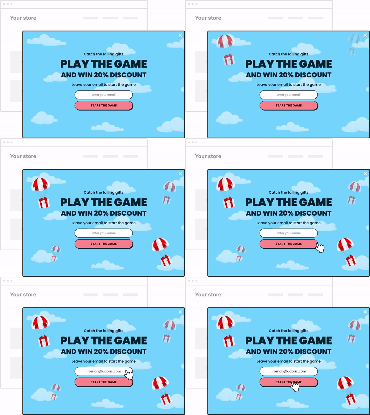

Adding gamification to your popups has a two-fold benefit: it improves user engagement and at the same time reduces bounce rate.
6. Leverage FOMO
Fear of missing out, or FOMO for short, is the concept of prompting people to take action by stirring up the fear of missing out on a deal, an experience, a reward, etc.
A good example of FOMO at play is when you are perusing a product online and then something like “Only 2 left. Get yours now”.
Or something like “30% discount. Offer expires in 24hrs”. Shows up on your screen.
When you see any of those, you will naturally want to act as fast as possible not to lose out, even if you never had plans of buying.
You can as well employ this phenomenon when creating your popups. Adding FOMO to your popups will make your visitors act hastily, thus driving up your conversion and sales.
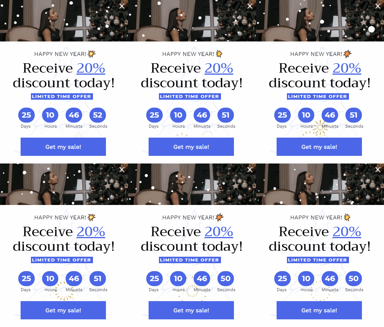
One good way to infuse FOMO into your popup is by embedding a countdown timer into it.
Here is a template from our library you can try out:

7. Make your CTA Strong
What’s a popup without a CTA (Call to Action)? No matter how well-crafted and strategically implemented your popups are, they won’t yield any result if they have no CTA.
As such, you need to make your CTA (which is basically the link or button visitors need to click to perform an action) as compelling as possible.
One surefire way to do that is by using power words and phrases like “get yours now”, “grab this offer”, “buy now”, “take me there” etc.
3 Best Popup Apps for Shopify
This guide wouldn’t be complete if we only give you tips for creating a high-converting popup without showing you how to do it.
Luckily, you don’t have to write complicated lines of code to create a popup on your website. Using the right popup app will do.
That said, here are the 3 best popup apps for Shopify you can count on.
1. Adoric


Adoric is undoubtedly one of the best popup apps for Shopify on the market, and for a good reason: it comes with loads of tools and features that make it super easy to create stunning popups.
In fact, you can create a popup to grow your email list, promote your special offers, and gamify your users’ experience, with a few clicks of the button, thanks to our intuitive campaign wizard.
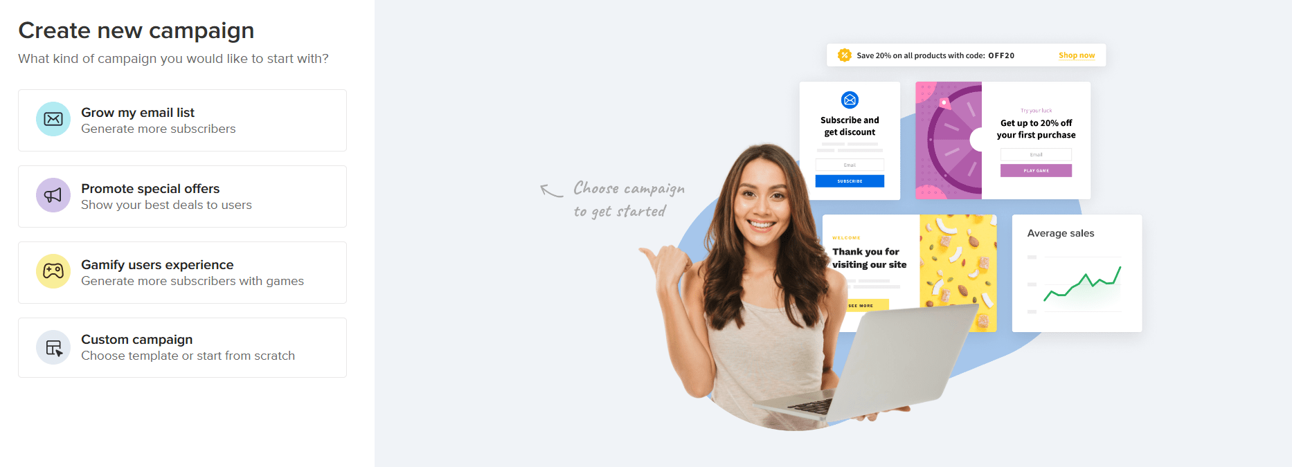

Moreover, Adoric comes with powerful segmentation and trigger features that enable you to show your popup to the right people at the right time.
Best of all, Adoric has a library of over 1000 customizable templates you can use to speed up your popup design.
Ready to try out Adoric? Add it to your store right away to see it in action.
2. Rivo Popups
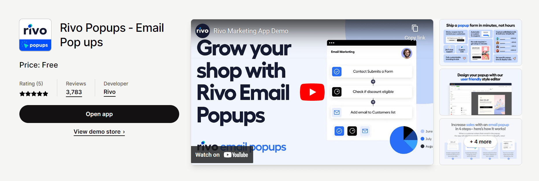

Rivo Popups is another great popup app that makes creating scroll-stopping, attention-grabbing popups a breeze.
Like Adoric, Rivo Popups also comes with many tools and templates you can leverage to create popups that attract customers and drive sales.
With Rivo, you can create sticky bars and opt-in popups, add gamification to your popups, set display rules to your popups, etc.
3. POP Sales
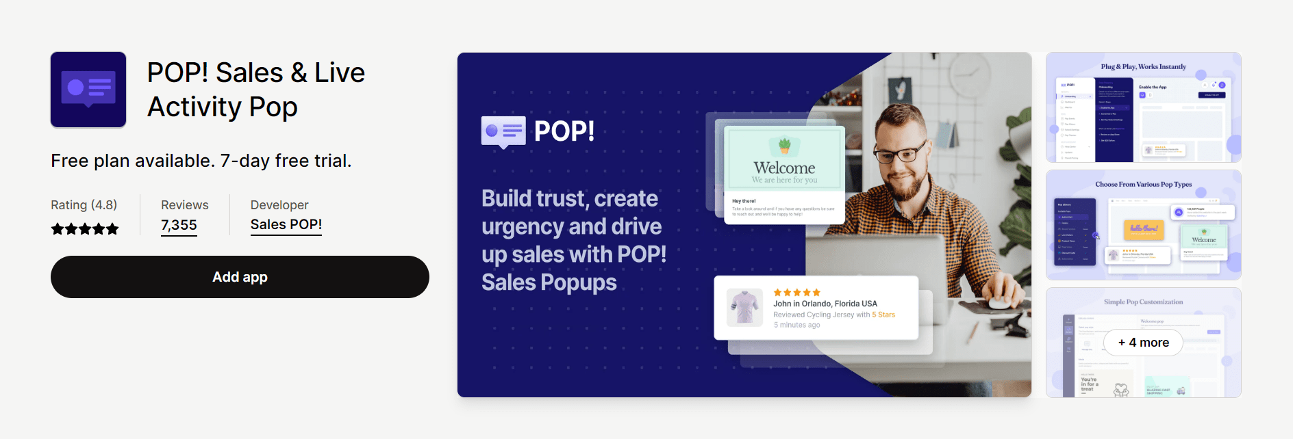

Third and last on our list is POP Sales. As the name suggests, this app lets you create attractive popups to drive sales.
It lets you display popups based on your visitors’ location, track users’ engagement with your popups and lots more.
In addition, it is easy to use.
Conclusion
Was a long one, wasn’t it? Anyway, the whole gist of this post is to show you how useful popups can be. They are excellent tools for driving sales and improving website conversion.
However, you have to use them well to see any meaningful benefit. Hopefully, with all we’ve shared in this post, that wouldn’t be much of a problem.
Ready to try out Adoric to see how it can help improve your conversion and sales? Add it to your Shopify website right away to take it for a spin.
You can start for free and scale up to our paid plans as your business expands.

