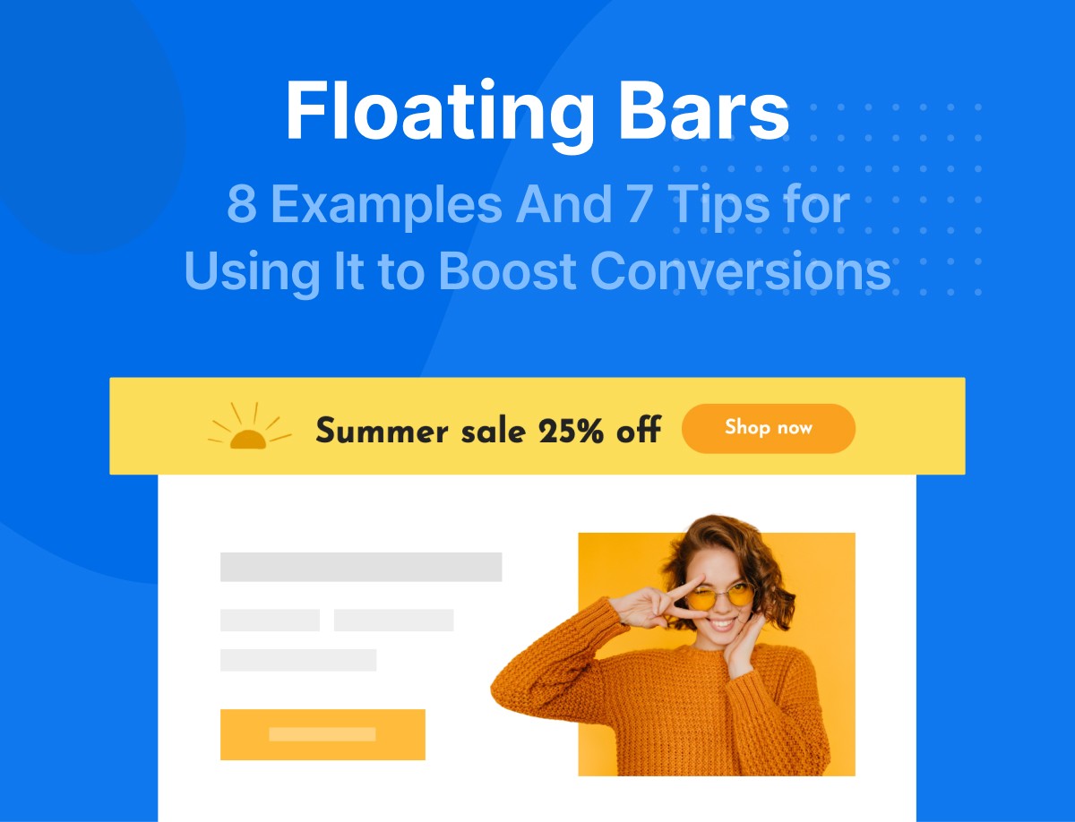
Are you looking to promote your campaign, but without annoying your visitors? A floating bar is all you need.
Floating bars, also known as ‘hello bars’ are similar to pop-ups. They function almost the same way, but with some differences.
They are not only popular because they barely annoy visitors and at the same time more effective at improving conversions than regular popups.
Content:
- What is a floating bar and what does it do?
- Benefits of using a floating bar
- 8 floating bar examples
- 7 tips for using floating bar to boost your conversion
- Conclusion
What Is A Floating Bar and What Does It Do?
A floating bar is a sticky bar that sticks to the top, bottom, or even the side of a web page. It remains at its position even as web visitors scroll down or up a web page.
Like popups, they are used to prompt web visitors to take certain actions or give information about a product or service.


Benefits of Using A Floating Bar
It’s rather unfortunate that most business owners haven’t explored the use of a floating bar on their websites. Little do they know that it can help with conversion rate optimization.
Don’t be like them. Use floating bars to boost your conversion rates. Read along and we’ll show you just how to do that.
Let’s explore why you should use floating bars.
Floating Bars Aren’t Intrusive
Many people have the impression that popups are intrusive and disturbing. This is true only when they are used uncontrollably. However, floating bars help you to completely deal with this concern, thus, avoiding any setbacks to your conversion rate optimization process.
Popups, unlike sticky bars, may hurt your users’ experience. Imagine the annoyance of a popup suddenly interrupting while you are trying to engage with a website. You will likely close the site or go somewhere else, right?
That’s exactly what visitors experience on websites that use uncontrolled popups. So, it’s better to play safe by using sticky bars, else you risk losing your visitors forever.
But did you know that combining a popup with a floating bar for the same campaign can uplift your conversion rates? Try using floating bars alone or with popups and see which works better with your users before making a decision.
Floating Bars Offers Better Engagement
A floating bar can still be visible to the web user whether they scroll down or to the top of the web page.
Floating bars are like sticky notes on your fridge that prompt or remind you to do something. Except that in this case, the sticky note is always before your user as they browse through your website.
Like the sticky notes you place on your fridge, floating bars are not invasive, and so won’t prevent visitors from engaging with your website.
Isn’t that great? What this means for you is better engagement, and, hence, more conversions.
Ideal for Growing Your Email List
If you are looking to succeed with email marketing, first, you need to build a mailing list.
Looking for additional means with which you can grow your email lists? Use float bars to prompt your visitors to sign up for your newsletters or other lead magnets you intend to use. Without a doubt, your email list will see significant growth by using floating bars.


The subtle nature of floating bars makes them likely to fetch you more results than other methods.
Drive Traffic to Targeted Pages
Do you have a landing page for a new product, service, or an upcoming event? Drive traffic to that page with the help of a hello bar.
Don’t make it bland, inspire curiosity with your web visitors. Write a convincing copy and a catchy call-to-action on your floating bar and watch your page get flooded with visits in a short while.
Welcome Visitors to Your Site
A warm welcome upon arriving at your website can go a long way to give your visitors a good first impression of your brand. What better way to do this than with a floating bar stretched across the top of your page?
Additionally, displaying a welcome message via a floating bar can help to improve your conversion rate as well as your sales.
So, it’s worth the effort. Create one today.
Promote Events and Announce Offers
If businesses can use physical banners to promote their events and announce offers, there’s no reason why you shouldn’t do the same with a floating bar on your website.


Perhaps the best part of using a floating bar to promote events like webinars or sales offers is that you can also build your email list at the same time!
Make the most out of your conversion rate optimization. Increase the number of attendees at your event or the sales you get by promoting them with a floating bar.
Increase Your Social Following
Social media provides you with a platform to promote your brand. As such, the more followers you have on your social media handles, the better for your business.
This goes to show how highly you should prioritize growing your followership on social media.
A popup is ill-suited for this job.
So, what to do? Take advantage of the subtlety of a floating bar to do the job.


This way, you make a follower out of your web visitor without the risk of chasing them away from your website forever. That’s you eating your cake and having it- a win-win!
8 Floating Bar Examples
Looking for some floating and announcement bar inspirations? You are in luck – we have 8 of them to show you, and they are all coming from our template library.
You can try any of our high-converting, professionally designed floating bars right away. You also don’t need any coding or graphic design skills, thanks to Adoric’s intuitive design editor.
#1 Grow Your Leads
A hello bar is a useful tool to grow leads for growing your mailing list. It also works well for generating leads for your business.
However, for maximum results, keep your floating bar as simple as possible. The template below nails this hack by limiting its text to one line and asking for the user’s email only.


#2 Promotions
Giving out enticing deals and discounts is a sure way to get your customers’ attention. It also helps to increase customer loyalty.
Create a sense of urgency with your audience by announcing that items that are up for promotion are in limited quantity.
The Cyber Monday floating bar below is a good way to create a sense of urgency with your web visitors. The fact that specific details about the deals are left out will also inspire some curiosity. This will make them want to see what your deal is about as fast as they can.
The bold color of the CTA makes it stand out while the text it carries directly prompts the user to click on it.


#3 Seasonal Sales
Do you have an offer you would like to notify your visitors about? Or, maybe, there’s an upcoming sale you would like them to know about? Announce it with a floating bar!
A floating bar with a bold-colored background like the one below will be hard to miss. Use it to garner more sales with your big announcement.
You can also edit or tweak it as you like.


#4 User support
Great customer service starts with providing quality support to your customers. How do you do that if you don’t have their contact details?
Prompt your users to drop their contact details with the promise of giving them all the support they need for an excellent user experience on your website with the floating bar below.
Feel free to customize it to your taste.


#5 Seasonal Offers 2
If you’re building a seasonal campaign for your business, take advantage of this floating bar to get more sales.


You can also set up this campaign to be triggered based on your visitor’s time and date, and you can be sure they’ll see it during the fall.
Mind you, the texts in this floating bar template are just a placeholder – you can easily edit them using our design editor. So, your offer mustn’t be 30%.
#6 Signups
You sure want as many people as possible to sign up for your offer, don’t you?
Increase your signups by using this floating bar template. Its basic design drives your audience to focus on the words which is the crux of your campaign. The CTA also clearly communicates the value you are offering in return for their time.


#7 Product Launch
Did you just launch a new product? Why not use this floating bar to promote it to your visitors?
You could link the floating bar to the product landing page or another resource that educates your audience about your new product.


Make them feel even more special by asking them to be the first to use it.
If it’s a service or a product upgrade instead, make sure that you modify the template to communicate just that.
#8 Spin to Win
Spin to win promotions has fast become popular with many brands. Yours shouldn’t be left out.
Use the template below to get your audience anticipating the thrill that comes with playing a game and winning freebies.
Even better when it’s during a major sale like Cyber Monday. If yours is a Black Friday sale or any other major sale instead, don’t hesitate to tweak this template accordingly.


Free Shipping Bar
Who doesn’t love free shipping? In fact, one of the easiest ways to entice customers to buy some more from your store is by offering them free shipping.
However, it’s not enough to offer free shipping; you equally need to make efforts to ensure shoppers are aware of your free shipping offer. This is where Adoric’s free shipping bar feature comes in handy.
Adoric’s free shipping bar is a feature that allows you to display free shipping information on your website via a sticky bar.


You can customize the bar however you want and make it appear on your website at the right time, and ensure the right people see it.
7 Tips for Using Floating Bars to Boost Your Conversions
Now you know what floating bars are and how they can benefit your brand. We’ve also shown you some professionally designed templates to choose from, and how you can use them. But we won’t stop there.
A good strategy like the floating bar with proven results can still fail if not done properly. You don’t want your efforts to be in vain. We don’t want that for you either. So, sit tight and digest these proven tips that we have compiled to make your floating bars a success.
Keep the Size Small
It’s a floating bar, not a popup. The only reason floating bars are considered to be non-intrusive is mostly because of their simplicity and small size.
Thus, don’t make the mistake of increasing the size of your floating bar by so much in a bid to make it more visible to your audience.
It will do the very opposite of optimizing your conversion rates. The reason is, unusually large floating bars will irritate your visitors. This could result in an increased website bounce rate and ruin your chances of a relationship between your web visitors and your brand.
Use Lead Magnets
Lead magnets are marketing tools used to generate leads by offering something exciting in exchange for a potential client’s contact information.
You could offer an ebook, a video tutorial, a workbook, newsletters, or webinars in exchange for a web visitor’s email address, for example. Think of it as an opt-in bribe.
Using a lead magnet is a way to guarantee that the leads you generate are directly relevant to your campaign. This is because your lead magnet has to be specifically created for the audience you are targeting.
Also, your target visitors won’t hesitate to drop their contact details and download your offering as it would be useful to them at that exact time.
And there’s no better tool to use for this task than a floating bar.
This is especially useful if you are a publisher or a digital coach who provides helpful resources or training to your audience.


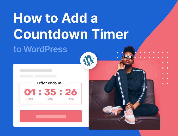
Infuse A Countdown Timer
Creating a sense of urgency around your campaign is an effective way to make your visitors take action quickly.
It also increases the perceived value of your offering and gives them the impression that they have something to lose by not acting quickly.
Countdown timers are virtual clocks that count down from a certain date or number to indicate the beginning or end of an offer or event.


In this survey by neuromarketing, researchers found that countdown timers can increase conversion rates quite remarkably.
This makes it great for promoting limited-time deals.
Personalize Your Floating Bars for Your Audience
Personalization makes a significant difference when it comes to conversion rate optimization. It has the power to grab your visitor’s attention and eventually get them to sign up for an event or make a purchase.
Website visitors are unique, behave differently, and have varying interests. If you appeal to them by customizing the floating bar they see based on variables like their gender, age, location, and any other data you have access to, you’d be connecting with them on a personal level.
Adoric allows you to personalize your floating bars for different audiences according to the variables mentioned above.
This could in turn improve user engagement and satisfaction on your website.
Perhaps the best part of this strategy is the fact that it is effective across all industries and business types.
Keep Your Floating Bar’s Content And Design Clear And Simple
Making your floating bar a block of unnecessary text sure isn’t the way to get the attention of your web visitors.
Thus, it’s best to use minimal texts to improve your conversions. Keep your copy lines to the point. Make your content clear and concise.
Also, make sure that your overall design is simple and appealing enough to make your visitors engage with it.
Use Different Call-To-Action
Using a compelling call-to-action on your floating bar is great. Varying it from time to time is even better for engagement and conversions.
Making purchases or signing up for newsletters are probably not the only actions you want your web visitors to carry out as they progress along the customer journey.
You probably also want them to connect with you on social media, read a blog post, or attend an event.
It would be okay for your web visitor to see a floating bar on your page with a CTA asking them to sign up for your newsletters upon their first visit.
If, however, the same floating bar with the same CTA keeps being displayed on subsequent visits after the visitor has subscribed, they might get bored and leave your site.
How do you get the CTAs on your floating bar to appeal to both new and returning web visitors? Switch things up!
Vary your call-to-action from time to time so you won’t always have the same prompts on your floating bar. This tip will help you increase engagement, retain web visitors, and build brand loyalty.
Adopt Smarter Campaign Triggers
Your floating bar doesn’t have to be the first thing your web visitor sees upon landing on your website.
In some cases, your web visitor should get familiar with your website for a bit before you introduce a floating bar into the picture. And yes, it’s possible to do that.
Adoric comes with a lot of trigger options such as page scroll, exit intent, etc. Why not try one out to see if your floating bar will perform better.


In every web promotion strategy, user experience is important so that your marketing efforts don’t backfire. Timing your floating bar right helps to ensure this and increases your web conversions significantly.
Conclusion
Many businesses are not harnessing floating bars as much as they should. It’s surprising, considering the huge difference it could make in a campaign, especially when combined with other traditional marketing efforts.
Floating bars may not be as visible as popups, but they equally contribute significantly to the conversion rate optimization of your website. They act as a subtle reminder that follows your visitor everywhere they go on your website without being pesky.
Apart from the little or no annoyance tendencies of a floating bar and the fact that it remains visible as your web visitor navigates your website, it has several benefits.
Some of these benefits include significant growth of your email list, directing traffic to targeted pages, welcoming visitors to your site, promoting events and announcing offers, and increasing your social following.
Despite the many advantages that using floating bars might add to your business, it could also go wrong if not done properly. Therefore, it is necessary to adopt best practices to boost your conversion rate when opting for the use of floating bars.
These best practices include minimizing your floating bar size, using lead magnets in your campaigns, incorporating a countdown timer to make your audience act quickly, personalizing your floating bars according to your audience type, paying attention to your content and design, varying your call-to-action, and using campaign triggers.
Sign up for a free Adoric account today and improve your website conversion rate optimization using floating bars.

