No sales funnel is really ever complete without a landing page. The reason is, you need one to convert your traffic to leads and sales.
So, like or hate ‘em, you can’t do without having one. Unless you don’t give a darn about converting your traffic.
But what exactly is a landing page? And what’s the deal about it?
A landing page, simply, is any page you direct visitors to from a link. Or, more succinctly, a page a visitor “lands” after clicking a link.
The deal is that landing pages serve one major purpose: generate leads.
Of course, there’s more to landing pages than meets the eye. In this post, I will be taking you through the anatomy of landing pages.
The goal? To help you build them effectively. And also optimize the ones you’ve built already. It’s sure going to be a long post but promises to be a great read.
To make it easy for you to follow through, here are points that I will cover in this post:
Let’s set the wheels in motion, but first the highlights:
- What is a landing page?
- Landing page vs homepage: what’s the difference?
- When should you use a landing page?
- Best practices for creating a landing page
- How to build a landing page easily
- How to drive traffic to your landing page
- Optimize your landing page with Adoric
- Wrapping it up
What’s a Landing Page?
Let’s start off by seeing how Wikipedia defines it:
“..a landing page…is a single web page that appears in response to clicking a search engine optimized search result,…marketing email or an online advertisement”
This is the apt, straight-to-the-point definition of a landing page.
It can then be deduced that any page can pass as a landing page: your homepage, about us page, contact us page, etc. Isn’t it?
Well, not exactly so. From the marketing standpoint, a landing page isn’t just about any page; it’s a page you drive traffic to for one sole purpose: to generate leads.
Some visuals might help drive my point home better.
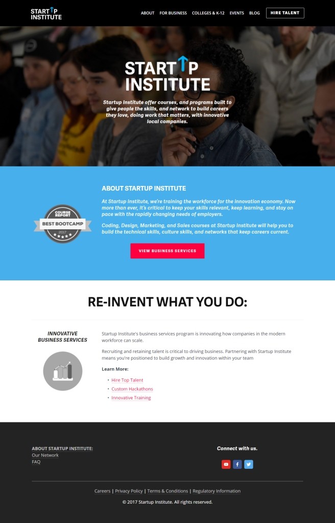
Here’s a homepage that might as well pass for a landing page:

And here’s what an actual landing page should be:
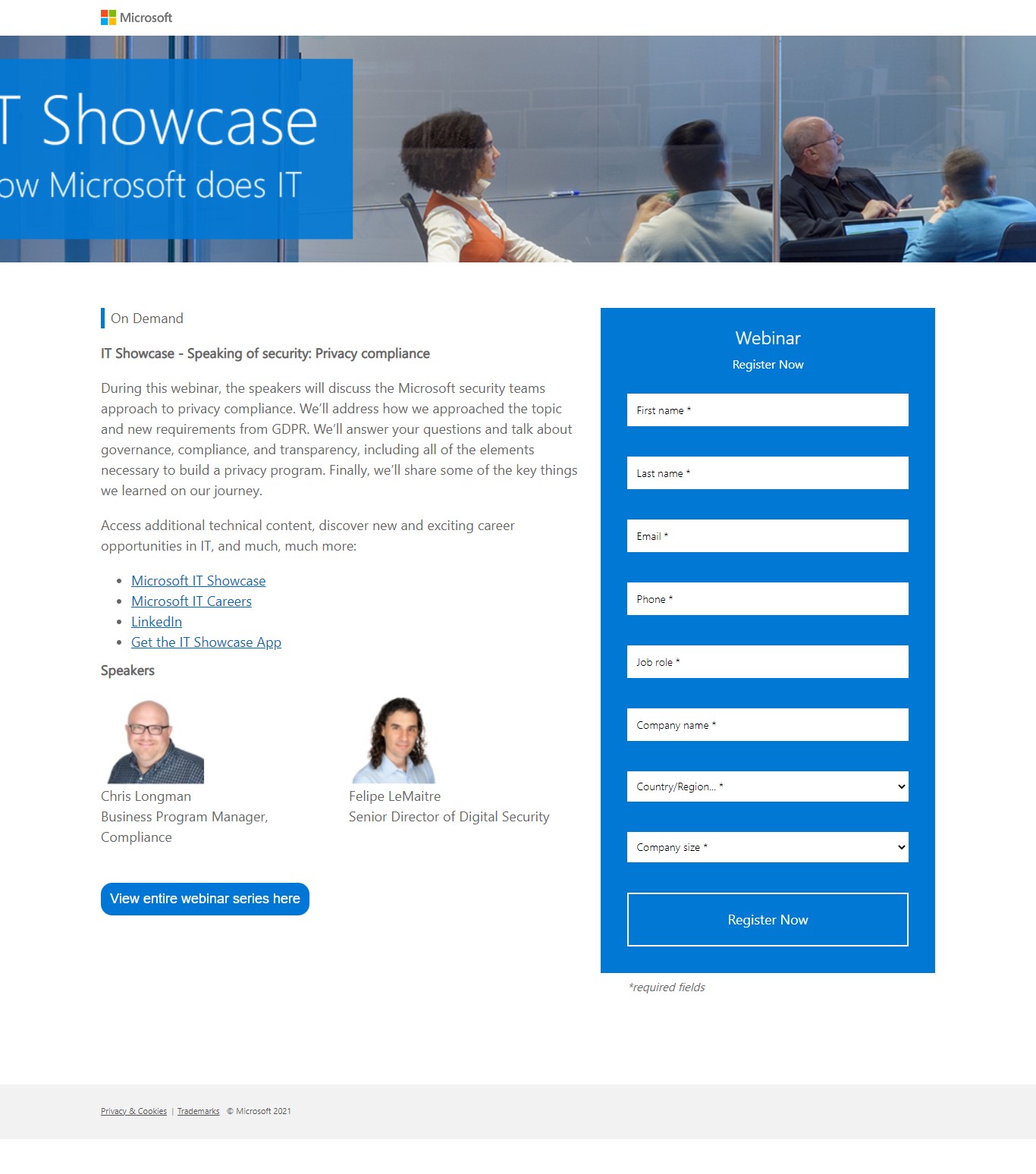

What difference did you notice? The image at the bottom has few distracting elements, unlike the former. No navigation link, no footer, just a prominent opt-in form. That’s what makes it a landing page. More details shortly.
Landing vs Home Page: What’s The Difference?
To make it easier for you to grasp the difference between a landing and a home page, I would like to make an illustration.
Let’s say you wanted to buy a nice, comfortable loafers shoe, and you are considering buying from two different stores: A and B.
You walk into store A, and right from the door, you see lots of “nice” stuff that catches your fancy: a wristwatch, leather jacket, sunshades, etc. And they are just too enticing to ignore.
You will most likely leave that store with lots of “stuff” you never actually intended to. Probably never coming close to the loafers you had in mind.


But then, in store B, you see nothing but loafers everywhere starting from the entrance door. You will definitely not miss it this time.
In the context of marketing, a homepage can be likened to store “A”, whereas a landing page to “B”.
Getting the idea?
Thus, what sets a landing page apart from a homepage – or any other web page – is that it is free of distracting elements. And its sole purpose is to convert a visitor into a lead.
Why is Landing Page Important?
Why take the stress of building and optimizing a landing page when your homepage could pass? Well, I will leave you to answer that question. But here are some helpful cues to help you answer that question.
1. To Generate Leads
I know, I know. I have said that like a million times already, so why repeat it again?
Well, the reason is that the main essence of having a landing page is to win leads. Thus, anything short of that makes it a regular webpage and not a landing page.
However, in some instances, a landing page can be used to generate sales, rather than leads. The key takeaway is, a landing page should help you reach your marketing goals.
2. A Place to Keep Your Offers
Let’s say you are looking to run a lead magnet campaign in the hope of getting your visitors’ emails in exchange for an ebook. Where should you embed the ebook? Certainly not your homepage. Neither in your “about us” page, but on a landing page.
Here’s an inspiration from Upwork
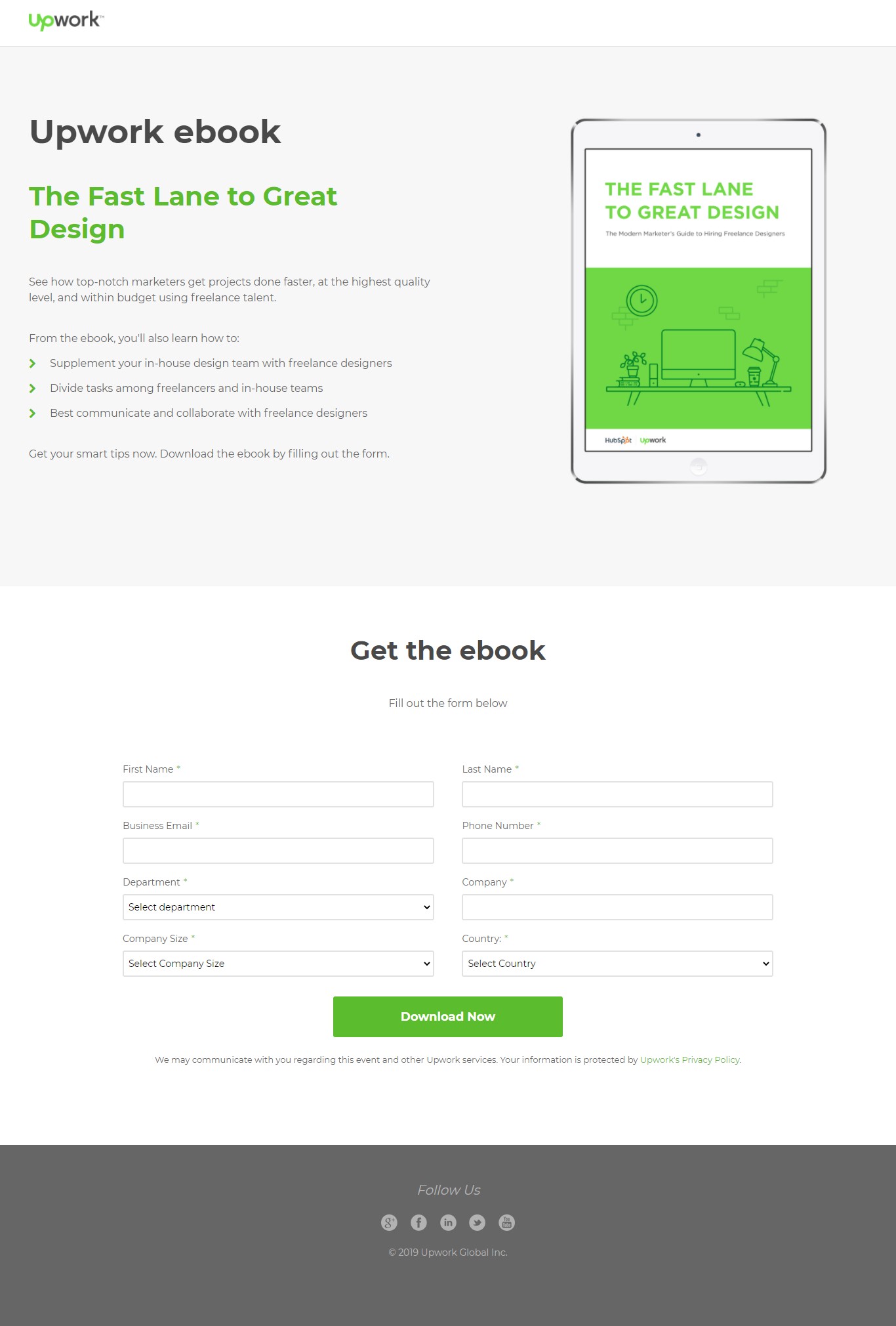

Getting the point?
3. Helps You Build Credibility
Imagine for a second that you are scrolling through your Facebook feeds, dropping likes here and there.
Then while still at it, you see a sponsored ad. It promises to teach you how to, say, make money as an affiliate marketer. You take an interest, click on the ad but only to be directed to a website’s homepage.
On that page, nothing is said again about the ad you had earlier seen. Just link buttons, images, and irrelevant texts. You will get pissed, won’t you? Definitely.
But you wouldn’t if you had been directed to a landing page that is specific to that ad.
Of course, this is imaginary. The key takeaway here is that directing visitors to a landing page that is relevant will help you build credibility.
4. Increase Conversion Rate
Since the core essence of landing pages is to help you win conversions, it makes sense to use them when looking to increase your conversion rate.
And you know, more conversions equates to more sales.
When Should You Use a Landing Page?
Yes, having a landing page is great.
But when will they come in handy? Or should I say, when do you really need a landing page? Here are a few instances:
1. To Promote an ebook
So you just published your latest book: it’s a masterpiece and you can’t wait to share it with the world. How do you go about promoting it?
Simple. Create a landing page, embed a button with a download link to the book, and drive traffic to the page. That’s all. Supposedly, I guess.
Of course, there’s more to that, but the point is, a landing page will come in handy when you want to promote an ebook.
2. Get Signups for Your Webinar
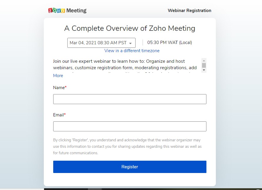
Launching a webinar soon? You will surely need as many attendees as possible to sign up, won’t you? Here again, is where you will need a landing page.
And it doesn’t have to be so fanciful and seductively elegant. Something as simple as this will work:

3. Encourage Free Trial for Your SaaS Product
A landing will be great, too, if you are looking to get as many potential customers as possible to demo your Saas product.
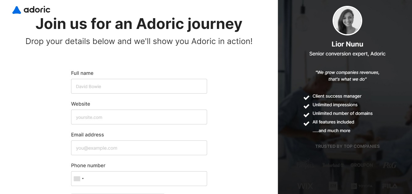
Here is our own demo landing page. I hope it inspires you.

Want to make sure your landing page has the same sleek, trendy, elegant style with your storefront? Consider Blum by SalesHunterThemes as our suggestion. It offers a distinctive design, focusing on captivating visual elements with bold, impactful text. Blum also delivers strong performance on mobile devices, ensuring lightning-fast page speed and responsiveness. Especially, all pages generated by Blum theme have 8x Google Pagespeed score on mobile.
Best Practices for Creating a Landing Page
Designing effective, converting landing pages is a mix of art and science. But not to worry, it’s not as hard as it might look to you.
Without ado, here are helpful tips to keep in mind when building a landing page.
- Eliminate navigation links
- Keep key conversion elements above the fold
- Write compelling copies
- Weave FOMO into your page
- Make your page mobile-friendly
- A/B test your landing page
1. Eliminate Navigation Links
Eliminating navigational links and buttons is one landing page design tip you can swear by. The reason is, navigational links are nothing but distractions, even though they may look otherwise.
Having these distracting elements on your page is synonymous with having holes in a bucket. No matter how hard you try, it’s never going to get filled.
Have a look at these two pages: which do you think will convert better?
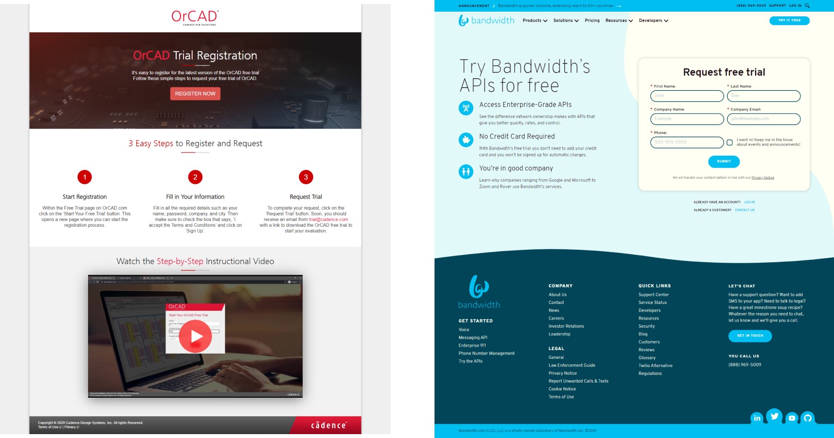

The first, most certainly. The reasons are, first: it has no navigational link. That means users won’t be tempted to click away from the page.
Second: it has very few clickable links. As a matter of fact, it only has one which is the red register button.
Getting the idea?
One last thing. While having navigation links is a bad idea, seeding your landing page with one or two CTA buttons isn’t. In fact, landing pages with only CTA buttons and no opt-in forms are known as Click-through pages. They work pretty well.
For example, the “OrCAD” page you see above is a click-through page.
2. Keep Key Conversion Elements Above the Fold
Above the fold, above the fold….what the heck does above the field mean? I wondered the same in the early days of my marketing career, so I get your frustration.
If you have ever bought a newspaper from a vendor before, you will have noticed that the papers are usually folded in two when kept on display. There is the top half – or above the fold, in this context – and there’s the bottom half.
When you relate this to a website, above the fold is the part of a webpage a user sees first upon arrival without having to scroll down.


This makes the above-the-fold part of your landing page the best place to keep your opt-in form or CTA button. If you noticed, the LinkedIn landing page example above has two CTA buttons above the fold.
Don’t agree that above-the-fold is a good place for CTA buttons or opt-in forms?
Here are some stats that will melt away your doubts:
- Above-the-fold content, on average, holds down 80% of users’ attention.
- Placing your CTA above the fold can potentially increase your conversion rate by 41%
3. Write Compelling Copies
Writing compelling copies is a skill you need to master as a marketer. There are no two ways about it.
What’s the secret to writing a good copy? Empathy!
Be empathetic when you write; understand that people are coming to your page to have their problems solved.
Need some more copywriting tips for your landing page? There you go:
Start With an Attention-grabbing Headline.
You’ve probably been told this over a million times. Truth is, your headline is, more often than not, the first place your visitors’ attention goes upon landing on your page. So it has to be captivating enough to hold them down.
But how do you write a memorable headline? Well, I figured out that some inspiration might help. Here are some of the best landing page headline copies I found:
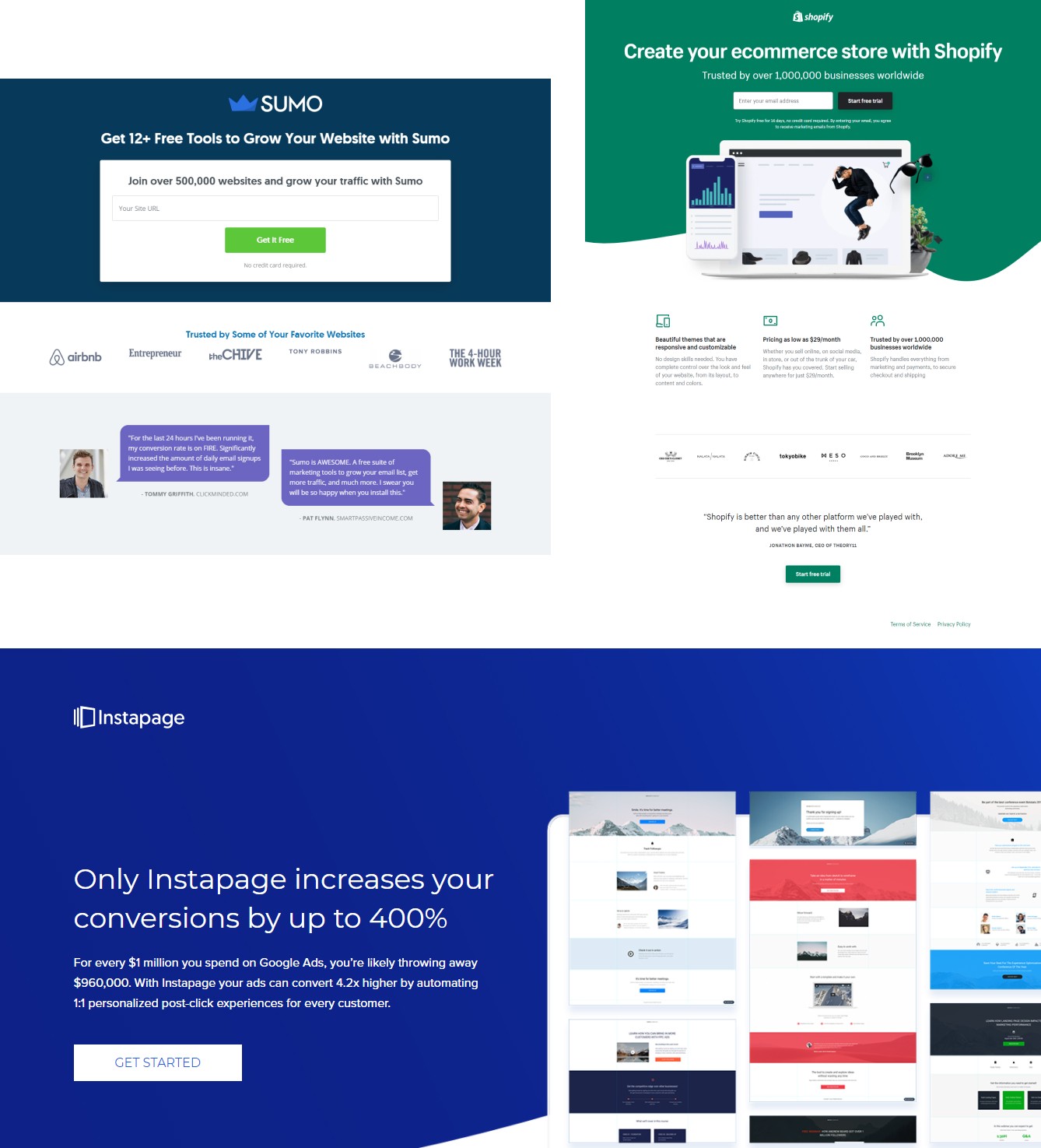

If you noticed, those headlines are clear, concise, and apt.
Keep Your Focus on Benefits, Not Features
You could go on and on ranting about how great and feature-packed your product is, but if your users don’t see any benefit in using it, you’ve lost already.
So for example, instead of saying “the best, mobile-responsive landing page-builder app”, you could say “build landing pages fast without coding”. This packs more punch, doesn’t it?
Hence, when writing your copies, focus on benefits and not features.
Infuse Power Words Into Your Copy
What are power words? They are persuasive words you use to play on people’s psyche, with the goal of getting them to take the action you desire.
For example, instead of saying “download my ebook”, you could say “last chance to get this ebook”. This is almost hypnotic, isn’t it?
That’s because there’s a power word at play there: last chance. Also, there’s an element of FOMO(fear of missing out) working here. We will get to that soon.
Here are some more power words you can use to up your copywriting game:
- Intense
- Now
- Instantly
- Attention-grabbing
- Supercharge
- Increase
- Thought-provoking
Keep It Short and Simple
You’ve probably heard about the KISS principle: Keep it simple, stupid. I believe the stupid here means simple.
Keeping your copy short and simple ensures users stay engaged on your landing page within the little time they have to spend.
Make it Scannable
Making your copies scannable is one copywriting tip to always abide by. Do you know why? Only about 16% of users will read your copy word for word. The rest will scan.
As such, you just have to make your copy scannable. Here are some creative ways to go about it:
- Use a bulleted list to call out important points, like I am doing here
- Highlight focus words by bolding or using contrasting colors
- Use pull quotes to draw attention to important points
4. Weave FOMO Into Your Page
Have you ever really loved someone before? One litmus test to know is if you fear losing that person.
Okay, I am intruding into your love life, and that’s uncool. Apologies. I was only trying to draw an analogy.
My point here is, as humans we always tend to fear losing something we find valuable – not just love. We fear losing a discount deal, missing out on our favorite TV show, not getting what everyone around us got, etc.
This fear, technically, is known as FOMO: fear of missing out. By leveraging this fear, you can make your users take prompt action when they land on your page.
But does FOMO really work, or is it one of those mumbo jumbo marketing gimmicks? I will leave you to answer that question, but here are some stats you might find interesting.
- 69% of internet users, particularly millennials, experience FOMO, and their buying decisions are usually influenced by it.
- What’s more interesting is that 60% make reactive purchases because of the fear they experience
Would it be overly ambitious if I said that FOMO is a cash cow?
So then, how do you incorporate FOMO into your landing pages? Here are some tips.
#1 Display a Countdown Timer
Ever watched a clock tick away into a new year before? If you have, you sure experienced a rush of excitement, didn’t you? A countdown timer it’s no different.
It’s nothing more than a digital clock that ticks away to a certain time in the future. You use it to remind users that they have a limited time to act. By act, I mean make a purchase, sign up for your mailing list, create a free account, etc.
A countdown timer will really come in handy when you are looking to get signups for your webinar via a landing page.
Thankfully, Adoric makes it easy to add a countdown timer to your landing page. More details shortly.
#2 Add Social Proof
Did you know that 92% of your visitors will very likely convert if only they saw reviews from other users? This is social proof 101.
As such, adding social proof to your landing page should never come as an after-thought.
Hold on a minute, what is social proof all about? Social proof, in a nutshell, is the reviews, testimonials, feedbacks, etc. left by your past customers/users.
But they have to be authentic – or at least look so – for your users to take them seriously?
So see to it that you add some form of social proof to your landing page.
5. Make Your Page Mobile-friendly
Hope you are aware that most people coming to your page will do so via their mobile devices? This is no assumption but fact.
Thus, you would be shooting yourself in the foot if your landing pages aren’t mobile-friendly.
Fortunately, optimizing your page for mobile isn’t rocket science. With landing page building tools like Unbounce, you can seamlessly create a mobile responsive version of your page.
6. A/B Test Your Landing Page
So I saved the last tip for the best.
I hate to break it to you, but if you follow all the 5 tips shared so far to the last letter, you might still not see meaningful conversion on your landing page.
Does it mean that all these tips don’t work? Far from it. The truth is, in marketing, you can’t really pinpoint what will resonate well with your target audience.
Something as subtle as using a red, instead of a blue color, on your CTA button can significantly win you more conversions.
Altering your headline messaging can as well do the same. But, you never can really tell until you try.
For this reason, you have to keep experimenting – or to be precise, A/B test – with different ideas to see what works and what doesn’t.
Need some A/B testing ideas? Oh, we’ve got plenty.
How to Build a Landing Page Easily
I bet by now you have one burning question that needs to be answered: How do you build a landing page?
Don’t worry, your question is about to be answered.
The good thing about landing pages is that you can create them in many different ways, easily. Be that as it may, there is still a hard way to go about it. And that way is writing complex HTML, CSS, and JavaScript codes from the ground up.
Grrr! Who has time for that?
So, what then is the easy way? Simple. Using landing page building tools.
Best Landing Page Builder
Let’s now review some of the best drag-and-drop landing page builder tools on the internet.
GemPages Landing Page Builder for Shopify
In case your website runs on Shopify, GemPages – a top-ranked Shopify page builder – is a good choice for you to consider.
GemPages empowers 165,000+ Shopify sellers across 130+ countries to build 1,800,000 professional-looking and high-converting store pages without writing a single line of code. It has received an average 4.9-star rating from 3800+ reviews in Shopify’s app directory.
Whether it is the landing page, product page, collection page, or any other subpages, the design process is a breeze with the intuitive drag-and-drop editor, 100+ conversion-driven elements, 80+ premade CRO templates, 60+ integrations, and many other possibilities. Especially, with the first AI feature in GemPages v7, Image-to-Layout, you can instantly generate editable layouts from reference URLs or images.
It’s easy to access and try GemPages because it offers a free plan for beginners. Of course, you can unlock more advanced features by upgrading to higher plans, starting at just $29. For added convenience, GemPages Academy offers step-by-step guidance, ensuring ease in building pages with GemPages.
Unbounce
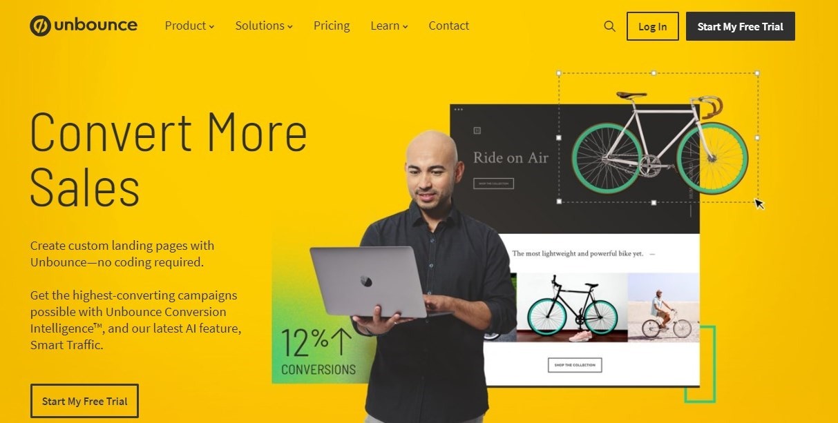

Founded in 2009, Unbounce is undoubtedly one of the most popular landing page builders. So, why am I starting off with Unbounce? Well, for a lot of reasons, and here are some:
1. Easy to use drag-and-drop editor
You don’t need to know a single thing about coding to use Unbounce’s drag-and-drop editor. Plus, it allows you to optimize your page design for mobile.
2. 100+ landing page templates
Don’t have the time to use the drag-and-drop editor? Unbounce has got over 100 templates you can bootstrap your design with.
3. Dynamic Text Replacement
Automatically change the text on your landing page to match the search text visitors used to find your page.
4. Easy publishing
Unbounce allows you to publish your landing page straight to your WordPress website or on a custom domain.
Pricing
Unbounce offers a 14-day free trial, after which you will have to switch to any of their paid plans which start at $80/month.
Pricey? Check the next builder tool.
Leadpages
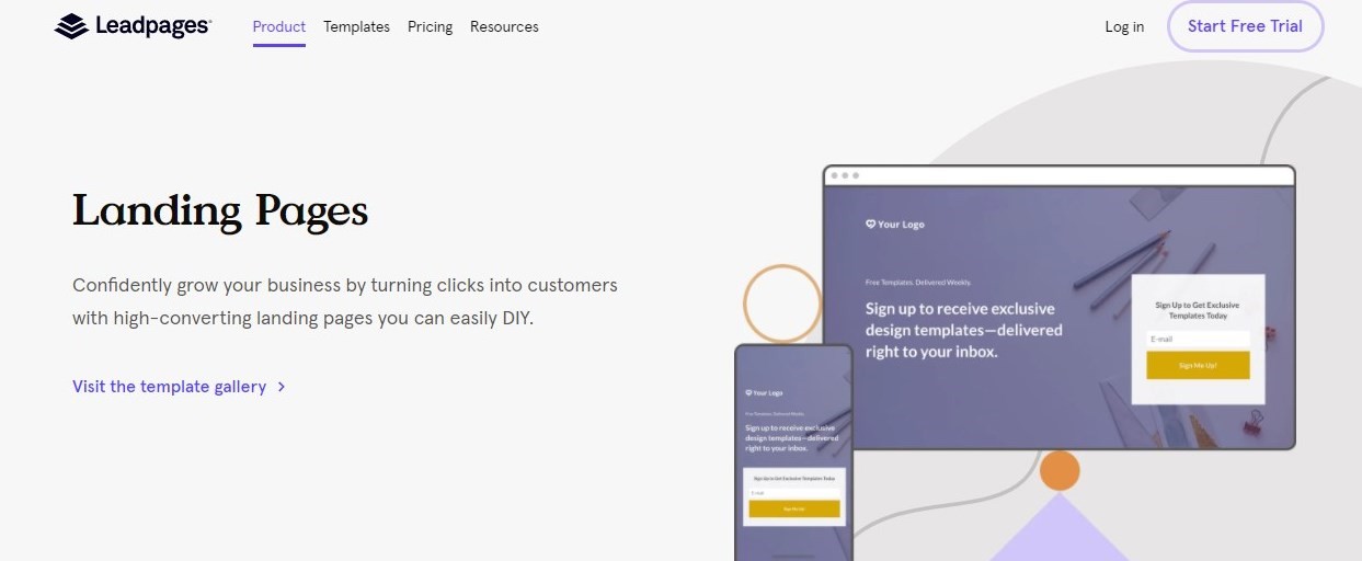

Leadpages, like Unbounce, is also another pioneer of drag-and-drop technology for landing pages.
It features a collection of over 200 mobile-responsive templates, a robust A/B testing tool, reservation and calendar widgets, and lots more.
With Leadpages, you can integrate your favorite email marketing service into your landing page without any help from a custom software developer.
And it’s much more affordable, with a starting price of $27/month.
Elementor Free Landing Page Builder
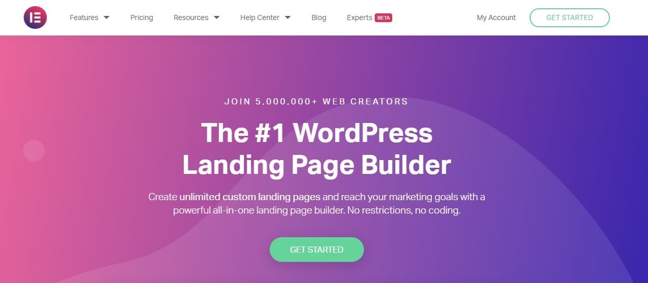

Looking for a free page builder plugin for your WordPress website? You just found one: Elementor page builder.
Though free, Elementor comes with all the tools that you will need to build a converting landing page: drag-and-drop editor, responsive editing, widget templates, and lots more.
Best of all, it is easy to use.
PageFly Landing Page Builder for Shopify
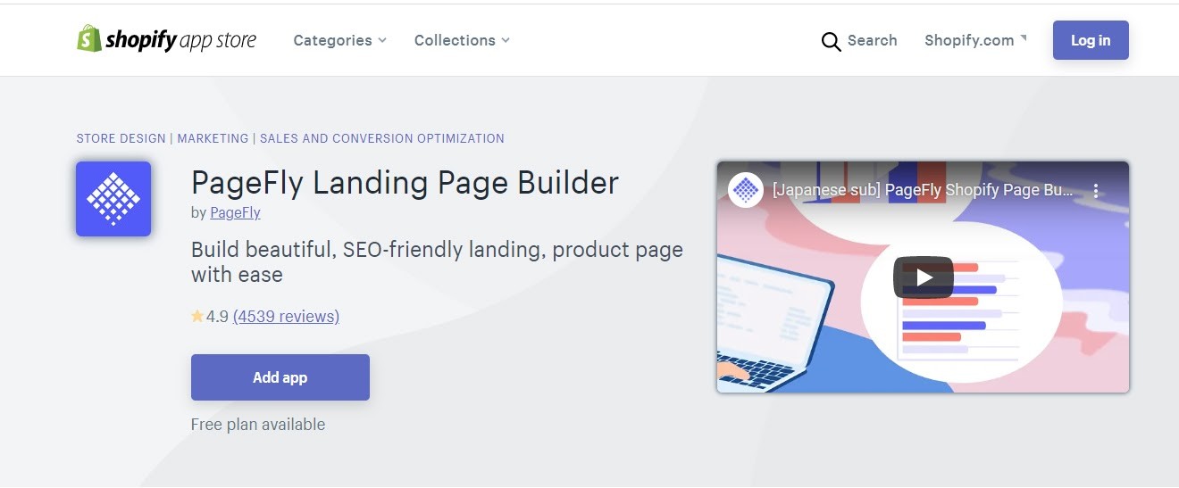

Okay, your website runs on Shopify and not WordPress. Well, that’s why you have Pagefly landing page builder: it’s exclusive to Shopify.
With PageFly, you can create a sales landing page and even optimize it for SEO without hassles.
What’s more interesting is that PageFly allows you to save your page designs as templates and reuse them later in the future.
And yes, it’s free. Though it has paid plans with more advanced features.
Alright, that’s about it for landing page builder tools. Next up is driving traffic to your landing page.
How to Drive Traffic to Your Landing Page
No matter how well-designed your landing page is, your efforts will amount to nothing if that page isn’t getting any traffic.
How then can you drive traffic to your landing page without breaking the bank? Here are some helpful tips.
Email Marketing
Email marketing to date still remains one of the most effective marketing channels you can count on. To begin with, email marketing is 40 times more likely to win you a new customer than Facebook ads.
On top of that, it costs little to nothing to run.
But to see meaningful results from email marketing, you need to master the art of converting visitors to your website to subscribers.
This is where our form builder tools come in handy. Also, with our carefully crafted, high-converting popup templates, winning leads and driving traffic to your landing page is easy peasy.
Social Media
Do you only visit, say, Facebook to watch cat videos and screenshot funny memes? If that’s the case, you are leaving a lot of money on the table.
Social media is a marketer’s gold mine: use it properly and you will never need to worry about driving traffic to your landing page.
By using boosted posts, running ads, and posting content to your social media handles regularly, you can drive lots of traffic to your landing page.
Forum Marketing
Ever heard of forum marketing? It’s another effective, yet untapped promotion strategy you can use to drive traffic to your landing page.
Here’s how it works: you find an online forum where your potential users/visitors hang out and get active on it. By this, I mean making contributions, participating in discussions, etc. The goal is to make yourself visible on the forum.
Need I mention that you need to attach a link back to your landing page in your signature? That’s how you get the traffic you are looking for.
Optimize Your Landing Page With Adoric
It’s been a long post, hasn’t it? Well, I am about to wrap up, but before I do I will like to show you how Adoric can help optimize your landing page.
After all, if your page isn’t well optimized, sending traffic to it won’t amount to much.
With that said, here are tools Adoric puts at your fingertips to optimize your landing page.
In-page Optin Forms
Earlier on, I shared with you reasons why placing your opt-in forms above the fold is important. But how do you go about it?
By using Adoric’s in-page positioning feature. It works like this:
First, you create an opt-in form. Of course, you don’t have to start from scratch to do so as we have lots of form templates you can pick from.
Next, tell Adoric specifically where you want the form to be placed by using the select option.
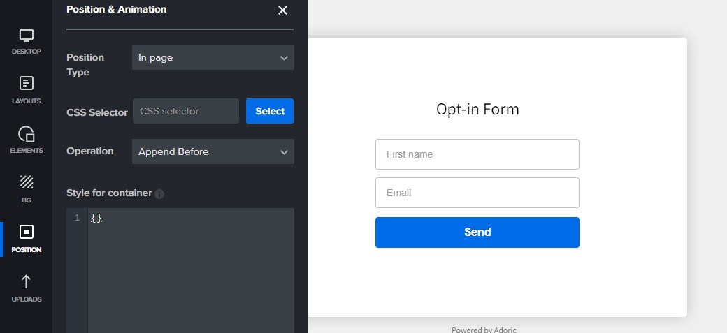

And you are done. Check out this tutorial to better learn how to use our in-page placement tool.
Countdown Timer
You sure want visitors to act promptly upon landing on your page, don’t you? A countdown timer will really be helpful for that.
Thankfully, Adoric makes it easy for you to add a countdown timer to your page. Plus, you can tweak it just the way you please.
For more on countdown timers, go check out this guide.
Embed Videos
Adding videos to your landing page can go a long way in boosting your conversions. It goes without saying that Adoric can also help with embedding videos into your landing page.
Wrapping it Up
So there you have it: a detailed guide anyone can use to build and optimize a landing page for conversion. For one thing, this guide has proven that you don’t need to be a guru developer or marketer to build an effective landing page.
If you need any form of assistance with the tools shared in this post – particularly Adoric’s tools – feel free to reach out to us.
Do you know the best part? Adoric is free!

