Did you know that more than 50% of the entire web traffic comes from mobile? On top of that, experts believe that by 2025, mobile traffic would have increased by 25%.
Mobile has come to stay – it’s the future.
Thus, if you are not accounting for mobile in your design, you are leaving a lot of money on the table.
Thankfully, Adoric allows you to create mobile-friendly campaign designs without breaking a sweat.
Mobile-friendly designs not only help to reduce your website’s loading time, but it also helps to improve user experience.
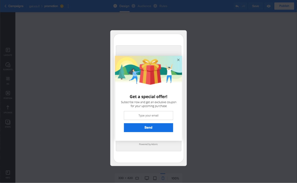
Improve Conversion with Mobile-friendly Popups
Adoric’s drag and drop builder allows you to create mobile-friendly popups, sliders, and sticky bars.
To do so, you can either start from scratch with a blank template or pick any of our high-converting templates and make modifications.
With the drag and drop editor, you can specifically target a mobile screen size with your campaigns. For example, you can create popups for screens with a width of 320px or less.
What’s more, you can create multiple designs for different screen sizes, and test them out to see which works best.
Did we forget to mention that you can also create exit-intent popups for mobile screens, too?
Of course, you can!
And that’s not all. Just like you would for the desktop, you can also create multi-step popups for mobile devices.
Audience and Campaign Triggers
No matter how well-crafted your mobile campaigns are, they won’t yield many results if shown to the wrong audience. Worse if they are shown at the wrong time.
For this reason, Adoric allows you to target a specific demographic of audience with your campaigns, and at the right time. You can target audience based on:
- Language
- Geo-location
- Traffic source
- Device type
Plus, you can set trigger rules based on
- Mouse action
- Page scroll
- Exit intent
- Time delay
What Next?
Now you’ve seen how Adoric can help you win as many mobile users as possible, why not sign up for an account right away?
